Epson 3800: Gamut Examplesby Eric ChanLast modified: Mon Oct 08 17:21:36 Eastern Daylight Time 2007
I put together some interesting gamut plots for my Epson 3800. The purpose of these plots is to gain some insights into the suitability of various RGB working spaces, monitor gamut limitations (based on my own Samsung 19" 191T LCD display), and paper color ranges for two papers, Premium Luster (based on the Epson-supplied Pro38 PLPP.icc profile) and Velvet Fine Art (based on a custom profile that I made for this paper). All plots below are in CIE Lab.
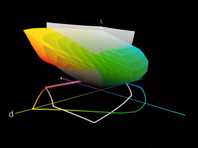
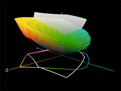
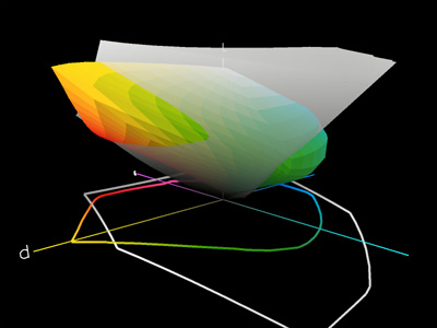
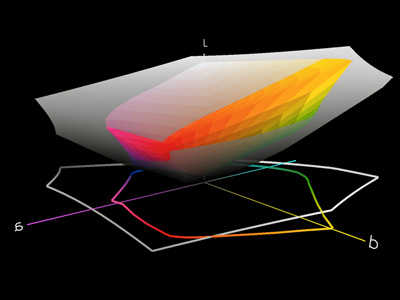
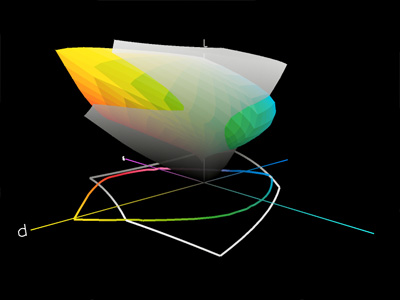
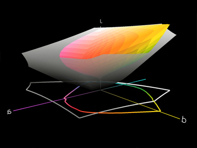
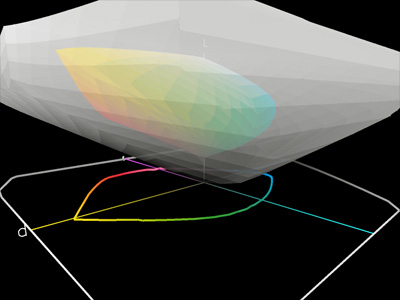
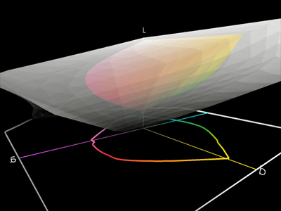
Example 1: Premium Luster (eight plots)First, let's compare the gamut of Epson Premium Luster (with the 3800, K3 inks, and the Epson-supplied Pro38 PLPP.icc profile) against various other gamuts: my monitor (first row), sRGB (second row), Adobe RGB (third row), and ProPhoto RGB (fourth row). Within a given row, the two columns provide different views of the same plot. In all eight plots, the Premium Luster gamut is shown in color, whereas the other gamuts are shown in translucent gray.Premium Luster is a resin-coated E surface (luster) paper. Luster papers are known for high contrast and vivid, saturated colors (large color gamuts). It is sometimes thought that printer gamuts are smaller than monitor gamuts. This may be true, but we can see from the first row that this idea is misleading. My LCD (which is an average performer and roughly matches the sRGB color space) certainly contains some colors that my 3800 can't reproduce on Premium Luster (see the light gray areas that poke out of the colored volumes), but similarly PL can hold many colors that my LCD can't show (see the light yellow, mid green, and dark reds and magentas that are poking out of the gray blob). Which gamut is bigger? The answer doesn't matter. The important point is that neither gamut contains the other: each one has colors the other can't reproduce. Comparing the first and second rows shows that my monitor's gamut is a rough match to sRGB (see the gray blobs). As before, notice the large colored volumes poking out of the gray mass: this indicates that there are many colors that I can print on Premium Luster that won't fit into sRGB. This implies that if I use sRGB as my RGB working space, I will be limited to the colors that lie inside both the gray volume and the colored volume; I don't get to use the colors of that lie outside the gray volume. In other words, I'm not taking advantage of the 3800 + Premium Luster's full potential. The third row does a similar gamut comparison with Adobe RGB. Although Adobe RGB has a noticeably larger gamut than sRGB, the plots clearly show that Premium Luster can still hold some colors that Adobe RGB cannot. This is most pronounced in the light yellows and the mid-to-dark greens and red/magentas. The fourth and final row shows a gamut comparison with ProPhoto RGB. This RGB space is enormous and completely contains all the other gamuts considered earlier, including the Premium Luster gamut.
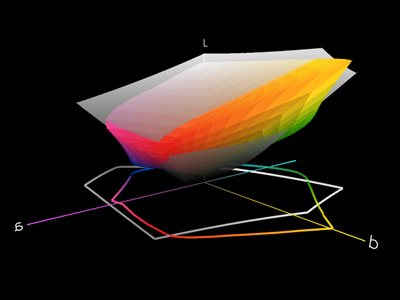
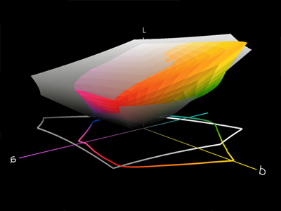
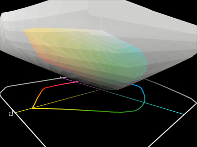
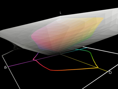
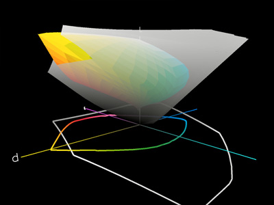
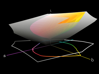
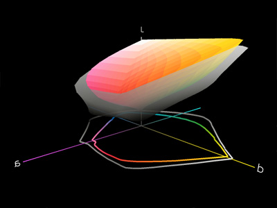
Example 2: Velvet Fine Art (eight plots)Next, let's compare the gamut of Epson Velvet Fine Art (with the 3800, K3 inks, and my own custom profile) against various other gamuts: my monitor (first row), sRGB (second row), Adobe RGB (third row), and ProPhoto RGB (fourth row). Within a given row, the two columns provide different views of the same plot. In all eight plots, the Velvet Fine Art gamut is shown in color, whereas the other gamuts are shown in translucent gray.Velvet Fine Art is a lightly textured matte paper. It is widely known that matte papers have noticeably less contrast and smaller color gamuts compared to luster papers. Nonetheless, we can see from the first three rows that VFA can still hold colors that the other gamuts cannot. Since the VFA gamut is smaller, the differences are less pronounced. For instance, in the third row, we see that it is only the light-yellow region of VFA's color gamut that pokes out of the Adobe RGB gray plot. As before, the ProPhoto RGB gamut (fourth row) completely contains the VFA gamut.
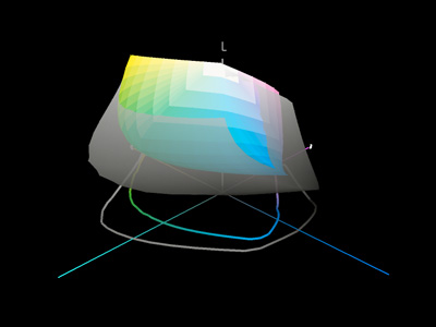
Example 3: Velvet Fine Art vs. Premium Luster (two plots)Finally, let's compare the Velvet Fine Art and Premium Luster plots against each other. While it is true that Premium Luster has a significantly larger gamut overall, notice that VFA still has some colors (however few) that lie outside of Premium Luster's gamut. In general, the two plots below show that VFA is better able to produce light saturated colors, and Premium Luster has a larger gamut everywhere else.
Summary and ConclusionsFrom the examples above, as well as additional tests that I've performed on many other inkjet papers, I would conclude:
Home |