the 3x3Font Story
JackBackRack
13Feb03
the story begins with my experimentation with scalable graphics and my desire to have fonts play well within my simple sandbox. so first, i needed an easily transformable font. one way to achieve that is to use fonts describable by strokes (aka vectors).
secondly, in order to keep my sanity, i needed a font that could be easily specified. i didn't want to write yet another font editor. clearly postscript and truetype fonts are not easily specified. they are readily available but involve interminable file formats and third-party libraries issues.
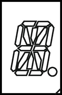
now these two goals seemed at odds, but it did give me an opportunity to rethink and simplify fonts. what is the simplest possible font anyways? can we do better than that nasty but classic alphanumeric 16 segment LED font:
we could start with the basic 3x3 grid as in the alphanumeric font:
this seems to be about the simplest possible structure with which to operate. in order to simplify the font beyond the alphanumeric font, we could disallow diagonals. having 12 horizontal/vertical segments that can be on or off yields a total of 4096 possible glyphs.
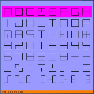
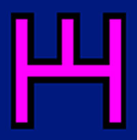
in the JACKfont, glyphs are constructed according to the following rules. a legal glyph consists of (1) a series of strokes with endpoints on the 3x3 grid, and (2) strokes are either horizontal or vertical. the following is an attempt to generate an uppercase alphabet, digits, and punctuation using these restrictions:
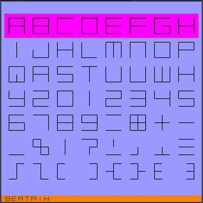
corresponding to the following characters:
ABCDEFGH
IJKLMNOP
QRSTUVWX
YZ012345
6789=*+-
_%|?;,.:
/\()<>{}
(as an aside, i would like to mention that this is a work in progress and that i'm not entirely happy with the glyphs for <>, {} and most importantly colon.) now the most striking thing about this font is that that several characters are ambiguous under the simplest implementation of these restrictions:B8, DO0, KHZ, AR, UV, and Z2. on the other hand, this weakness could be a strength by giving the reader a certain pleasure in disambiguating glyphs from context. in order to get a feeling for this consider the following example of a few words spelled out with this font:
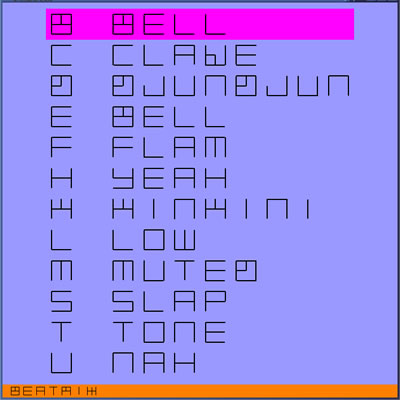
now although glyphs can often be disambiguated by context, in other settings, such as typing a single glyph by itself, it is imperative to have glyphs be self-identifying. fortunately, we can add disambiguating marks in keeping with our original rules. in particular, we can disambiguate the font by adding selective horizontal or vertical marks to all but one of the members of ambiguous glyph groups. the following is one possible unambiguous version of the above font:
and the same words spelled out with it:
we can now read letters a bit easier at the expensive of learning some slightly exotic glyphs. i also experimented with dropping parts of glyphs, but that strayed from an until then implicit rule of keeping the JACKfont glyphs blocky and centered.
lowercase letters can be added in a variety of ways. first, the simplest way is to construct them as shrunken upper case letters. unfortunately, this makes them ambiguous. this leads to the second way which is to shrink them but add either an underbar or overbar. third, and probably most challenging, is to handcraft an entire new set of lowercase glyphs. the 3x3 grid constraint combined with the centering aesthetic appears to be daunting for these smaller glyphs.
here is my first attempt at creating lowercase glyphs:
some of the glyphs (e.g., a, e, g, p, q, and y) appear twice as high. it has a certain quirky charm though. other glyphs are somewhat challenging to read (e.g., j, l, and z), but are not completely inscrutable.
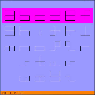
next i tried shrinking the big letters and created the following lowercase font:
now i think the problem glyphs are g and p and q still appear extra tall. it does though have a pretty regular internal consistency.
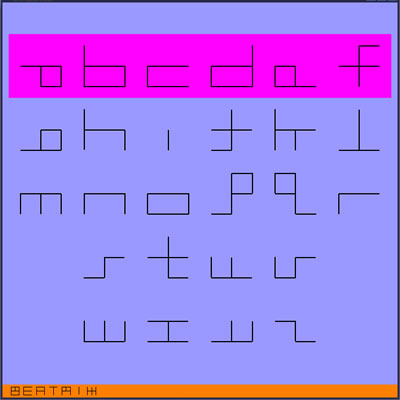
unfortunately, the letters are now inconsistent in overall area, that is, some glyphs have bigger squares than each other (e.g., a versus b). the following is a variation which attempts to even out their areas:

it could be that this font is just a bit too hard to read. more experience will tell.
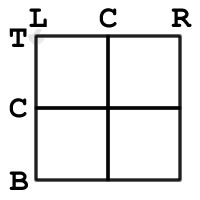
having glyphs be based on a 3x3 grid makes it relatively easy to specify the glyphs. we start by labelling the grid points using the row and column labels from below:
for example, the lower left grid point would be LB and the center point would be CC. a series of points can be strung together and represented as a string. these strings describe the path of a pen. for example, an O can be described as "LBLTRTRBLB;" where a semicolon is a pen up command and the stroke starts by default with the pen down.
finally, characters can be easily skinned by growing the dimensions of each of its constituent vectors into rectangles. this is particularly easy because each of the vectors is restricted to being either horizontal or vertical. shadows can be added by layering two skinnings of the same or different scale:
i would like to thank brian knep for advice and support.