Improving Your MATLAB Figures
05 March 2008
I admit it - I'm lazy when it comes to reading technical papers. I usually do a four step approach: abstract, figures, conclusion, and then the whole paper if I'm still interested after the first three steps. But too often the figures are so poorly made that I can't understand them without reading the paper. Many people make plots in MATLAB and it can be challenging to make the plots look good since the default settings are fine for the screen, but not for print. In this post, I describe some simple techniques for improving MATLAB figures and provide an example figure with code.
Recently, I saw a headline about $4 per gallon gasoline. That got me thinking about gas prices (not too long ago it was $1 per gallon), so I went to Energy Information Administration and downloaded a spreadsheet of gas prices since 1990. I’ll use this data for the example figure, shown below.
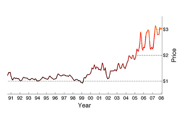
With a little vim work, I was able to massage the data into a MATLAB struct array with dates as one field and price as the other field. The figure is a simple linear plot of price since 1990, but I’ve changed many of the default options to improve the plot. What follows is a summary of the options I chose and why.
-
PlotBoxAspectRatio: Since we’re viewing data over a long time period, I want the x-axis to be long compared to the y-axis. The default MATLAB settings produce a squarish plot which doesn’t give the same impression. Here I chose a 2:1 ratio.
-
XTick and YTick: A problem I see in many figures is unnecessary ticks and labels. MATLAB tries to make its best guess, but it can’t know what you’re plotting and what is important. For this plot, I chose the XTicks and labels to mark the beginning of each year and the YTicks to only mark whole dollar amounts. I also moved the YTickLabels to the right side since I thought it improved the plot.
-
Grid: Typically, turning the grid on clutters up the plot with unnecessary lines. But sometimes it is important to tie the data to the axes. For this figure, I chose to mark the whole dollar amounts with dashed lines, but only start the line once the price passed that amount. In this way, I give a good sense of the price without unnecessary lines (i.e., chartjunk, for Tufte fans).
-
LineWidth and FontSize: The default line widths and font sizes are fine for the screen but too small for print. I chose 14-point fonts for the tick labels and 18-point fonts for the axis labels. The main data is plotted in line width 2 with dashed lines at width 1.
-
Color: A major problem many authors forget about is that color doesn’t print (for most readers). In other words, if the figure will be viewed in black and white don’t encode important data as color, use line styles and markers instead. But, color can certainly make plots more interesting - this figure would be somewhat boring if the price were plotted in the default MATLAB blue. I chose to vary the color with price, which is somewhat complicated to do, but improves this simple plot.
-
EPS: It’s best to print your plot as epsc (print -depsc) if you use LaTeX. I typically print as epsc and then convert the figure to pdf instead of printing to pdf directly from MATLAB. The borders are better printing to epsc, though there probably is a setting to get good borders when printing to pdf.
One final tip is to always write scripts or functions to generate plots from your data. When working on a paper, you will have to recreate figures many times as your data changes or for many other reasons. It’s also worth keeping around code for different types of plots because chances are that you will need it in the future. The script for this plot is attached below.