Should I Run there?
Depending on where you’re going and how fast you run, might it be faster to run there than take public transportation? Pondering this question, I decided to start a side project to find out!
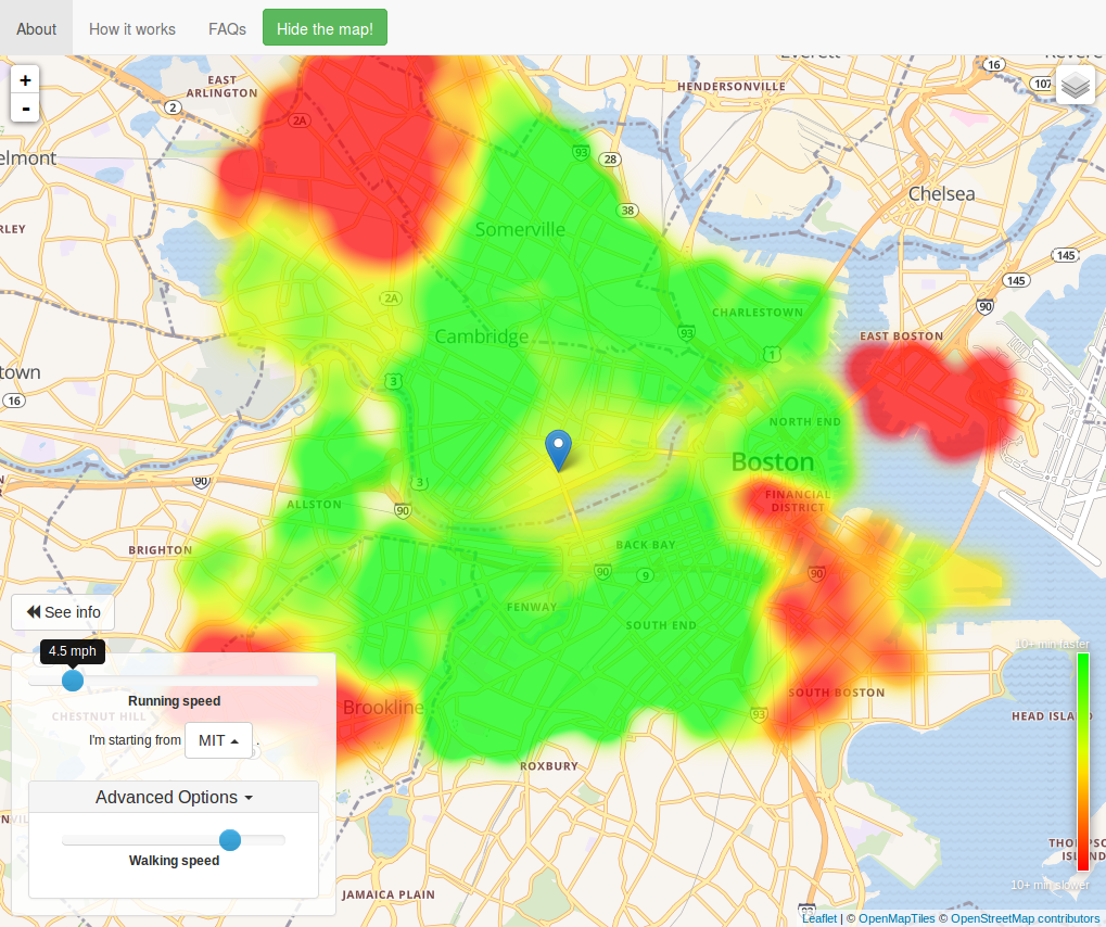
In this project, I used open source data and open data API’s to compute where in the Boston area it may be faster to run: as a function of running speed, versus taking the subway. The result is presented as a web-based GUI, where the user can pan and zoom in on a map, and change his or her running speed. Green areas on the map mean that it’s faster to run there, and red areas means it would be faster to take the T.
Data and Computation
I am thankful to a number of open source projects and open data API’s to make this possible! Specifically, I used the MapQuest Open Data initiatives API to query directions from point A and B, and the data for that service was itself provided by the OpenStreetMaps project.
Considering a single starting point such as MIT, or the Boston Common, transit directions from this starting point to a sampling of nearby destinations were queried using the MapQuest Open Directions API. For each starting point and destination, directions were obtained for walking, and for taking the subway. To estimate how long it would take to run the route, I linearly scale up the time for the walking directions based on running speed. While only an approximation, this allows a comparision between running speed and taking the T for many different destinations. We can take the difference to see how much faster running would be.
These differences in travel times are only computed for a scattering of points around the Boston / Cambridge area – but we want to compute a beautiful interpolation between these points. For this, I used a radial basis function (RBF) network to interpolate. This essentially places a small Gaussian at each location that I’ve measured. Weights for each of these Gaussians are computed offline using linear algebra. Then, we can evaluate the sum of weighted Gaussians between our samples to estimate the running speed difference. The result is a smooth, beautiful interpolation.
Website to Show Results
All of the above is computed once, offline. To make the data visible to a user however, I set up a web-based GUI with a map (thanks to the Leaflet project and other open map tile hosting!). A user can move and zoom into the map, and see the colored green / yellow / red interpolation overlaid. The user can also change various options, such as setting walking and jogging speeds, to see how that affects the results.
The RBF networks are summed together in the browser. This requires significant computation for each pixel. To get all of this to perform well enough in real time, I used a few tricks. Web workers to implement multi-threading, as well as some javascript optimations to cache the RBF values, predict which tiles will be loaded next, and more. An alternative (that would probably be faster in the long run!) would have been to pre-render the running overlay as separate tiles, and serve those with a map server – maybe for version 2.0!
Photos
While the website is no longer hosted (the map tile server I was using, from MapQuest Open Data initiatives, no longer exists – and I haven’t switched to a publicly available alternative yet), you can see an animation here:
The above animation shows the effect of running speed for someone starting at MIT.


