Color Matching with Adobe Camera Raw 3
by Eric Chan
April 21, 2006
Update (July 2008)
I wrote this article back in 2006, when Camera Raw's profiles were
built into the plug-in and could only be tweaked via the
Calibration sliders. As of July 29, 2008, Adobe has released Camera
Matching beta profiles for Canon and Nikon DSLRs. These
profiles do a much better job of approximating the color
appearance of other raw converters (in this case, Canon's DPP and
Nikon's Capture NX) than the method outlined below can do. This
has a lot to do with the lookup tables now available in the DNG
1.2 profile format (the earlier profile format was limited to
matrices, and hence linear transforms).
It's also possible to use the DNG
Profile Editor to get Camera Raw / Lightroom to match the
color appearance of other (non-Canon, non-Nikon) raw converters,
or even do funky things like make a Canon camera look like a Nikon
camera! See Tutorials 2 and 3 on the DNG
Profile Editor online documentation page for more info.
For the time being I've decided to leave the original text of this
article online.
Overview
My preferred RAW converter is Adobe Camera Raw 3.3 (ACR). I
like the interface, and I am comfortable with the tool set and
understand what each one does. I appreciate the smooth tonal
transitions, good shadow detail, and superb highlight-recovery
feature. However, I've never been that happy
with ACR's color rendering for the cameras I use. Warm tones are weak, especially reds and yellows, and
greens lack saturation. In an earlier article,
I described how I calibrated ACR for my cameras using a GretagMacbeth
ColorChecker chart. The resulting calibration has worked well for
many images, but in others the color balance is still a bit off.
When I come across an image that gives me color headaches in ACR, I
often try using other converters. For example, I often find that
Capture One gives me a very pleasing color treatment with very few
adjustments, especially with skin tones. Of course, having to switch
back and forth among multiple
tools is annoying and disrupts the workflow. So I began
wondering: wouldn't it be nice if I could imitate Capture One's color rendering
using ACR? Or, more generally, is it possible to use ACR to reproduce the color
and tone curves of other RAW converters?

Autumn Color, Vermont, 2004
(developed in ACR using a "Capture One style")
The answer is yes -- or, at least, you can get pretty darn close!
The process is reasonably straightforward and involves the following three steps: first match the white balance,
then match the tone (using curve points in ACR's Curve tab), and
finally match the color (using ACR's Calibrate tab). It takes some
time to complete these steps, but the nice thing is that once you're
done, you can save the resulting calibration (and optionally the tone
curve, too) so that it can be easily applied to other images with the
click of a button.
The rest of this page is devoted to describing the color and tone
matching procedure in more detail, the idea being that if you've read
this far, you're probably wondering how you can do this yourself. I
often hear comments of this nature from other photographers: "I like ACR, but I prefer the color
rendering of DPP" (or some other RAW converter). Well, hopefully this
article will help you coax more pleasing colors out of ACR.
What follows is a practical guide
with little explanation of the theory and the principles. If you wish
to learn more about color science and its role in photography, I
suggest visiting Bruce Fraser's
online articles and Bruce
Lindbloom's web site.
To carry out this procedure on your own, you will need three items:
The third item is a checkerboard containing 24 colored
squares with known spectral properties. (No, it does NOT suffice to
print out an image of the ColorChecker on your inkjet printer and use
that instead!)
This guide assumes you are comfortable working with
Photoshop and Adobe Camera Raw.
Profiling: step by step
For convenience, I will refer to the RAW converter we're
trying to match as the "target converter." I use Capture One as an
example in the
figures below.
-
Photograph the ColorChecker under your desired
illumination
conditions. Some suggestions:
-
Be sure to expose in RAW mode.
-
Expose at a low ISO (e.g. 200).
- Avoid nearby colored objects (e.g. grass, painted
objects, etc.), because these may
leave a color cast on the chart.
- Avoid including shiny objects (or anything
else brighter than the white square) in the frame.
- Keep the
illumination on the ColorChecker as even as possible.
- Expose carefully to avoid clipping the white patch and
the dark patch. Use your camera's histogram to assist you.
-
Stop down the lens (e.g. f/11 or smaller aperture)
to minimize vignetting.
It's fine to avoid completely filling the frame with the
chart.
- Copy the RAW image of your photographed ColorChecker to your
computer and open it using the target converter. In the example
image below, I've opened the RAW image in
Capture One:

-
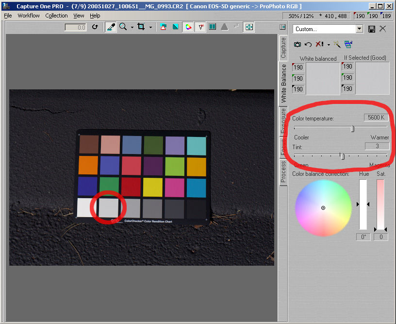
Set the white balance in your target converter using the
gray square next to the white square (R4C2). In Capture
One, this step is performed by selecting the White Balance
tab, then clicking on the gray square:

-
Process/develop the RAW image using your target
converter. In particular,
- Set the destination color space to ProPhoto
RGB. This will be the working RGB space of the
converted image.
- Save the output image in a lossless format, such as TIFF.
- It is not necessary to use 16 bits per color component; 8
bits is fine.
From now on, we'll call this converted image the
target image.
-
Open the target image in Photoshop and use the
color sampler tool to find the RGB values of each
of the gray patches in the bottom row of the
ColorChecker chart. Jot these numbers down.

Note that since these squares are supposed to
be neutral, the color components for a
given square should be pretty close to one
another. You might also notice that the values
vary depending on where you sample the square.
Small changes here and there are usually due to
noise. If these variations bother you, just
select an area near the center of the square, run the Blur ->
Average filter, and then obtain a sample from
within the selection area.
Here are the numbers I got in my case: 224, 191,
144, 92, 47, 21.
- Now we'll begin working in ACR. The idea is to match the white
balance (using one gray square), then the tone curve
(using all six gray squares), and finally the colors (using the
red, green, and blue color squares).
Use ACR to open the RAW image
of the photographed ColorChecker:

- Use the crop and align tools in ACR to exclude everything else
except the 24 squares of the ColorChecker (i.e. eliminate all
background material). The purpose of this step is to make the
histogram accurately reflect the squares' tonal values. You may
want to zoom in after performing this step to make the
ColorChecker image
easier to see.

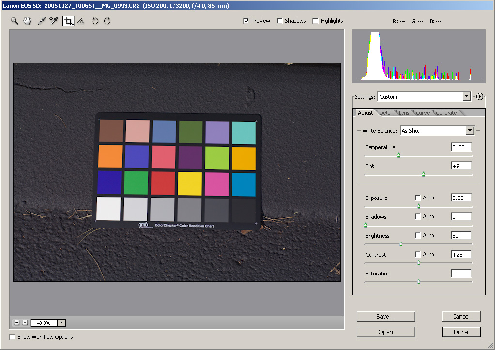
- Perform the following setup in ACR:
-
Choose "ProPhoto RGB" as the color space in ACR's workflow options.
- In the Adjust tab, set Exposure to 0, Shadows to 0,
Brightness to 50, Contrast to 25, and Saturation to 0.
(These are ACR's defaults, except for the shadows slider.)
- In the Detail tab, set sharpness to 0, luminance smoothing to 0,
color noise reduction to a moderate value (e.g. 20-25).
- Set all values in the Lens tab to 0.
- In the Curve tab, choose "Linear" from the Tone Curve
menu.
- Set all values in the Calibrate tab to 0.

- Look at the histogram and make sure that nothing is clipped,
i.e. no overexposure and no underexposure. You can
check the highlight and shadow warning boxes to make sure that the white square
is not overexposed and that the dark square is not underexposed. If overexposure or underexposure has
occurred, try another
exposure of the ColorChecker with your camera.

- Press S to get the sampler tool. Add "sampler points" to the middle
of each square in the bottow row (the gray patches). Also add
sampler points to the leftmost three patches in the third row (blue,
green, red patches). Sampler points are a great new feature in
ACR 3.
- Set the white balance (use shift-click with the sampler tool, or
press "I" to get the white balance tool) using the patch in row
4, column 2 (i.e. the
gray patch to the right of the white square).

Move the sampler tool over the surface of that gray patch (R4C2),
keep an eye on the RGB readout values, and make sure that the RGB
values are fairly neutral. They should not be more than one level
apart (e.g. 189 190 190 is ok).
- Go to the Curve tab. Look at the sampler points that you added for the six gray patches.
Ctrl-click on each one to add a corresponding point on the tone
curve. There should now be six interior points on the curve,
corresponding to the six gray patches.

- We are now going to match the tonality of the target image. While keeping an eye on the six gray patch sampler values near the
top of the ACR window, adjust the six points on the tone curve so
that the sampler values match the gray patches' values in the
target image (see Step 5, above).
The easiest way to do this is to use ACR's keyboard shortucts. Use ctrl-tab (or shift-ctrl-tab) to select
the next (or previous) control point, and use the
up/down arrow keys to adjust the tone values. Hold down the
shift-key to make increments of 10 instead of 1.
If the patches' RGB values aren't perfectly neutral, that's ok;
just match the green
values.

- The last step is to perform color matching.
Here is the iterative approach I used.
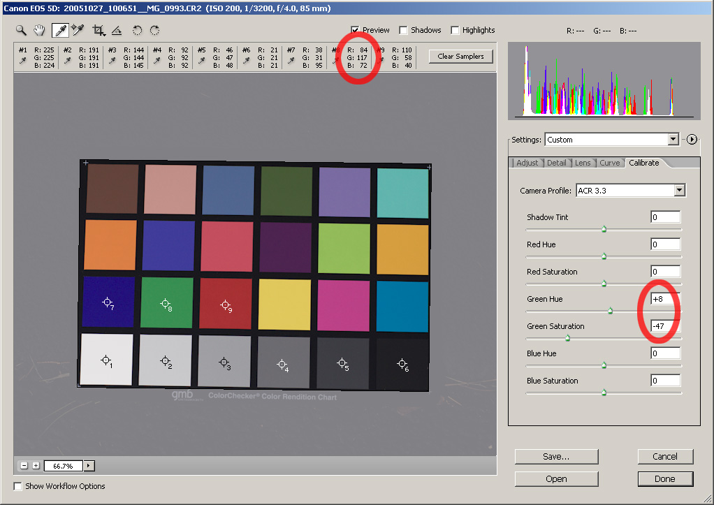
-
Start with the green patch (row 3, column 2) and try to get the values to be
proportional to the target image's values for the green patch.
In my example, the green patch in the target image has RGB values
(80, 112, 69). Since the green sampler in ACR shows
that the green value is 117, I aim for (84, 117, 72).
Use the green saturation slider to adjust red and blue values
relative to the green value. Use the green hue slider to adjust
red and blue values relative to each other. Tweaking the hue
slider will sometimes cause the green saturation value to change
(e.g. from 118 to 117). That's ok. Just keep tweaking the hue
and saturation
sliders until the green sampler shows values that are
proportional to the target image's green patch values.
For my example, here is what I got:

Notice how my values for the green sampler (sampler 8) have
the same ratios of R to G to B (84 to 117 to 72) as the green
patch in my target image (80 to 112 to 69). For your own case,
the necessary green hue and saturation slider values may be entirely different
from mine, so don't simply enter the slider values from
my example image above!
-
Next, switch to the blue patch (row 3, column 1) and its sampler. Repeat the
process with the blue saturation and hue sliders. The goal is
to get the values of the blue patch in ACR to be proportional to
the blue patch values of the target image.
Here is what I got:

After this step, you'll probably find that the sampler values
for the green patch have changed and may not be balanced
properly. That's ok. Don't worry about this for now; we'll
come back to it later.
-
Repeat the process for the red patch (row 3, column 3) and the red saturation and
hue sliders.
Here is what I got:

- This completes one round of color slider tweaking in the Calibrate
tab. As I mentioned above, the red sampler might now show a
balanced set of values, but the green and blue sampler
values are probably off. In my example above, you can see that this
is indeed the case. They shouldn't be off by too much, though.
By repeating the above three steps, we'll quickly converge on
a balanced set of red, green, and blue patches.
Fine-tune the sliders by repeating the above steps, starting with
green, then blue, then red.
In most cases you shouldn't need more than three or four
iterations. Once you become comfortable with how the hue and
saturation sliders work in the Calibrate tab, this iterative
process should only take a few minutes.
After 3 more iterations, I converged to this:

While the values of the red, green, and blue patches don't
match exactly with the ones produced by the target
converter, the have the same color component balance (i.e.,
the ratio of red to green to blue within each patch is
about the same).
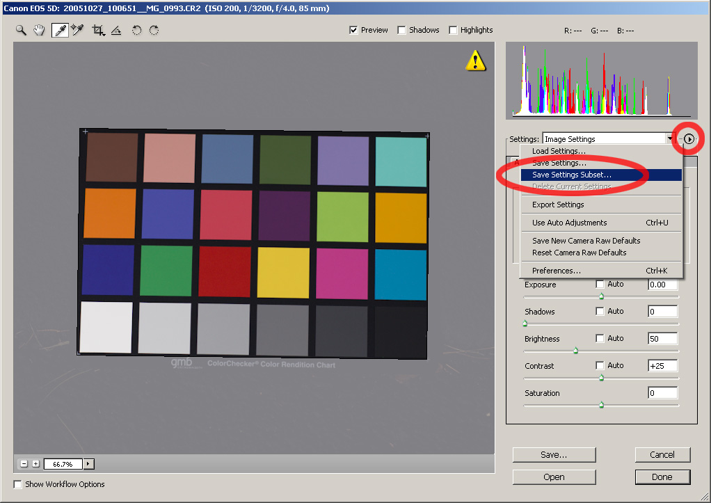
- Wow, that was a lot of work! Better not let it go to waste,
then. Save your calibration settings
by going to the right-triangle pop-up menu and choosing "Save
settings subset ...".

In the dialog box that comes up, choose
"Calibration" from the Subset menu and click the "Save..."
button. If you like, you can also save the tone curve used by
checking the "Tone Curve" box, too.
Give the target .xmp file a descriptive name, such as
"Canon_5D_daylight_CaptureOne.xmp".
Now whenever you want to apply the color rendering of your target
converter to an image, all you have to do is choose your saved
file from the Image Settings menu in ACR! If you also saved the tone
curve in the .xmp file, you'll match the tonality, too.
Example
Here's a photograph I took in Vermont in October 2004. The tree's
leaves had a deep red color, and I recall struggling with ACR to obtain
the same richness that I saw when capturing the image. The default
rendering from ACR does a pretty good job with the image's tones, but
the reds look rather lifeless.

Default output from ACR (no calibration). Reds look rather pale.
For the image below, I set the calibration sliders using the
calibration technique described in this article.
The reds certainly come to life, though they are slightly too pink for
my taste, especially in the leaves in the upper-left part of the frame.

Output from ACR after applying the color calibration method
described in this article. Reds are more vibrant but have a slight
pink/magenta cast. This might be fixable with a gentle White Balance
tint tweak, but not without affecting the green foliage, too ...
|
For the third image, I used the tone curve and calibration settings
obtained using the color-matching procedure described above. In other words, I
used ACR to produce an image in the "style" of Capture One.

Output from ACR using the color matching approach described above,
i.e. in the style of Capture One. Of the three images here, this is
the one I prefer.
|
Which is the best? There's certainly no right or wrong answer
here. These images are just three different interpretations of the
same RAW image data. I actually expect some readers may prefer the second (middle)
image. Personally, I like
the third image best; its colors and tones are the most pleasing to me
and most closely represent the
scene as I remember it. Perhaps most importantly, they remind me of
why I wanted to photograph that tree in the first place!
Now, I'm not saying that going through this tedious color-matching
procedure is the only way to get pleasing colors in ACR. Far from
it. In this
case, I was having some difficulty getting the color balance I
wanted in the image, and I found it easier to get there by imitating the
colors produced by another RAW converter. This technique is not
intended to replace standard curve and slider adjustments in ACR.
It's simply another tool to add to one's digital darkroom toolbox.
ColorChecker Comparison
Below you can see the photographed ColorChecker chart developed by
the target converter (Capture One). Move your cursor over the chart
to show the one rendered by ACR after color matching and tone
matching. (I have converted both of these images to sRGB for web
display.) Not identical, but pretty close.

Move your cursor over the image to switch to ACR's output.
Closing Thoughts
The color matching approach should generalize fairly well across all RAW
converters, not just Capture One. In my own case, I've tried
it on Capture One, Raw Shooter Premium, and Canon's Digital Photo
Professional (DPP)
software, and it has worked well in all cases. Again, it's best
not to think of the results as "right" or "wrong" -- it's a matter
of taste, after all. The calibration settings I obtained by
matching Capture One, for instance, work better for some images than
for others.
I must say, though, it's
really nice having all of these different color and tone
variations available in a single interface. I just cycle through
the Image Settings menu until I find one I like and use it as a
starting point for finer adjustments. It's like having a
little "appearance and style" library right at my
fingertips.
Acknowledgments
Thanks to Jeff Schewe for helping me get started with the color
matching procedure.
|