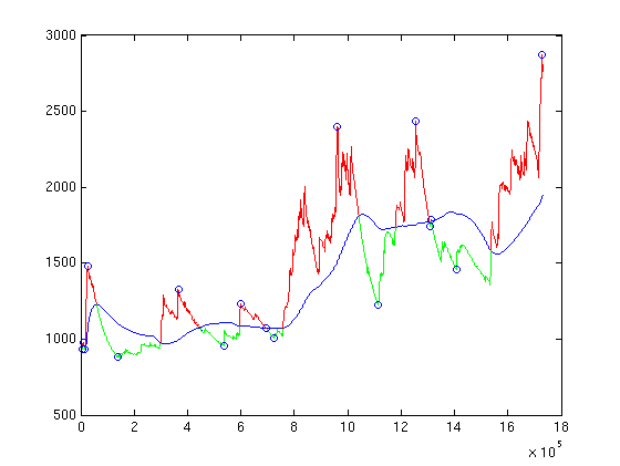

We use the moving-window average (blue line) to decide whether a data point is in a peak (red) or a valley (green) by simply looking at whether the difference between the data point and the moving-window average at that point is positive or negative.
We then group consecutive points with the same label (peak or valley) into regions. We circle the extremum of each region (in this specific case, we decided to circle the data point in each region for which the difference between the data function and the average function is an extremum so as to account for the general trend).