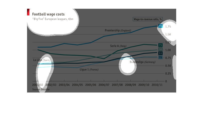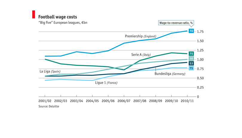
This chart shows the wage to revenue rate for Football in the 5 European leagues. Germany,
France, Italy, England, and Spain make up these countries. The trend has been raising since
2001 until 2010/2011. England has always lead the pack in this aspect according to the data
collected on this chart.
This chart examines football wage costs amaong the "Big five" European leagues. The costs
are compared starting from the 2001/02 season ending with the costs for 2010/11.
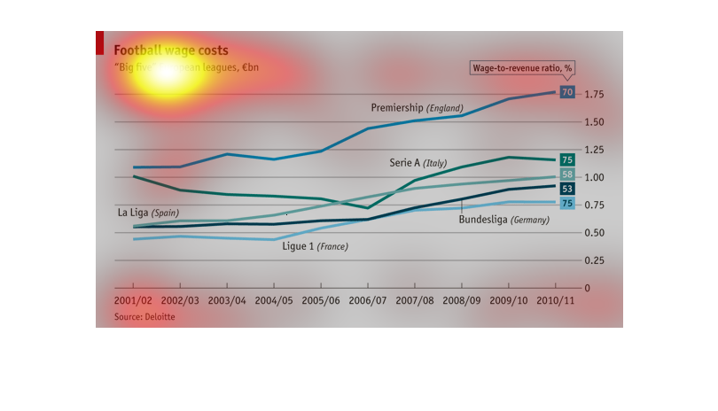
X-axis is years (seasons), y-axis is a wage to revenue ratio percentage. The lineplot shows
the big five european football leagues and the football wage costs.
this chart describes football wage costs of European teams. It shows that England Premiership
has the highest wage to revenue at 1.75 percent. The lowest percentage is France at .75%
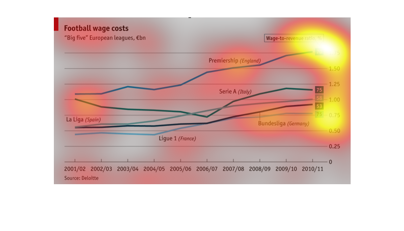
A chart depicting football wage costs for the "big five" European leagues. Premiership in
England is shown to have the highest and Ligue 1 in France is shown to have the lowest.
The image is a graph that deals with football wage costs in the "big five" European leagues.
It covers a 10 year span from 2001/02 to 2010/11. The highest wage to revenue ration is Premiership
England. Lowest is Bundesliga (Germany).
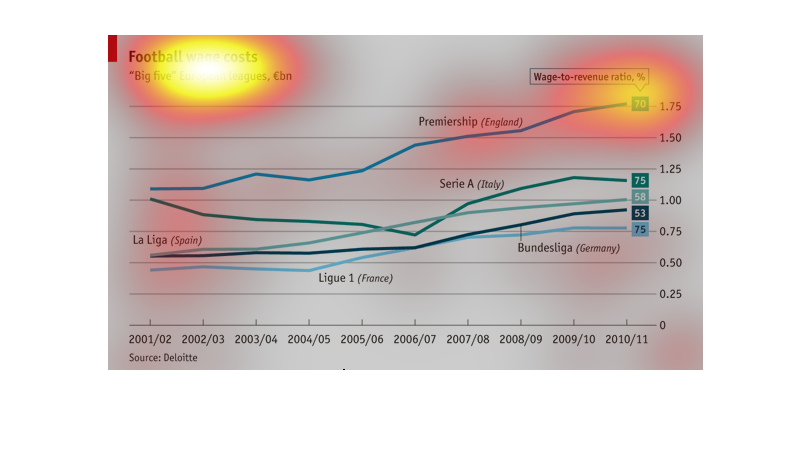
The image shows football wage costs for the "big five" football leagues over the course of
about ten years. The "big five" includes France, Germany, Italy, Spain, and England. The information
is presented in Euros.
This chart describes the costs of wages of the "Big Five" European football leagues. It is
a line graph of the wage-to-revenue ratio (in percentages) of each of these 5 leagues from
the 2001/2002 season to the 2010/2011 season (on data point per season). I can't quite make
out what the y-axis is...it ranges form 0 to 1.75, though it seems to be graphing wage-to-revenue
ratios, which are bounded between 0 and 1...rather confusing. England has the highest ratio
across time, while France has the lowest ratio across time.
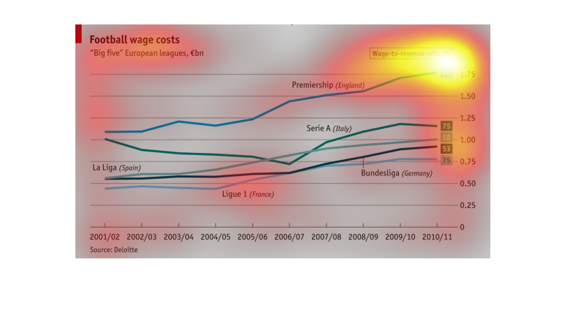
This graph compares the football wage costs of the "Big Five" European leagues in Euros. This
is accomplished by using a line graph of wage-to-revenue percentage for each league.
The line graph describes wages among European football organizations. It shows many different
football groups and how much players are paid annually. The far right side shows wage to income
ratio for players in these organizations.
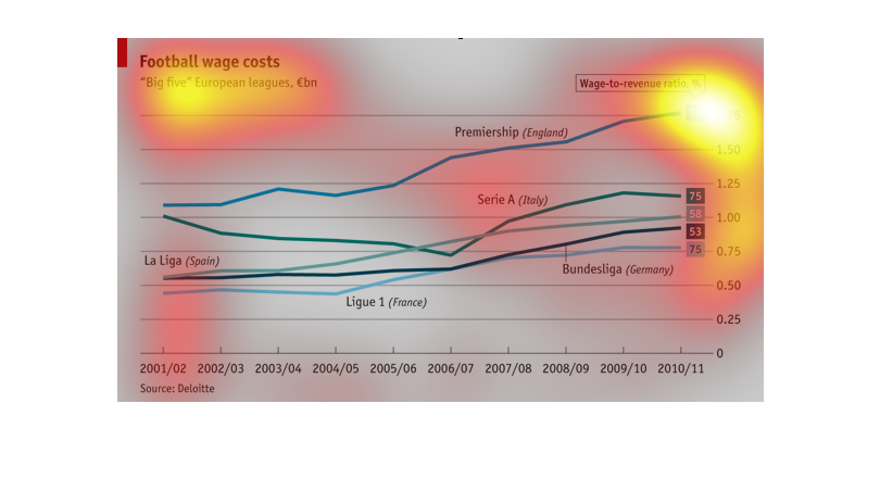
This graph shows the different wages that european football players are paid. The big 5 countries
are equally represented here and I think the graph is trending upwards.
Football wage costs (Big 5 european leauges, in billions), in wage to revenue (%).  Premiership
(England) is highest Ligue 1 (France) is lowest with Serie A (Italy) and Bundesliga (Germany)
in between
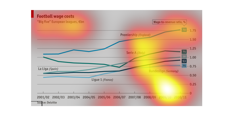
This graph describes the costs of football wages using a wage-to-revenue ratio. The football
leagues involved were the major leagues in France, Italy, Germany, Spain, and England. The
highest ratio always belonged to England. The other leagues showed some decrease over time
but midway through the decade showed some growth, although not as great as the Premiere League
in England.
This chart describes the five Football European league's various wages paid out to players,
workers, and everyone affiliated with the league. It is between La Liga (Spain), Serie A (Italy),
Premiership (England), Bundesliga (Germany), and Ligue 1 (France). England's league leads
with the highest percent ratio with France at the lowest percent ratio across the years. One
thing is for sure, over time, from 2001 to 2011, wages have increased significantly over time
now that sports are one the number one sources of entertainment.
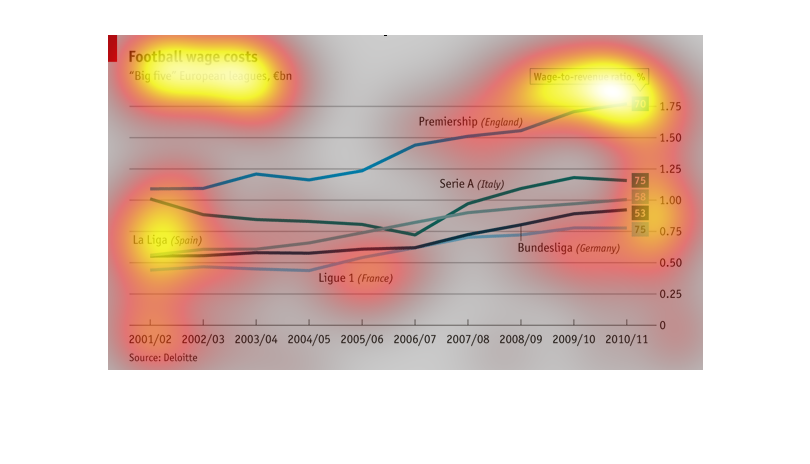
The graph shows what current football players make in different European leagues over time.
Overall, all of the leagues have shown an increase in the wages that the players receive.
The Premier League in England currently pays their players the most, with the Italian league
and Spanish league coming in second and third respectively.