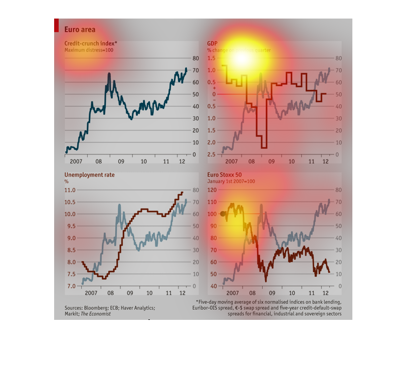
This graph represents different pieces of data for Europe. It shows GDP, Credit index, unemployment
rate, and the Euro stock index. It ranges by years 2007 to 2012.

This chart addresses numbers in Europe. It contains a Credit-crunch index representing overall
bank lending. And separate graphs showing GDP, unemployment rates and the Euro Stoxx 50 from
2007-12 respectively.
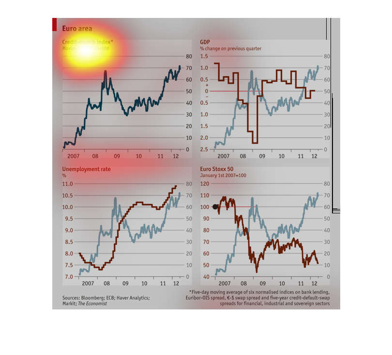
This chart covers the EU in four different areas, the credit crunch index, GDP, percentage
of unemployment rate, and the Euro Stoxx 50. The green lines show a general climb upward,
the red line for unemployment shows a sharp climb upwards, the other red lines showed a decline.
This series of charts depicts the Euro Area in different metrics including the credit crunch
index, unemployments rate, GDP and the Euro Stoxx 50 index.
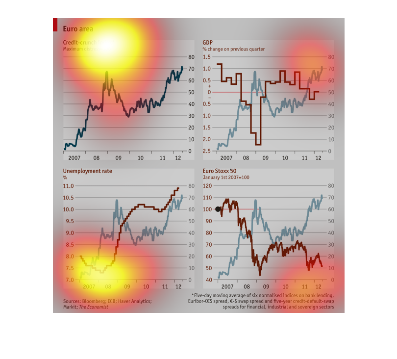
This seems to be some kind of economic chart for Europe. There's four different graphs that
are added to it, including a credit crunch index, GPD graph, Unemployment Rate, and Euro Stox
50.
These chart describes the Euro area credit crunch index(maximum distress = 100), GDP(% change
on previous quarter), Euro Stoxx 50(January 1st 2007 = 100), and unemployment rate(%). Every
chart dates back to 2007.
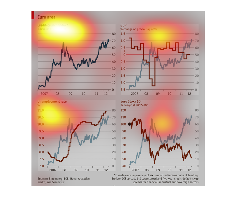
The 4 charts describe the financial quality of european countries by the GDP (percent change
over previous quarter), Euro Stoxx, unemployment rate, and credit scores.
This graph shows the credit crunch index.The credit crunch index is comprised of the GDP,
unemployment rate, and Euro Stoxx 50 change.  There are four separate line graphs.  One for
the composite index and one for each of the contributing values. The change in GDP from previous
quarter, the unemployment rate, and the Euro Stoxx 50 values are shown in red.  Their contribution
to the credit crunch index are shown in blue.  The credit crunch index increased yearly with
the exception of a decline between mid 2008 and late 2009.
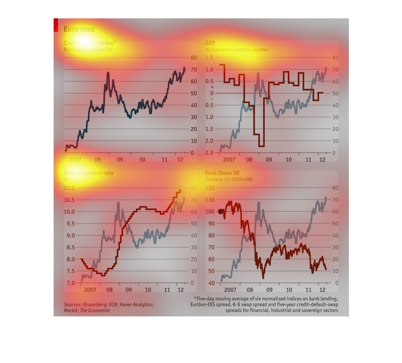
The chart shows the credit-crunch index, the percentage of Gross National Product, the unemployment
rate and the Euro Stoxx index for the period 2007 through 2011 for the Euro zone.
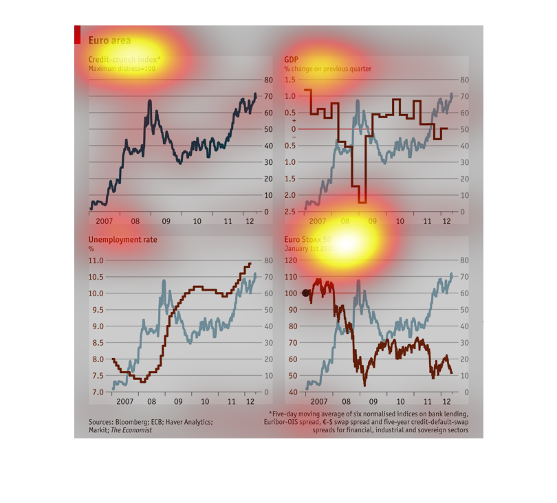
This charts appears to show the euro index over a fiver year period or longer. It is show
lines that reference to the credit crunch as well as other data. GDP and unemployment is presented
in the charts aw well as Euro Stoxx 50.
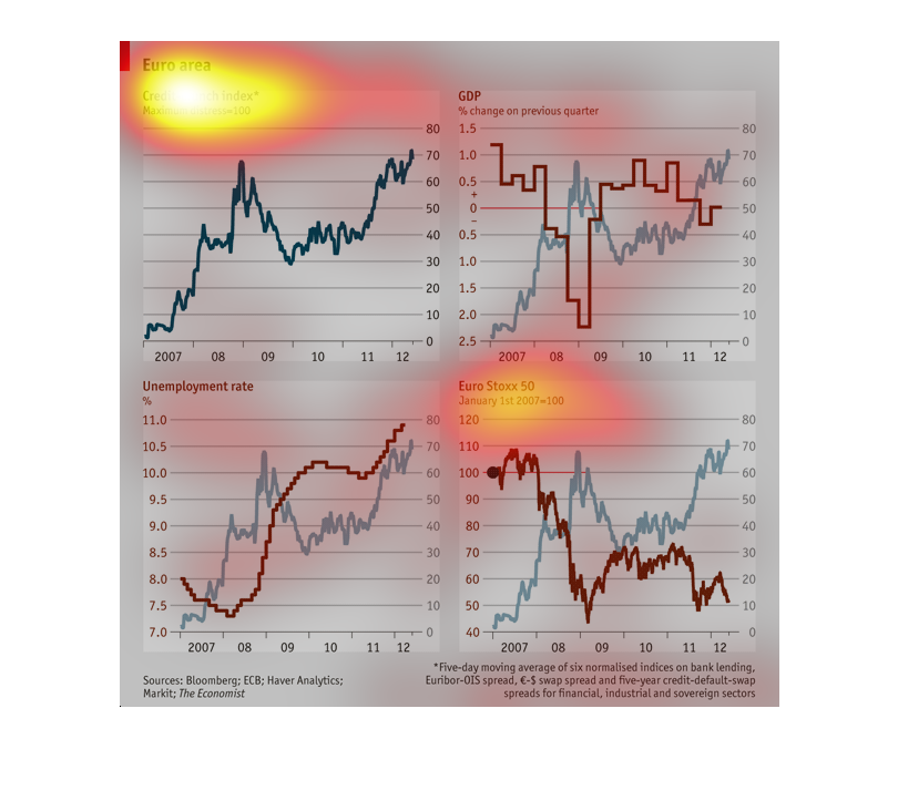
One image is based on Euro area including  credit-crunch index.  The index is read by maximum
distress  100.  There is another image that describes the unemployment rate and Euro Stoxx
50, January 1, 2007.
There are 4 different line graphs representing different sets of data from Europe. The first
graph shows the credit-crunch index and the second graph shows the GDP % change of the previous
quarter. The third graph shows the unemployment rate. The last graph shows Euro Staxx 50.
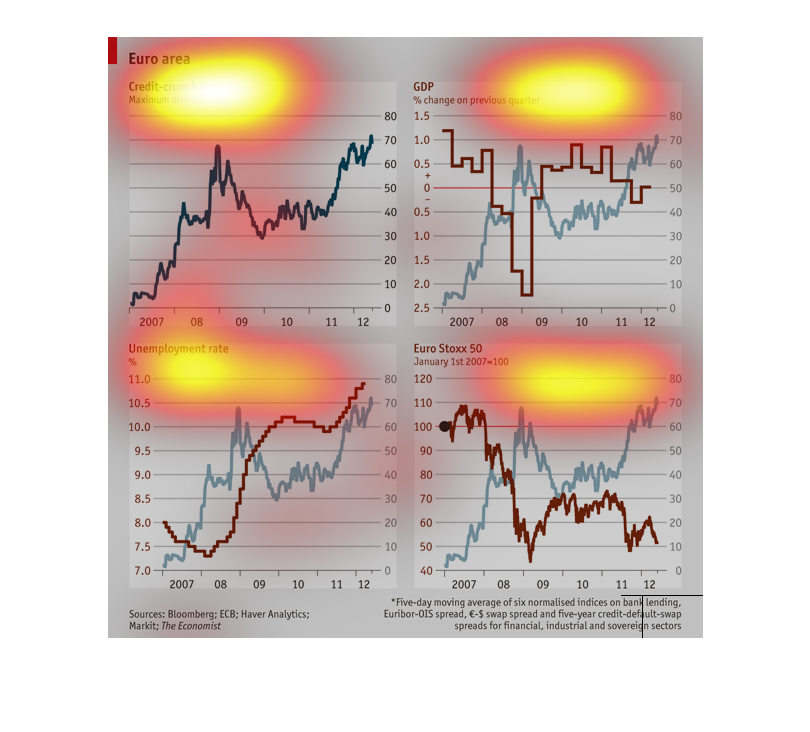
This show four charts that are apparently rating Europe's economic health in 4 areas: unemployment,
credit, DGP, and the stock market.  The charts describe two different time periods
This set of graphs represent the change in GDP, unemployment, credit-crunch, and value of
Euro-Stoxx over 5 years from 2007 t0 2012. These graphs are slightly confusing.