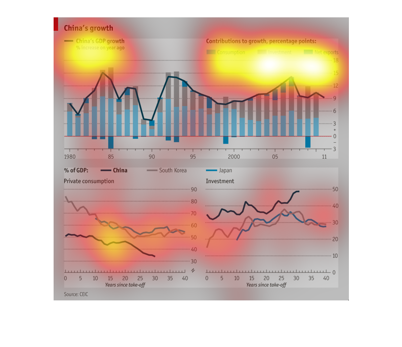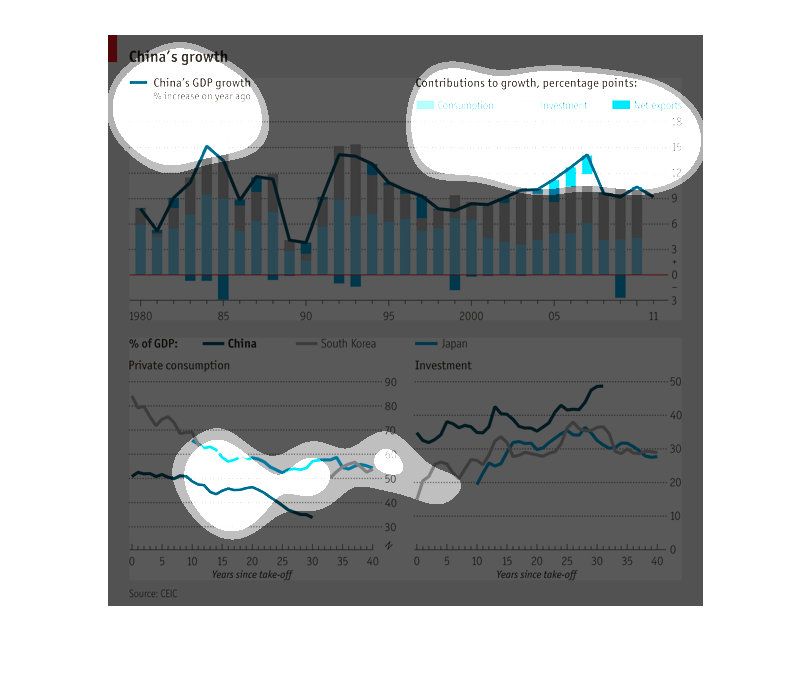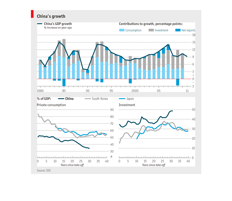
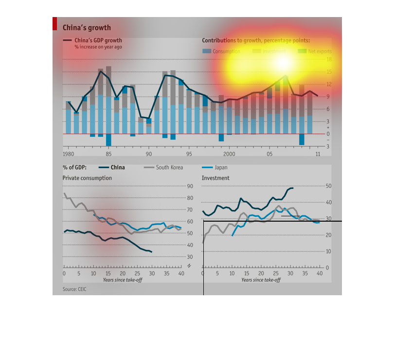
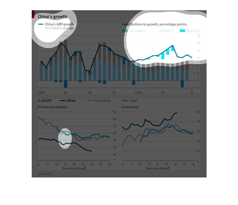
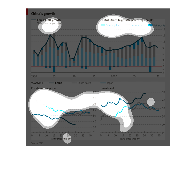
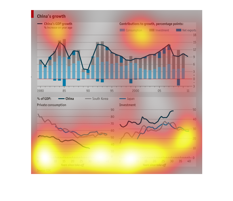
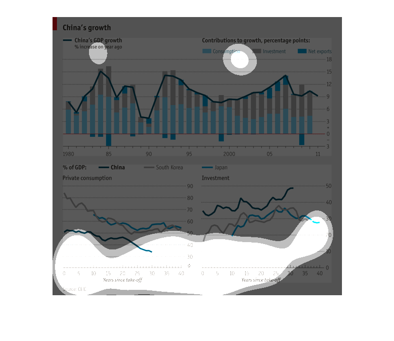
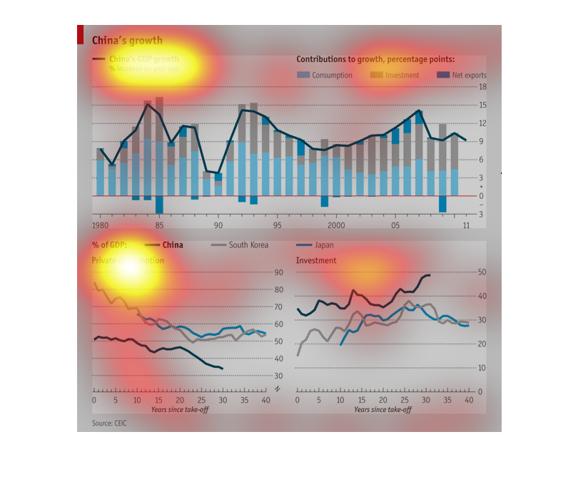
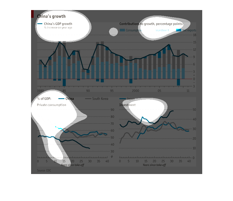
the picture is of two graphs detailing chinas growth and contributing to the growth such as
investments, consumption and net exports. it shows results for each year
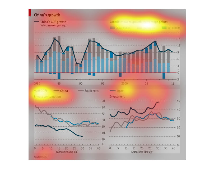
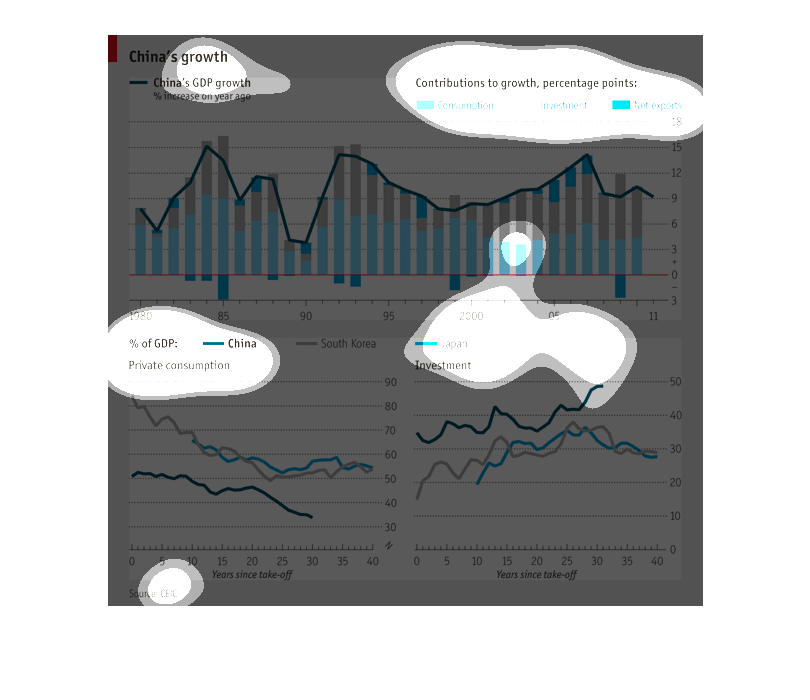
This chart describes and depicts China's GDP growth as a percentage of increase from the previous
year fro the year of nineteen-eighty to the year two thousand and eleven.
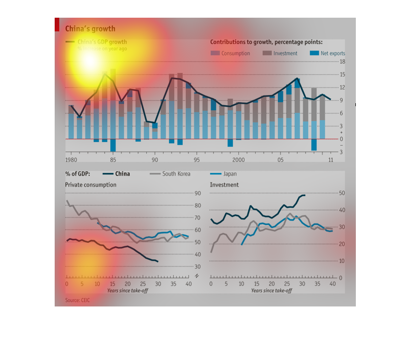
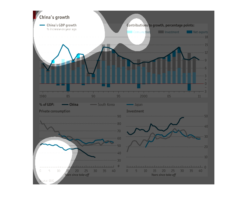
This chart shows China's growth, and the contributions to growth, percentage points. In light
blue it shows consumption, investment in grey, and Net exports in blue.
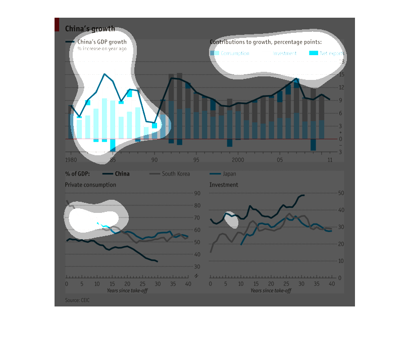
This chart tracks the growth of China. It begins in 1980 and goes in a triple bell curve of
growth periods until the end is reached in the year 2011.The growth in 2001 was double of
the growth in 1980 and about 2/3s of the highest 3 points.
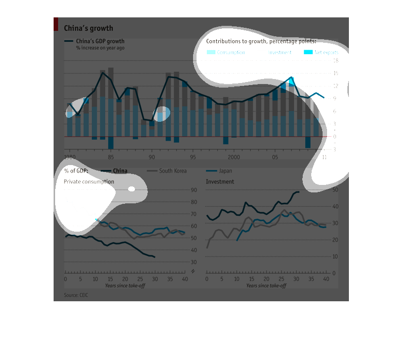
There are three charts here. The first is a vertical bar graph which outlines China's GDP
growth. It further breaks down that growth into consumption, investment, and net exports.
The second chart is a line graph comparing private consumption as a percentage of GDP between
China, Japan, and South Korea. Finally, there is another line graph comparing investment between
the same 3 countries.
China's GDP growth comapred to South Corea and Japan from 1989 to 2011. Shows contribution
to growth in % points, private consuption and investments in China, South Corea and Japan.
This graph shows chinas growth. The graph ranges from 1980 t0 2011. The graph is based off
of contributions to growth in % points. The three are consumption net export and investments.
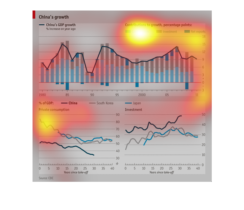
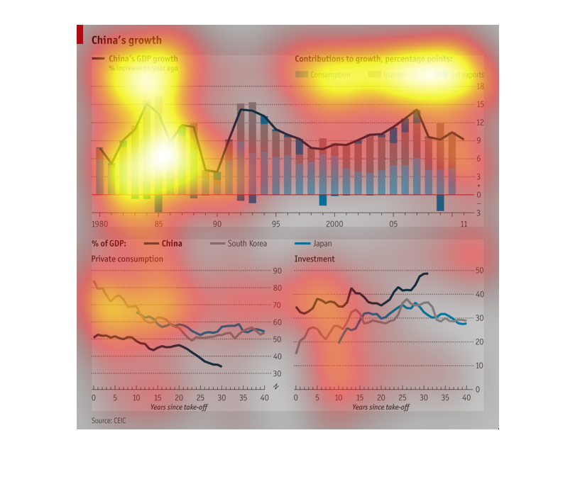
This graph shows China's GDP growth between 1980 and  2011. The graph shows that there has
been some changes in the GDP over the years. There have been inclines, declines, and periods
of no growth. This graph also documents how that money is being obtained (consumption, investment,
and net exports). The two graphs on the bottom show what percentage of the GDP is spent in
private consumption versus investment. These two graphs compare China, Japan, and South Korea.
The graphs show that China has had the lowest private consumption, but the highest investment
on average. South Korea and Japan have been pretty comparable for both.
This is bar chart showing China's domestic growth from 1980 to 2011.  Each bar is three colors,
representing the parts consumption, investment and net exports. Below it are two line charts
that show the amount of investment and consumption, respectively of China, South Korea, and
Japan.
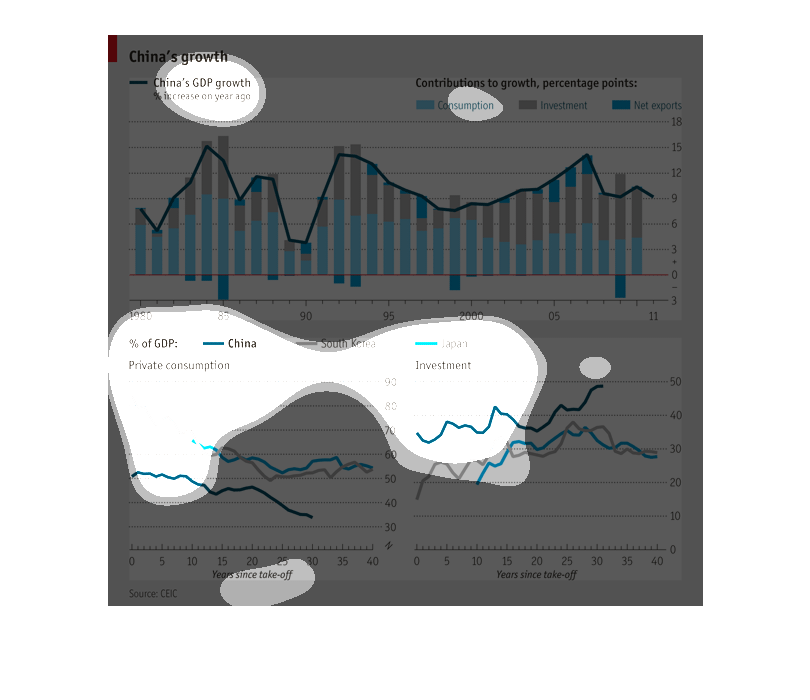
The main graph at the top of the page is about China's growth.   This graph breaks down contributions
to the countries' growth, as well as the amount of points, investment, and consumption.  There
are also two other graphs bellow this main one. The smaller graph on the left side of the
page compares China's private consumption as compared to Korea.  The graph on the right shows
information on investment in Japan, and their growth rate.
This chart contrasts and compares the data regarding China's GDP growth over the past 30 Years.
It also compares investments to private consumption over time.
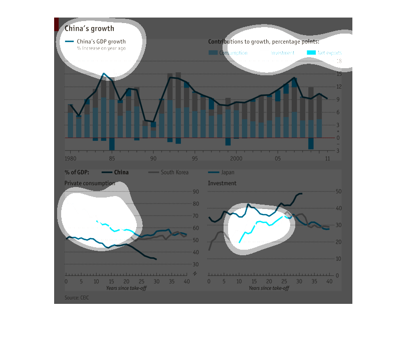
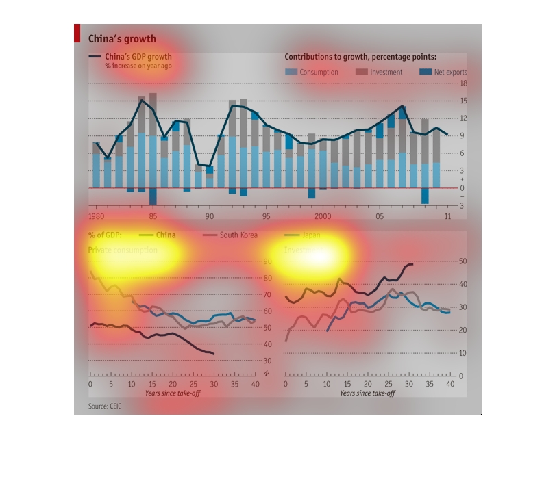
This chart depicts Chinas growth across different area of measurement including GDP, private
consumption and investment when compared to other Asian countries.
The image is about chine gdp growth over the couples years and this is a chart of showing
 the illustration of countries with their percentage now although south Korea has the most
by a mere of 95 percent .
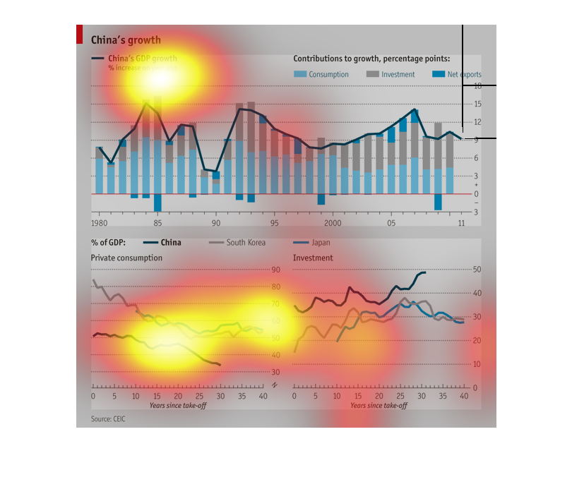
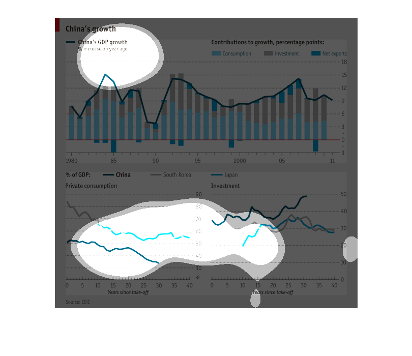
This chart shows growth in China. This graph summarizes the growth in GDP, and what factors
are contributing to the growth of China's GDP. These factors are net exports, investment,
and consumption.
The top image shows the relationship between China's GDP and its consumption, investments,
and net exports between the years of 1980 and 2011. The bottom chart compares China to other
Asian countries in the region.