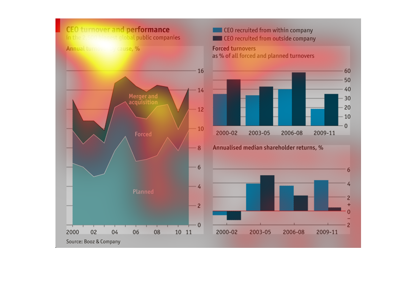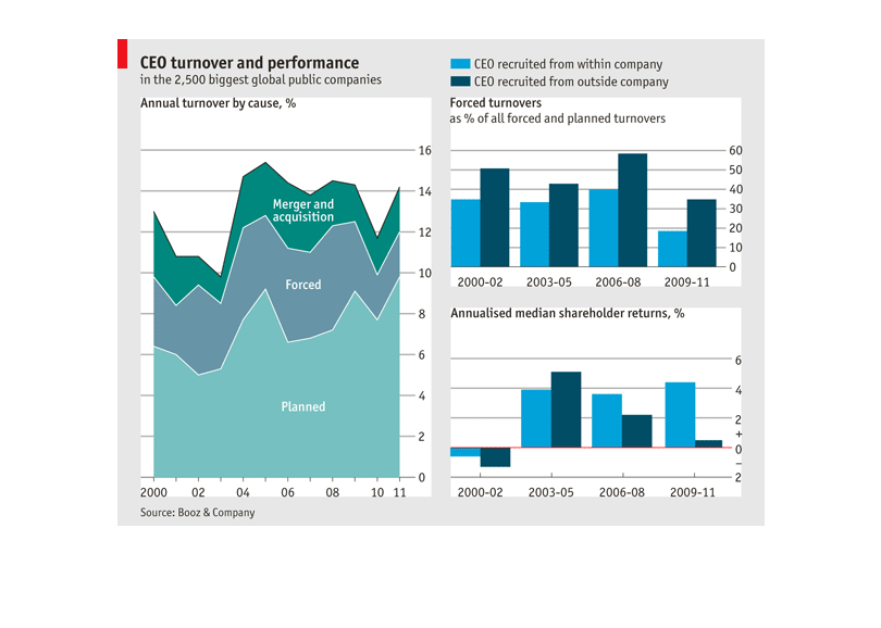
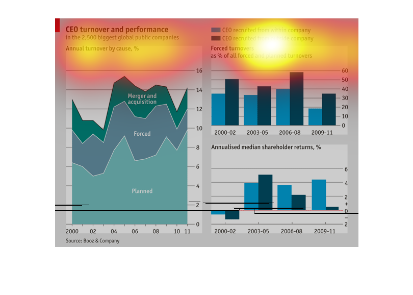
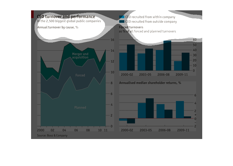
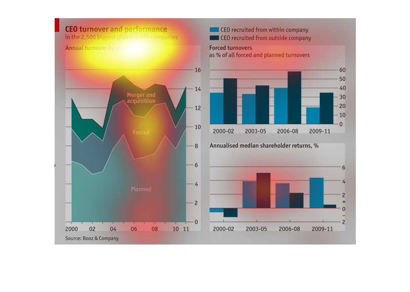
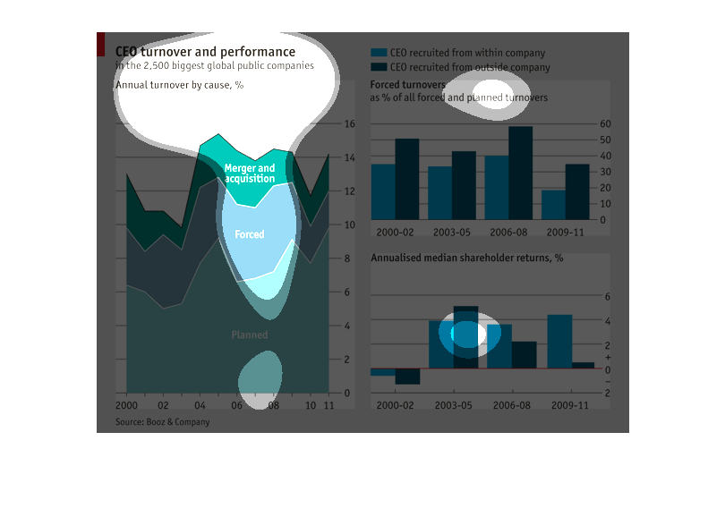
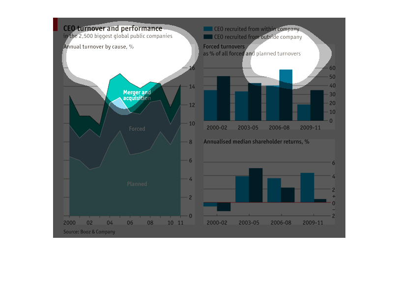
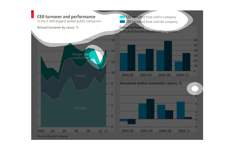
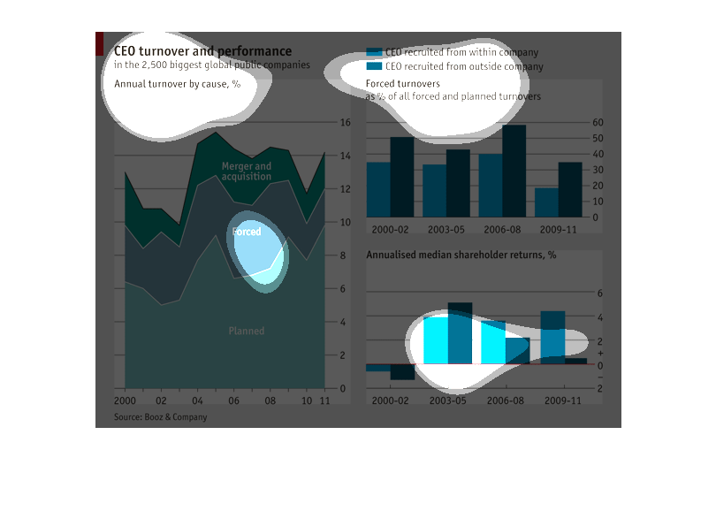
This fun little graph shows CEO turnover and performance in the 2,500 biggest global public
companies. In light blue it shows CEO recruited from within company, and in light blue CEO
recruited from outside company.
This chart is representing CEO turnover and performance. The different colors are representing
how different CEO's came to be where they are and how that affects the overall performance
of the company. Also trying to find out maybe which approach would be best in hiring a new
CEO.
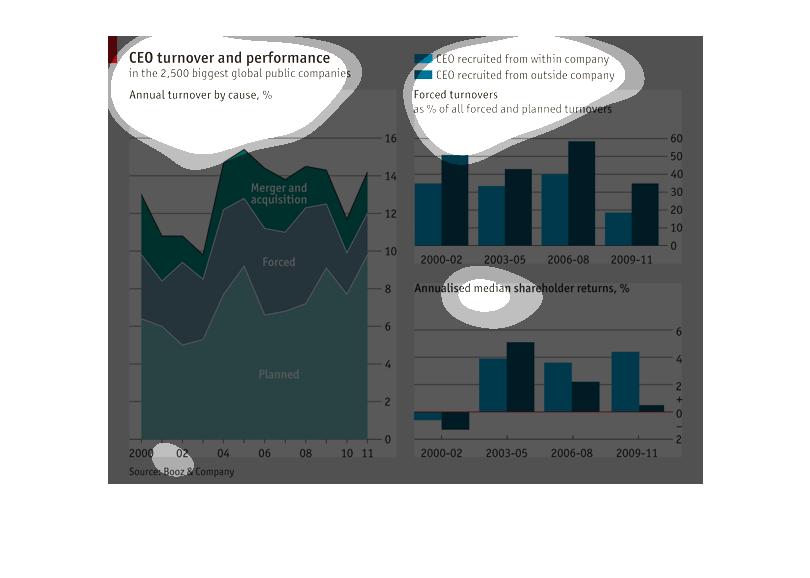
CEO turnover and performance for over 2,500 of the biggest public global companies. CEO company
turnover is broken into three categories Merger and acquisitions, forced, and planed.
This graph describes the CEO turnover compared to their performance in the 2,500 biggest global
companies.  It also compares CEO recruited from outside and inside sources.
This chart shows the CEO performance and turnovers  in the 2,500 biggest, global public companies
on the planet. It also shows the percentage of forced turnovers.
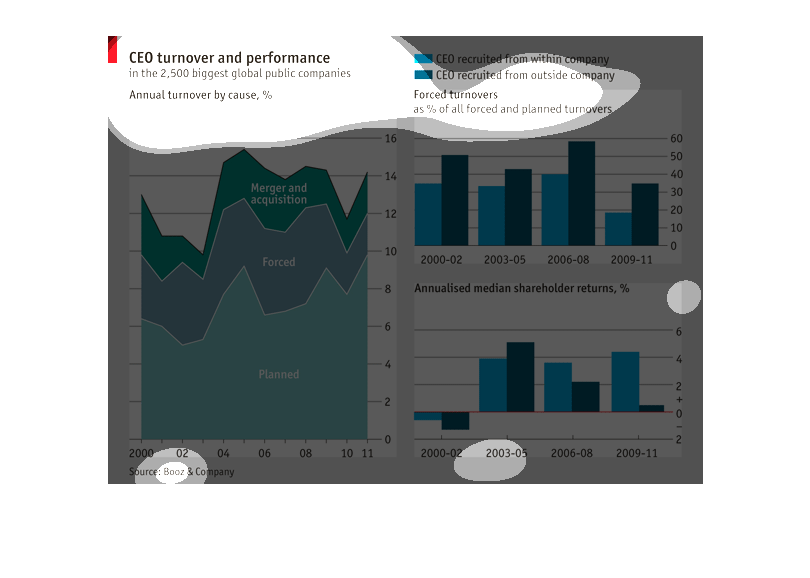
The chart shows CEO turnover and performance for the largest 2,500 publicly traded companies.
It graphs mergers and acquisitions-related turnover, as well as planned and forced turnovers.
It also shows whether CEOs were recruited internally or headhunted from an outside company
for 4 distinct periods divided over 2000 to 2011. It also graphs median shareholder return
over this time period.
This chart shows the CEO turnover  and performance  in the 2,500 biggest global public companies.
It also shows CEO recruited  from within the company, and outside the company.
This is a ceo turnover and performance graph. The bars are dark and light blue showing yearly
turnovers and performance gains. There is also a dark green,light green, and grey graph showing
a total overview of the turnovers and gains.
This chart shows the CEO turnover and performance in the biggest global politic companies
by Booz & Company. It shows the companies that are appointing CEO's during 2009-2010. It shows
that companies are standing from outside their organizations showing that are almost twice
as likely as insiders to a not positive outcome.
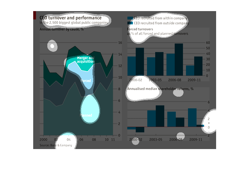
This is an analysis of the turnover and performance rate for CEO's in the 2500 largest global
public companies. The first graph on the left shows annual turnover rates that were caused
by  merger and acquisition, planned turnovers and forced turnover percentages.  The bar graph
on the right, upper corner show the recruitment from within a company vs. outside workers.
 The bottom right graph shows the annualised median shareholder returns in percentages from
the years  2000-02, 2003-05, 2006 - 08 and 2009-11.

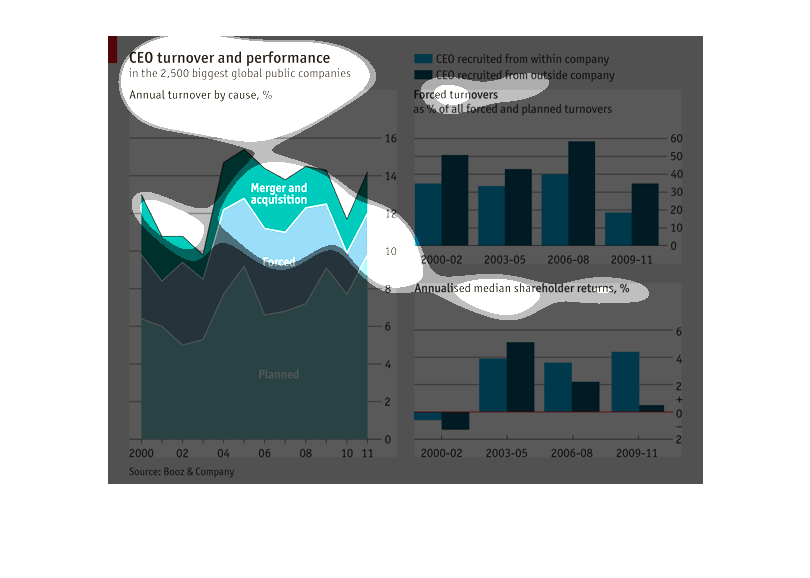
One graph shows the CEO turnover rate by cause and performance. The largest cause is planned
turnover. One shows the amount of forced turnovers. One shows annualized median shareholder
returns as a percentage.
This graph is comparing CEO turnover and performance between CEO's promoted from the inside
the company and those hired from the outside. "Mergers & Acquisitions" appears to be the number
reason for CEO turnover, "forced" comes in second and then "planned". The performance measurement
is done in two-year increments and shows that CEO's hired from the outside perform slightly
better than those promoted from the inside.
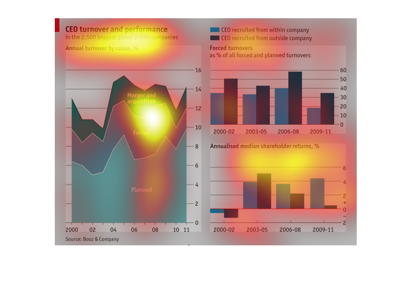
This chart shows CEO turnover (including forced) and performance in various companies. Planned
is shown as lowest, forced in the middle, and merger highest.