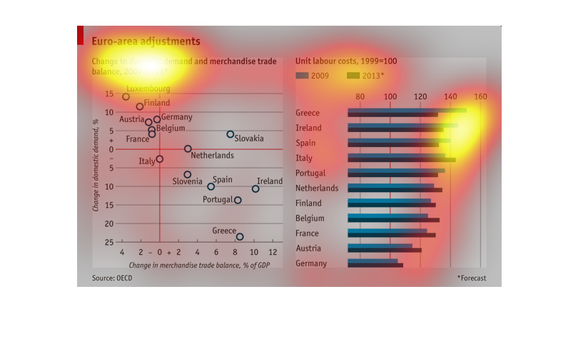
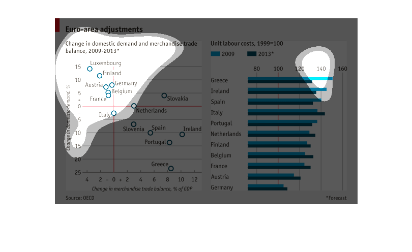
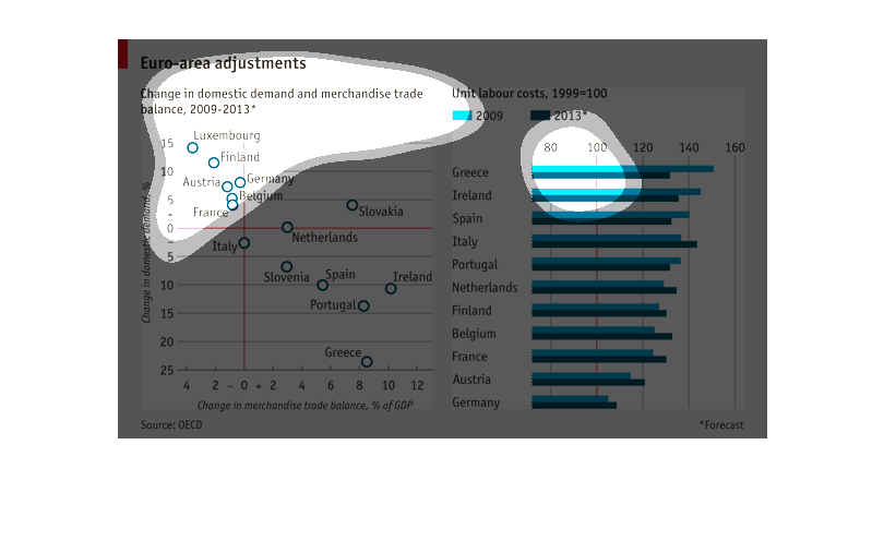
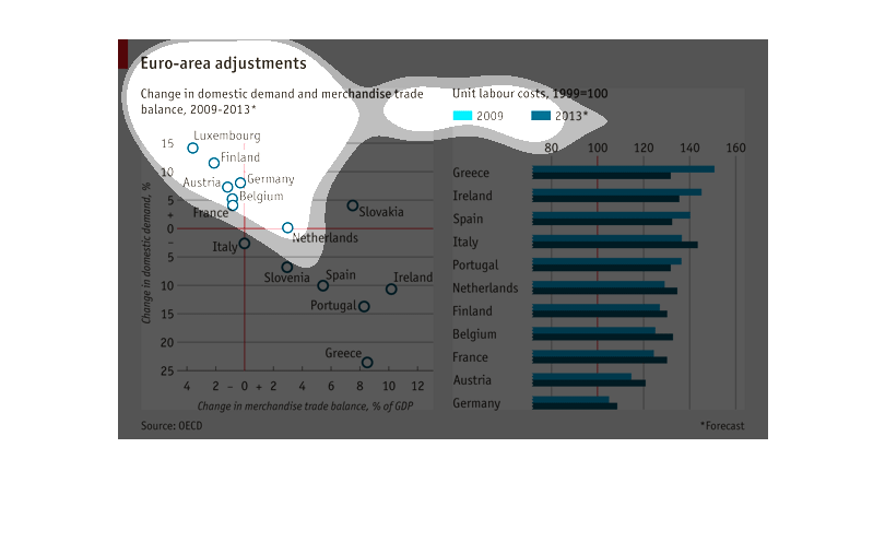
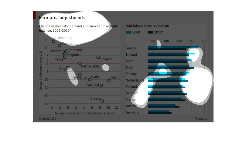
This shows European-area adjustments in changes of domestic demand/merchandise trade balance
for 2009-2013. The highest change is Luxembourg with about 15% positive change, compared to
the worse (Greece) at a 25% loss.
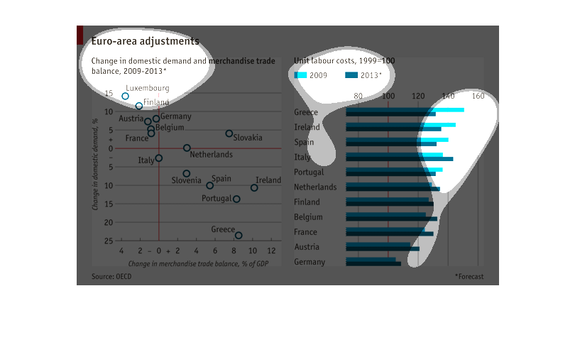
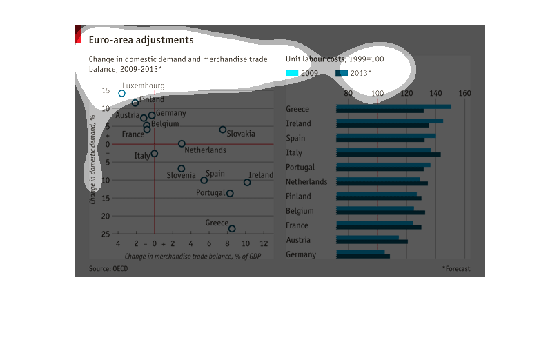
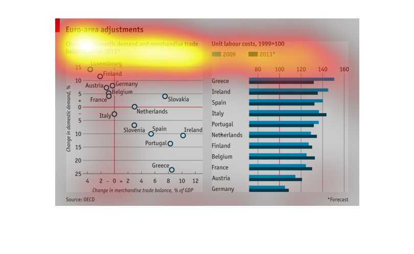
This image covers 2009-2013 of the change in domestic trade and merchandise.  The left charge
tracks changes in domestic demand and change in domestic merchandise trade balance.  The right
chart details changes by country.
This particular chart and graph compares the cost of labor among different European countries
and the amount of trade from each of these countries.  This details how they coincide.
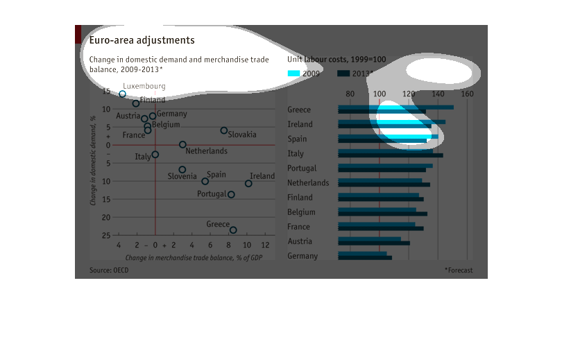
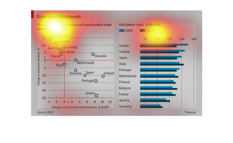
For the Euro area, this chart shows, the change in domestic demand and merchandise trade balance
as a percentage of GDP over the period 2009 to 2013.   A side bar shows the change in unit
labor costs from 2009 to 2013, , with a base year of 1999
The graph is for Euro Area Adjustments and change in domestic demand and merchandise trade
balance from 2009-2013. This also includes labor costs. One side of the graph shows change
in domestic demand in %. The other shows change in merchandise trade balance. The Labor costs
are cheapest in Germany, while the most expensive in Greece.
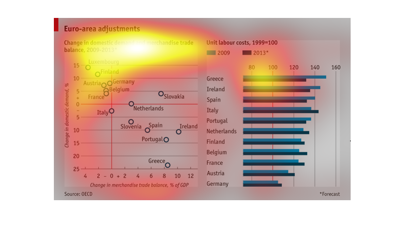
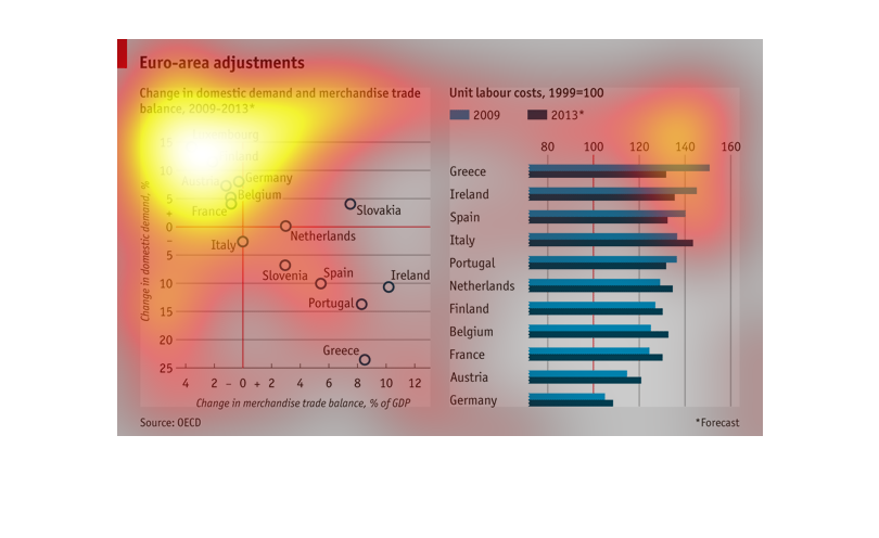
A chart depicting the merchandise trade balance and unit labour cost from 2009 to 2013. Greece
has the highest labour costs and Germany has the lowest.
European trade statistics chart comparing figures of 2009 to 2013. Domestic demand is plotted
in increasing order by European countries. Overall labor costs are presented in decreasing
proportion to one another by descending costs of European countries
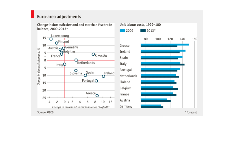
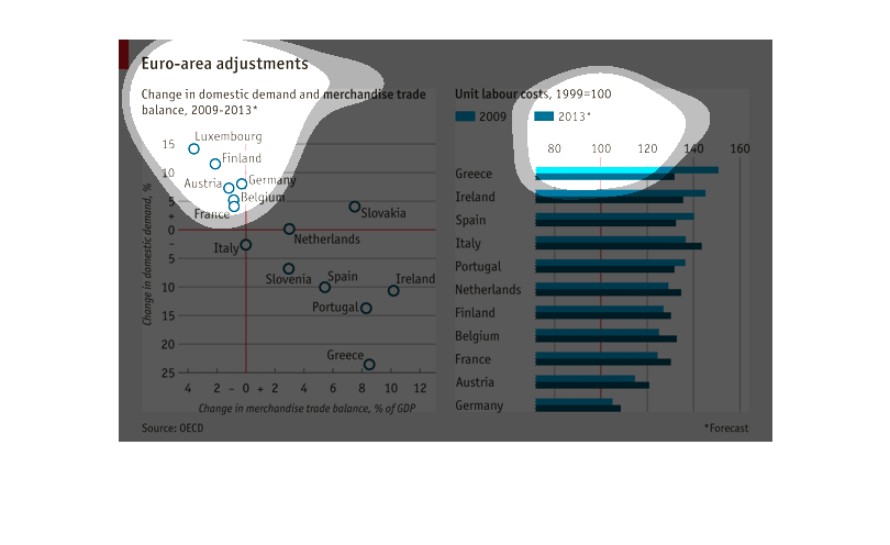
Euro-area adjustments	  Change in domestic adjustment demand and merchandise trading  2009-2013
 Countries showing the largest increase in change in domestic adjustment demand and merchandise
trading were Finland, Germany, Belgium, France and the Netherlands.
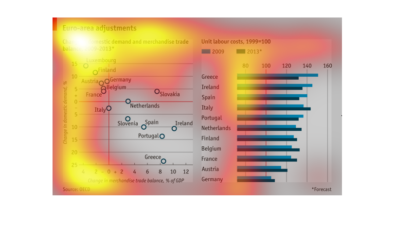
some sort of adjustment for euros in  different countries the graph shows which countries
the euro is worth more in compared to other countries and is listed from greatest to least
The image presents information regarding Euro-area adjustments for change in domestic demand
and merchandise trade from 2009-2013. The GDP and labor costs are represented for the countries
listed.
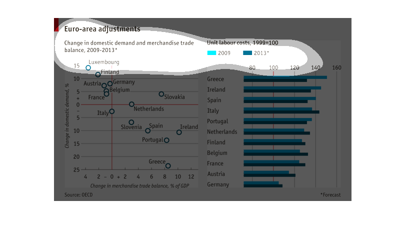
The Chart seems to be tracking the trend in merchandise and trade demand as a product of GDP.
It shows purchase activity between European Countries. It appears Greece, Ireland and Spain
top the list.
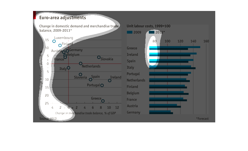
The left hand chart shows Euro-area adjustments. Change in domestic demand and merchandise
trade is expressed on the graph. The quantity of change in domestic demand and merchandise
trade is shown for various European nations. The chart on the right shows unit labor costs.
Greece had the highest unit labor cost, and Austria had the lowest cost.
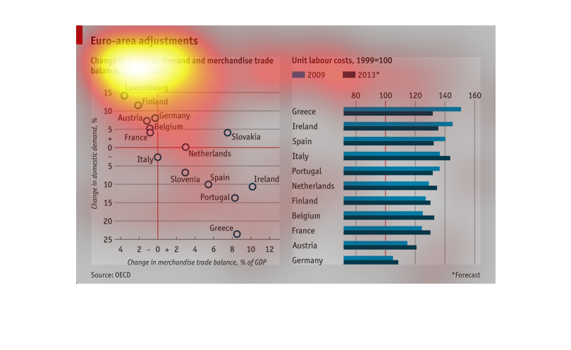
This chart is a Euro-Area Adjustment. It is for the change in domestic demand and merchandise
trade balance  of the percentage of GDP for the years 2009 to 2013. On the bar graph, 2009
is listed as light blue, 2013 as dark blue. There is also a graph listing each EU countries
status.
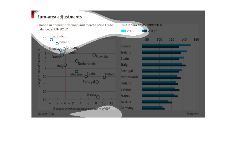
This chart illustrates "Euro-area adjustments" or the change in domestic demand and merchandise
trade balance from 2009-2013. The labor costs from 2009 are directly compared to the costs
in 2013 with 1999 used as the reference year.
This graph shows the change in labour costs from 2009 to 2013 according to country.  Countries
like Greece, Ireland, and Spain showed decrease in labour costs while most other countries
had an increase in labour costs.