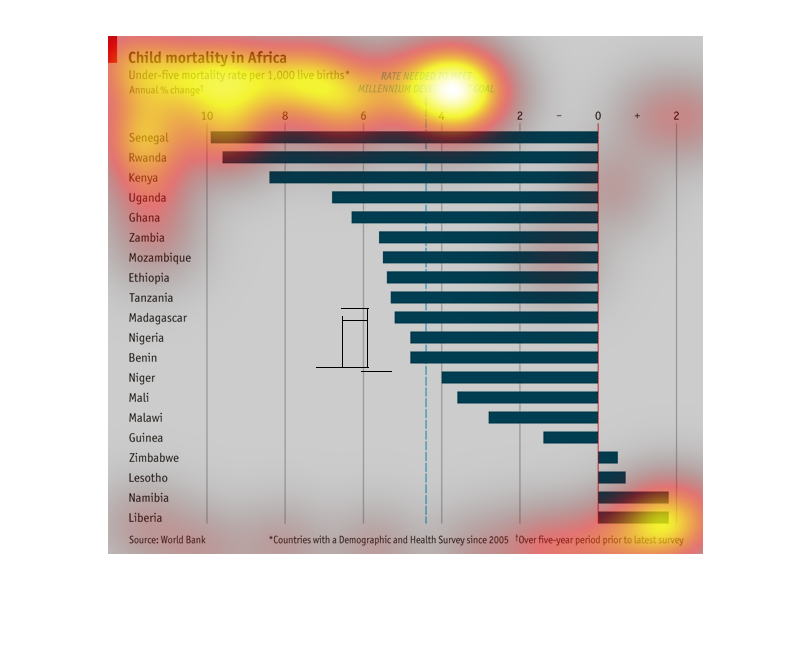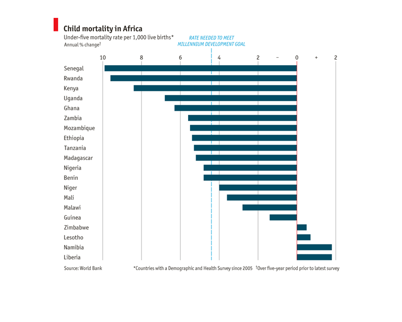
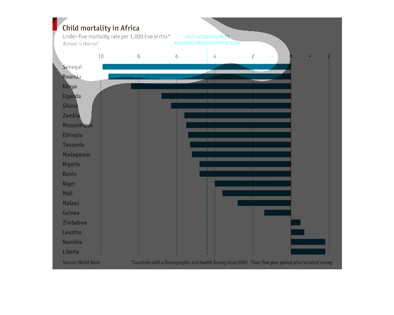
This chart shows the annual percentage of change of child mortality rate in Africa in children
under five years old per 1000 births. Most countries are below zero, some significantly so,
only a few are above zero.
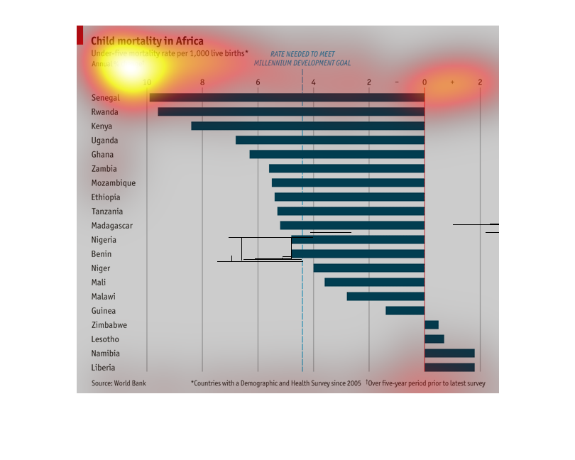
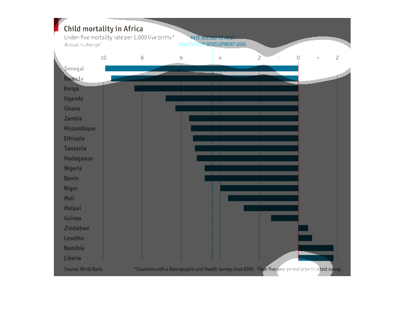
This image is a graph of the under age five child mortality rate per 1000 children. It has
a line for the rate needed to meet the millennium development goal as well as the rates for
all countries in Africa.
The image describes child mortality in Africa.  The graph shows under 5 mortality rate per
1000 live births by African nation.  It also includes a dotted line for the rate needed to
meet Millennium development goal.  Currently more nations exceed that rate than don't.
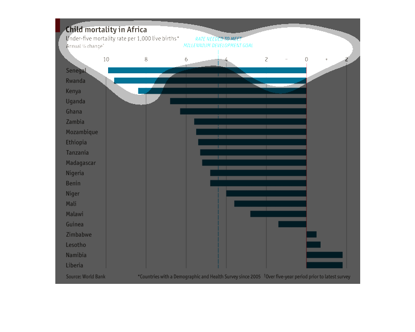
This chart shows the mortality rates for children under five in different countries in Africa.
Senegal has had the greatest mortality rates while Liberia has had the smallest mortality
rates. Rwanda and Kenya have similar mortality rates as Senegal.
This is a chart showing Childhood mortality in Africa for under-five mortality rate per 1,000
live births. Some of the countries listed in Africa are: Senegal, Rwanda, Kenya, and Uganda.
Developmental goals in African nations in history. The graph is a bar graph showing the nations
on the left and the amount of years on the bottom. They also have a negative amount off to
the right.
This graphic displays the percent change in Under 5 Infant Mortality Rate for African nations.
 It ranks the countries from highest to lowest.  It includes a marker indicating where the
Millennium Challenge target is so that we can see which nations have met the goal and which
have not.    The data source is World Health Organization.  It shows that the highest decreases,
nearly double the average, were in Senegal, Rwanda, Kenya and Uganda.  They are closely followed
by Ghana and Zambia which appear to be slightly above average.  Then there is a group of nations
who exceeded the Millennium Challenge target which appears to be around 4.5%.    Several nations
came close to the target including Niger, Mali and Malawi.  A few nations actually showed
increases: Zimbabwe, Lesotho, Namibia, Liberia.  This graphic is well laid out and makes it
easy to see the relative progress of each country.  It took very few clicks for me to get
the overall sense of the graphic.  I only had to go back and forth to get specific country
names.
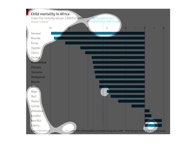
Graph regarding the child mortality in Africa for children under five, per live birth.  It
shows the different countries in Africa who had a demographic and health survey since 2005,
the under-five rate per 1000, and the annual % of change needed to meet the goal of 0.  The
World Bank was the source.
This graph illustrates the rate of child mortality in Africa per 1000 live births compared
with the rate needed to reach millennium goal in countries with data since 2005 and covering
a five year period.  The chart lists numerous countries, with Senegal having the most critical
rate of child mortality.
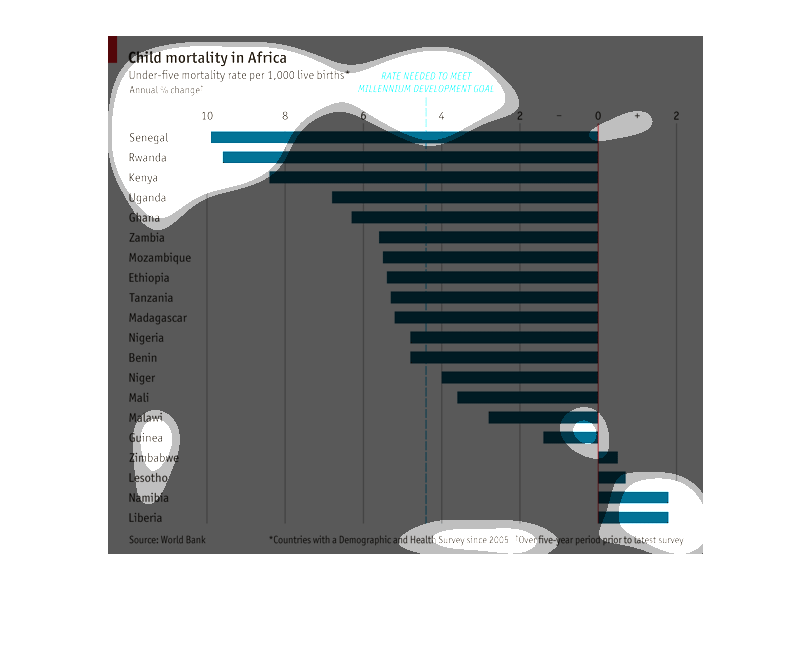
Chart shows child mortality rates in Africa in countries with a Demographic and Health survey
since 2005. Each nation's statistics are compared to the rate needed to meet the millenial
development goal. The source of the statistics is the World Bank.
This graft looks at the mortality rate of children under five in different parts of Africa
per 1000 live births. Senegal with the most and Liberia with the least. the rate needed to
meet the millenium development goal.
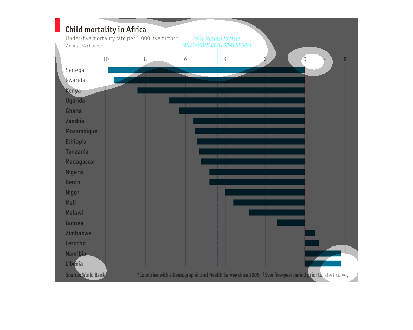
Chart shows different countries in Africa and their child (under-five) mortality rates. Senegal
had the highest at -10 per 1000 live births. Liberia had the lowest, at +2 per 1000 live births.
There was also a line showing which countries met the Millenium development goals