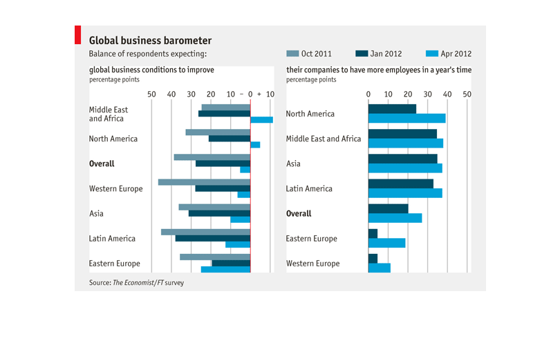
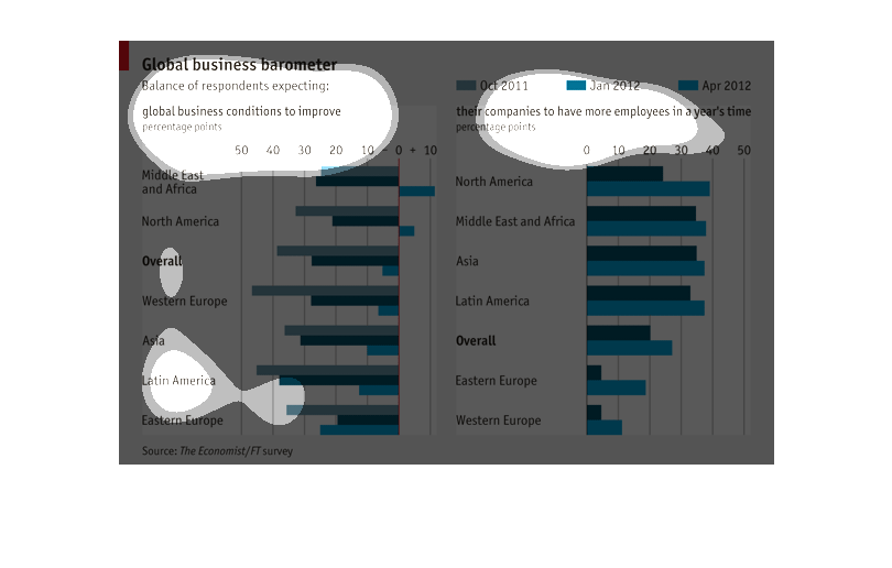
The left graph indicates optimism about business growth based on various countries at different
dates.  It appears that Most countries expect an overall decline.  The right graph indicates
that all countries expect to have more employees over time but the least amount is expected
by Western Europe.
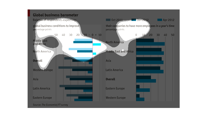
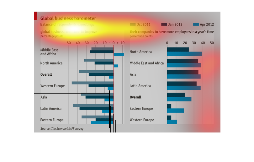
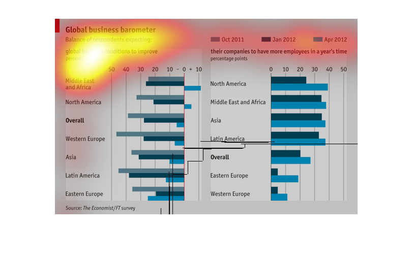
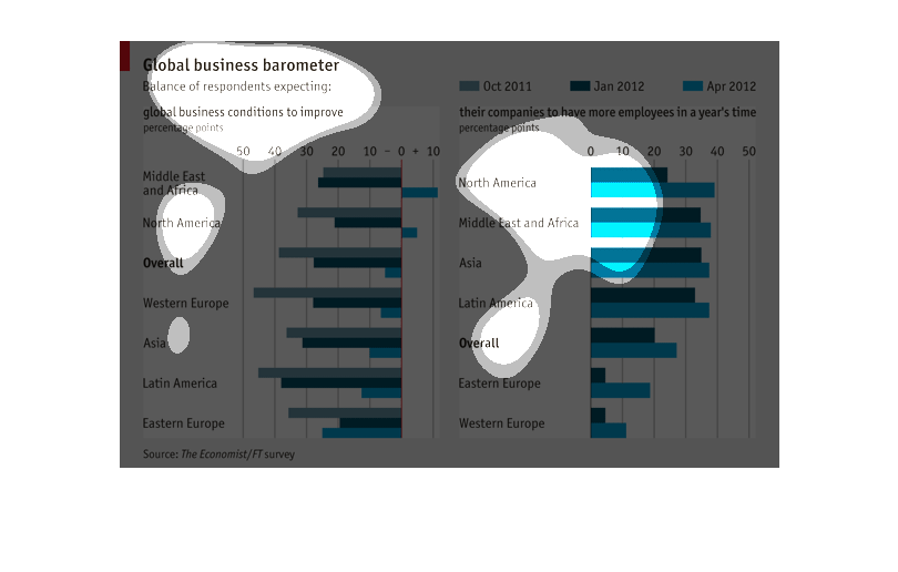
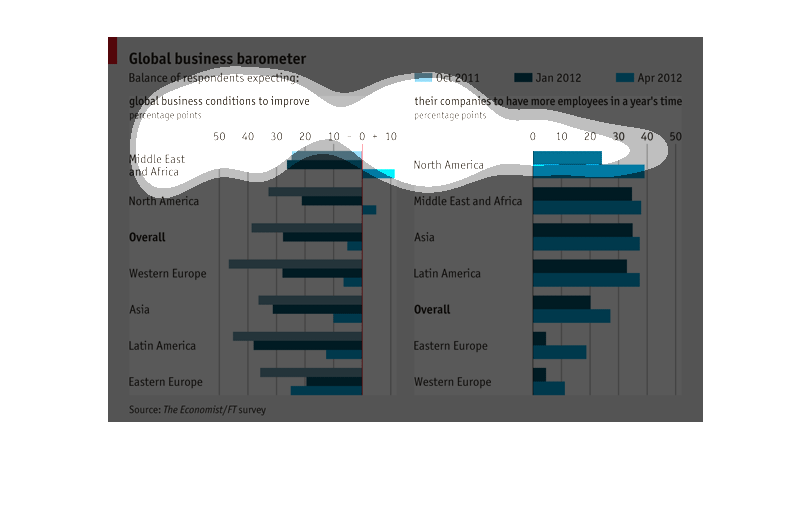
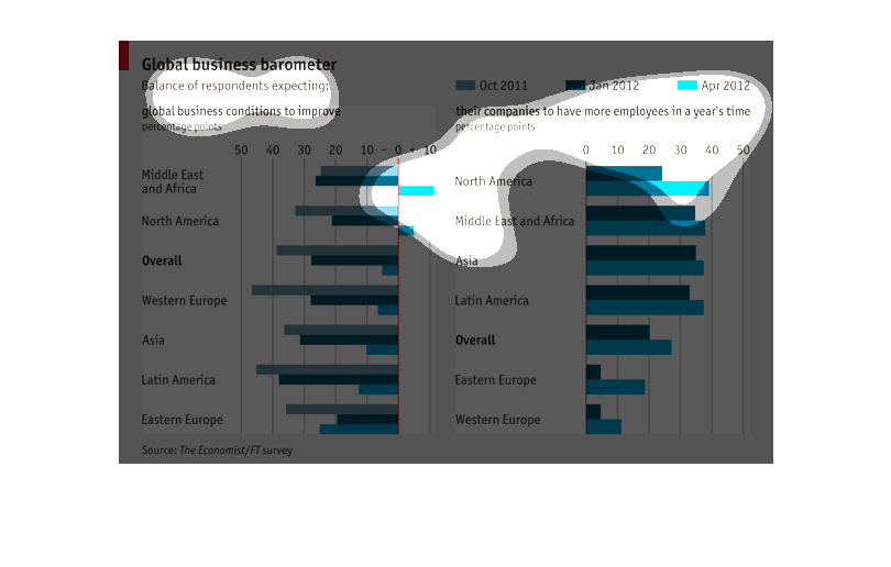
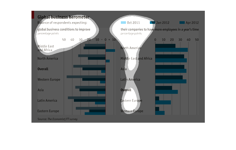
This chart shows the global business barometer.  It shows the balance of respondents expecting
global business conditions to improve and the respondents expecting their companies to have
more employees in a year's time.  It compares the respondents in each category by continent
and also gives the percent overall.  It compares responses in Oct 2011, Jan 2012, and Apr
2012.
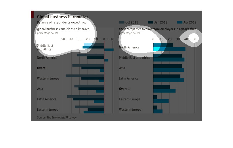
This chart shows Global business barometer. The months and years shown are: Oct 2011, Jan
2012, and April 2012. Some of he countries listed are: Middle East and Africa.

This is a graph that entitled "Global Business Barometer".  There are months and dates across
the top of the graph beginning with Oct 2011 and ending at April 2012.  Down the left side
of the graph is a column showing the names of countries expecting global business conditions
to improve.
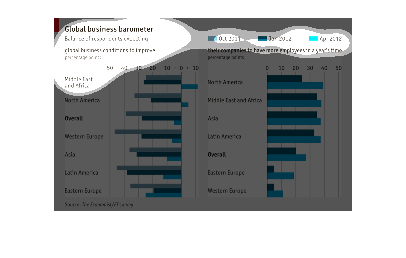
The first graph depicts how people in different countries feel about global business and if
it will improve. The second graph shows how people in different countries respond if they
will have more employees within a year.

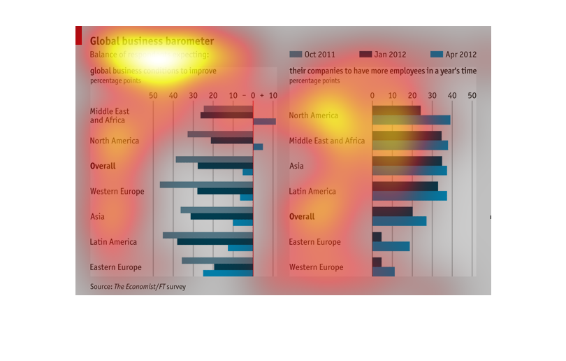
It appears to show what the future of business growth outcomes for different parts of the
world. It looks like area where there are conflicts have a negative outlook on business grow
where more civilized at peace nations are show very good growth.
The image is a graph of the Global Business Barometer. There are two bar graphs showing the
balance of respondents expecting global business conditions to improve and the number of companies
expecting to have more employees in a year's time..  Both are given in percentages and divided
by world areas. Values are given for Oct. 2011, Jan 2012, and April 2012.  The middle east
and Africa have the highest percent of respondents expecting business conditions to improve.
 North America has the highest percentage of respondents expecting to have more employees.
This chart depicts the business outlook for  improvement is various places worldwide and indicates
which areas are likely to have more employees in the next year.
This chart appears to show global business barometers percentages of statistical data from
October 2011 to April 2012, It appears that conditions are likely to approve around the world.
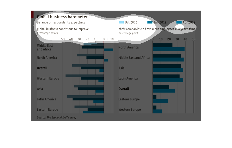
The chart is about Global Business Barometer.  Global business conditions to improve may include
their companies to have more employees in a year's time.
Global business barometer chart that highlights how much business is done in different parts
of the world. Specifically deals with number of employees and working conditions.
This bar graph is a global business barometer for fall 2011 to spring 2012. The graph is mostly
broken up by continent, but Europe is broken up into regions.
This is a global business barometer graph spanning the time period 2011 and 2012.  It illustrates
how businesses in various regions have been able to increase their employees (in percentage
points).  The middle east and africa and north america had the greatest increases in April
2012.
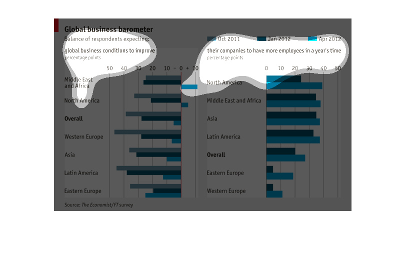
This graph is titled global business barometer. It is showing the balance of respondents experiences
and what they expect will improve. It compares regions to on and another. Including North
America, Middle East, Asia, Latin America, Eastern Europe and Western Europe. Plus there is
an overall to compare everything to.