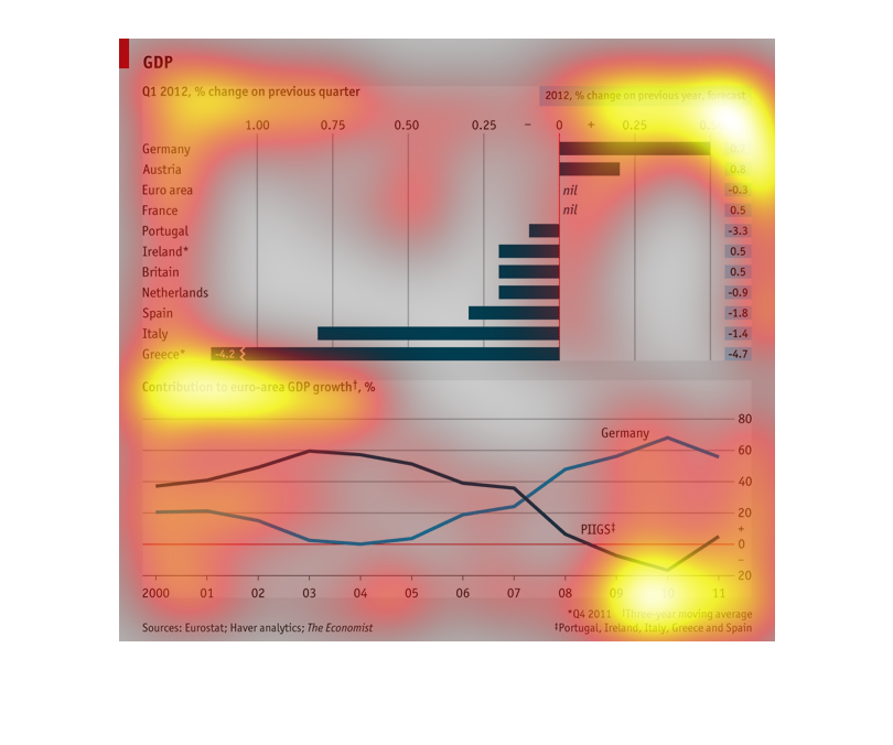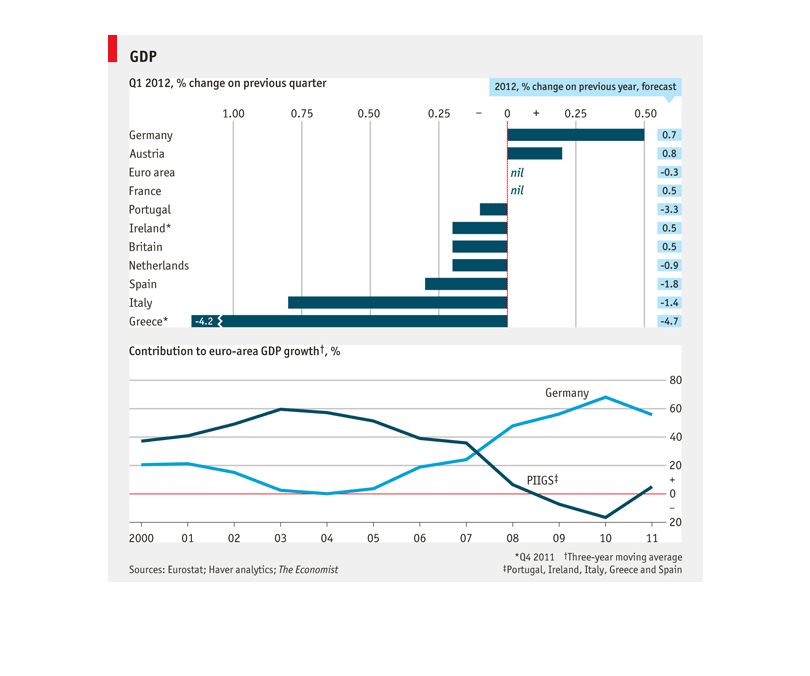
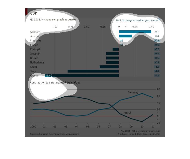
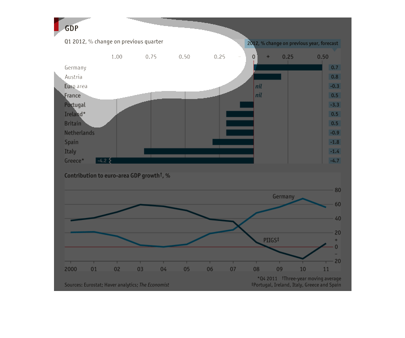
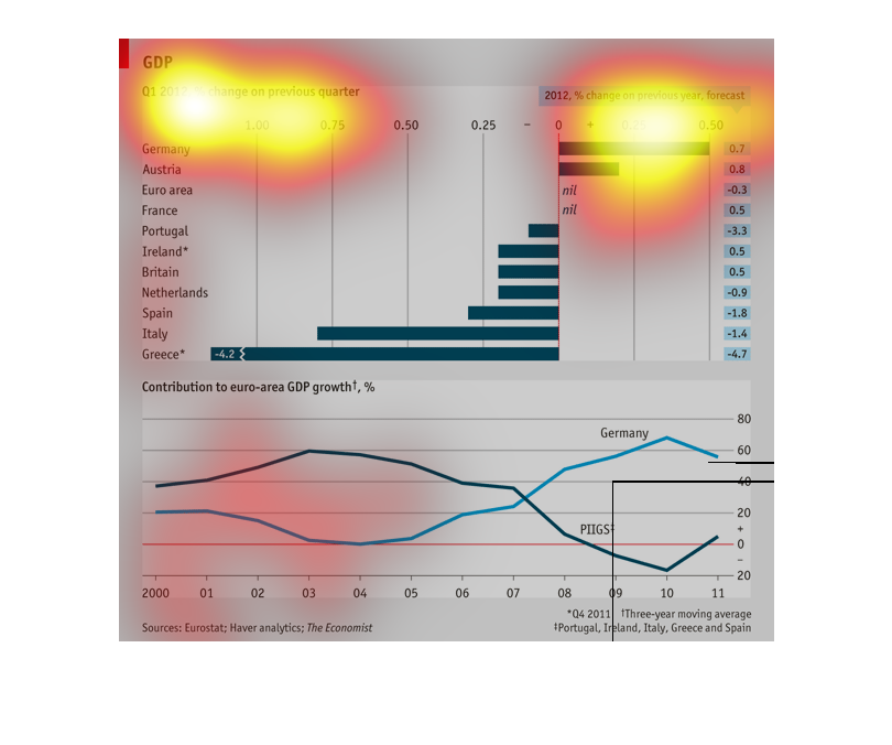
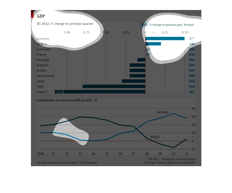
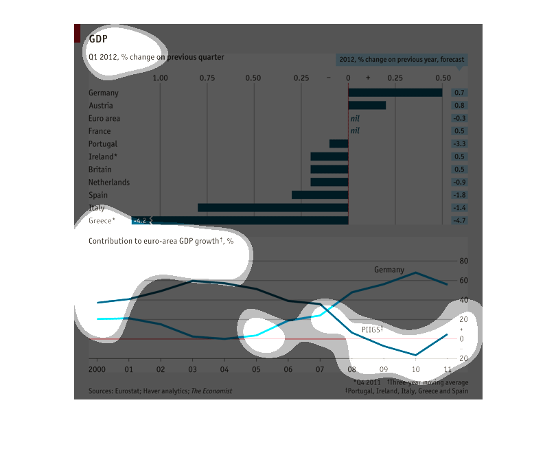
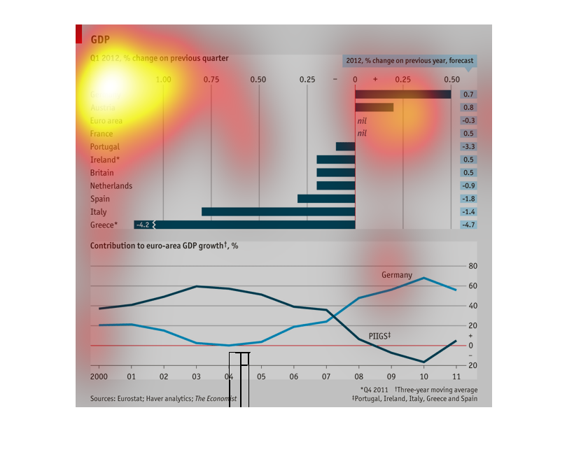
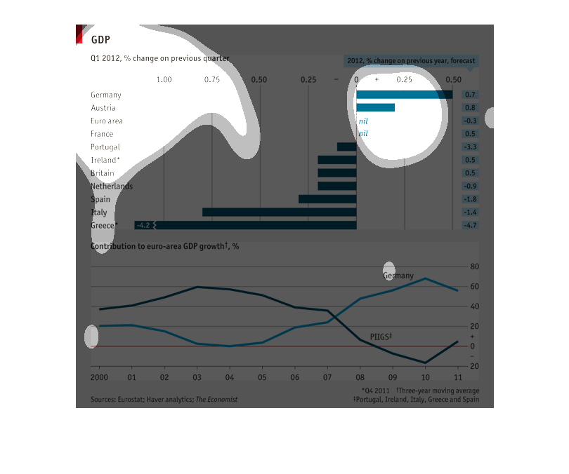
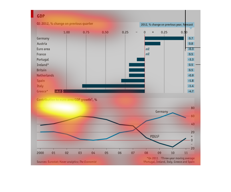
This chart depicts the change in GDP from Q1 2012 in percentage difference from the previous
quarter. It shows that Germany grew the most while Greece shrank the most.
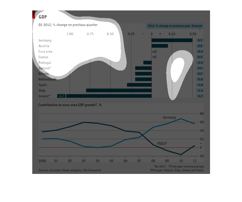
This is a chart the shows the growth of GDP, and the contribution to euro-area GDP growth
Q1 of 2012from a -4.7 from to 0.7, including 2012 % change on previous year forecast.  There
is a second lienear chart describing three year Q4 2011 moving average of Portugal. Ireland,
Italy, Greece and Spain.
This graph shows the GDP from different countries around the world in quarter 1 of 2012 of
percent change in the previous quarter. The graph shows that Greece seems to have the most
growth.
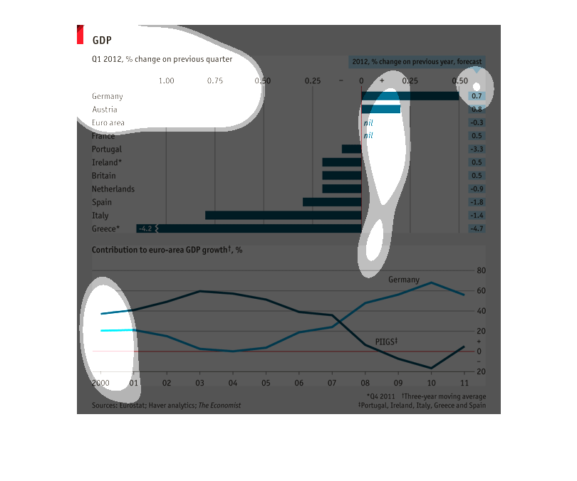
The top part of this image is a bar graph which describes and compares the GDP of several
countries in percentage of change over the last quarter. The bottom part of the image contains
two line graphs describing the contribution to euro-area GDP growth from years 2000-2011 of
Germany.
The graph illustrates the percent that the GDP of various European countries contribute to
the growth of GDP for its area of Europe, as well as forecasting how much this will change
over the next quarter. Germany tops the list in the greatest amount of positive change with
50%, though Austria is predicted to increase more with a 70% improvement. Greece has had the
most negative impact on GDP with a -420% loss of GDP and is predicted to loss further ground
dropping to -470% over the next quarter.
This graph shows the GDP of countries in the first quarter and does a comparison graph for
the previous year, as well as the contributing countries growth.
This chart shows the GDP percent change on previous quarters for first world countries. Some
of the countries listed are: Germany, Austria, Euro area, and France.
This chart is a decription of different countries and how they are doing in GDP. This is a
quarterly forcast for the countries and the results are displayed  on a line graph.
The graph seems to show a variety of countries and their percent change of the previous quarter
of their currencies for the year of 2012. Greece has the lowest of the other countries.
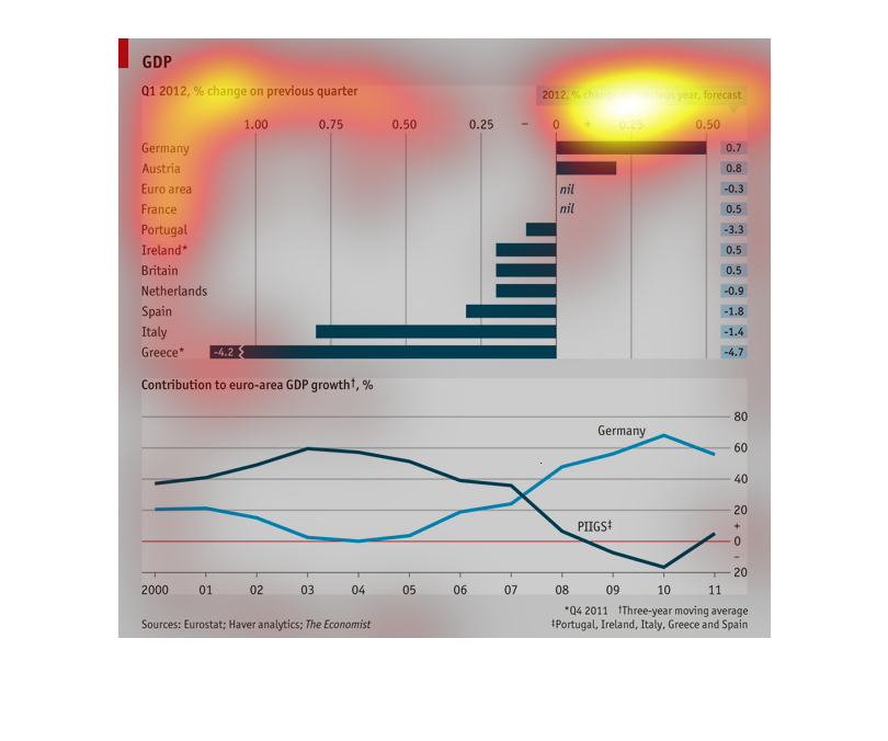
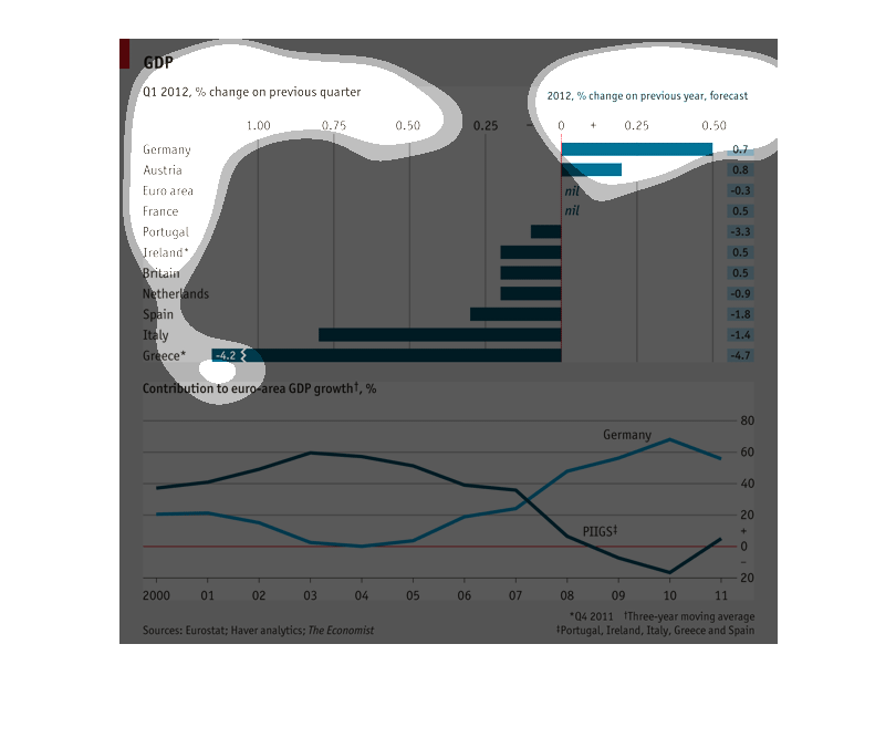
The graph describes the contribution of European countries' to the European GDP. The top half
of it is a bar graph representation, and the lower half uses another graph.
The top graph is looking at GDP of European countries in the first quarter of 2012, and comparing
it to the previous quarter. The bottom graph is measuring the contribution to european GDP
growth.
This graph shows a list of countries GDP changes in the first quarter of 2012, as represented
in percentages. Some countries had a negative change and lost money while other countries
gained money in the first quarter.
This graph illustrates the GDP in 2012 compared to the previous quarter.  A line graph on
the bottom also shows GDP over time and how it has changed.  Greece is the highest country
on the list that has not held up to the Euro.
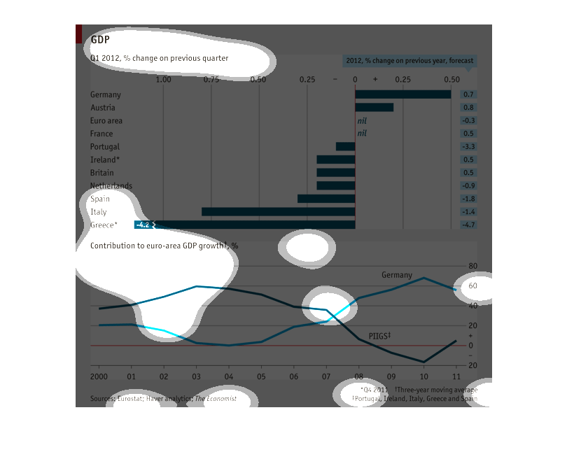
This is a measure of European GDP by country compared to last year, and a three year moving
average of the positive contribution to the area's GDP for several countries. Europe is in
dire financial shape.
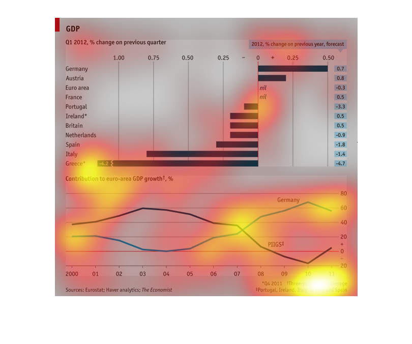
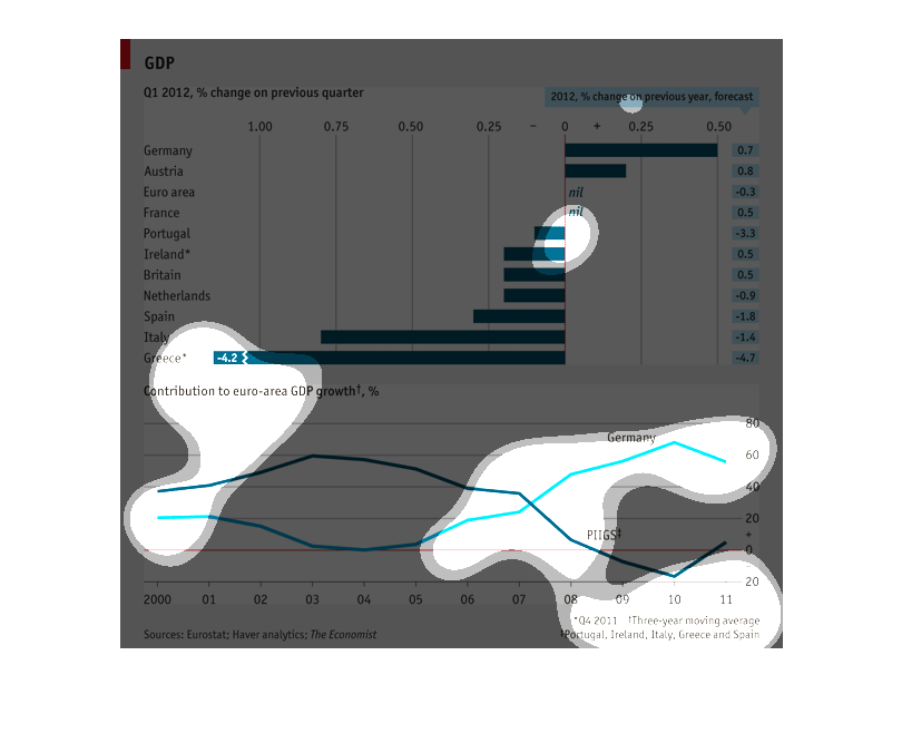
The bar graph at the top displays the quarterly percentage change of GDP for European countries
in relation to the previous quarters GDP.  The graph also displays the forecasted annual percentage
change of GDP to the previous year for each country. The lower line graph shows the contribution
to euro area GDP growth by year for the previous 11 years.  Plotted are values for Germany
and a combined line for Portugal, Ireland, Italy, Greece, and Spain. There appears to be a
perfectly negative correlation between the two plotted lines.