This graph shows the relationship between the number Facebook friends a user has and the type
of stock they invest in. It also shows a comparative analysis between various countries and
how they invest in different stocks.
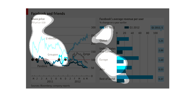
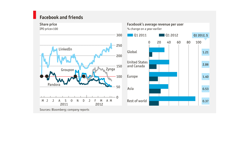
This chart presents information about Facebook's initial public offer.  There is data on the
graphs that also present user data for other media platforms, as well as income generated
per user.  This is broken down into revenue quarters.
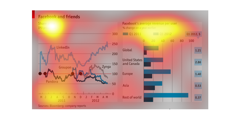

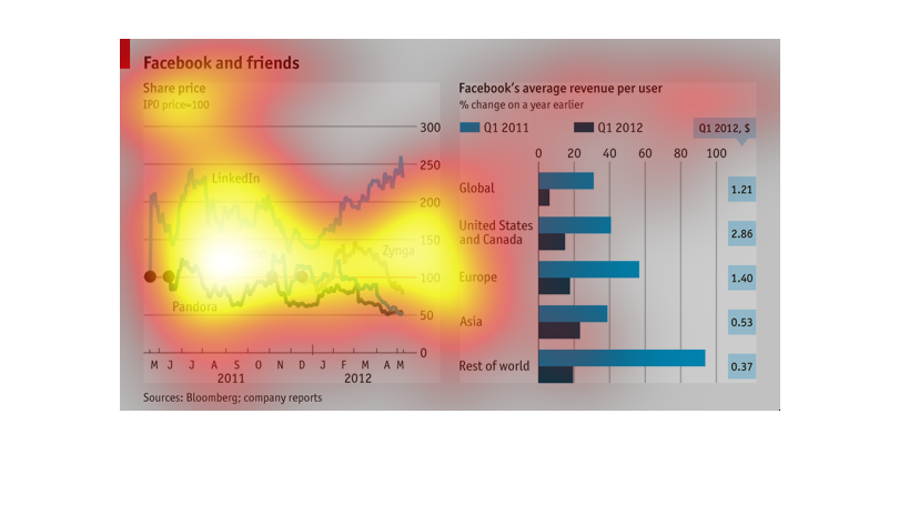
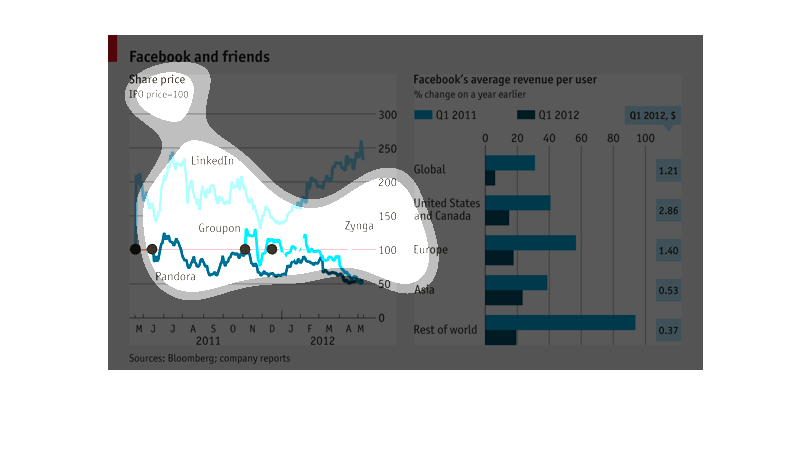
The left chart shows the stock shares for various social media sites like Groupon, Pandora,
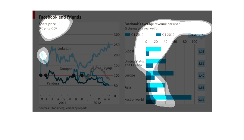
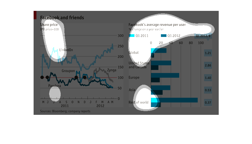
LinkedIn, etc for 2011 to 2012. The right chart shows the avenge revenue per user for Facebook.
It's broken into several countries with two bars per country, the first representing the
first quarter of 2011 and the second representing the first quarter for 2012.
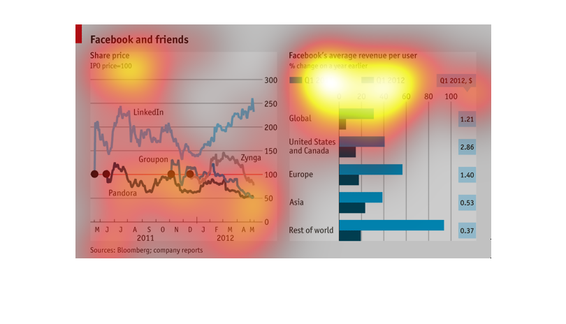
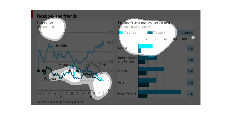
The chart on the left shows stock prices for "Facebook and Friends" - Linkedin, Groupon, Pandora,
and Zynga. The chart on the right lists Facebook's average revenue per user in different continents/countries
(US, Asia, etc)
This graph shows the amount of cash flow that Facebook receives from its users.  It also shows
the amount of revenue that LindedIn, Groupon & Pandora receive as well.
The first chart, entitled "Facebook and Friends" contains a comparison of social media related
entities based on their share prices. The second chart compares Facebook average revenues,
on a quarterly basis, based on different parts of the world.
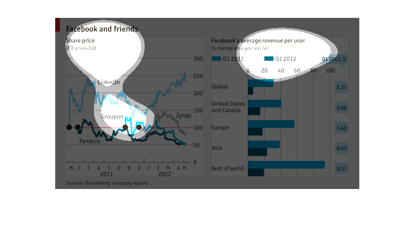
The chart on the right shows stock shares from 2011 and 2012 from Groupon and Pandora. It
seems that as time goes Pandora will loss shares, while Groupon will continue to show growth
over time. The chart on the right shows the amount of money Facebook makes per user in several
different continents. This includes the United States and Asia and the Middle East. If appears
that the 'rest of the world' category will have the most growth in money. All of these are
public platforms that are used daily by some people throughout the world. This would help
investors figure out what they should invest in 2012.
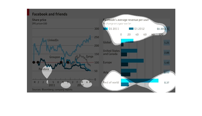
This chart is about the price of Facebook stock and it also includes the amount of money per
user that Facebook profits and where that user is located in the world.
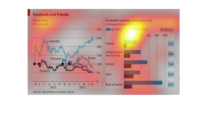
This group of charts shows the growth and contraction of Facebook competitors over time as
well as the average cost per user that Facebook pays in different areas of the world.
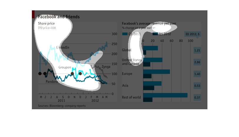
This image compares Facebook's popularity and revenue with other popular networking sites,
such as Pandora, LinkedIn, and Groupon. The revenue per year per user is reported by country.

This graph shows Facebook and friends and Facebooks average revenue per person. It compares
average revenue in the US, Europe, Asia, and the rest of the world. Revenue is very high in
Europe. The left side of the chart shows stock prices with Linkedin being one of the higher
ones and Pandeora one of the lower.