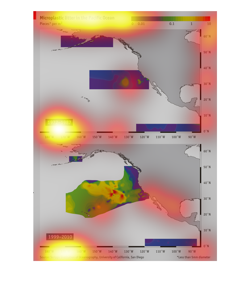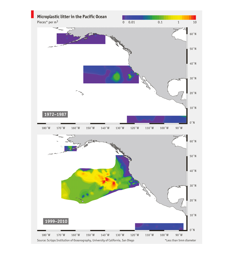
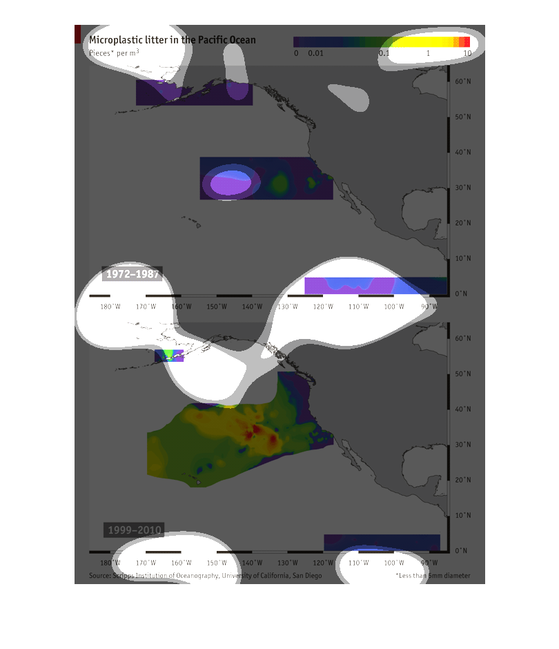
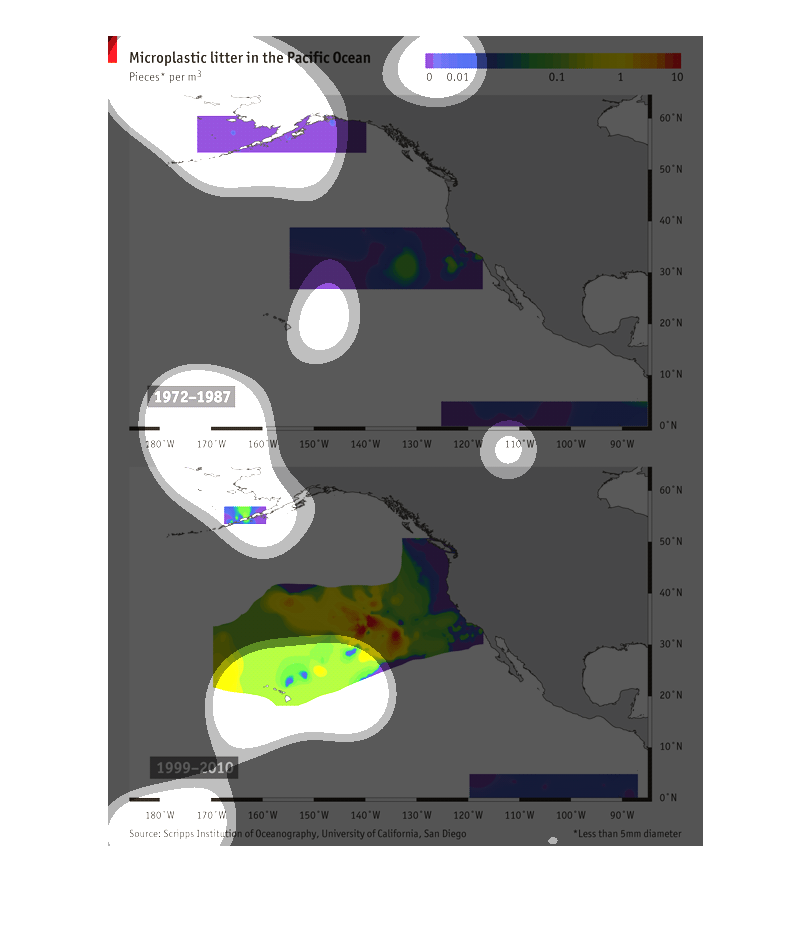
this chart describes with multiple colors microplastic litter in the Pacific Ocean between
1972 and 1987. Geographic maps. The top image shows higher density with dark purple while
blue is less density. The second image shows the same subject from 1999 to 2010 and shows
densities with greens, yellows, blues, and purples. The yellow and green have higher density
than blues and purples.
The graph depicts the microplastic waste found in the Pacific Ocean. The graph shows that
between 1972 to 1987 the litter was not as severe. From 1999 to 2010 there was a major spike
in the microplastic litter.
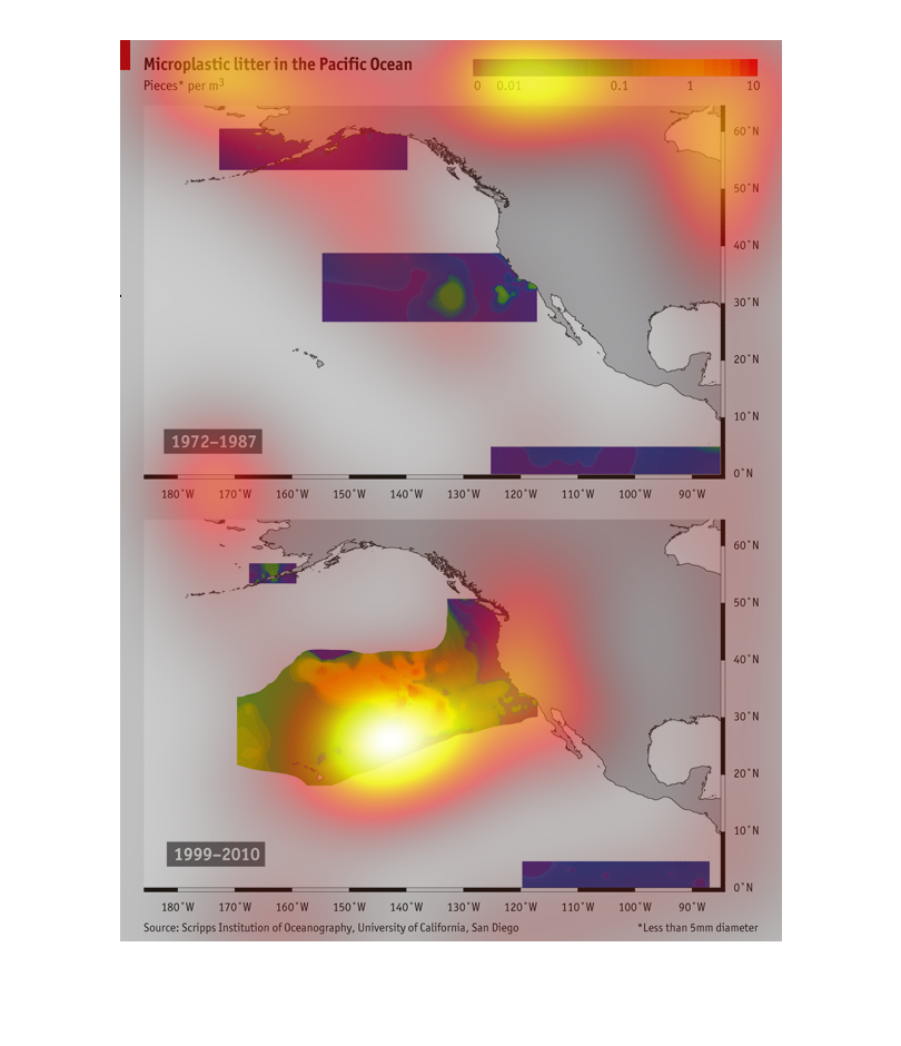
This image shows information regarding microscopic plastic the pacific ocean.  It shows that
most of the microscope plastic is in the pacific ocean along the western part of the United
States.
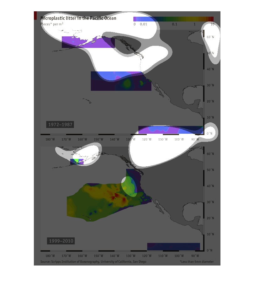
Microplastic litter in the Pacific Ocean. Scaled on a color chard from purple to red. Red
is 10.1972-1987 the colors ranged from mostly purple to a little green indicating that there
was minimal liter. From 1999 to 2010 that has jumped and not old has the coast been covered
in purple. The chart indicates that the colors have gone into the red and are large and growing.
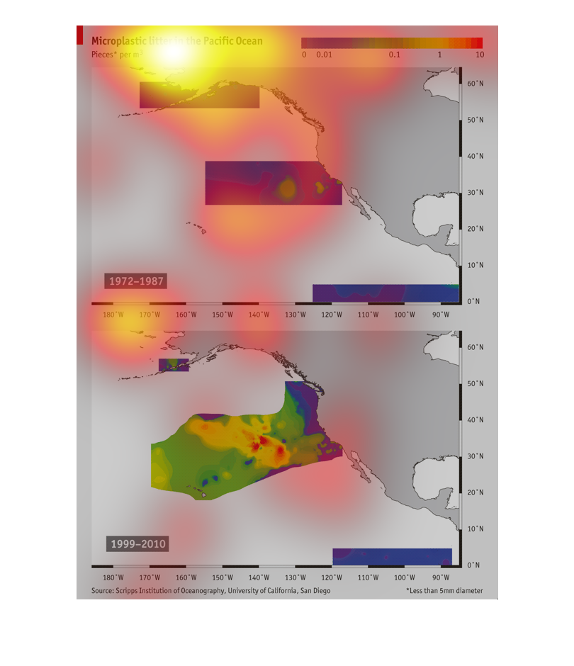
This shows the depressing graph of micro-plastic litter in the Pacific Ocean. Instead of showing
years, it shows pieces per cubic meter of water from 0.0 to 10. From 1972-1987 the average
was 0.2 or less, but after 1987, there are massive amounts near Baja California and Mexico.
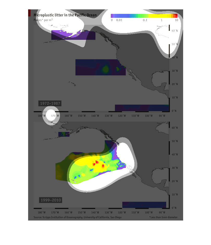
Microplastic litter in the Pacific ocean is the title. This compares the amount of litter
in the ocean from 1972-1987 to 1999_2010. The difference is very drastic. The 1972-1987 has
significantly less pollution the the more recent picture.
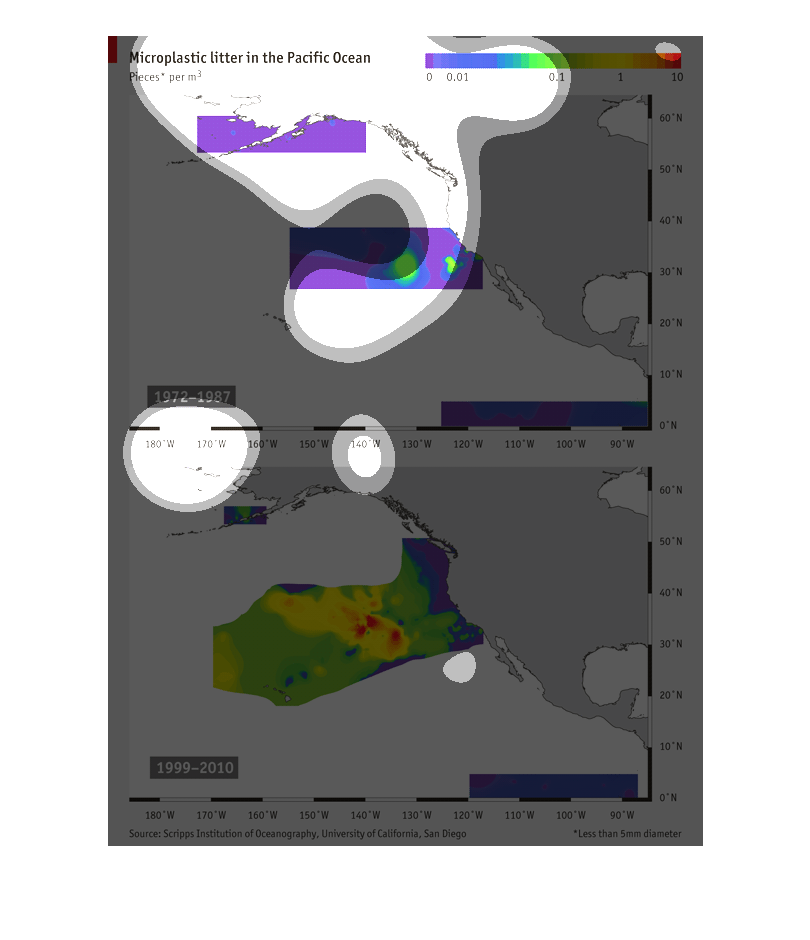
This is an image of coastlines in the Pacific Ocean showing the microplastic litter in pieces
per meter cubed.  These images are showing the years 1999-2010.
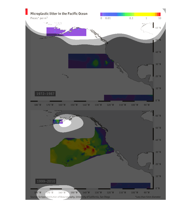
This graph shows Microplastic litter in the Pacific Ocean from 1972-1987 and then from 1999-2010.
It's a very colorful graph. 0 is purple all the way up to red for 10.
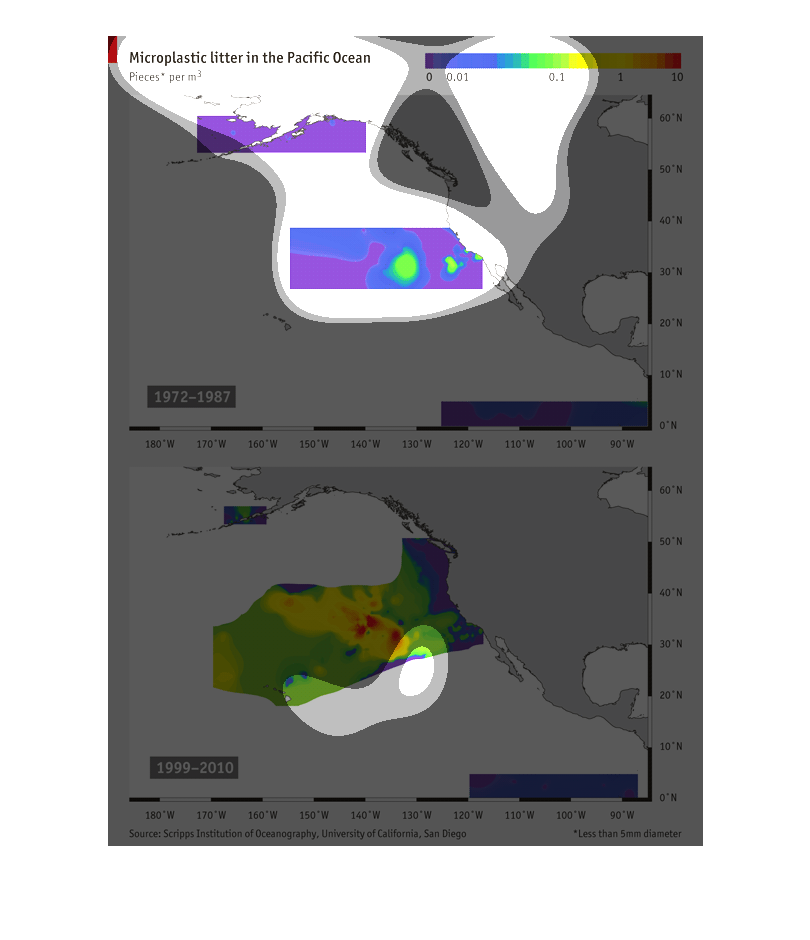
This chart shows the difference in the amount of microplastic litter in the Pacific Ocean
between 1972-1987 and between 1999-2010. The chart shows the greatest concentrations of microplastic
litter and that there have been greater amounts of this litter in the Pacific Ocean in more
recent years.   There was less litter in the waters near Alaska in 2010 than there was in
1987, but other areas off the west coast of the United States have gained greater concentrations
of litter in a larger area during the past twenty years.
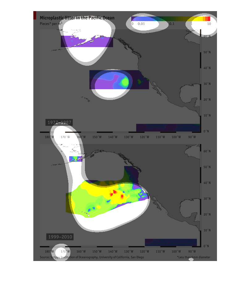
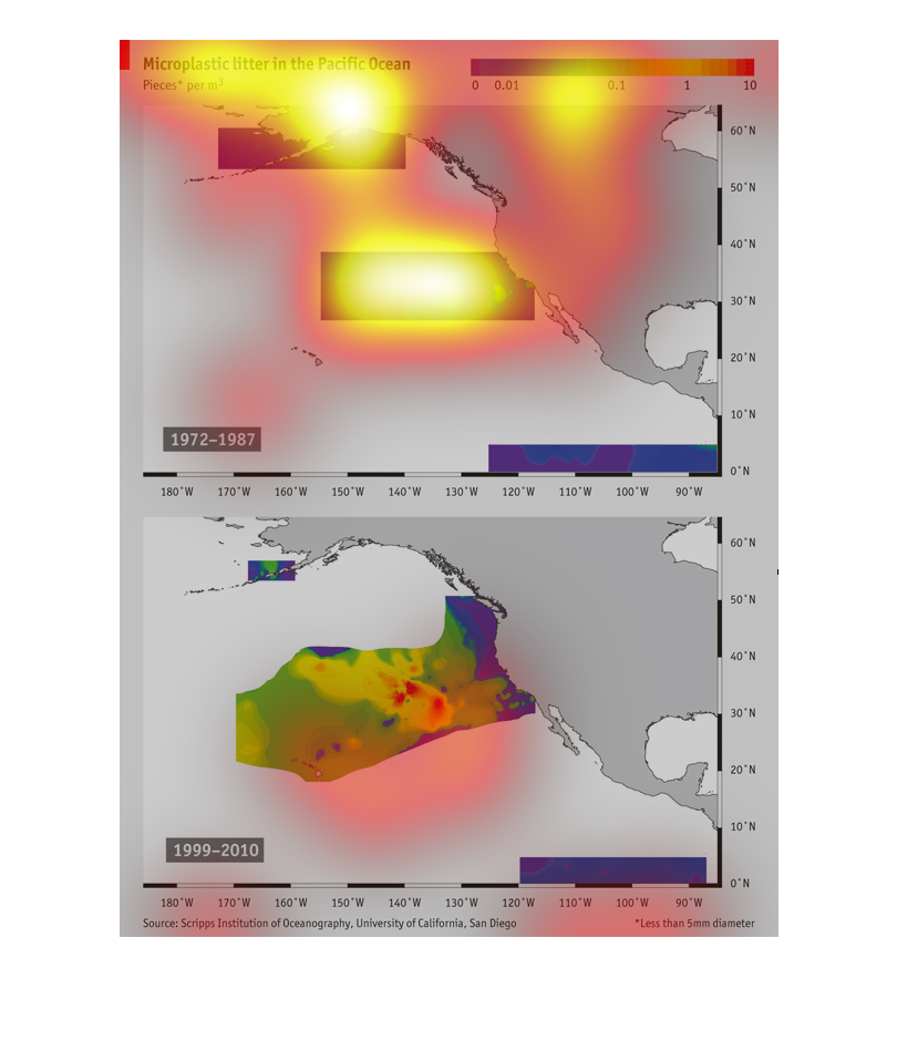
This shows microplastic litter in the Pacfic Ocean and how it has drasticaly increased between
1987 and 2010. This study was conducted by the university of California, San Diego.
This chart shows the Micro-plastic litter, in pieces per m3in the Pacific Ocean. It follows
from the years of 1972-1987, and 1999-2010. The colors go from dark purple to dark red at
the end.
Microlittering in the Pacific Ocean. Graph is 1999-2010. The coloring is to represent the
amount of litter recorded. Red is the heaviest amount and blue is the least.
This image represents Microplastic litter in the Pacific Ocean based on pieces per m3. The
first portion of the graph plots from 1972 to 1987 and the second part is from 1999 to 2010.
The colors represent the density of the litter and it is mapped using latitude and longitude.
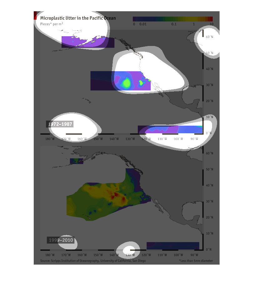
This image describes microplastic litters in the Pacific ocean. There is an image of the United
States, and it shows the amount of litter found off the coast from 1972 - 1987 and again in
1999 - 2010.
This graph compares the amount of micro litter in the Pacific Ocean. The researchers compare
year ranges of 1972-1987 and 1999-2010 to show that there has been a significant increase
in micro litter.