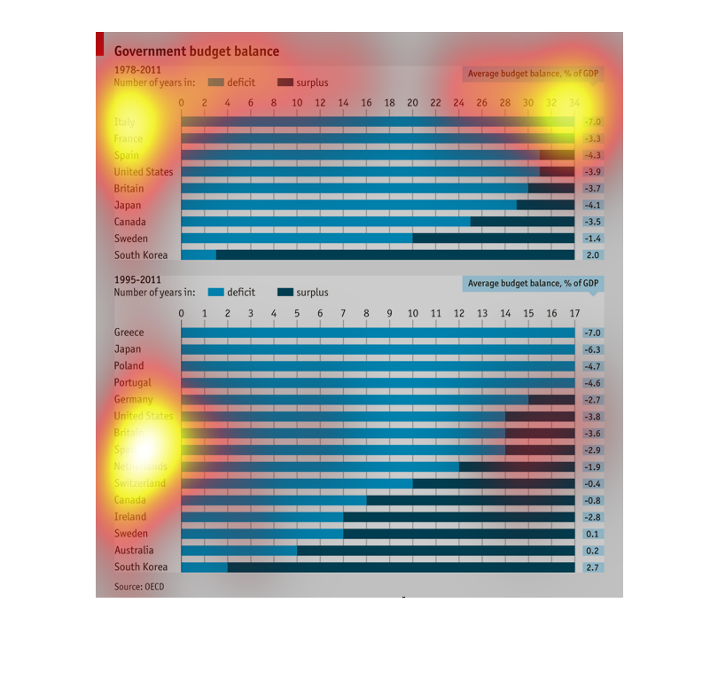
This is a summary of government budget balancing across different nations. What is plotted
is the amount of time in deficit versus in surplus for each country. South Korea and Australia
seem like outliers in terms of being mostly in surplus.
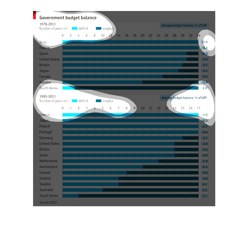
This chart describes the government budget balances of Italy, Spain, France, United States,
Britain, Japan, Canada, Sweden, and South Korea from 1978 to 2011 and Greece, Japan, Poland,
Portugal, Germany, United States, Britain, Spain, Netherlands, Switzerland, Canada, Ireland,
Sweden, Australia, and South Korea in 1995-2011.
This chart shows the Government budget balance for the years of 1978-2011 by country. Italy
and France have the most deficit with no surplus. Whereas, South Korea has had more surplus's
given than a deficit. Compared to the years of 1995-2011, where Greece, Japan, Poland, and
Portugal have the highest deficit. South Korea continues to have the lowest deficit and more
surplus's.
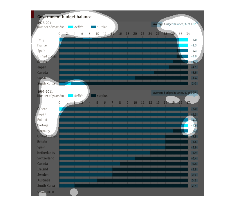
The chart shows several horizontal bars that represent the governmental budget balances of
various countries from 1978 to 2011.  Each bar is divided into light and dark blue, light
representing the deceit and dark representing the surplus.    The second chart is the same
info from 1995 to 2011.
This chart graphs government budget balances from 1978-2011. It show the number of years each
country on the chart spent in deficit or surplus. Average budget balance expressed as % of
GDP.
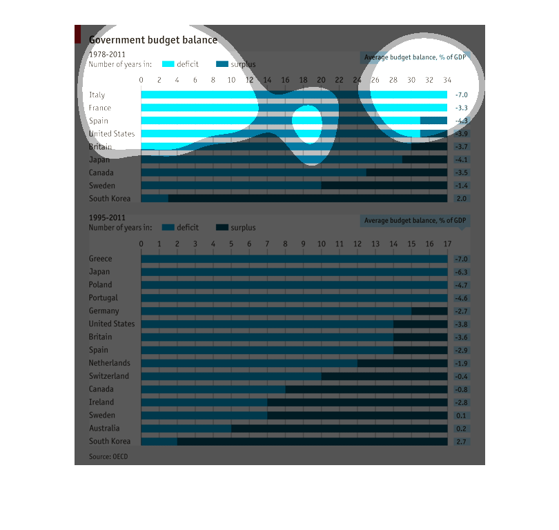
This is a bar chart of the Government Budget. This chart contains information from the era
of 1978 through 2011, it shows deficits and surplus.  Listed you have several countries to
the left and their individual stats to the right in percentages. Very easy to read.
This chart describes the Government Budget Balance from 1978-2011 as average budget balance,
percent of GDP and also for 1995-2011.  On average, only South Korea had a budget surplus
for each range of years.
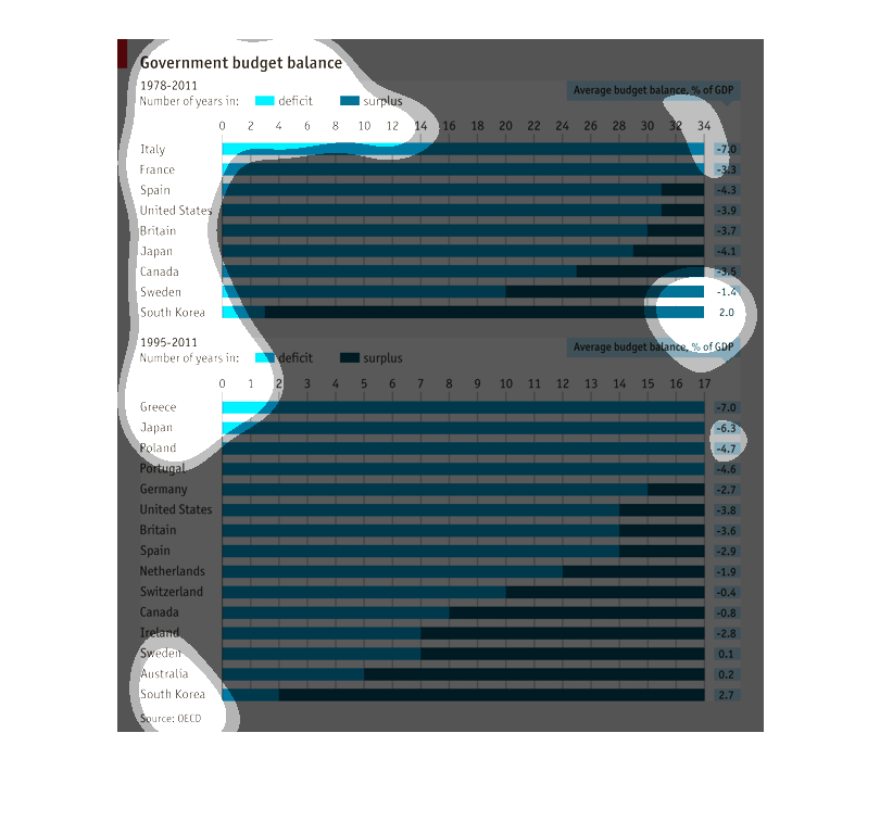
This chart shows Government Budget Balances from 1978-2011 for a number of countries, charted
by the number of years in deficit or surplus. The light blue lines represent years during
a deficit and the dark blue represent years during a surplus. The top chart shows an overall
trend from 1978 to 2011, while the bottom chart gives a closer look, narrowed down from 1995-2011.
South Korea leads the pack with 31 out of 34 years in the surplus, while Italy, Greece, France,
and Japan have spent all of the 34 years studied in a deficit.
The graphic is a bar graph comparing budget balances between different governments. Governments
include Western Europe, North America, and Asia. There is both a short-term and a long-term
graph.
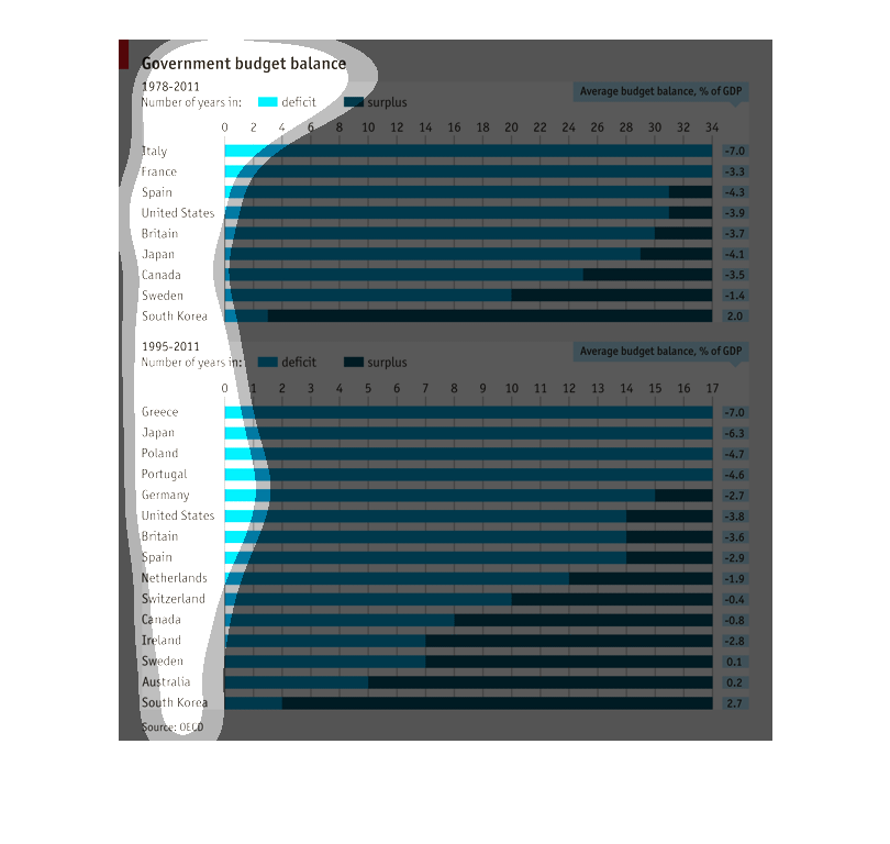
This chart is titled government budget balance. It is from the years 1978-2011 and is broken
down in deficit and surplus. Italy and France have spent the most years in deficit while South
Korea, Australia, and Sweden have spent the most years in surplus. The US has spent more years
in deficit than surplus.
It is a graph showing the difference in countries resources it has America Spain and a lot
of other countries bUT it's a nice graph yo say the least.
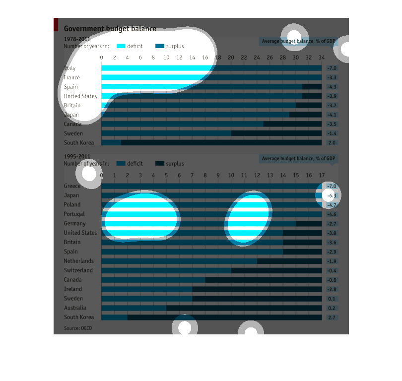
This image provides the breakdown of the government budget into deficit and surplus in a variety
countries from 1978 to 2011 or 1995 to 2011 depending on when data is available. It also provides
the average budget balance as a percentage of GDP for each of these countries.