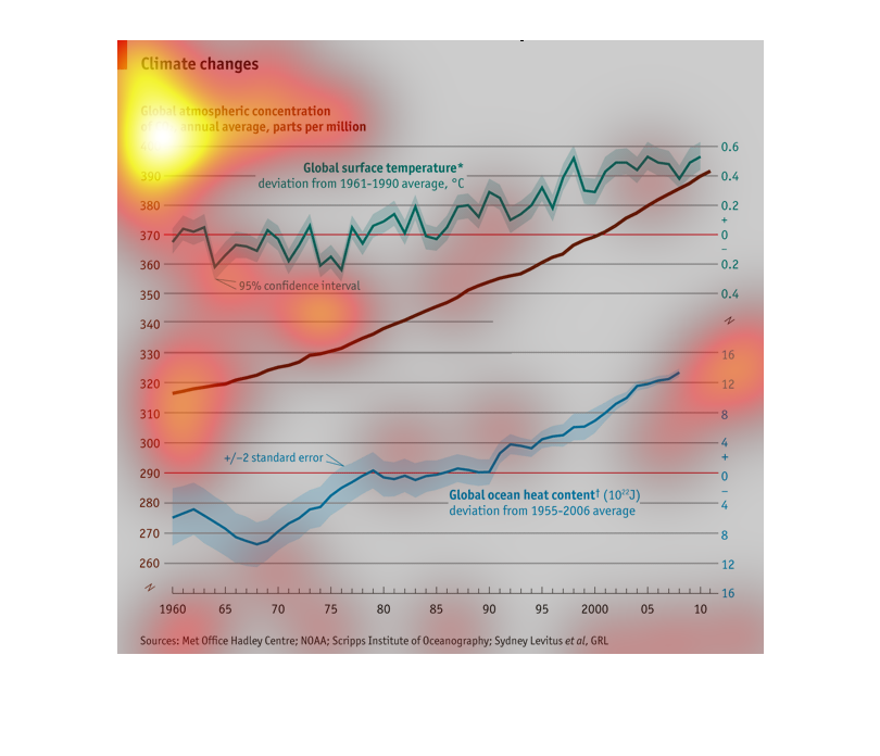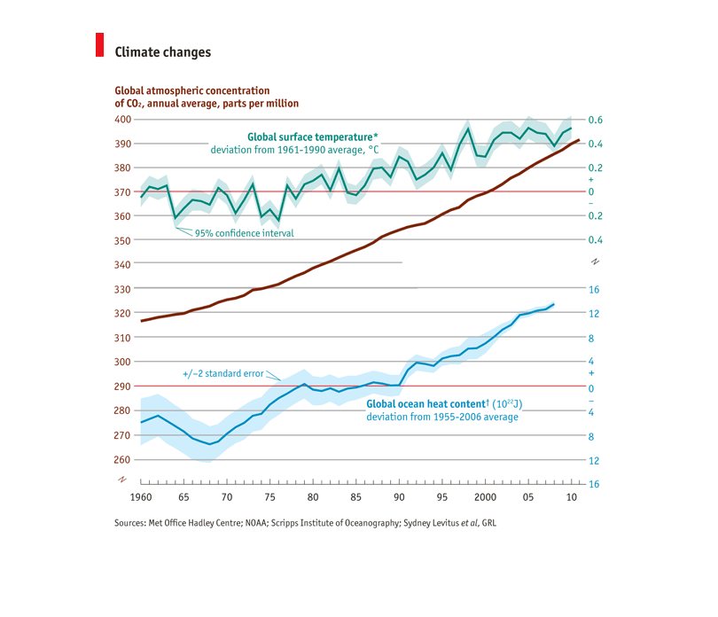
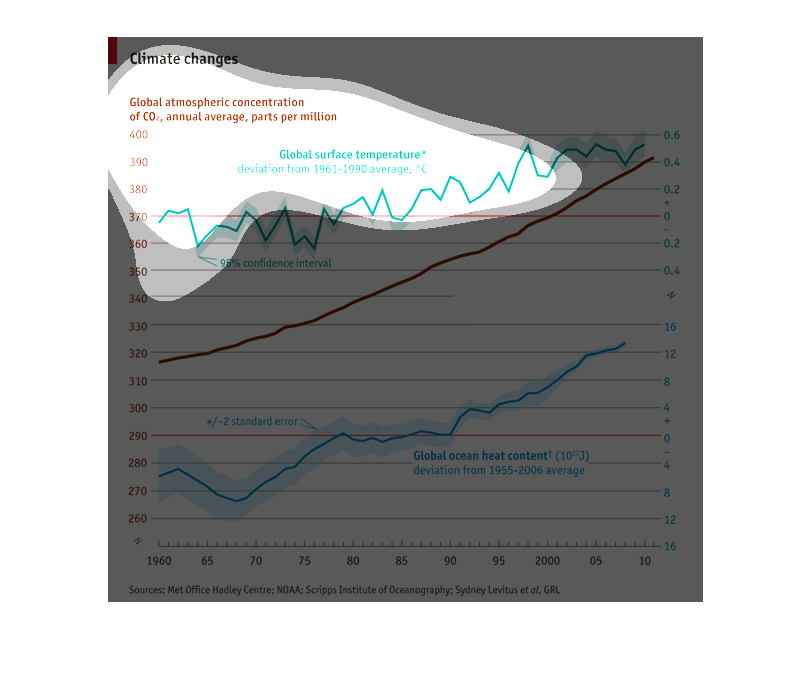
Multiple illustrations of climate change over time from 1960 to 2010.  Global surface temperature
has risen.  Global atmospheric concentration of Carbon Dioxide parts per million has risen.
Global ocean heat content has risen.
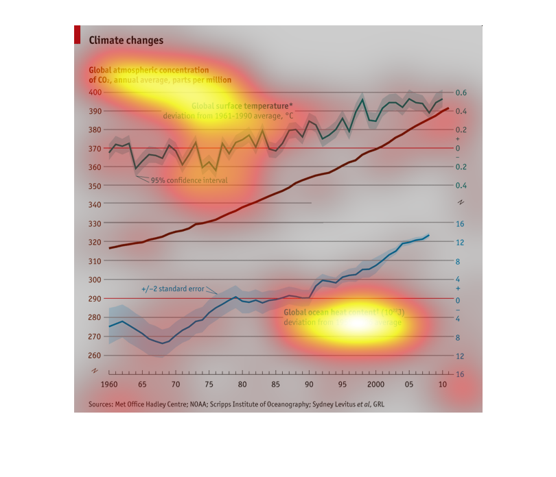
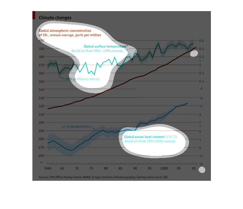
This graph shows the annual average climate change, as a unit of global atmospheric concentration
of CO2. It shows the global ocean heat content and global heat temperature also
This graph show climate change based on global atmospheric consentration of co2 on an annual
bases by measuring surface tempatures and ocean temperature.
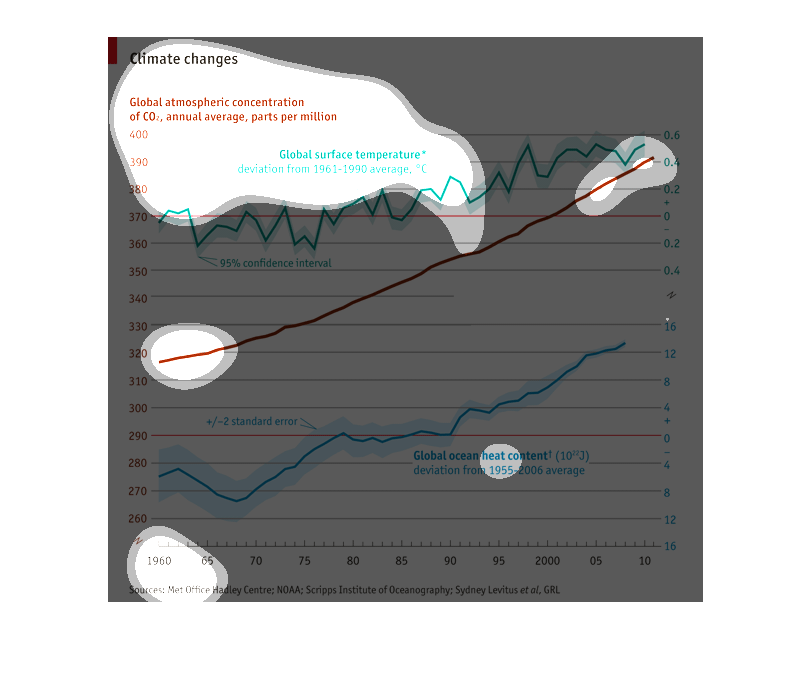
This graph shows global climate changes. The global surface temperature from 1960s to 2000
has shown a slight increase, while global ocean heat content seems to have increased significantly,
and changes in CO2 concentrations (measured in parts per million) have also increased greatly.
This chart is for climate change, showing the global atmospheric concentration of CO2 annual
 average of parts per million. It shows a slight rise in the average global surface temperature
deviation from 1961 to 1990.
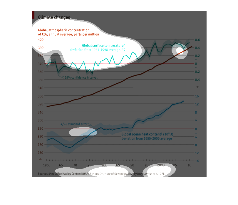
This graph shows three measures of climate change from 1955 to the present: CO2 concentration
in the atmosphere (parts/million), surface temperature (expressed as deviation from the average
between 1961 and 1999), and ocean heat content (expressed as deviation from the average between
1955 and 2006). CO2 has been rising steadily since 1955. Surface temperature is now about
.6 degree centigrade higher than the average; ocean heat content is up a lot.
Global Climate Changes chart. Global atmospheric concentration of CO2. National average. And
the global surface temperature are measured here to show the significant increase and chr
martingale these numbers yo show the upward mobility and trajectory.
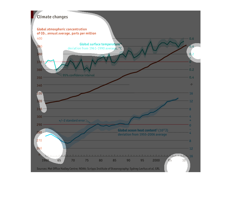
This graph shows the average atmospheric concentration of CO2 from 1965 to 2010. The graph
shows a rising trend in atmospheric concentration of CO2 since 1965. It also shows the average
temperature measured in celsius
Climate changes based on climate change of C02 as global surface temperature from 1961 to
1990. As the C02 levels increase you notice that the climate changes
This graph shows the ocean's heat content increasing from 1995-2006 on average; meaning, the
increase in the ocean's heat content gives the implication that the environment could be seriously
harmed if the issue is not address.
This graph is also from the Economist, a British publication. This graph shows climate changes
over time as measured by global surface temperatures and global ocean temperatures. The general
trend is an increases in temperature as time increases, with surface temperatures always higher
than ocean temperatures.
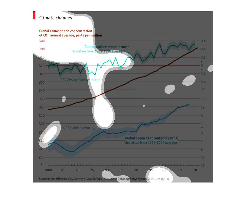
The image is about climate change. It tells about climate change through measures of global
surface temperature over time. It also contains data on ocean temperature.
This chart shows the change in various gases in the atmosphere and the percentage of each
and how it has change over time. It is shown from 1960 to 2010.