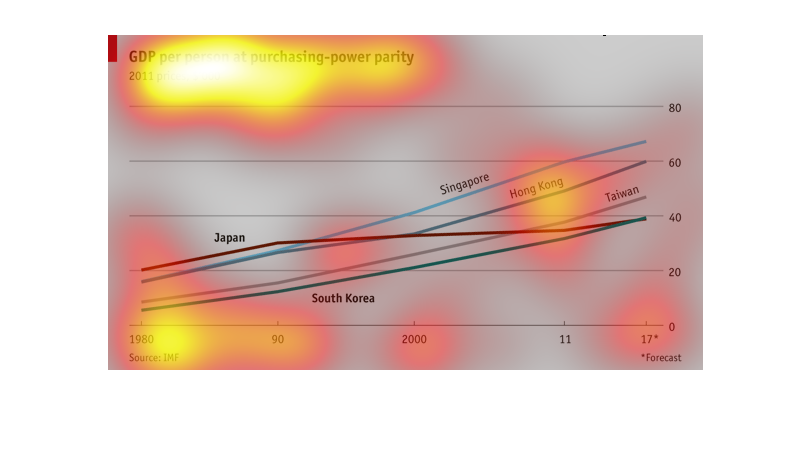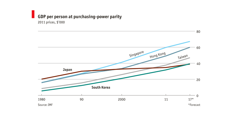
This graph describes the GDP per person at purchasing power parity and is based on 2011's
prices.  It shows this data on a line graph from 1980 to 2007 with Singapore at the top and
South Korea and Japan coming in at the bottom.
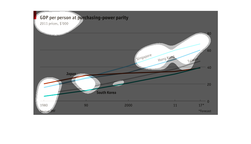
Different lines show different Asian countries across decades in terms of GDP per person at
purchasing-power parity. Singapore is forecast to have the highest value, where Japan started
out the highest. All countries are largely rising.
This chart displays the GDP per person at purchasing power parity. This chart specifically
focuses on the GDP in Asian companies. In this chart it seems like Singapore has the highest
purchasing power.
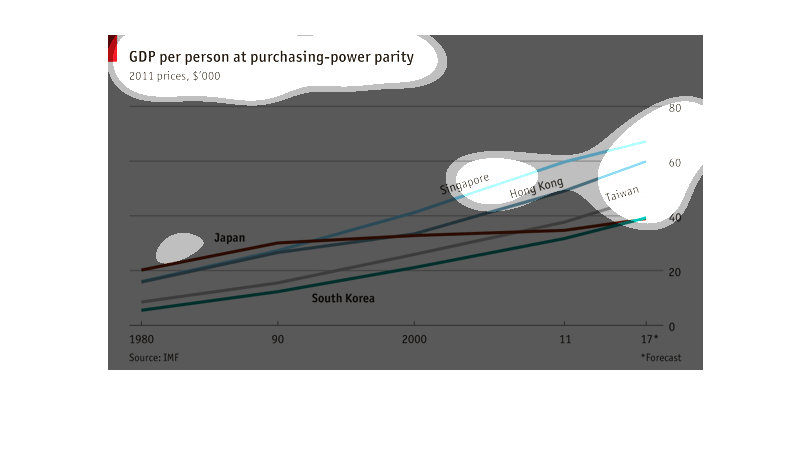
This chart shows the Gross Domestic Product per person at purchasing parity of several Asian
areas, including Japan, Taiwan, Hong Kong, and South Korea from 1980 to the project forecast
of 2017.  According to the chart, Singapore will continue to rank the highest.
Here the graph deliniates GDP per person at purchasing power parity by 2011 prices. The numbers
in this category for Japan, Singapore, Hong Kong, Taiwan and South Korea are shown.
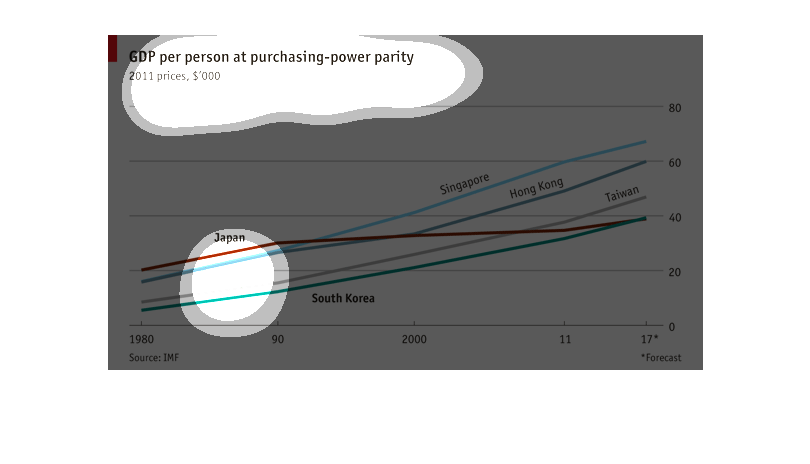
The graph is for the GDP personal purchase power parity.  From the chart, I can see it started
from 1980 and expect it to 2017.  The chart was include some countries Singapore, Hong Kong
and Taiwan
Here we have a line graph symbolizing the GDP per person at purchasing-power parity for 2011.
Listed countries are Japan, South Korea, Singapore, Hong Kong, and Taiwan.
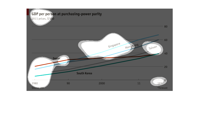
This graph shows the GDP per person at  purchasing power parity. It covers the years of 1980-2017.
The countries covered are: Singapore, Hong Kong, South Korea, and Japan.
This graphs shows gdp per person purchasing-parity. It sets the price relative to 2011 $ prices.
The x axis is the year, starting at 1980, and the y axis is the amount. It compares it between
several Asian countries, such as Korea, Singapore and Hong Kong.
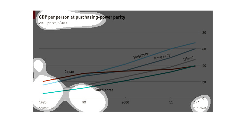
The graphic is a line graph concerning GDP per person equalized for purchasing power. The
graphic appears to be isolated to comparisons among nations in southeast Asia.
This chart is titled GDP per person at purchasing-power parity. It is based on 2011 prices.
South Korea has the lowest while Singapore has the highest. The general trend for all the
countries though is an increasing in GDP except for Japan where there was a decrease for a
time.
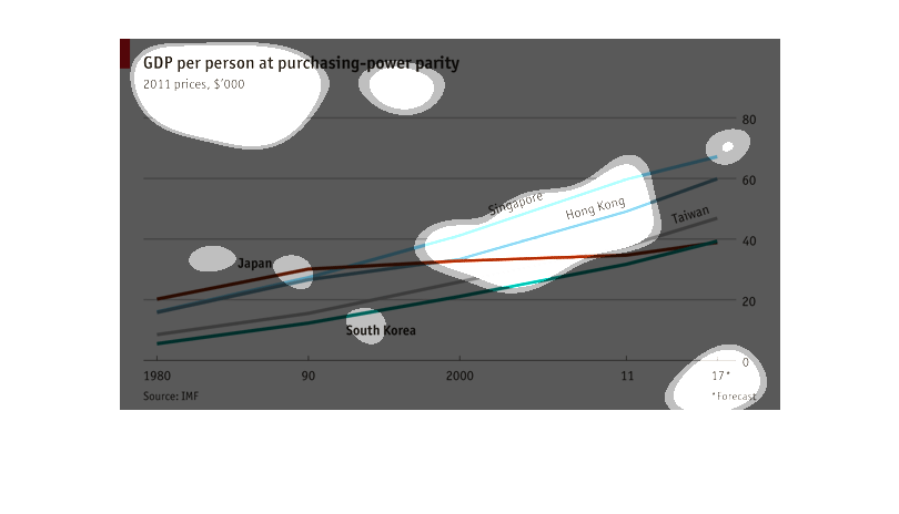
This shows the GDP per person at purchasing-power parity in using 2011's prices. It tracks
1980 through projections in 2017 and looks at Japan, Singapore, Hong Kong, Taiwan, and South
Korea. All but Japan are trending upwards, as Japan holds steady.
This image shows the GDP per person of several Asian nations from 1980 through 2017's projection.
 All nations' GDP are increasing, and increasing at roughly the same rate, thus showing purchasing
power-parity in these nations.
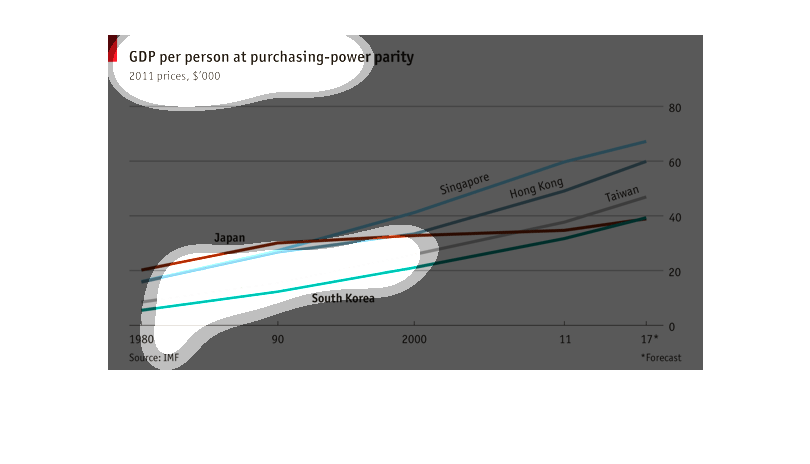
This chart seems to display several Asian countries -and the GDP per person at purchasing-power
parity of 1980. Japan, Singapore, South Korea, and Taiwan seem to be the countries in the
study.
This is a graph of gpd  per person at purchasing power parity. The scale shows the lowest
and the gradual increase in purchases from 2011.It shows from 1980 to current.