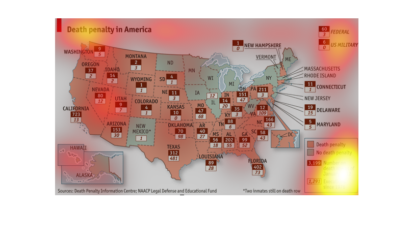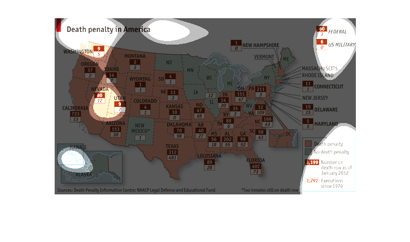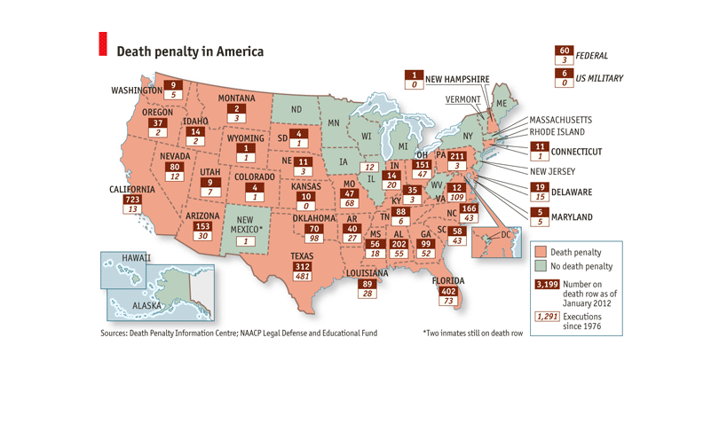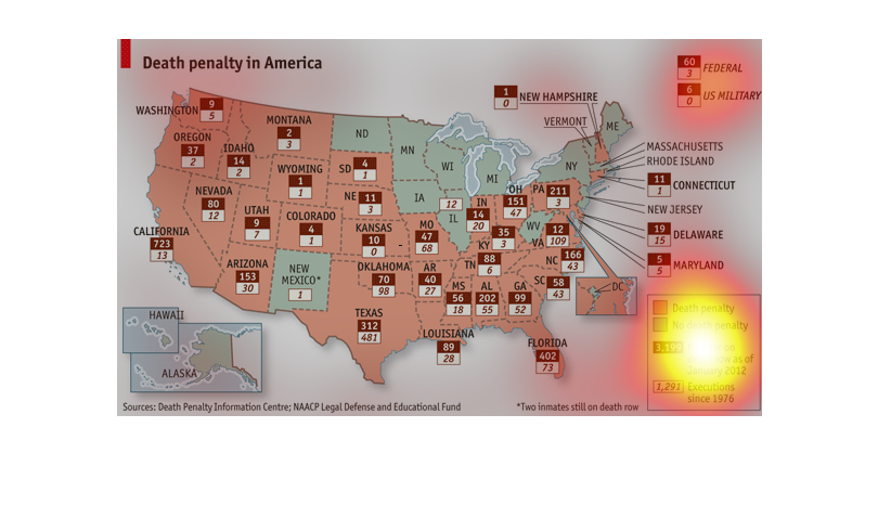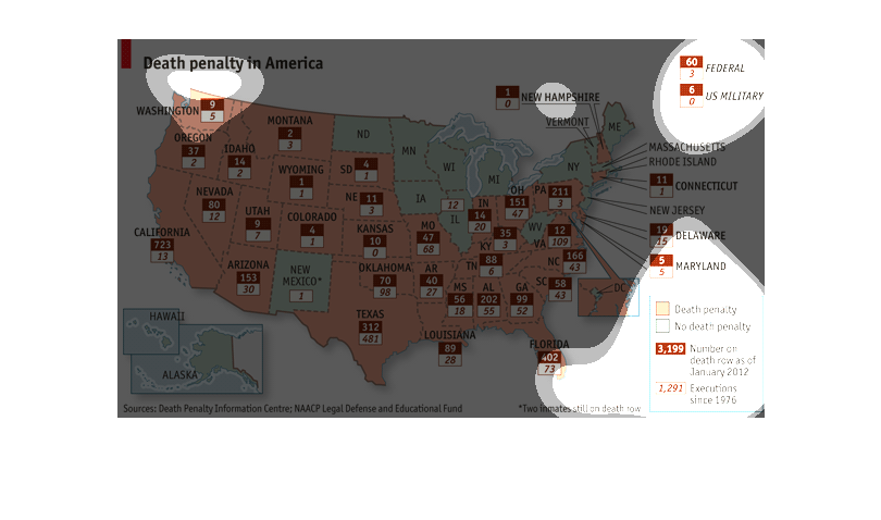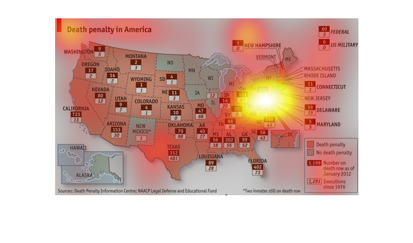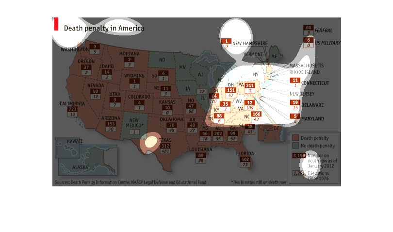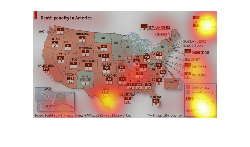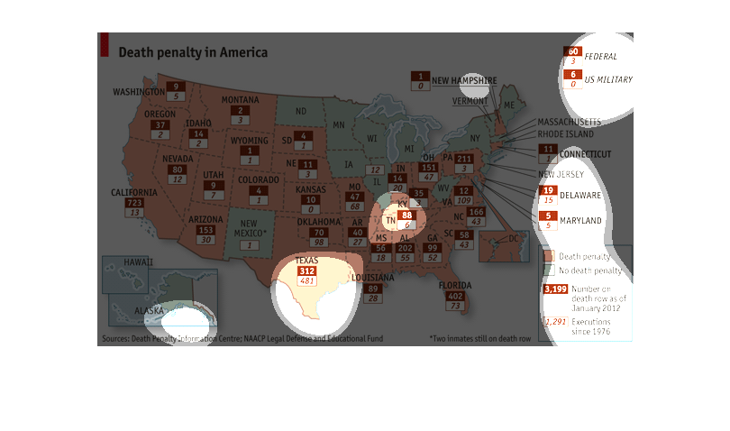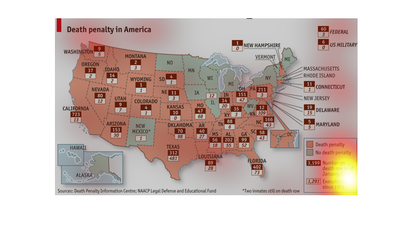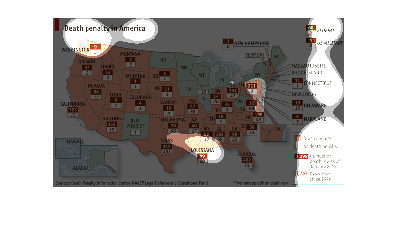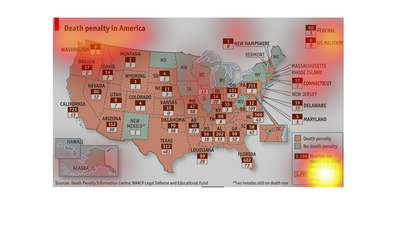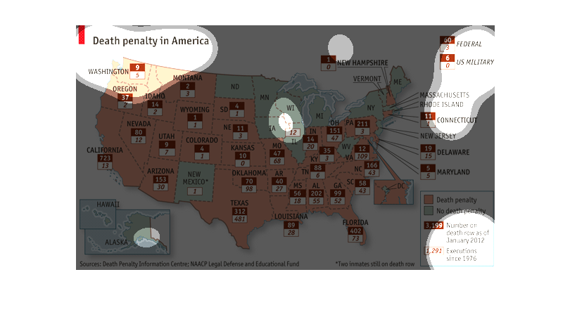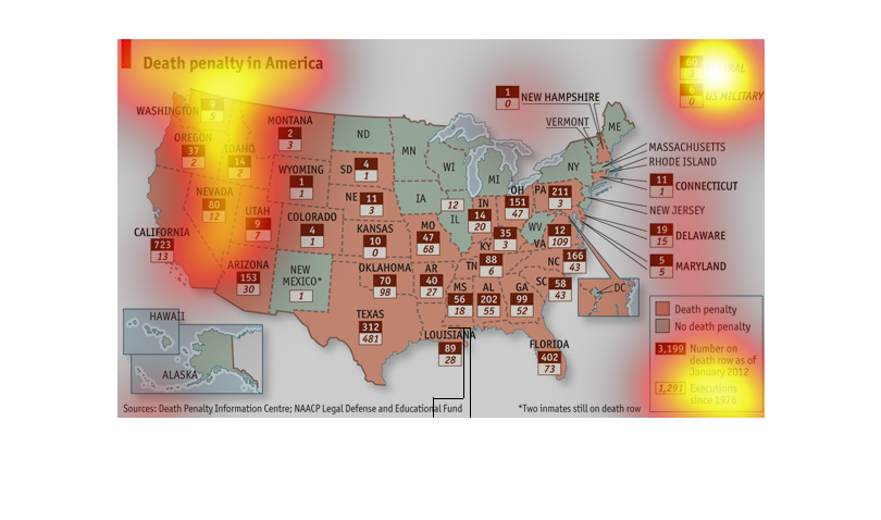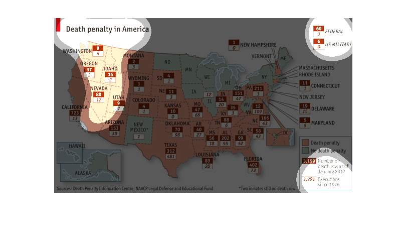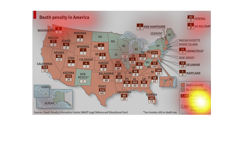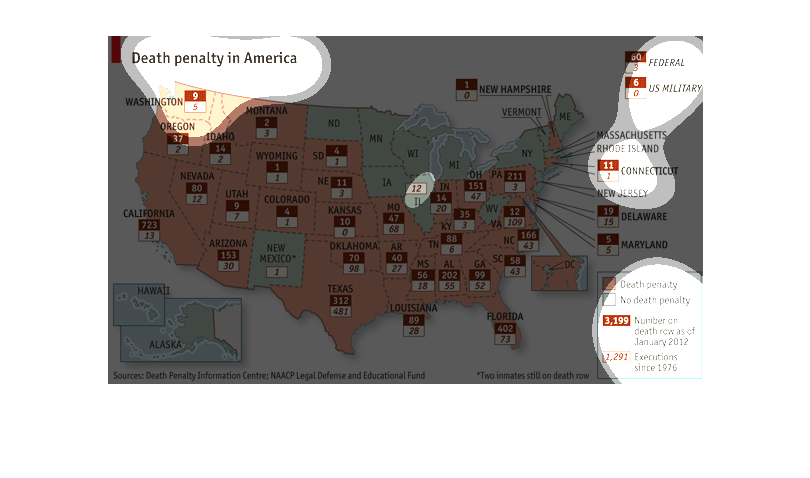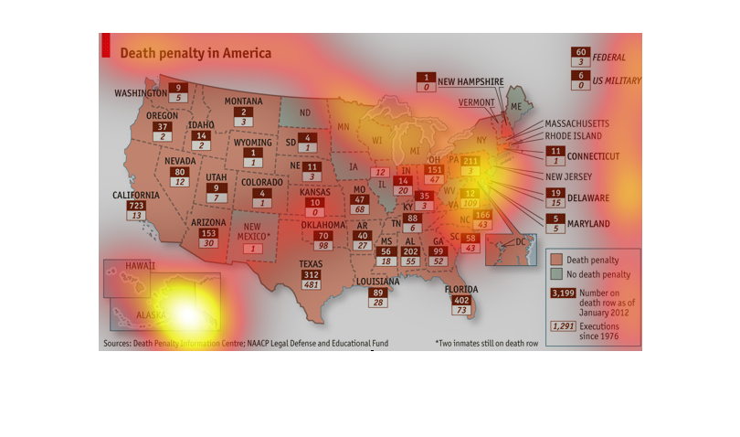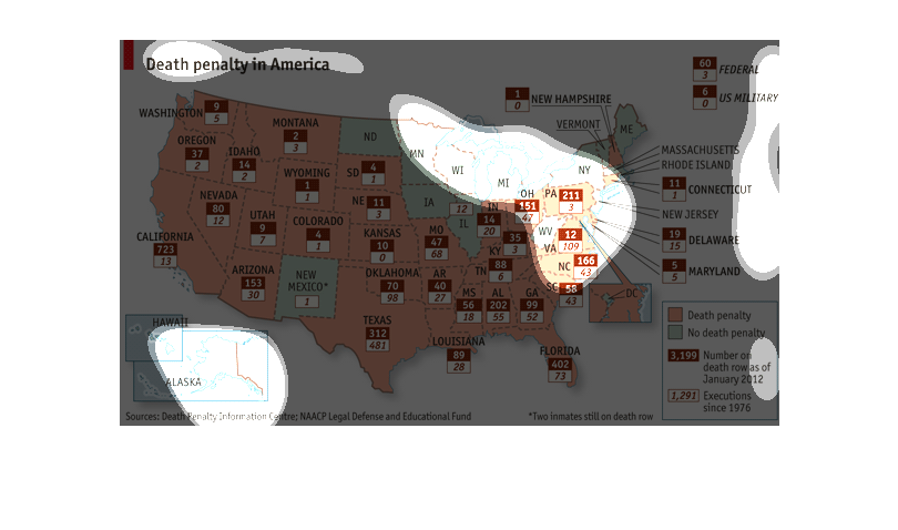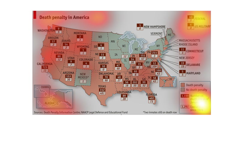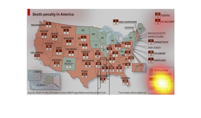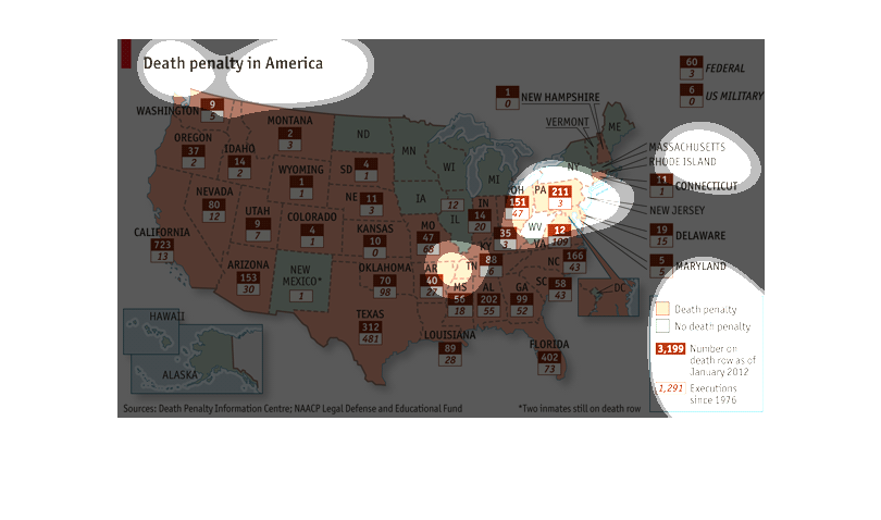
This graph of the United States of America shows which states have and don't have the death
penalty.  The graph shows the number of deaths from those states with the death penalty, as
well as the number of inmates currently on death row dating back from 2012.  It also lists
the number of executions dating back from 1976


It showing death penalty in America by each state. If a state is red, that means there is
a death penalty and if it is green, that means there is not a death penalty.


This is a picture of the United States with counts of how many people have been executed by
the death penalty since 1976.  Orange colored states have the death penalty while light green
colored states do not.


This map shows death penalty statistics across the United States.  First, it shows whether
or not the death penalty is used in the state or not.  After that, it shows the number of
inmates on death row since January 2012 in each state and the number of executions in each
state since 1976.


This chart is about the death penalty in the United States. The states that have the death
penalty are in orange, they have a red box the number of inmates that are on death row as
of January 2012, the white box shows the number executed as of the same date.


This map shows Death penalty in America. In tan it is for the Death penalty, and light blue
for the state not having legalized death penalty. In Red it shows Number on death row as of
January 2012.


The chart is a map of the United States showing the amount of inmates on death row and the
number of patients executed in each state. Also shown is which states have the death penalty
and which do not.


This map shows the death penalty usage throughout America. It seems that while it is widely
accepted in some areas like Hawaii, Alaska, and New Mexico and the middle of the northern
US do not pass the death penalty very often.


This graph shows the number of death penalties in the United States by state.  It shows both
the number of people on death row as of January 2012, and the number of executions since 1976.


The map is of the United States andshows the what states have the death penalty.  Also each
state shows the number of executions by the death penalty since 1976 and the number of inmates
on death row as of January 2012.


This is a map of the death penalty.   It shows which states have the death penalty and how
many people are sentences to death row in relation to how many people are actually executed.


The chart describes the death penalty in America by states that have the death penalty in
place and states that do not. There are  3,199 people on death row as of January 2012 and
1,291 executions since 1976. The majority of the states that have the death penalty are in
the south and western USA. A lot of states in the north do not have the death penalty.
