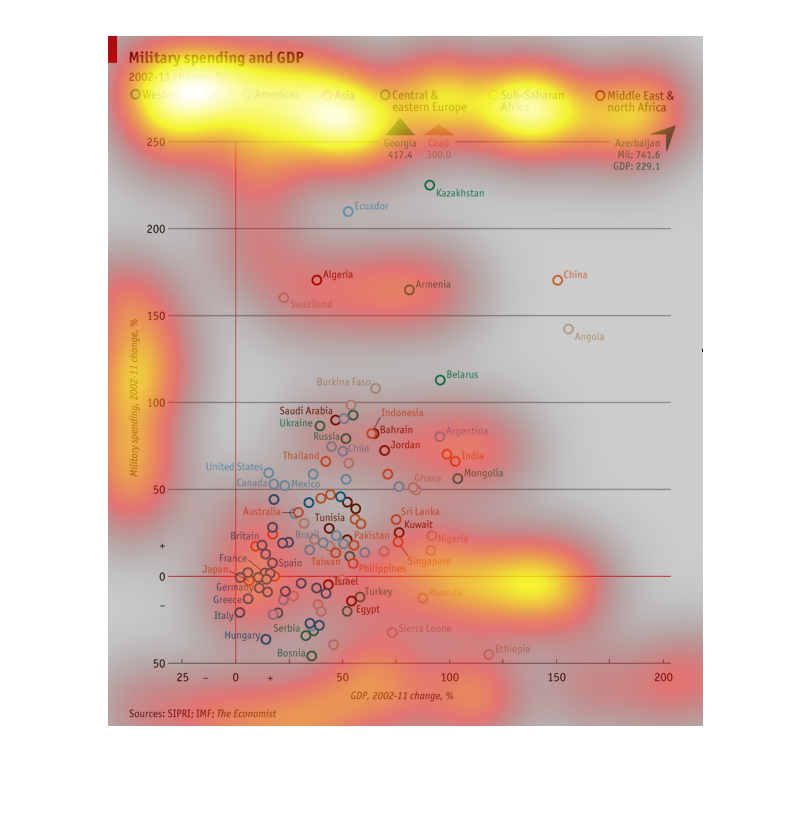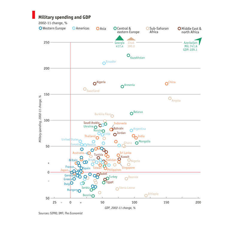
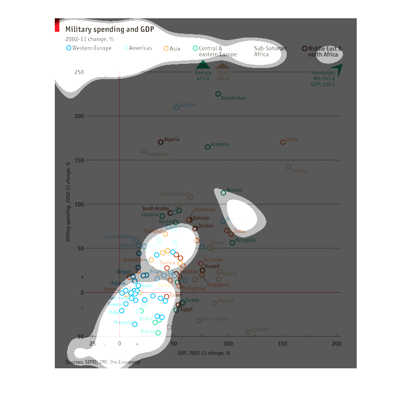
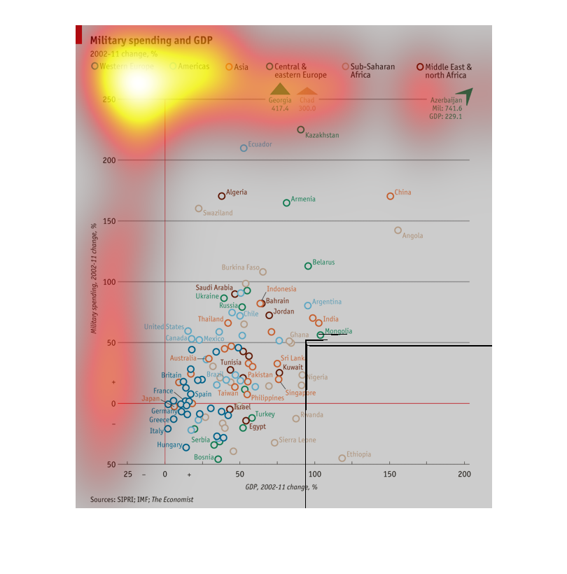
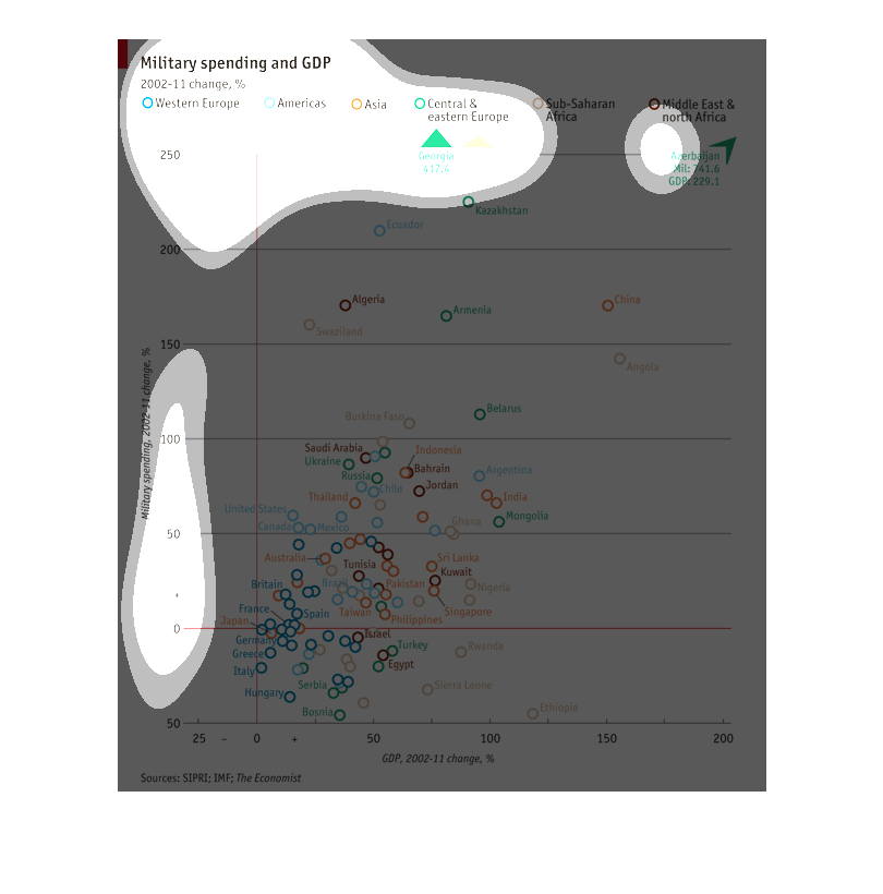
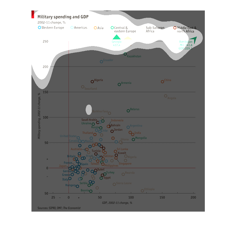
This chart depicts military spending as it relates to GDP from 2002 to 2011 in different regions
of the world. The largest percentage gain in the world is in Azerbaijan
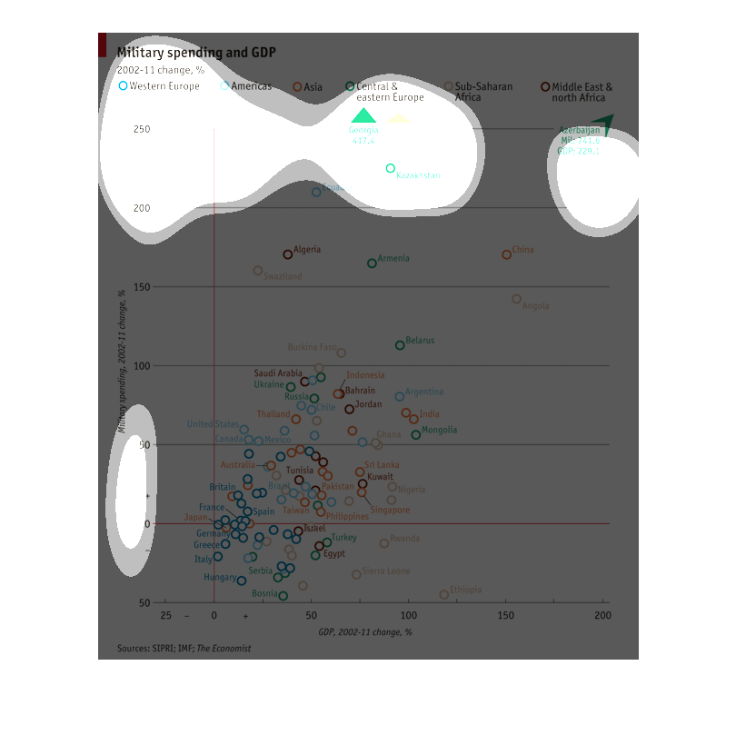
This graph shows the percent change in how military spending effected the gross domestic product
(GDP) of many nations, categorized by continental region, between 2002 and 2011.
The visual graph shows the amount of money that is spent by the military for different countries
including the USA, it also shows the GDP estimations.

This chart shows military funding and GDP between the years of 2002 and 2011. It looks at
the differences between western Europe, the Americas, Asia, central and eastern Europe, Saharan
Africa, middle east, and south Africa. The map shows that military funding has decreased over
time, but the Americas received the most.
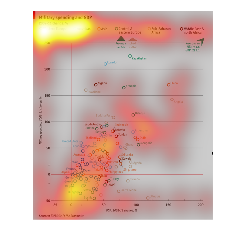
This graph shows military spending and GDP as a percent change from 2002 to 2011. It then
divides the graph into five different major regions across the world.
This is graph describes the change in military spending in five regions from 2002 to 2011.
The graph is a scatterplot of which plots each regions GDP against the military spending of
each region.
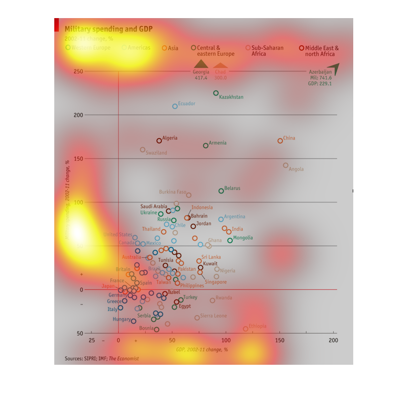
This chart describes Military spending and GDP of a wealth of countries. They are color coded
in accordance to where they are on the globe, with a scale up to 250
This graph describes military spending and GDP from the years 2002-2011. It appears that countries
outside of Western Europe experience the most drastic changes within this relation during
this time period.
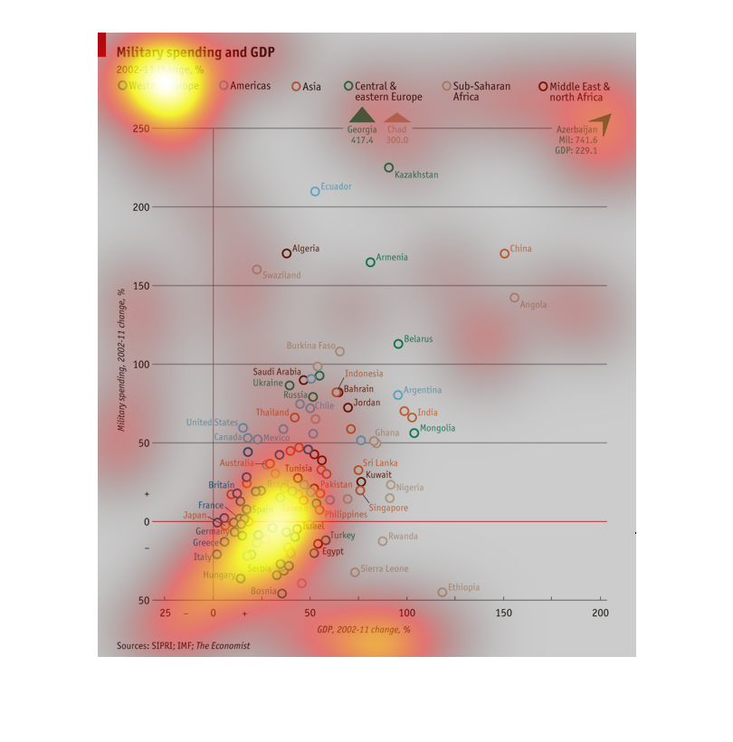
This graph shows military spending as compared to GDP from 2002-2011 by area of the world.
Including Western Europe, The Americas, Asia, Central and Eastern Europe, Sub-Saharan Africa,
Middle East and North Africa.
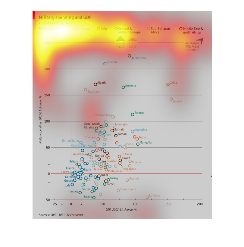
This is representing military spending and the GDP. They are using small circles being different
colors to represent different countries. It seems that all of the current spending is focused
to the middle east at the moment for apparent reasons.
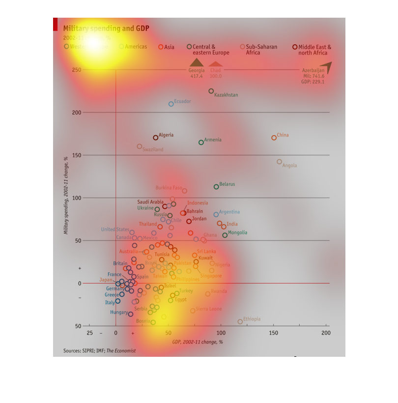
The chart describes military spending and GDP change between 2002 and 2011 in percentage.
It shows the average percentage as a bulletin instead of bars or a graph.
This graph demonstrates the relationship between military spending and GDP of different countries
and how it is affected by any increase in GDP for several nations.
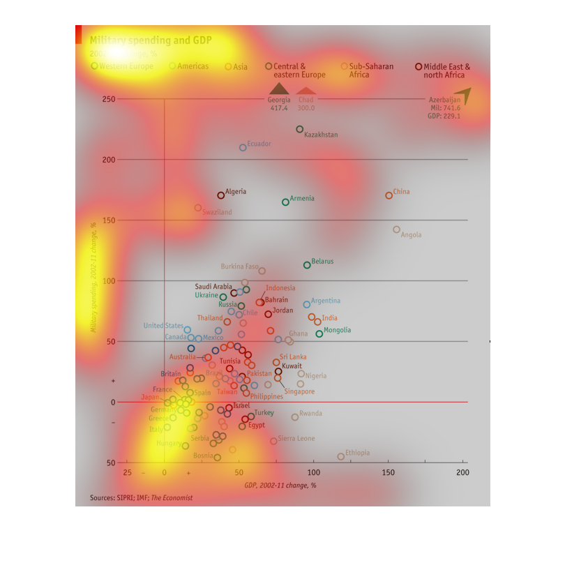
This graph depicts military spending across areas of the world in relation to GDP from the
year 2002.  This is done by plotting various points on a graph.
This chart covers military spending and the the GDP. It covers the change in percentages from
2000 to 2011.  The countries it covers is Western Europe, the Americas, Asia, Central and
Eastern Europe, and the Middle East and North Africa. The chart is a graph showing the countries
in different colors comparing their military spending to their GDP.