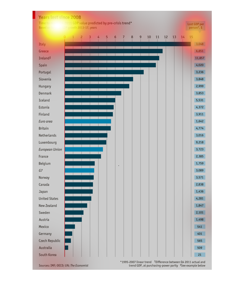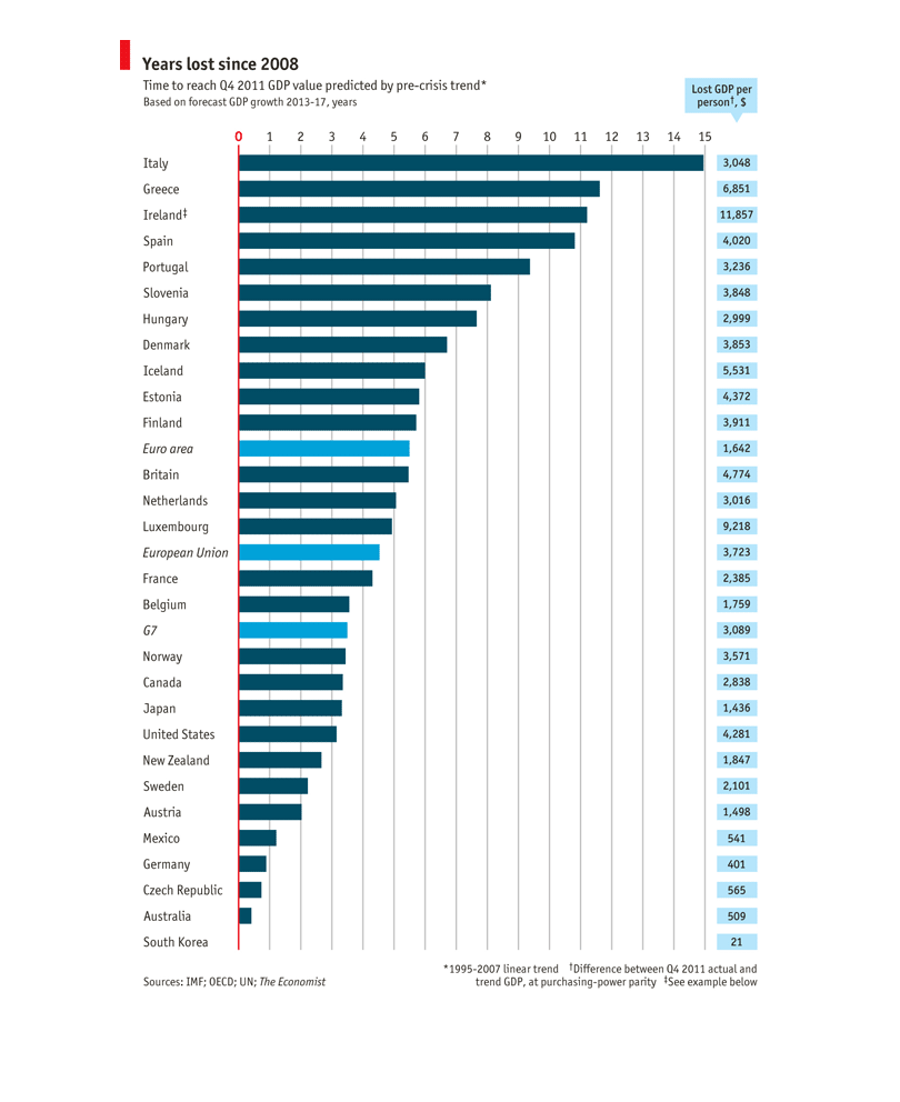
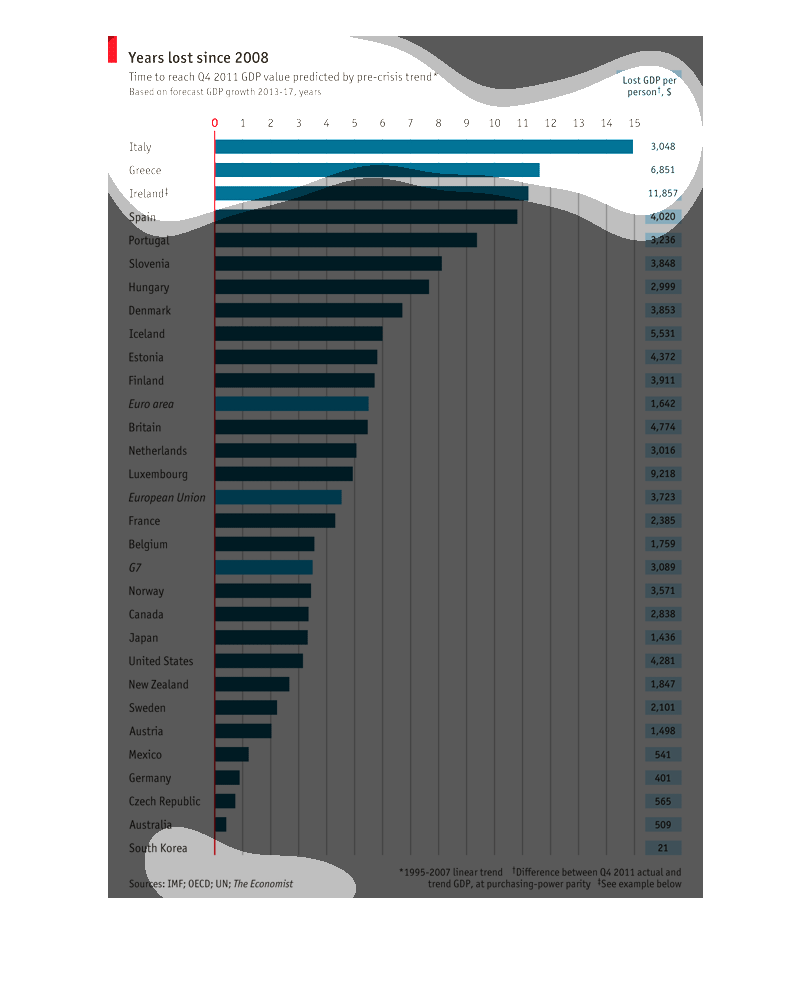
The chart states "years lost since 2008" as its purpose. Years lost refers "Lost GDP per person".
Italy is listed as having lost the most number of years.
This graph describes 'years lost since 2008' for various countries around the world.  It appears
toe describe the lost GDP per person for these countries.
This is an image for years lost since 2008 for the GDP. Italy has lost the most followed by
Greece. South Korea has lost the least and is barely showing any loss.
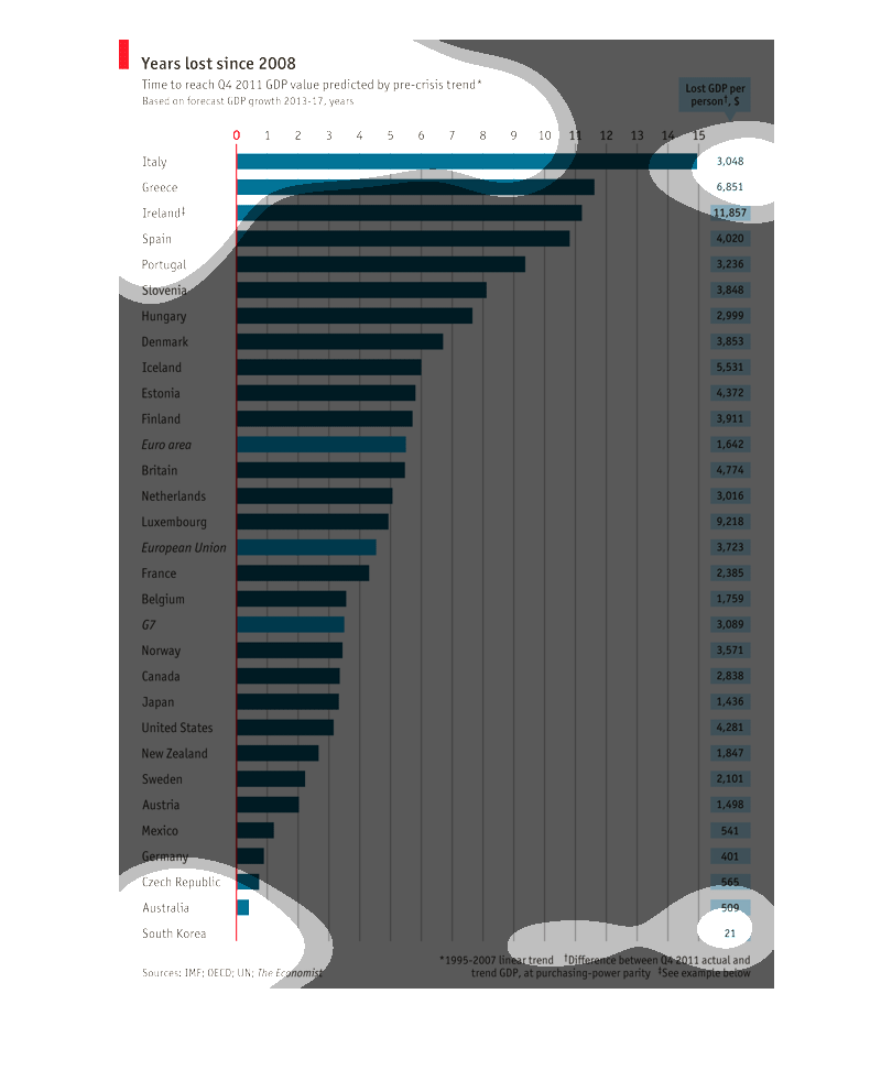
This graph indicates the years lost since 2008.  It illustrates figures by country with Italy
being the highest and how much GDP has changed in those countries.
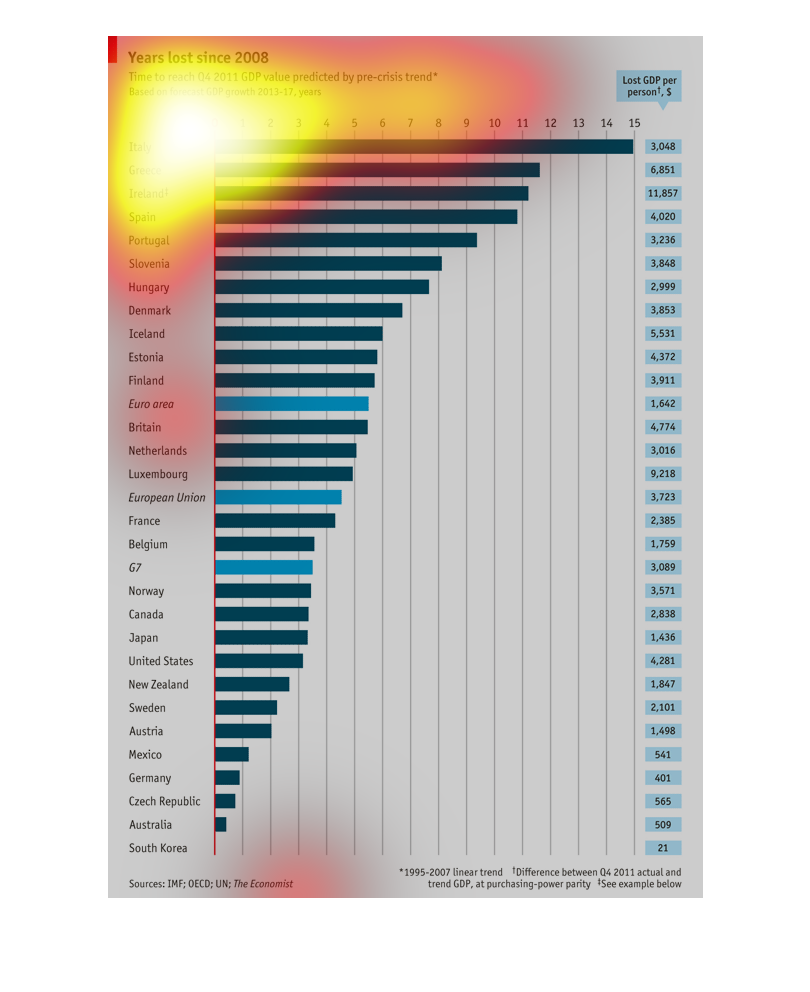
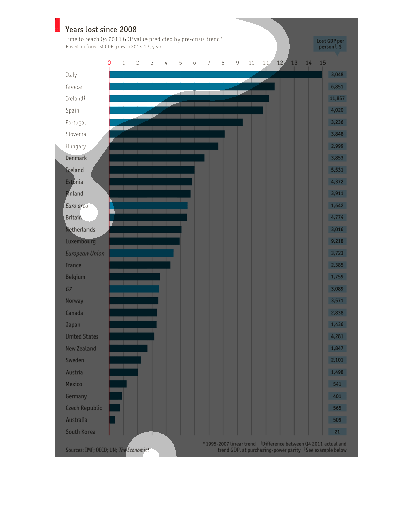
This chart show the amount of GDP lost per person in several different countries since  the
year 2008. It also graphs from the highest GDP lost to the lowest.
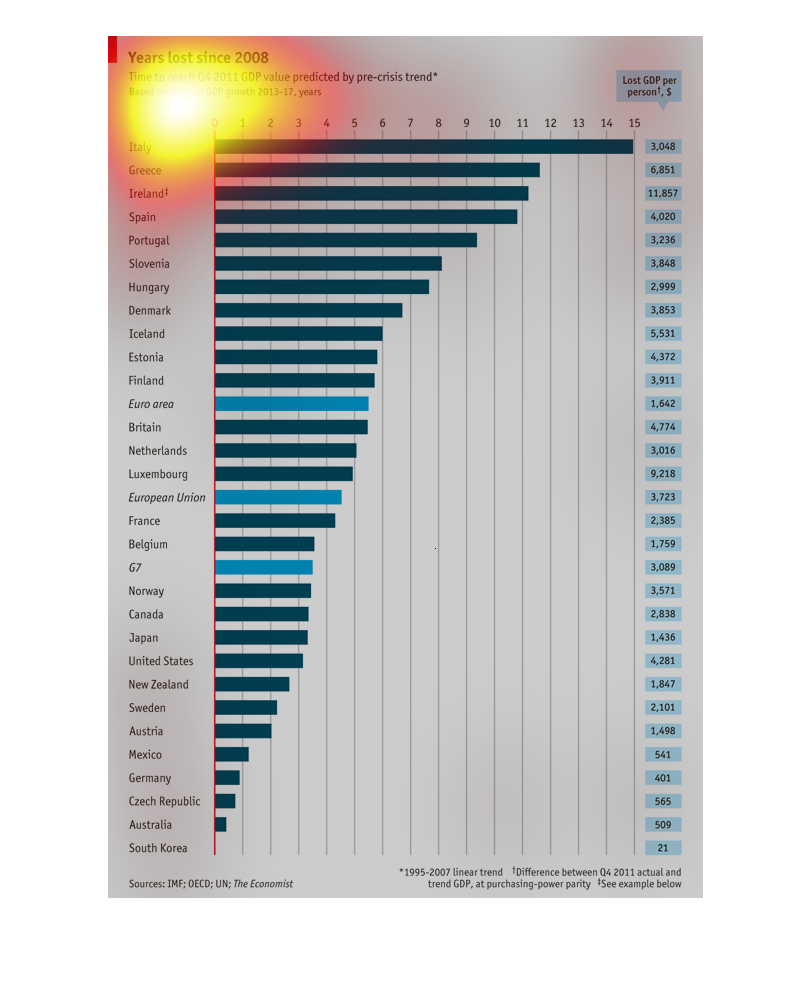
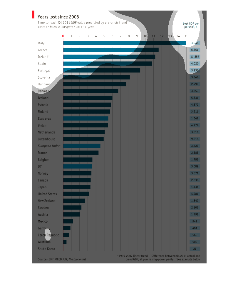
This graph shows the years lost since 2008 based on the time it took to reach the Q4 2011
value. It then compares multiple countries across the world with the value of lost GDP per
person.
This graph shows a detailed description of the years lost in wastage for a selected number
of countries. The trend is for quarter four and is based in the pre-crisis period.
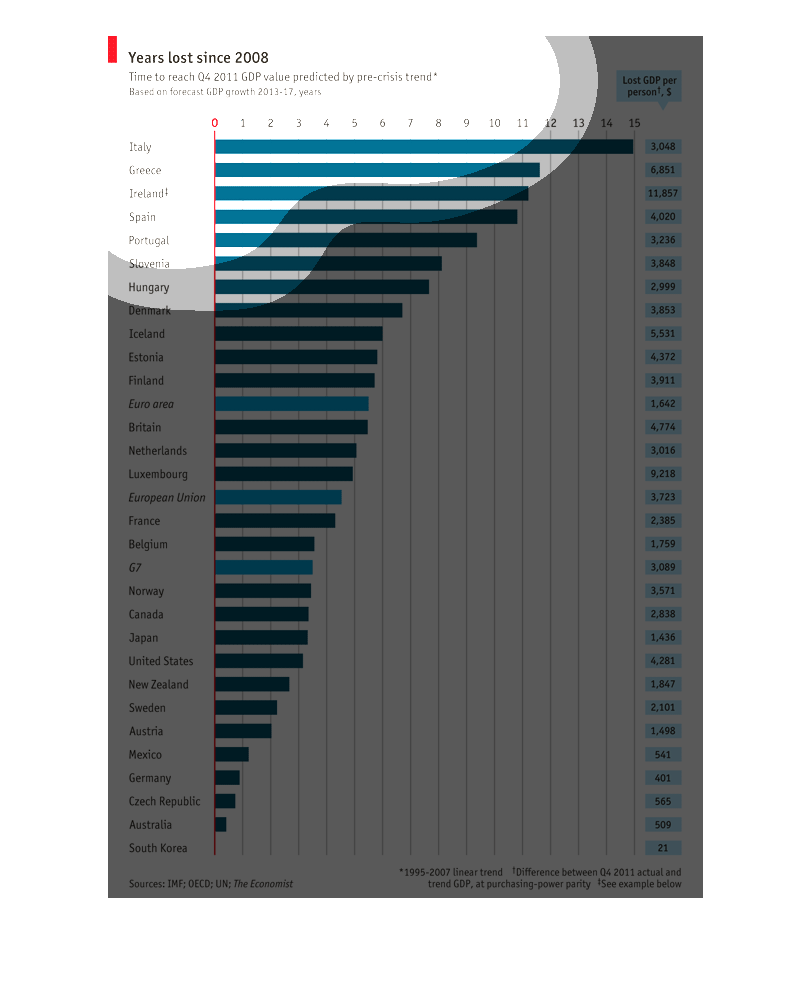
Time for a selection of nations to reach a predicted level of GDP growth as opposed to their
actual growth and represented therefore in 'lost years' of productivity and GDP growth since
2008
So there was a global recession in 2008, since that time nations have worked to regain economic
viability. This chart highlights how many years of growth were sacrificed my selected countries
while returning to economic functionality. Italy, Greece and Ireland have had the longest
time returning to functionality while South Korea and Australia have returned more quickly.
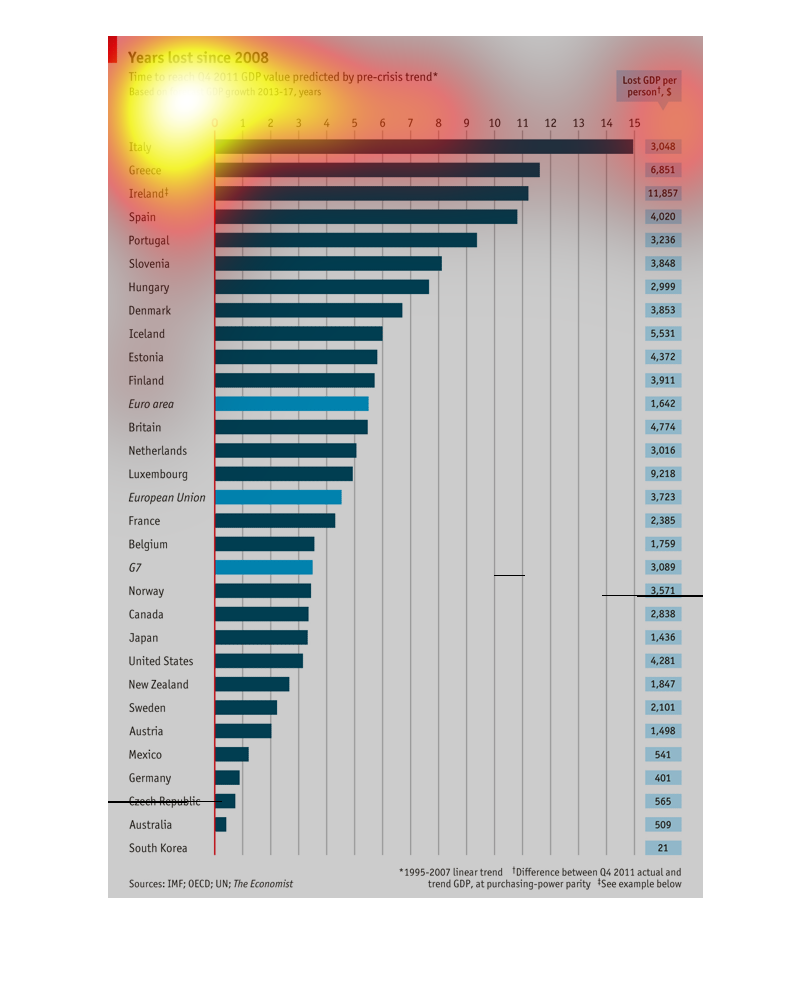
The right vertical axis shows the numeric value of the bar graph.
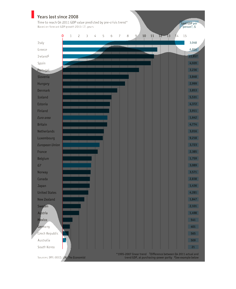
In the top left hand corner the title of the graph is Years lost since 2008.  Numerous countries
are listed down the left hand column of the page or graph.
This image shows the impact of the financial crisis of 2008 on various countries by showing
the 'lost' GDP per person in dollar amounts that it took to get back to 2011 4th quarter projections.
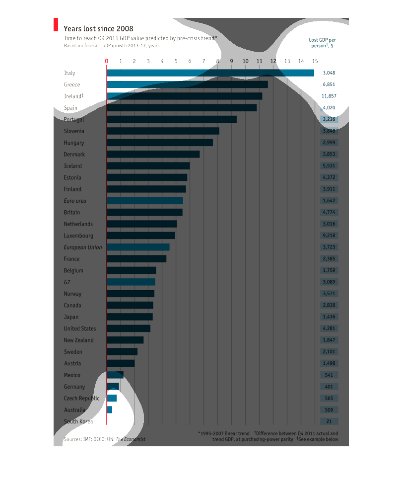
This chart depicts the time lost to reach a commensurate level of GDP with Q4 2011 before
the economic crisis. Currently Italy is the furthest behind when compared with a number of
other countries.
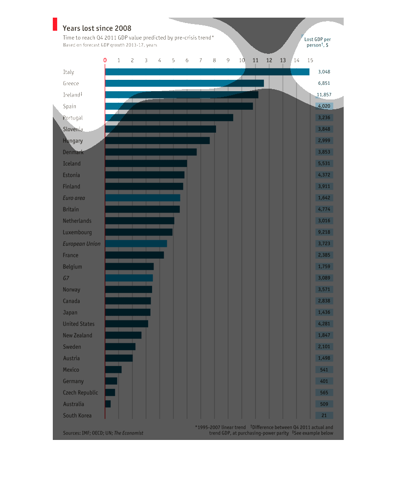
The chart shows the amount of lost GDP since 2008 among various countries such as Italy, Greece,
Ireland, and so forth. It also shows the amount of lost GDP per person.