This graph shows the relationship between a countries debt to income ratios.  In the blue
through dark blue are the levels of debt and the red is the racial gap of income.  From this
graph you can tell that Japan on the Y axis has the lowest debt to income ratio.
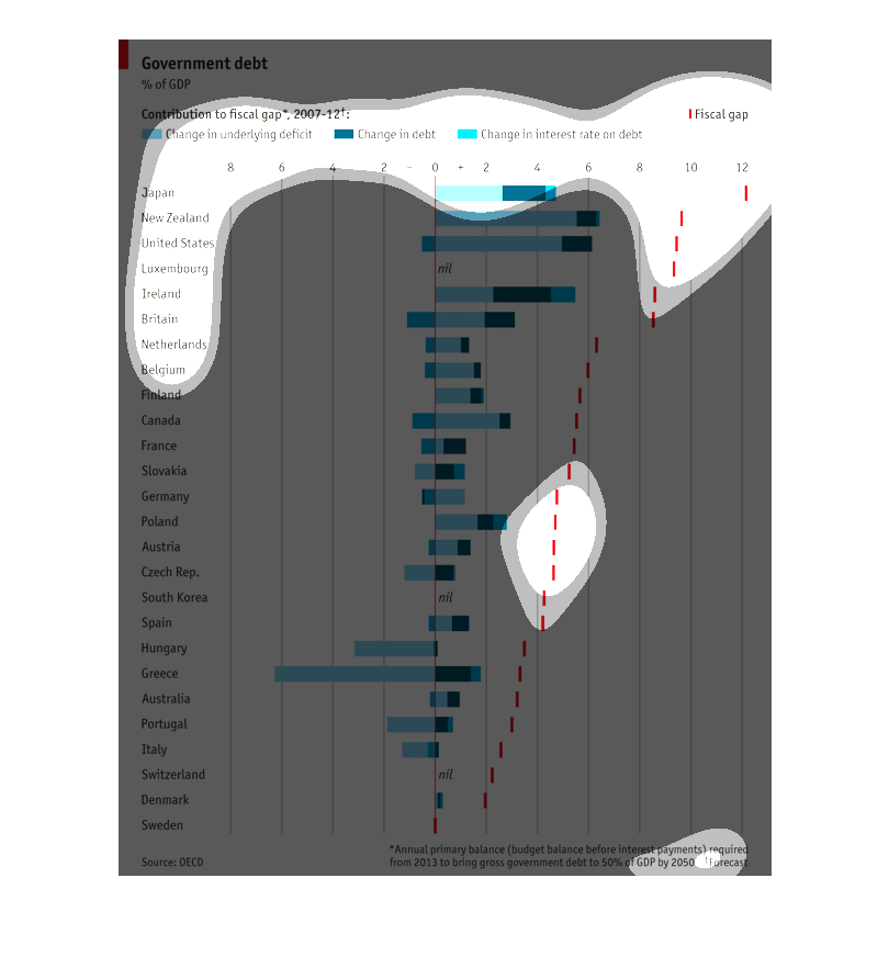
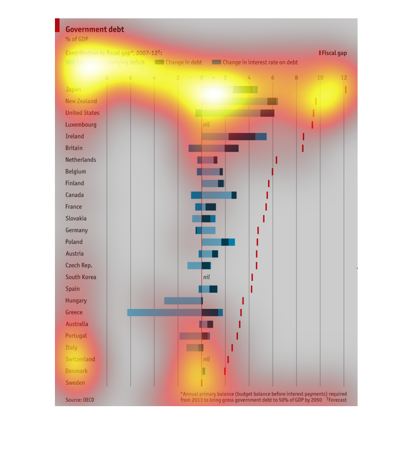
This bar graph is shows the percentage of GDP in relation to government debt for various counties
around the world with Japan at the top and Sweden at the bottom.   It does this comparison
by detailing on bar graphs the change in underlying deficit, change in debt,  and the change
in income rate on the debt.
This chart shows the government debt attained by the most relevant countries in the world
today. The details on the chart include the interest rate on the debt, the change win debt
and the fiscal debt. This chart is between the time table of 2007 to 2012.
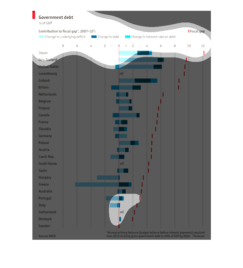
The title of this graph is government debt.  Listed on the left hand side of the graph directly
above a list of countries is a subheading, contributions to fiscal gap.  The information seems
to stem from 2007.
The graph is describing the amount of government debt for various countries. The color of
light blue represents change in underlying deficit, dark blue means change in debt, and medium
blue means change in interest rate in debt. There are also red dashes on the graph which means
a fiscal gap.
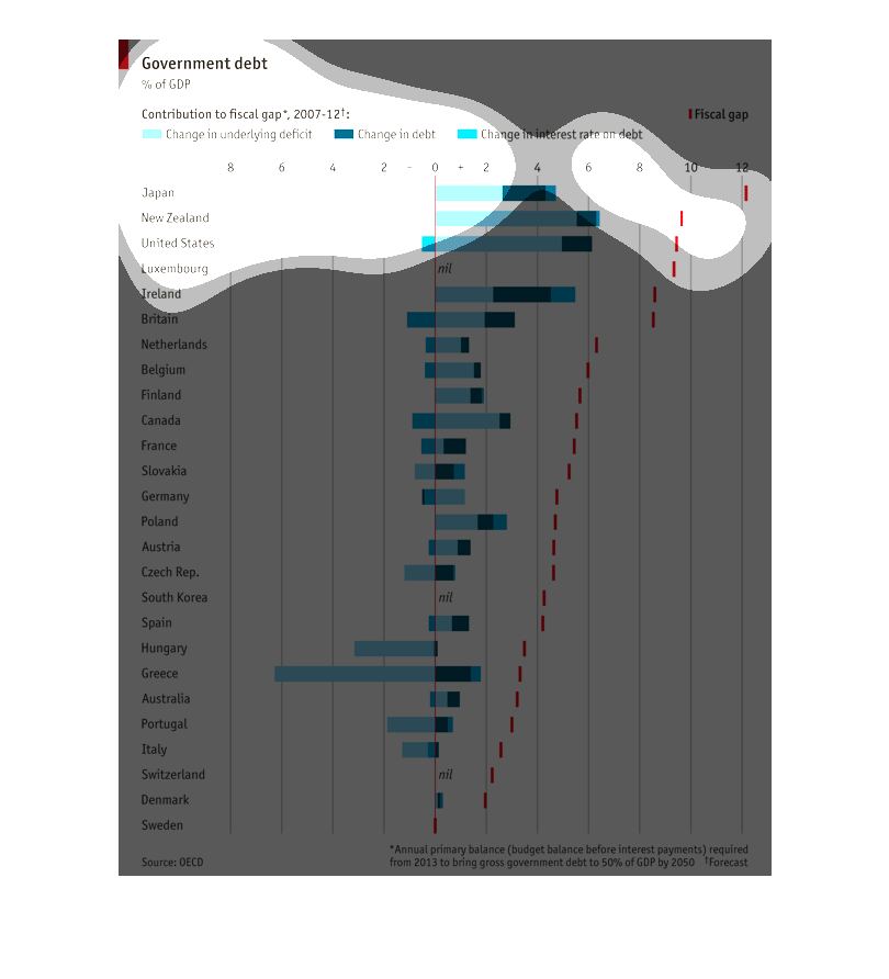
A chart showing the government debt of many nations. The chart delineates the change in underlying
defecit, change in debt, change in interest rate as well as fiscal gap on debt of each country.
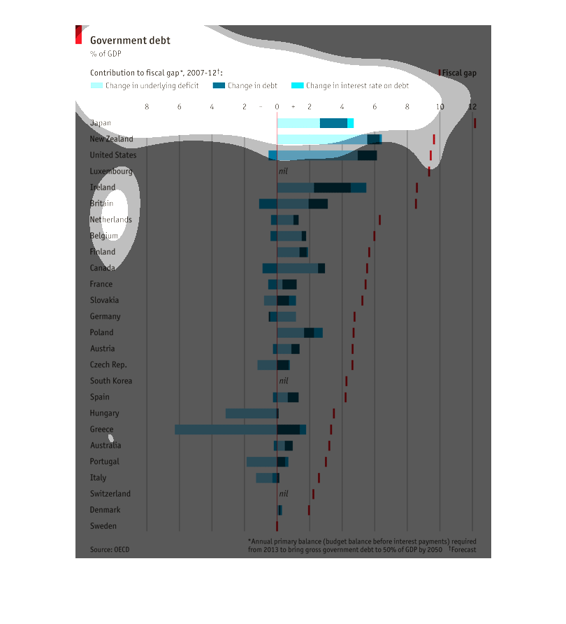
This graph is about the government debt in different countries.  Some countries have the positive
debt.  But some have the negative.  Also, there is red line it is about the fiscal gap
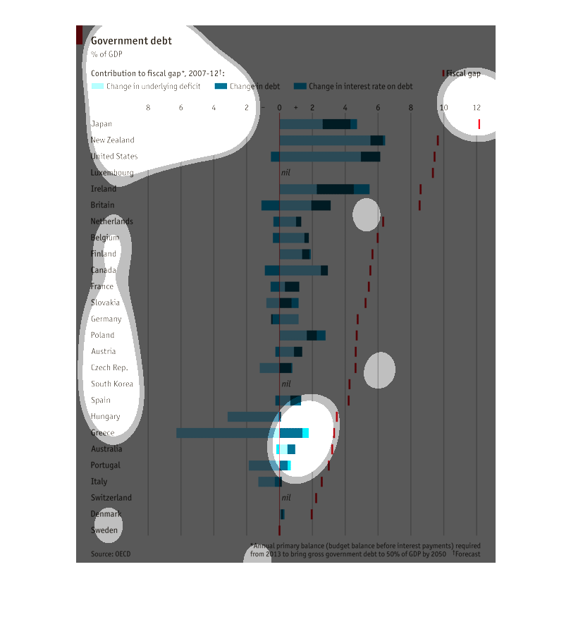
This chart shows the countries with the highest debt.  Japan is at the top of the list with
New Zealand and the United States following behind.  The country with the lowest debt is Sweden.
This graph shows the government dept, %gdp in the form of a vertical bar graph. The light
blue bar shows the the % change in deficit while the dark blue bar shows change in debt while
the medium blue bar shows the change in interest rate on debt. It shows the debt for roughly
30 or so countries.
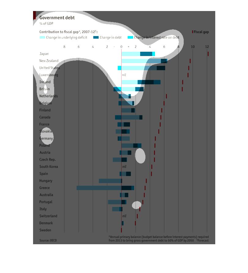
This lists countries, their government debt as a percentage of the GDP from 2007-2012. It
includes change in debt, underlying debt, and interest rates. The lowest percentages are where
we'd assume: Sweden, Denmark, Switzerland. The highest are Japan, New Zealand, and the US.
This chart shows the government debt of several nations, charting the change in underlying
deficit, the change in debt, the change in the interest rate on the debt, and then the fiscal
gap between them.
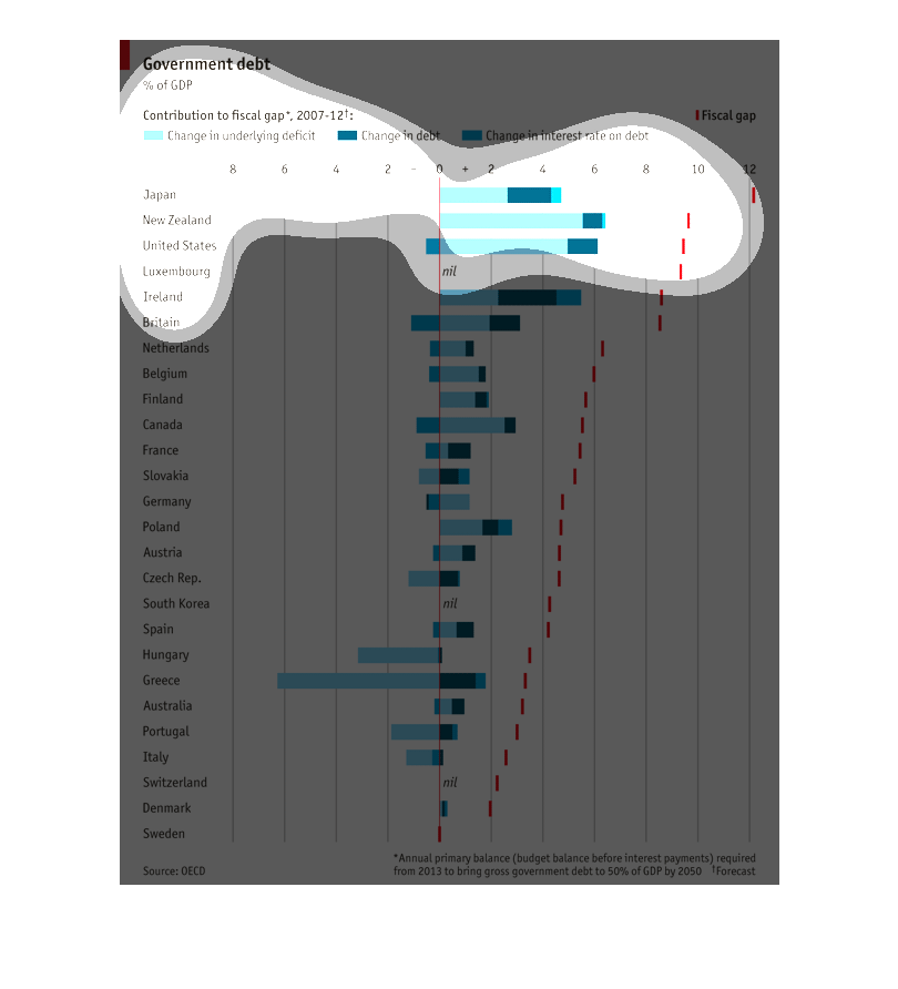
This chart seems to be comparing the amount of Government Debt, several countries have. It
also seems to be indicating the interest rates of their loans. There also seems to be a fiscal
calendar on this graph.
This is a graph showing government debt. The graph bars are dark blue, blue, and light blue.
The graph demonstrates debt from multiple countries from around the world.
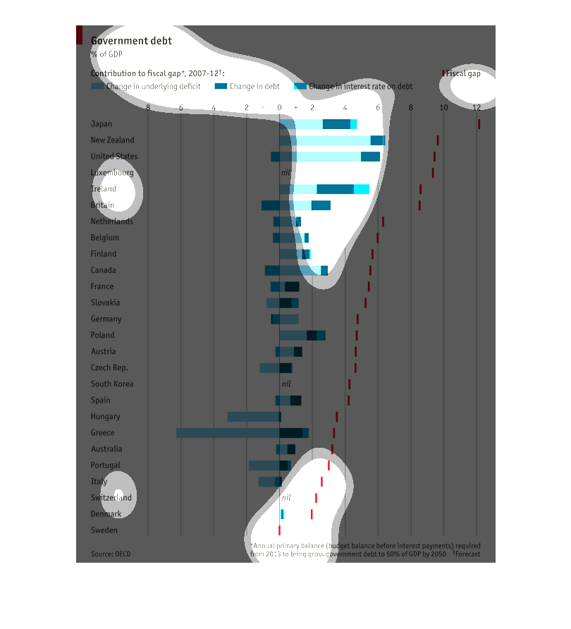
The chart shows change in government debt as a % of GDP for many countries, allocated by the
source of contribution to the fiscal gap from 2007 - 2012.  The source could be change in
underlying deficit, change in debt, or change in interest rate on debt, and total fiscal gap
is also shown. Countries including Japan, New Zealand, the US, Luxembourg, Ireland, and Britain
have the largest fiscal gaps, with change in underlying deficit being the largest component
of change in government debt.  For many other countries, change in underlying deficit was
also the primary cause for change in government debt.  Sweden, Denmark, Switzerland, Italy,
and Portugal had the smallest fiscal gaps.