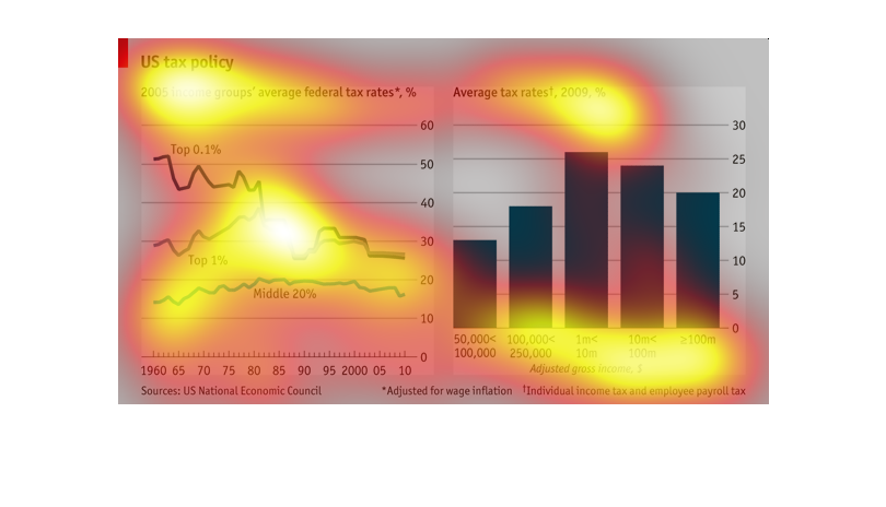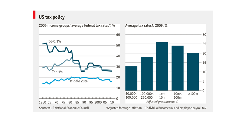
There are two graphs, of taes in different economic classes. They show that the middle class
is taxed unporportionately high in comparison to the upper class. The taxes of the upper class
have gone down over the years, while it has remained the same for the middle class.
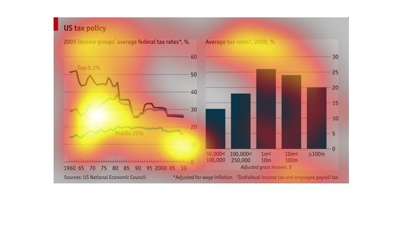
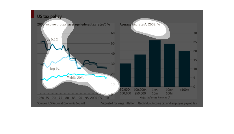
This graph is explaining how different social classes of people are taxed compared to one
another. It shows percentages and how they differ over time.
US tax policy 2005's group average for the federal tax rate compared to the US tax policy
2009's group average for the federal tax. From 1960 until 2010 the trends seem to of taken
a dive.  Then the next chart shows gross household income has raise substantially.
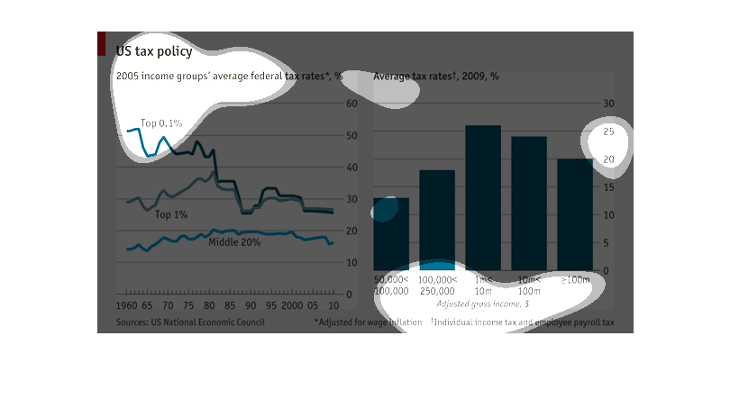
The US tax policy groups of federal tax rates in a tax bracket.for the year 2005. The data
is illustrated in a line graph and in a bar graph. The amounts seem to vary in the line graph,
but in the bar graph, the amounts are close

US tax rates in 2005 and 2009 are compared on this chart. The 2005 income groups' average
federal tax rates are adjusted for wage inflation. The 2009 group includes payroll and indvidual
income tax.
This is a compilation of two graphs for average tax rates, one in 2005 detailing federal tax
rates in the form of a connected scatter plot, and one in 2009 as a bar graph just showing
"average tax rates" without governmental level specification. Percentage (y-axis) is listed
on the right side of the graphs. The x-axis of the bar graph shows adjusted gross income but
the x-axis of the scatterplot is not detailed.
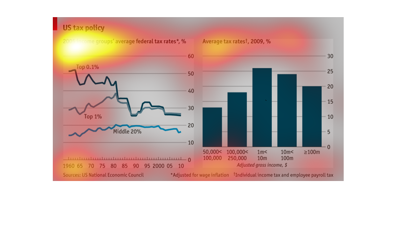
this is for US tax policy focusing on 2005 income groups average federal tax rates. it shows
tax rates have been falling for the top 1% as the middle 20% stays flat
This is an image on US tax policy. It shows the 2005 income groups' average tax rates. The
tax rates appear to be declining for the top one percent and remaining mostly steady for the
middle twenty percent.
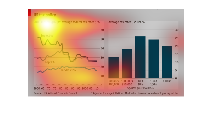
A chart depicting US tax policy showing the average tax rates for the last few decades. It
shows that the top rate has shown a steady decline with some sharp drops.
This graph details US tax policy. Covers 2005 income groups' average federal tax rates. Graph
also shows a 50 year range adjusted for inflation. Other graph details adjusted gross income.
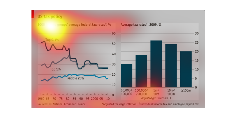
A graphical representation of US tax policy in 2005 and 2009.  The graphs show tax rates based
on income. Income for the right graphs goes from 50,000 yrly to over 100 mil yearly. In the
median incomes where tax rates appear highest.
This image shows the average tax rates of income groups from 2005 on the left, and the same
information for 2009 on the right. The left is a line graph, and the right is a bar chart.
The line graph may be incorrectly labeled, because the x axis is years from 1960 to 2010,
and it shows the rates of the top 0.1% plummeting.
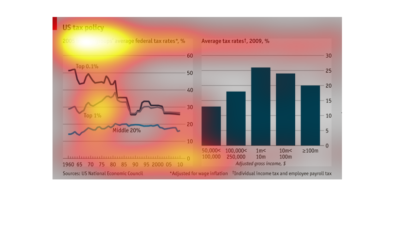
This is a graph detailing United States tax policy and compares the 2005 income groups average
federal tax rates to the 2009 average tax rates for these groups.
The image describes trends among taxation and time. The line graph describes the decline of
the top 1% of tax groups declining as time goes on. The second bar graph shows tax rate by
gross income.
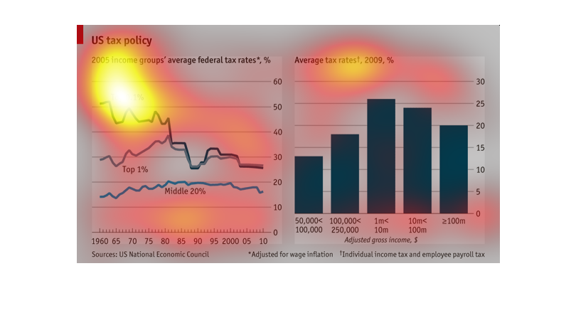
These two images correlates income tax rates between the classes (top 0.1%, top 1%, middle
20%). Tax rates for the wealthy steadily dropped while the middle class tax rate increased.
The bar graph reinforces this by showing its 2009 data on taxes for the middle class have
increased considerably than the line graph of 2005's tax rates.