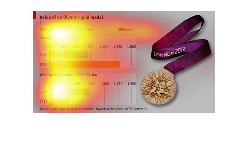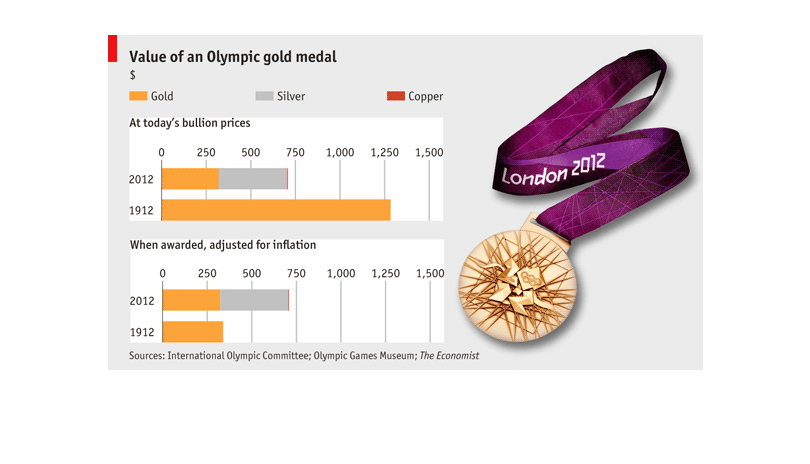
The graph shows the value of an Olympic gold medal.  It compares the medals given in 1912
to the medals of 2012.  In general the medals from 1912 would be worth more now, than the
current ones, but in today's price cost more than in 1912.
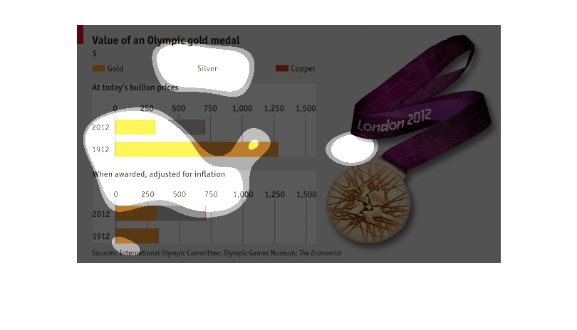
This chart is designed to show the value of an Olympic gold medal. At today's bullion prices,
a medal from 1912 has a significant higher value than one from 2012 seemingly due to the composition
of the medal itself. Comparing the two medals with an adjustment for inflation, the opposite
appears to be true.
The value of an Olympic gold medal. It compares the actual cost of the metal for the gold,
silver and copper medals bullion prices from 1912 to 2012 and it goes from 0-1500.
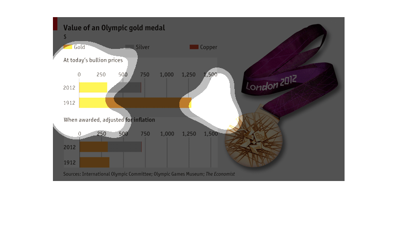
This figure is portraying the value of Olympic gold medals using bullion prices. The time
period covered is from 1912 to 2012. The charts are also adjusted for inflation.

This shows the "value" (hah!) of an olympic gold medal at today's bullion prices, comparing
2012 to 1912. In this case, gold medal were far more expensive 100 years ago. But when adjusted
for inflation, all three medals remain about the same.
The chart shows the value of an Omplyic gold medal. The chart accounts for increases in inflation.
 The values of the medials have decreased over time.
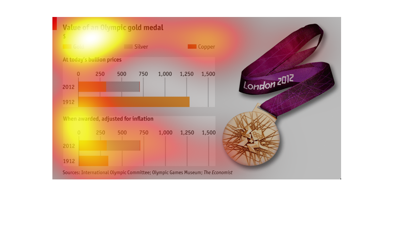
The image shows the value of an Olympic gold medal in 2012 vs 1992. The 1912 Olympic gold
medal would be worth a little over $1250 today, whereas today's Olympic gold medals would
only go for about $300. It also shows values for silver medals and copper medals.
This chart describes the value of Olympic gold medals. Today's bullion price for gold is much
less than it was in 1912, but when adjusted for inflation the price is virtually the same.
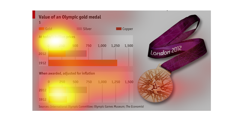
This image illustrates the value of the bullion in each olympic gold medal. It also adjusts
for inflations and shows two different representations in 1912 and 2012.
Value of an olympic gold medal at today's bullion prices: 2012 = $300 1912=$1,250  Value when
awarded (adjust for inflation): 2012 = $300 1912 = $300
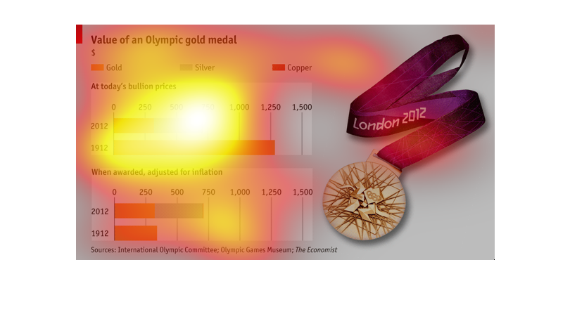
This bar graph shows the value of an olympic gold, silver, and bronze medal in 1912, and 2012,
respectively. A second graph also shows the value for a each medal in each year when adjusted
to inflation. It can be seen that numerically the prices have decreased dramatically, at least
for gold, but when adjusted for inflation the change in price is not so dramatic.
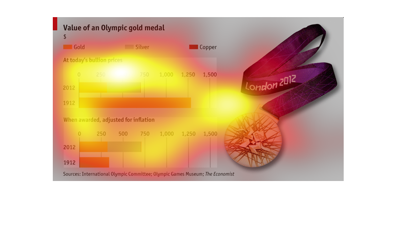
The bar graph shows what the value of an Olympic Gold Medal is worth in 1912 versus 2012 while
comparing that value to inflation of currency. The value of the gold medal has decreased tremendously
over time while inflation has increased.
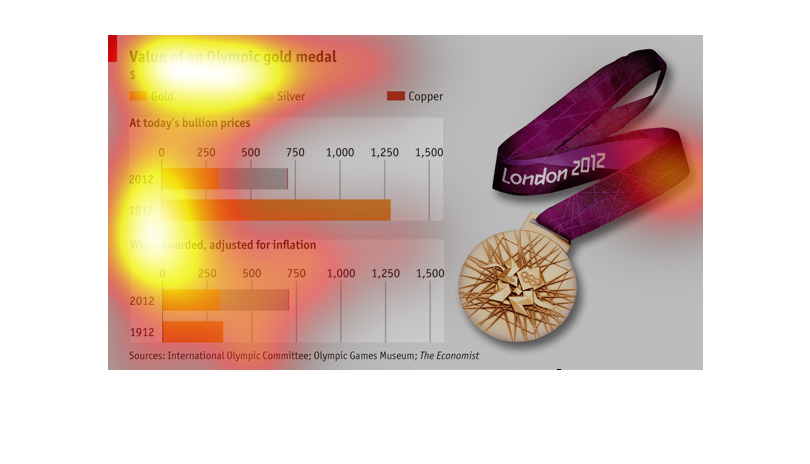
On this graph, the value of an Olympic gold medal from 1912 and 2012 are compared. The chart
also looks at the the value of silver and copper and adjusts for inflation.