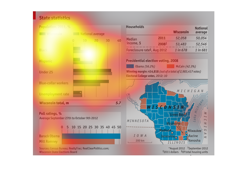
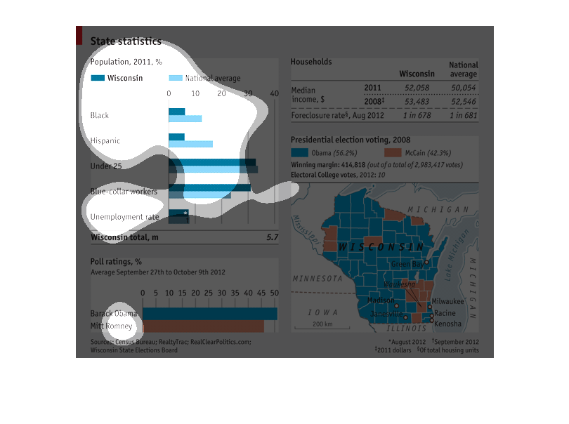
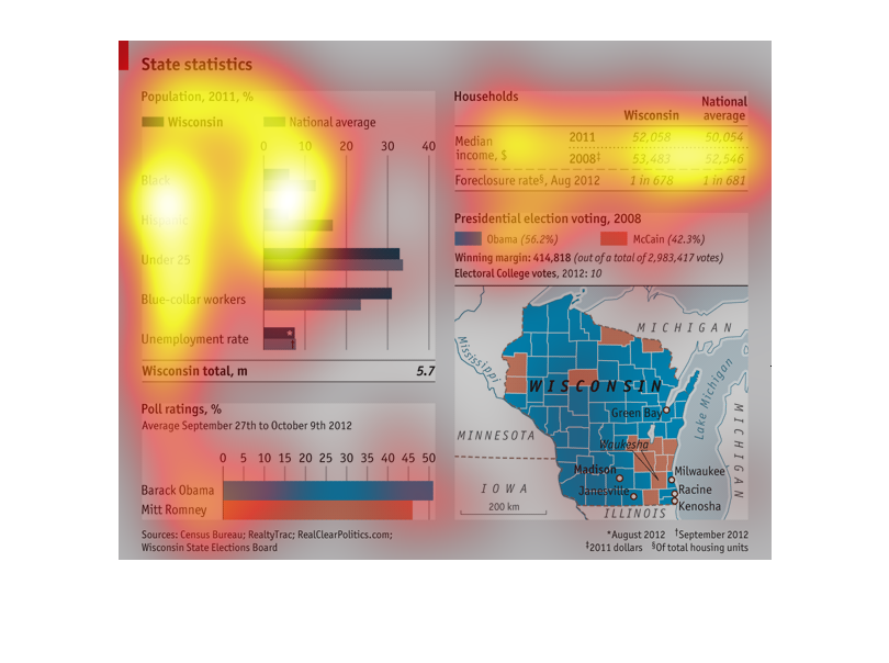
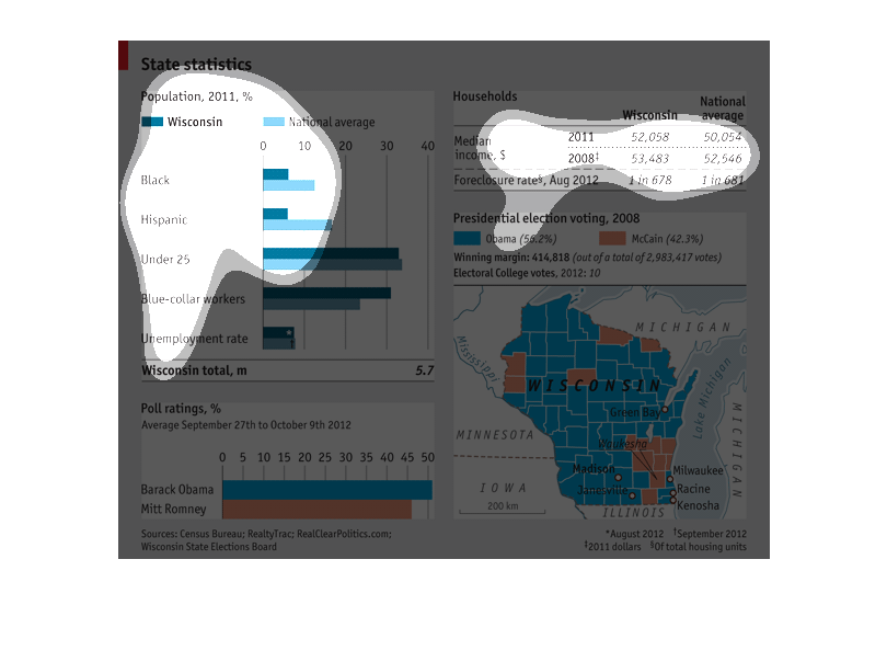
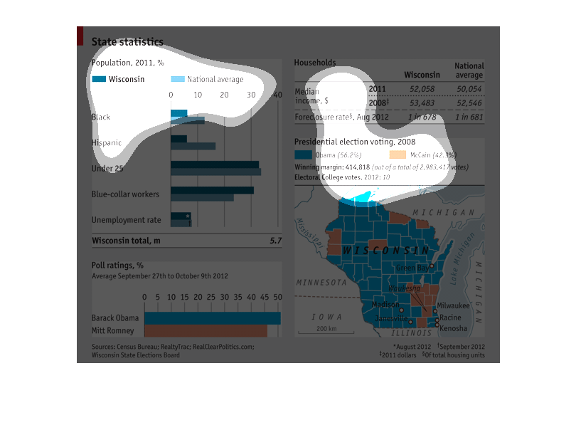
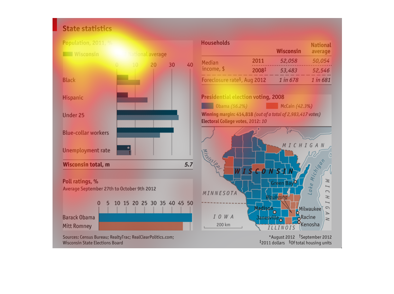
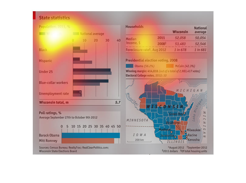
This image displays different statistics in Wisconsin. It compares Wisconsin's demographics
to national averages and then gives information on household income how Wisconsin votes. Overall,
Wisconsin is less diverse than the nation as a whole and tends to vote for Democrats in Presidential
elections.
This Image shows many different types of statistical data, including politcal data, from the
state of Wisconsin and also compares it to the national average.
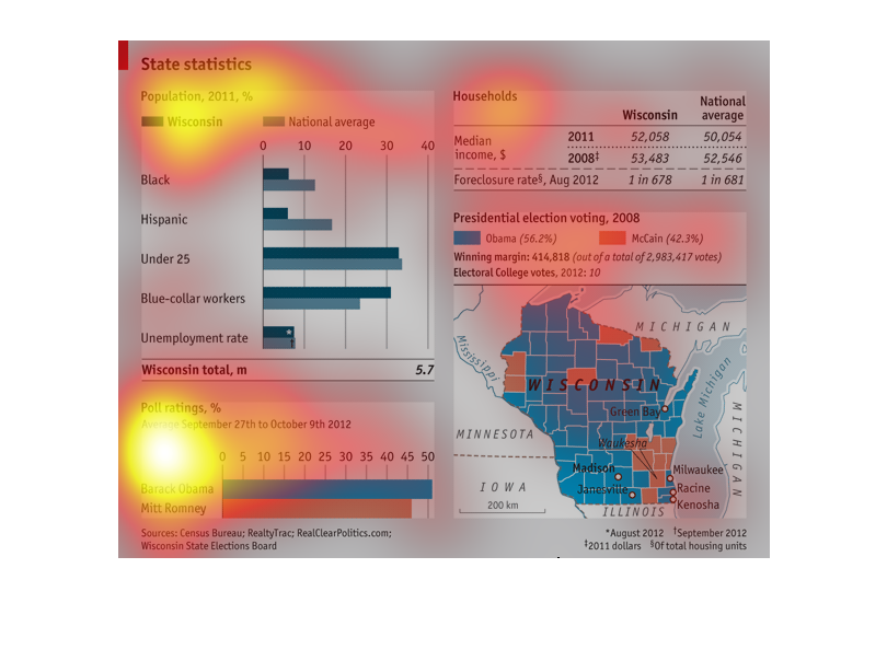
This graft is used to describe several different aspects. The first statistic describes the
population statistic of the state of Wisconsin as well as other demographics in including
socioeconomic statics and race. The image also tells who voted for McCain vs Obama
This is a series of statistics outlining voting trends in the state of Wisconsin. There is
a map that has broken the state up into counties and each county is highlighted in colors
that represent voting trends. It shows that most of the state (well over 50 percent) voted
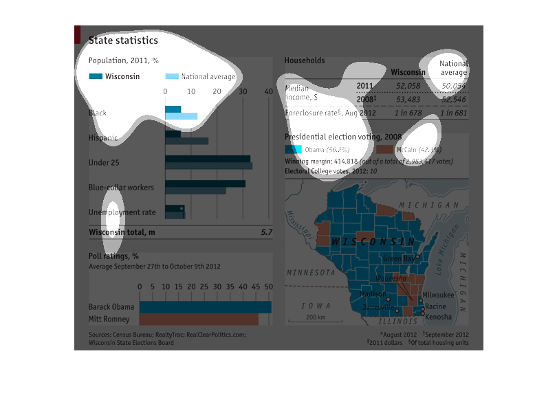
for Obama instead of McCain in 2008. The graph above it compares the household income in
Wisconsin to the national average in 2008 then again in 2011. The graph on the top left, outlines
the different ethnicities in the state of Wisconsin compared to the national average. It
also shows blue/white collar workers, unemployed persons, and those who are under the age
of 25. At the very bottom left, there is yet another graph that compares the poll approval
rating of Obama and Romney.
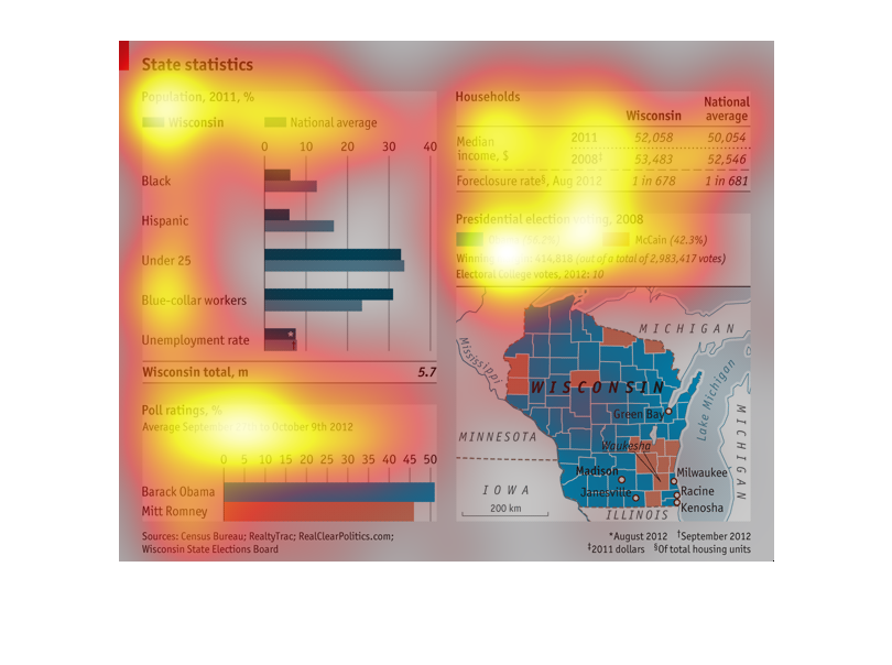
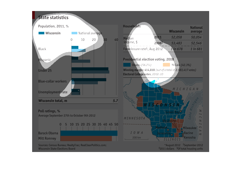
This chart appears to be showing the statistics of the state of Wisconsin. It shows the population
of the races against the national average, who voted for which presidential candidate, the
population density of various cities, income and other stats.
This image includes state statistics for Wisconsin. There is a table of information for Wisconsin
household median incomes vs the rest of the United States. There is a bar graph that compares
population  percentages vs the national average. There is a table with presidential voting
results in 2008, and a poll rating for Mitt Romney and Barack Obama for 2012
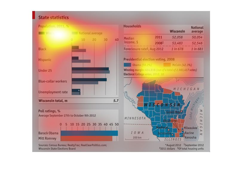
This graphic is showing the relationship between Wisconsin and the national average for various
financial, geographical, and voter demographics.  There are 4 different divisions on this
graph: how people polled in 2012 with Obama vs. Romney, which country voted for each candidate
(in 2008), population breakdown, and median income/foreclosure rate.
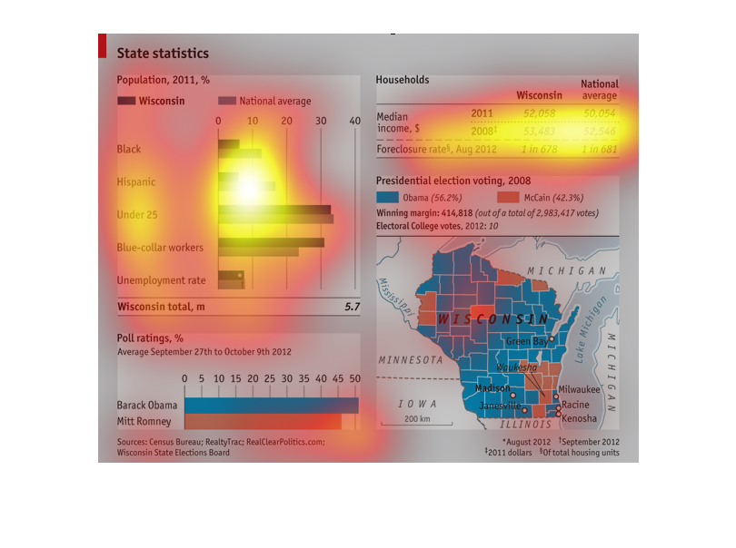
This is a chart of the economic status of the state of  Wisconsin in 2011, along with poll
ratings for the upcoming presidential candidates. Obama led by a significant margin.
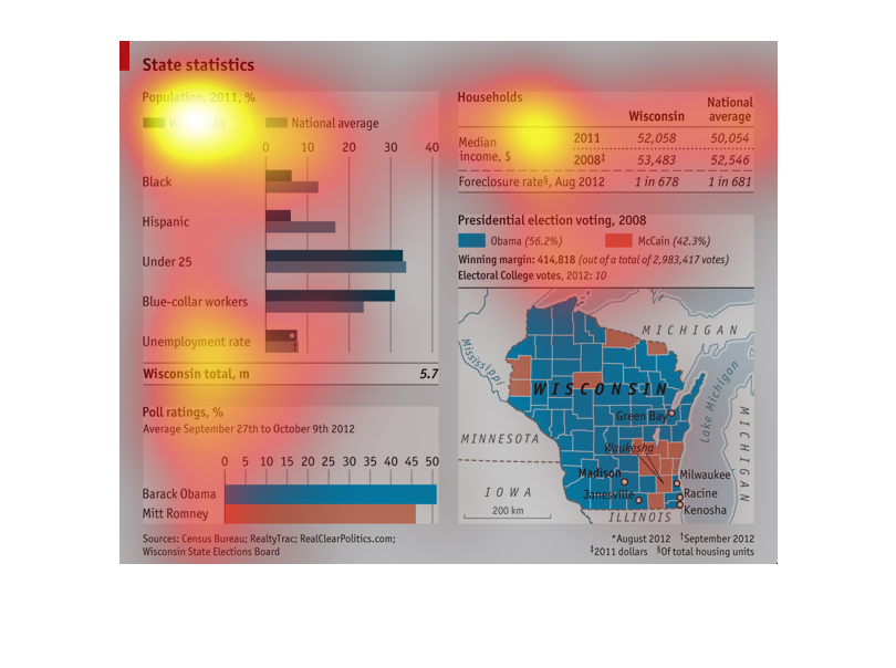
The image displays several different charts of statistics for the state of Wisconsin. The
various graphs display different age and racial group proportions and work force, presidential
support, and average wages as compared to the national.
This is a graph showing state Statistics. It shows which states have the highest population
of certain kinds of people in 2011.It also has average incomes. It shows the presidential
election percentages from 2008. The poll rating percentages are also included.
This graph details the presidential elections and demographics of Wisconsin for the 2008 and
2012 presidential elections. The majority of the population, and state, voted for Obama. The
population make up of Wisconsin is overly blue collared, slightly more than the national average,
while the minority populations are smaller than the national averages. The median income is
above the national average in Wisconsin.
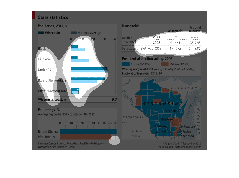
This graph shows the state statistics for Michigan. It  shows a population break down by race,
blue collar workers, unemployed, and age. It also shows an average household income by years
and number of foreclosures.  Finally it gives a break down for the last presidential election.
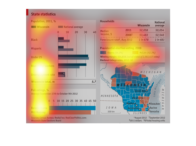
The chart gives state statistics for Wisconsin in 2011. Included are election results by county
(color coded red and blue), population broken down by race as compared to national averages.
Sources are the US CEnsus bureau and Wisconsin State elections board
The graph is about State statistics. The year is 2011 and it shows a percentage factor. There
are multiple demographic collections, ranging from black, hispanic, under 25, blue collar
workers, and unemployed. The graph also shows a differnce between wisconsin and the national
average. there is also a median income between the state and the national average. There is
also a presidential vote demographic between obama and McCain. There is also a map that shows
the areas that selected such politicians.
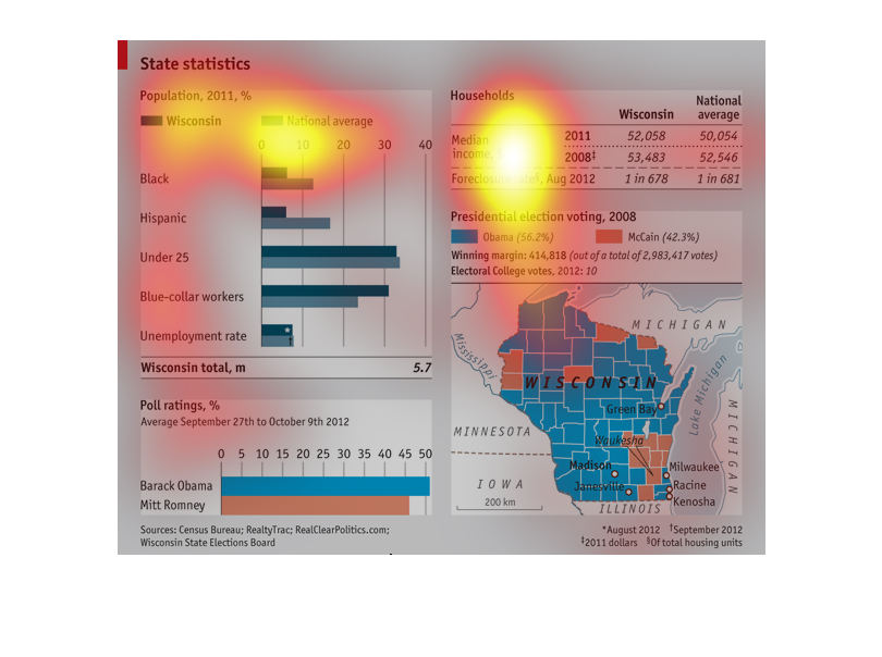
This graphic describes state statistics for Wisconsin in 2011. It had a lower rate of Blacks
and Hispanics than the national average. It had roughly the national average of those under
twenty five, a much higher Blue Collar rate and a fairly average unemployment rate. Poll ratings
showed that they supported Barack Obama somewhat more than Mitt Romney. It also has information
on household Income rates and more on the Presidential election.