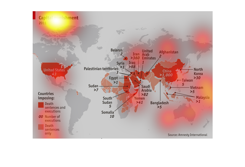
This graph shows the countries that imposed and/or executed people during the year 2011. The
graph includes the number of executions carried out in the countries that executed people.
This image is the countries that engage in capital punishment in 2011 as a global map. It
labels if countries engage in the death sentence, death sentence and execution, and lists
the number of executions that happened in that country.
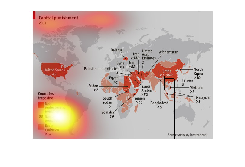
The graph is of a map of the world and illustrates capital punishment.  The United States
shows 43 death sentences and executions and China shows greater than 1,000.
This chart describes and displays the number of capital punishments given out by type and
location all over the face of the planet for the year two thousand and eleven.
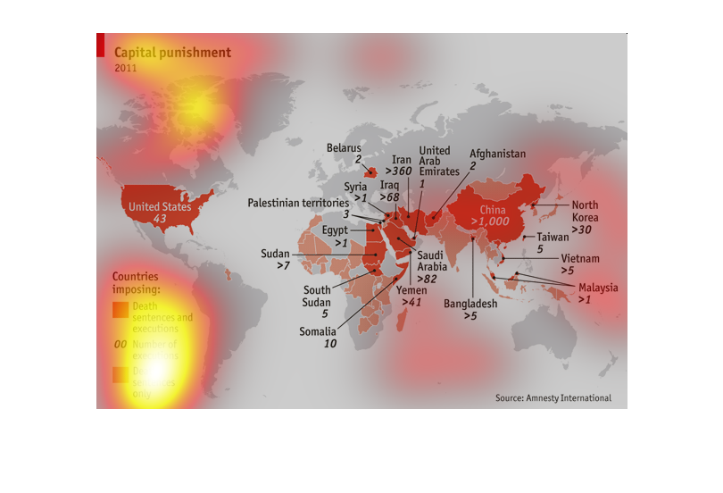
This image of the world map shows 2011 Capital punishment by nation.  Dark orange indicates
a country that carried out Death sentences or executions, light orange indicates countries
with executions only, and bold italiced letters indicate number of executions.  China far
exceeds all other nations with greater than 1000.
This graphic shows which countries partook in capital punishment in 2011 and the types of
capital punishment that were enforced, such as death sentences and executions or death sentences
only. The United States and much of Africa, the Middle East, and Southern Asia used capital
punishment in 2011.
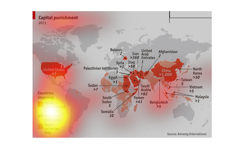
This picture describes capital punishment worldwide in 2011. It shows countries imposing death
sentences and executions. The most is China with over 1000 executions. In comparison the US
had 43.
This graphic displays the nations which impose the death penalty, those that carry out executions
(including the number of executions carried out in 2011). The data source is Amnesty International.
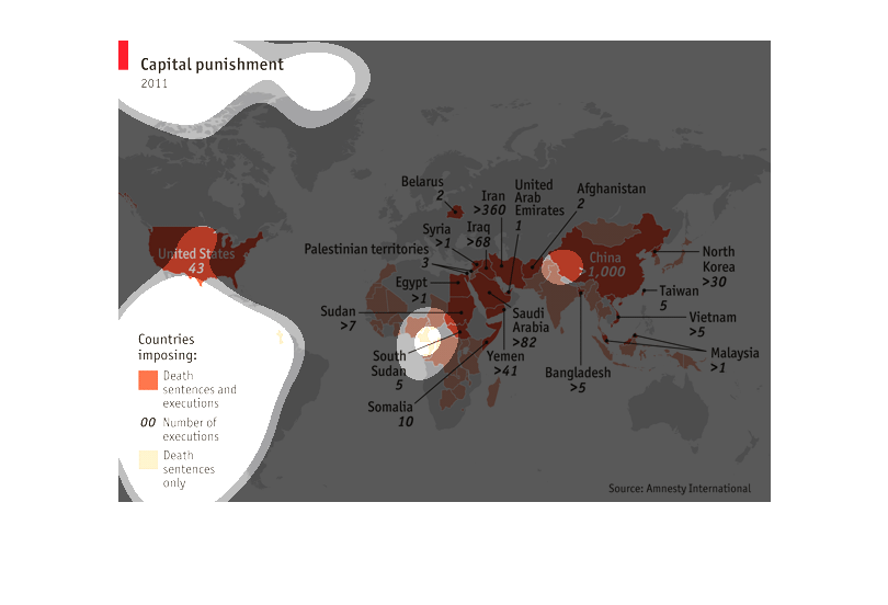
The graphic is laid out on a map of the world, with the death penalty nations highlighted
in light red. These are not labeled and there is not a key indicating which nations they
are. The executing nations are all identically colored in dark red. For each of these nations
a line points away from in on the map to a spot where the name of the country and the approximate
number of executions is listed. There is no data on the relative population size of each
country compared to the number of executions, so it is unclear which nations have the highest
execution rates, only raw numbers. The graphic is somewhat condensed by size and so the relationship
between the nation's spot on the map and the label are somewhat spread apart and not cleanly
organized enough to retain all of the details through the bubble view. You have to keep clicking
back and forth between the map area and where the line leads to obtain the details described
below. It indicates that China has the highest level of executions at over 1,000, followed
by Iran at over 360, Saudi Arabia at 82 and then at fairly close intervals Iraq, the US, North
Korea, and Yemen between 30-50. There is also a set of nations who carry out less than 10
per year including: Somalia, Sudan, South Sudan, Syria, Palestine, Belarus, Malasia, Vietnam
and others.
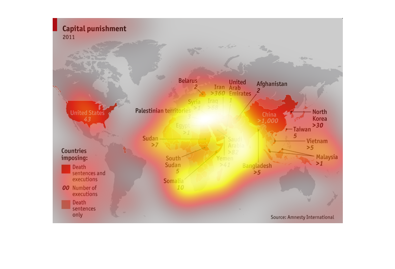
World map showing areas impacted by capital punishment...for each country, the specific area
that employs capital punishment is represented with a color, and indicated the numbers for
both sentences only as well as deaths for the year 2011.
This graph shows Capital Punishment statistics in 2011. It shows which countries improsed
death sentences and executions; number of executions; and number of death sentences only.
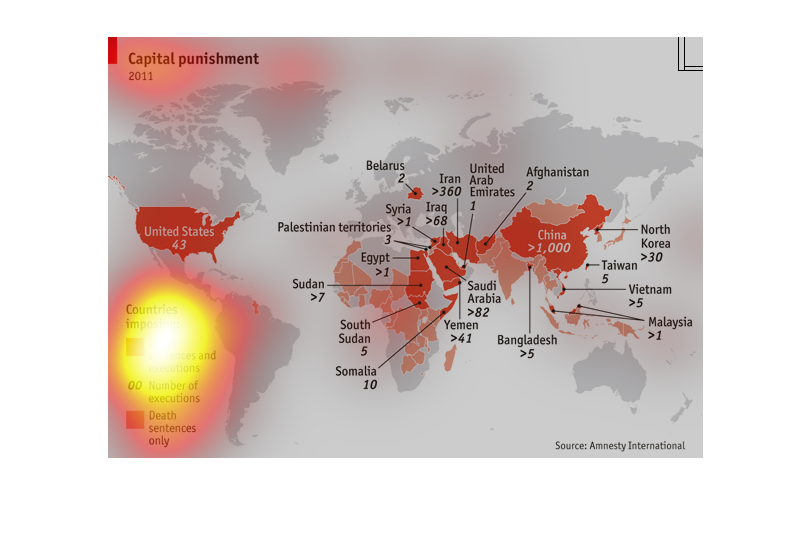
This graph depicts capital punishment around the world. It indicates the number of executions
and capital sentences handed out. The areas of the world that has the most executions is the
east and middle east. China leads the world in capital punishment.
2011's capital punishment statistics are shown by country and with death sentences+executions,
number of executions, and death sentences only.  The highest amount of executions are in China
(3 per day) and Iran (one per day)! By comparison, the US has just 43, less than one per week.
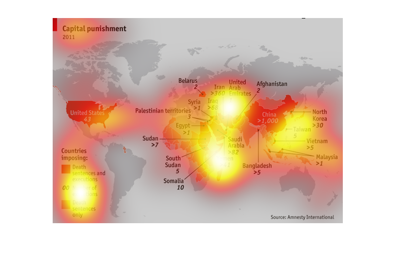
Capital Punishment in the year 2011 for countries of the world graphed on a map of the world
and denominated in total numbers of either executions or sentences.
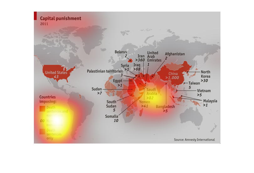
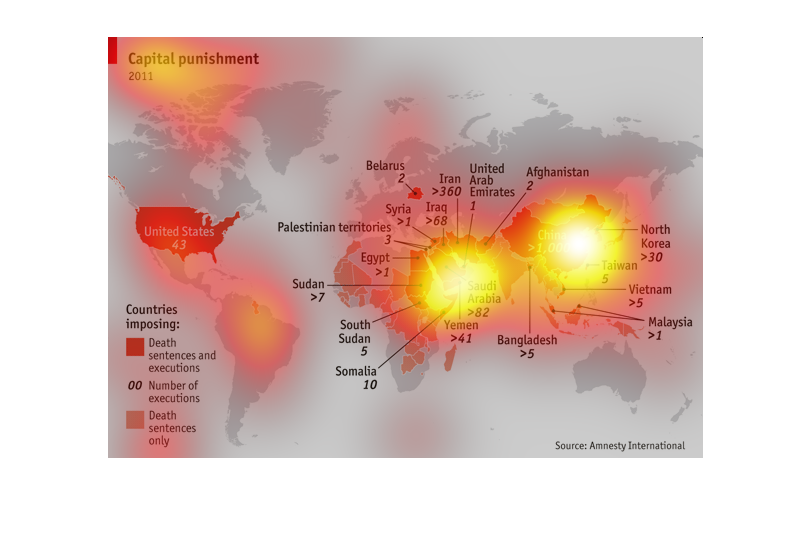
This graph is a heat map of the world highlighting the countries the have corporal punishment.
 It appears the middle East, parts of Asia and the US are the biggestlayers in corporal punishment.