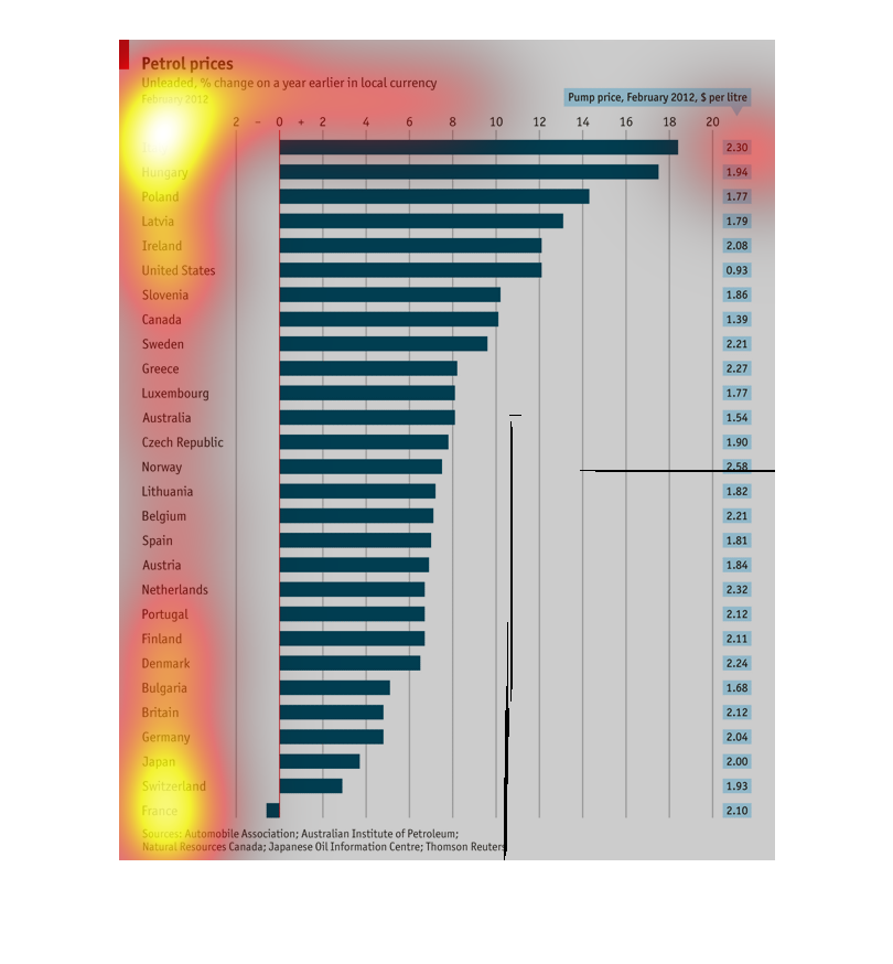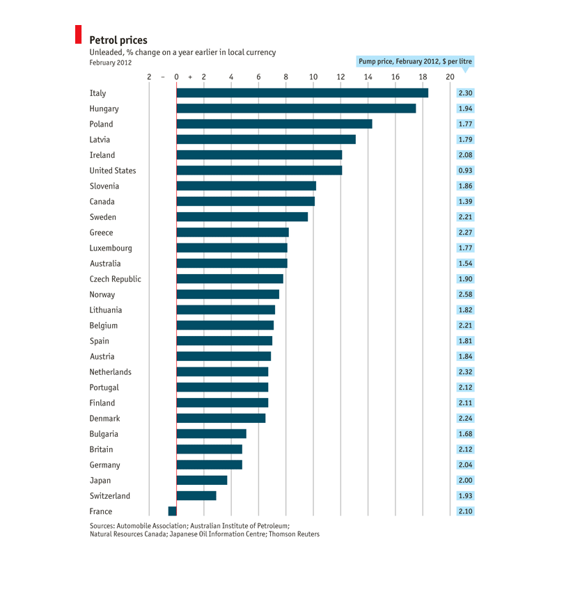
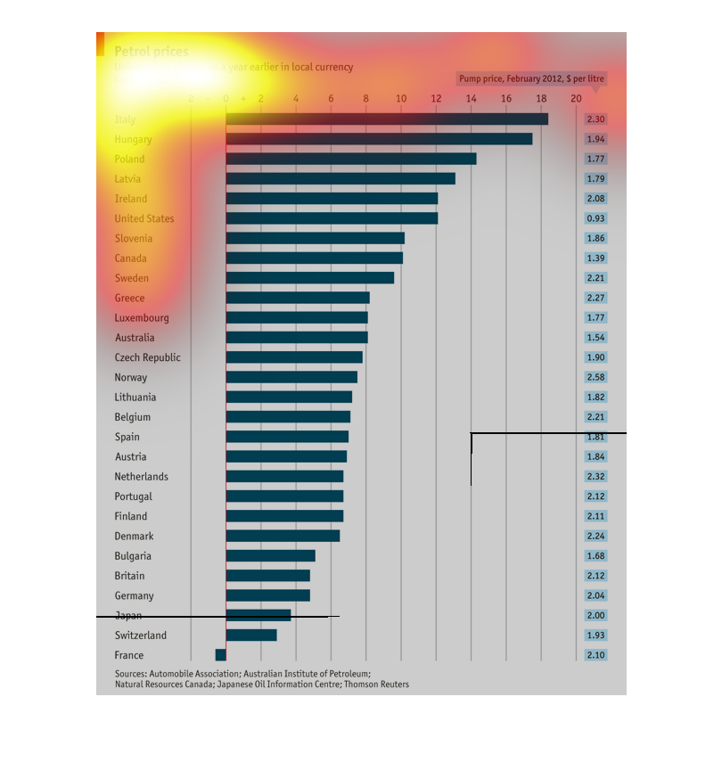
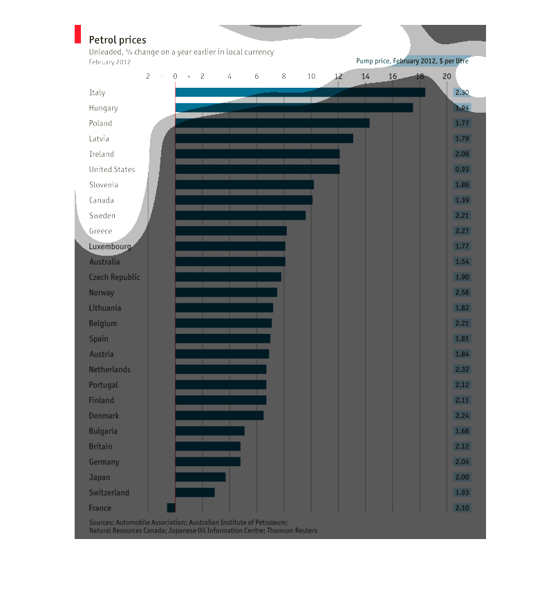
The graph looked at Petro prices percent of change on a year earlier in local currency for
February 2012. It compared various countires such as Italy, Hungary, Poland, Lativia, Ireland,
USA, Canada, etc.

This diagram shows the % change in petroleum prices comparing to the year before (2011) for
different countries in February 2012 with Italy having the highest oil price increase and
France having the lowest increase.

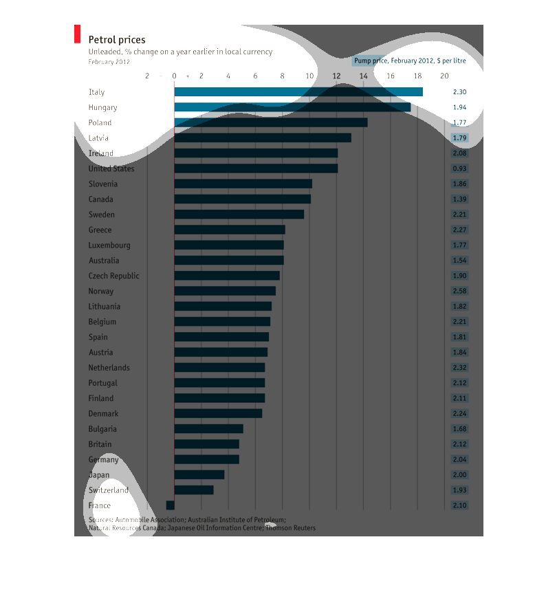
This chart shows the average petrol (gasoline) price per liter across the world. Italy pays
the most for unleaded petrol, and surprisingly, the United States is also very close to the
top of the chart. European economic powers like Germany and Switzerland pay some of the lowest
prices per liter.

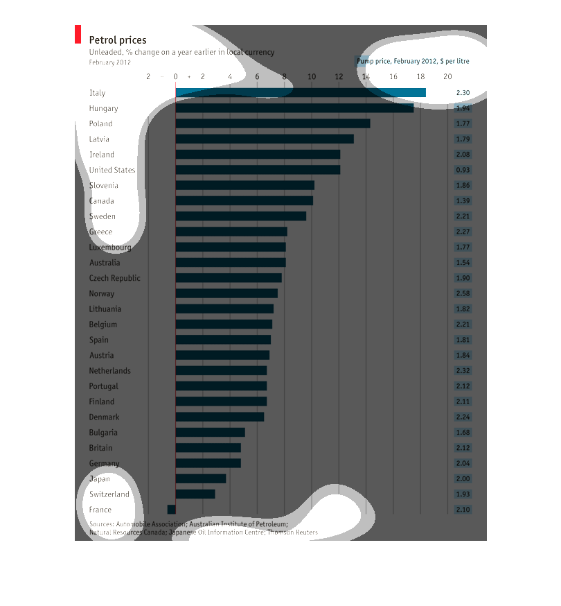
Petrol price changes in February, 2012. There is a list of overseas countries and then a bar
graph of the changes. Italy had the highest change and France had the smallest amount of change.
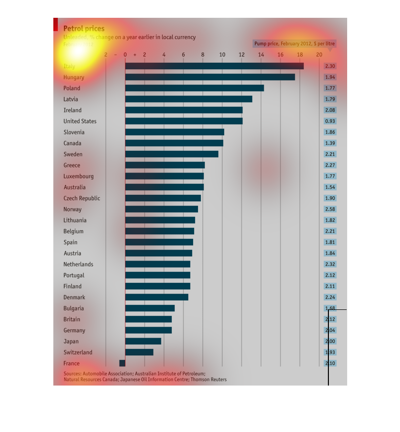
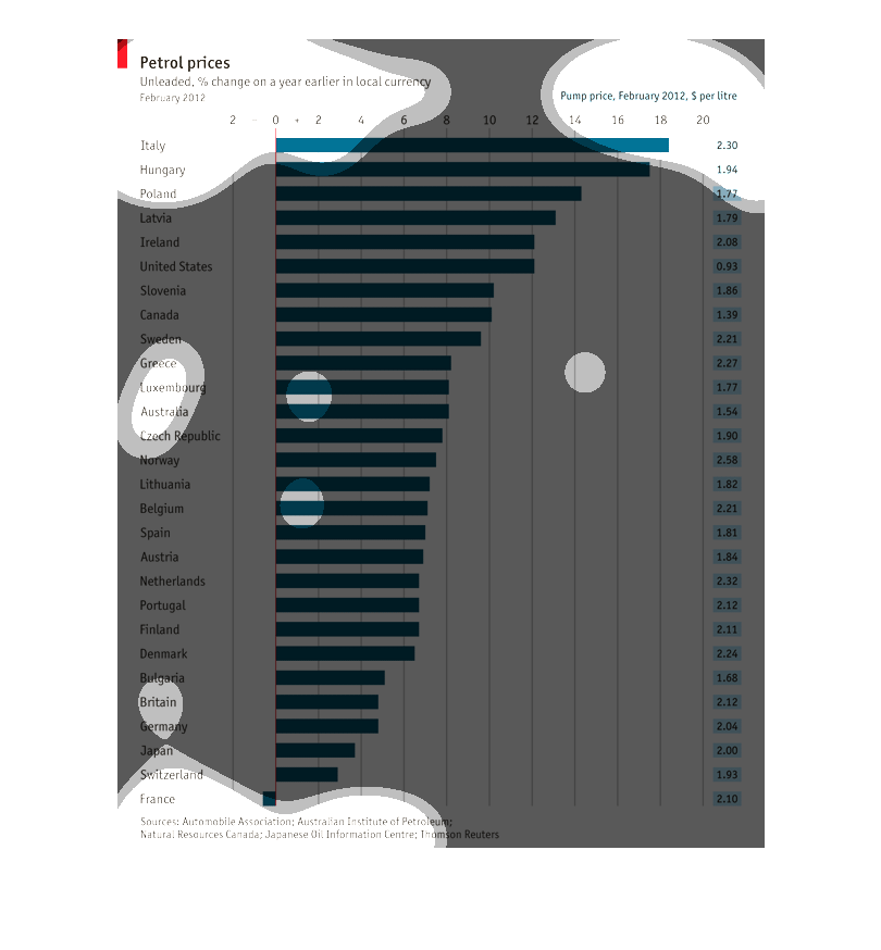
This chart show the Petrol prices of unleaded % change on a year earlier in local currency.
The countries listed are mostly third world countries. Some of the countries listed are: USA,
Slovenia, and Canada.
This is a graph of Petrol Prices throughout large markets in the world.  It is a horizontal
bar graph with each region using the same color bar but with various lengths.
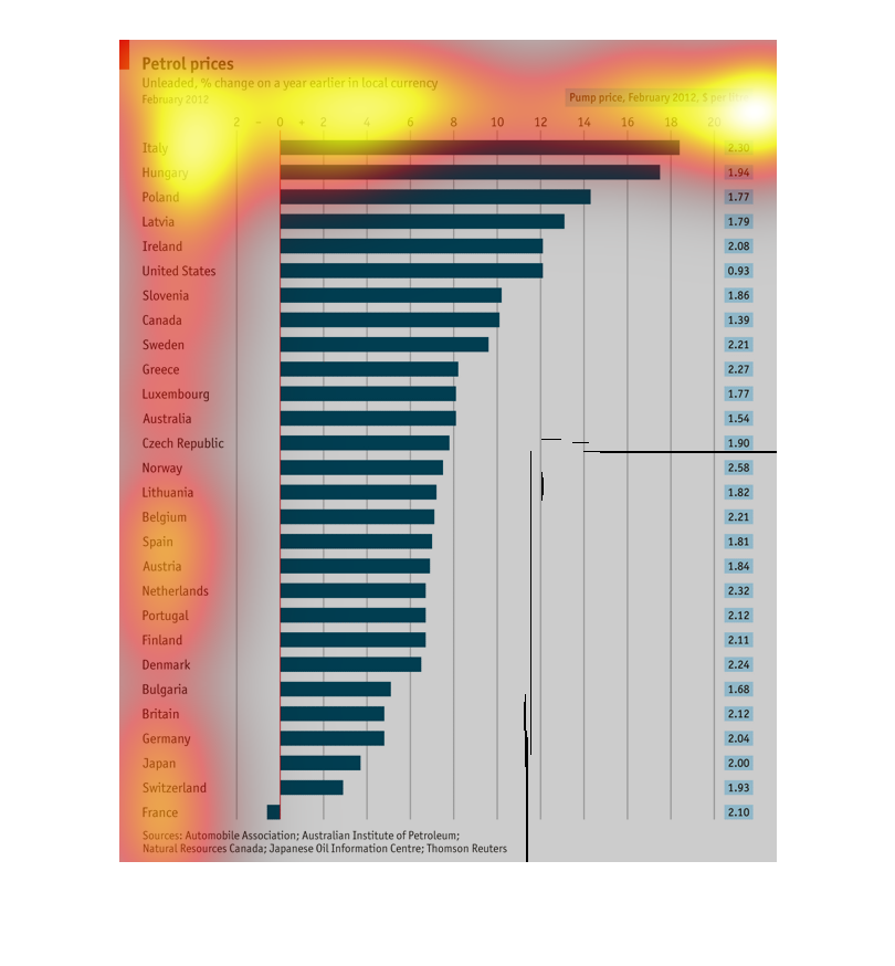
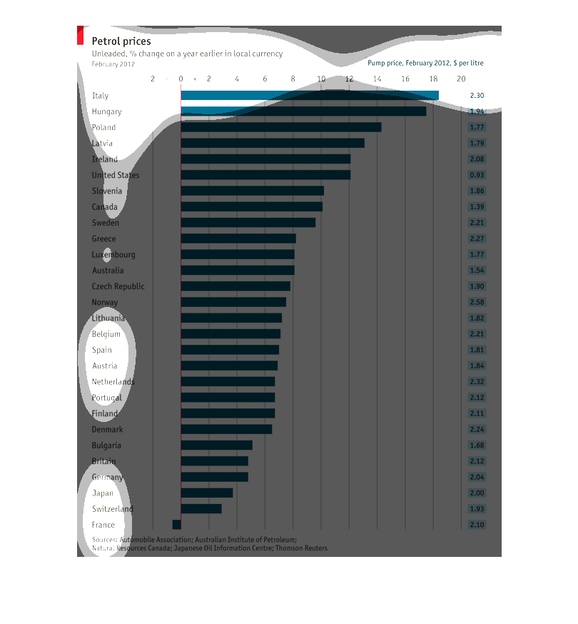
The graph illustrates the Pertol prices of the unleaded % change on a year earlier in local
 currency. The Pump price focus on the February 2012 ($ per litre) and the highest was in
Italy and lowest in France.
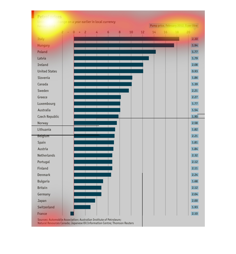
This graph is about the petrol prices in different places in the world. The graph displays
the countries in order from highest prices to the lowest prices oath Italy being the highest
and  France being the lowest.
This graph describes the percent change of petrol prices in different countries.  It includes
such countries as Italy, Hungary, Poland, Latvia, Ireland, United States, Slovenia, Canada,
Sweden, Greece, etc.  The highest petrol price change are in Italy, whereas the lowest price
change  are in France.
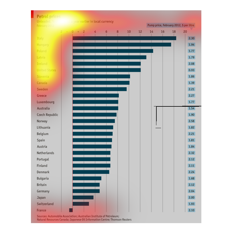
This bar graph depicts petroleum prices in February 2012 by country, it includes price at
the pump in each country's local currency. This graph is for unleaded.
This chart describes and depicts the petrol prices for unleaded as a percentage change on
the previous year in the local currency of several different countries.
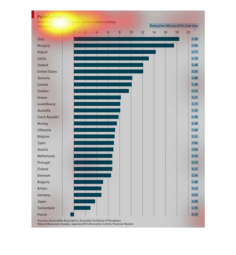
The chart describes percentage change of unleaded petrol prices, as measured in local currency,
as of February 2012. The top few are Italy, Hungary, and Poland.
This graph shows how petrol prices have increased from February 2011 to February 2012 (by
percentage). According to the chart, Italy's petrol prices have skyrocketed, rising 18% to
$2.30 per litre. In France, petrol prices actually dropped from 2011 to 2012, lowering about
.5% down to $2.10 per litre.
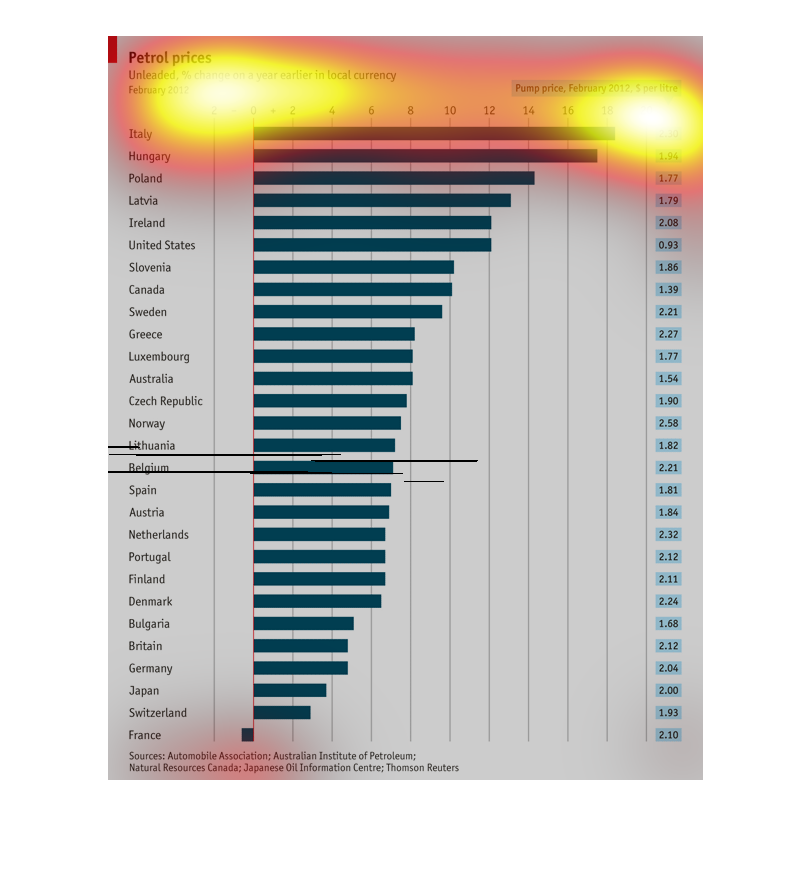
This chart shows the changes in oil prices for the year 2012, and a year earlier. It charts
from 0-20 for various countries such as Italy at the top, US in the top 10, and France at
the bottom.