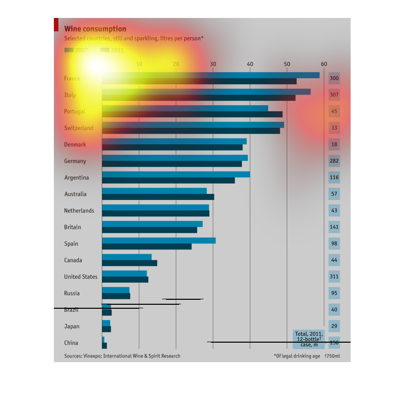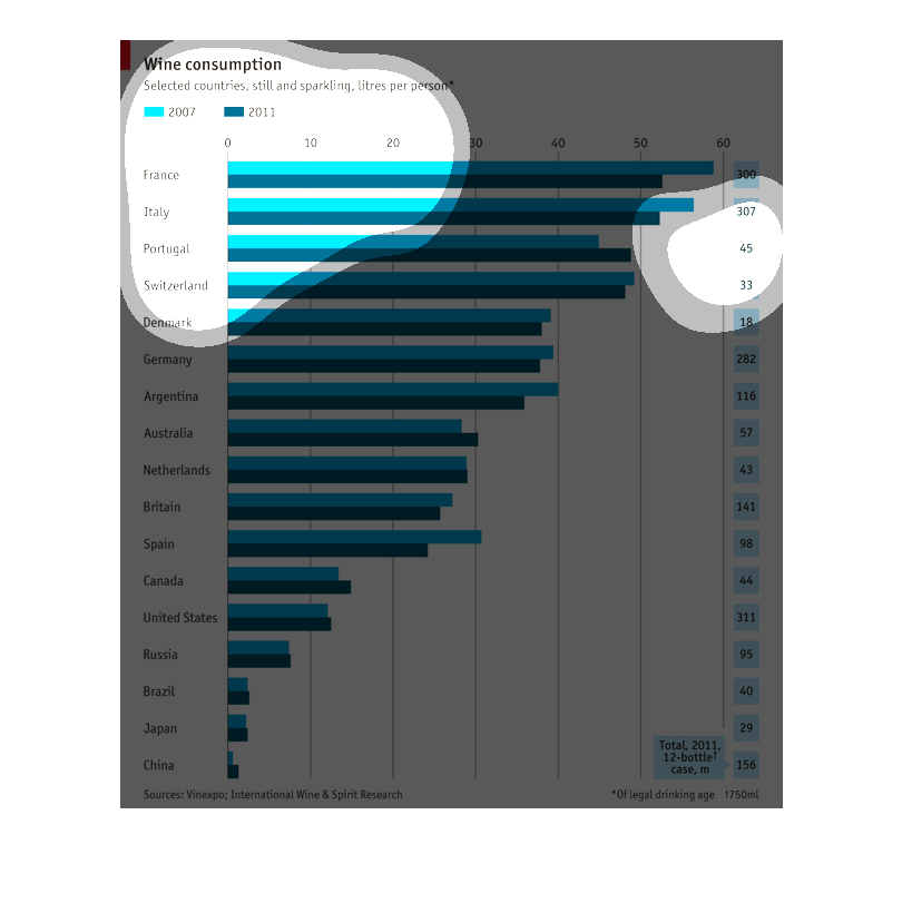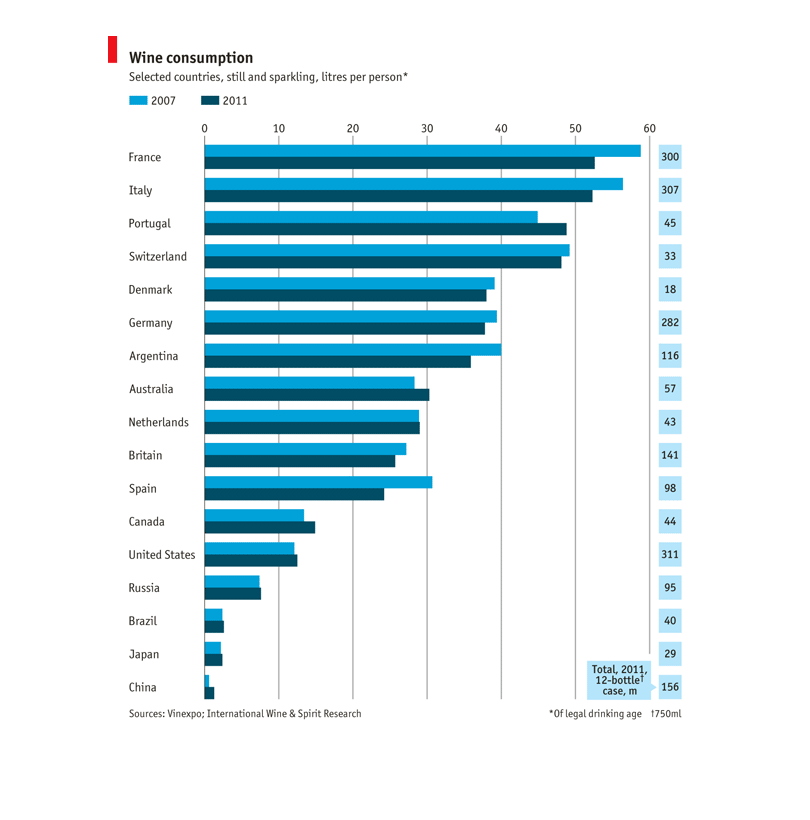
This chart depicts wine consumption in different countries by person by liter. It shows that
France is the highest consumer and China as the lowest consumer.
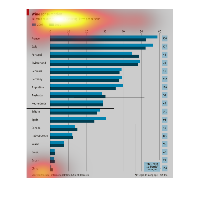
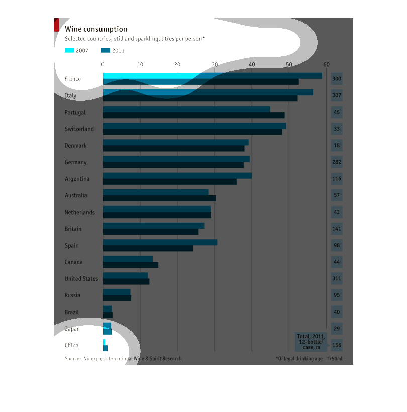
This chart shows the amount of wine consumption throughout the world  based on litres per
person.  This chart includes still and sparkling wines, and includes the years 2007 and 2011.
This graph shows the amount of wine consumed throughout different countries. The types of
wine include sparkling and still wine. The amount of wine is in liters per person. France
and Italy are at the top of the list with most wine consumed.
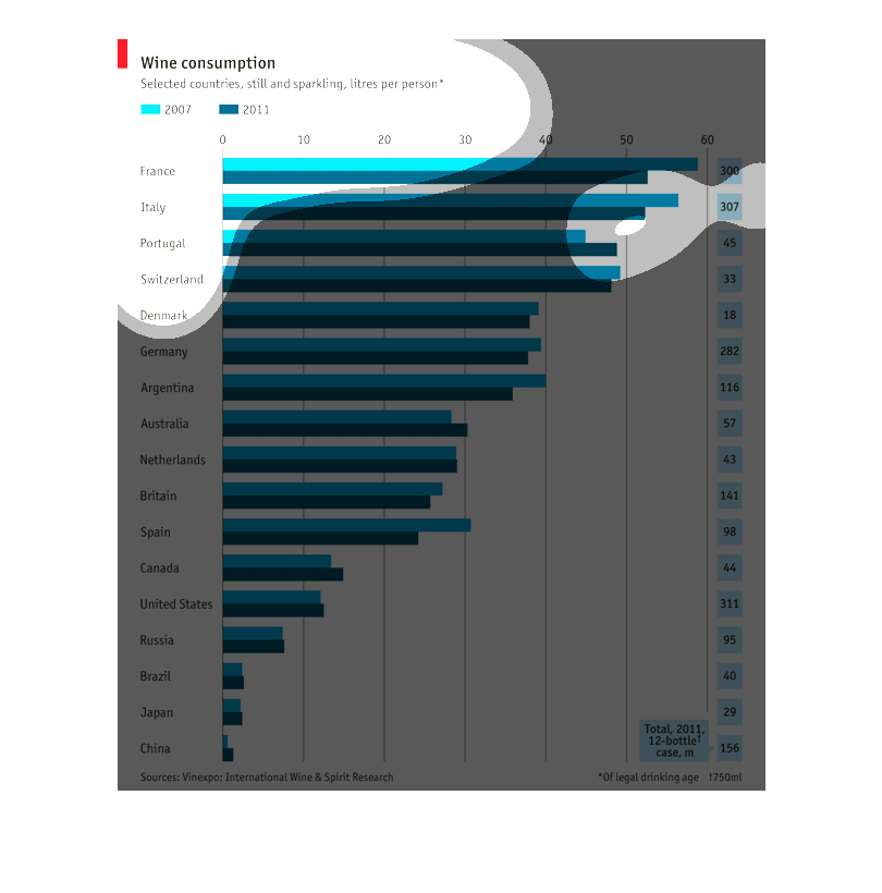
This image shows wine consumption in different countries. France is shown to have the highest
consumption rate while China has the lowest consumption rate.
This is a horizontal bar graph comparing wine consumption in liters per person in various
countries in the years 2007 and 2011. France tops the list. China is in last place.
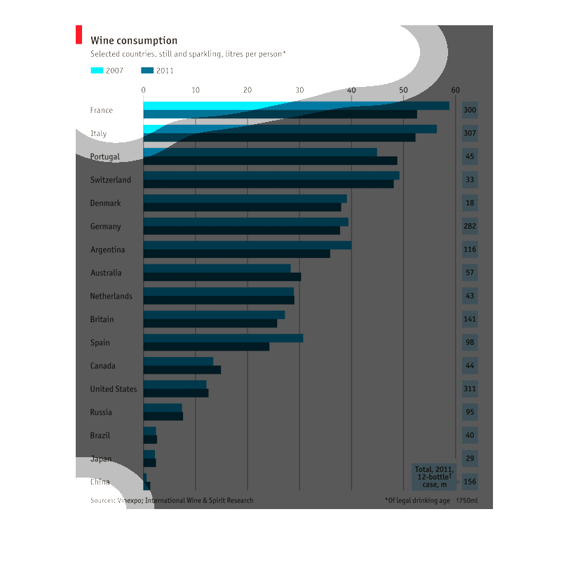
This chart show the wine consumption amount differences in countries from 2007, and 2011.
 Some of the countries listed are Italy, France, and Portugal.
This graph compares the amount of wine consumed per person in liters. It compares two different
years, 2007 and 2011, as well as multiple countries across the world.
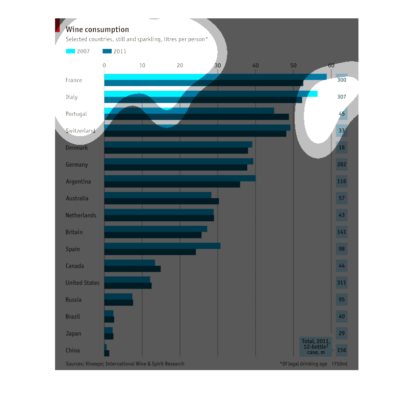
This graph shows the annual wine consumption for various countries. It shows the consumption
in liters per person in the years 2007 and 2011. they wine type is still and sparkling
This graph showcases the total amount of wine consumption of countries in 2007 and 2011, France
being number one with a total of about 55 liters consumed per person in 2011. China has the
least amount of wine consumption for 2011, with about 2 liters per person being consumed.
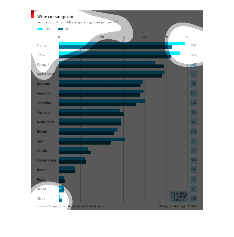
This graph illustrates the amount of wine consumption from certain countries. Of the countries
sampled, France drinks the most wine, while China and Japan drink the least.
This graph describes the wine consumption of eighteen different countries, and compares the
years 2007 and 2011. Both still and sparkling varieties are considered, and the units used
are liters per person. France consumed the most, while China consumed the least.
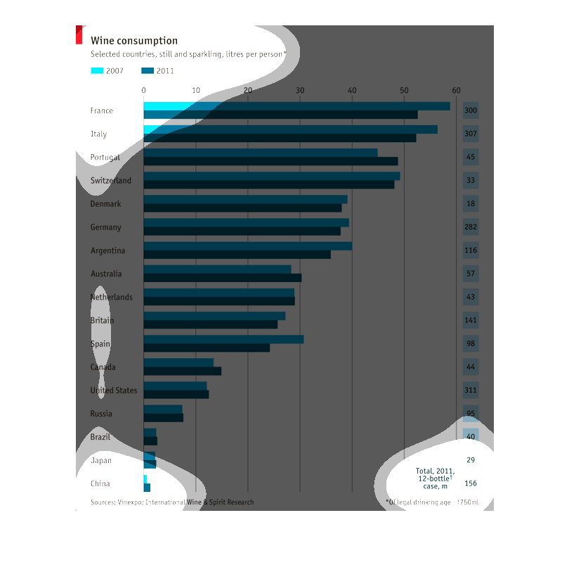
In the top left hand corner of the graph is the title, Wine consumption.  The graph seems
to show two different years 2007 and 2011.  The graph lists information based on liters per
person country-by-country.
This is a wine consumption bar graph comparing the years of 2007 and 2011. Wine consumption
is declining over time. The world wine leader is france, followed by Italy.