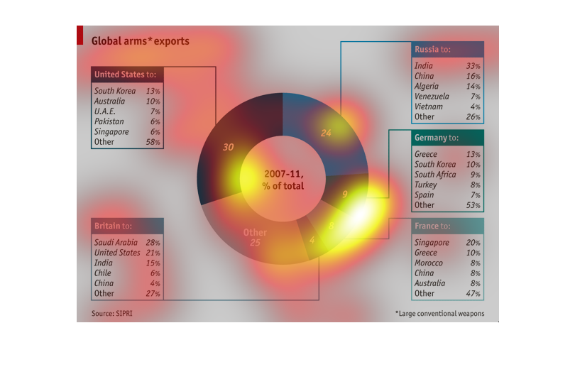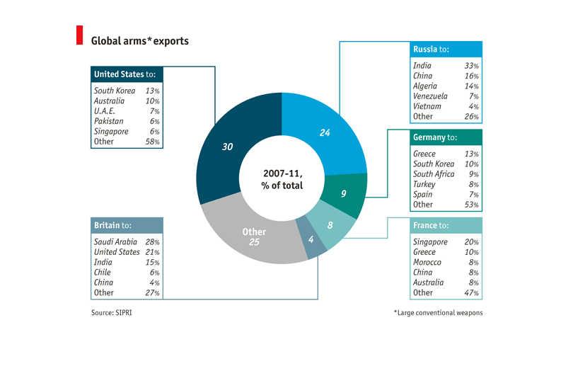
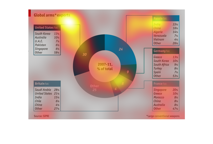
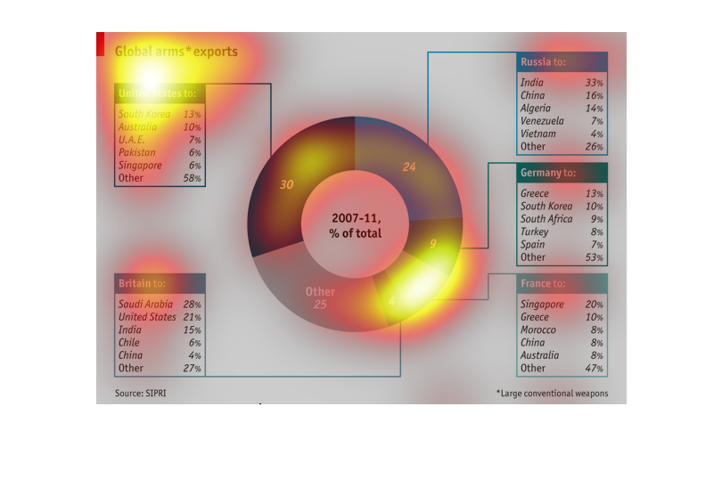
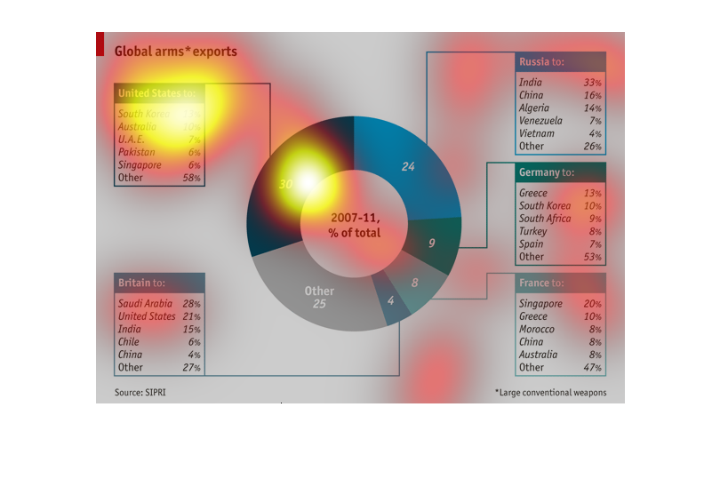
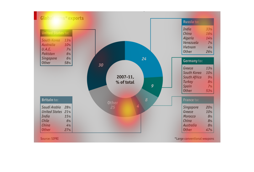
This is an image of Global Arms Exports from the United States, from Britain, from Russia,
from Germany and from France.  These exports are broken down into percentages to countries
they are exporting too, totaling 100% within each category.
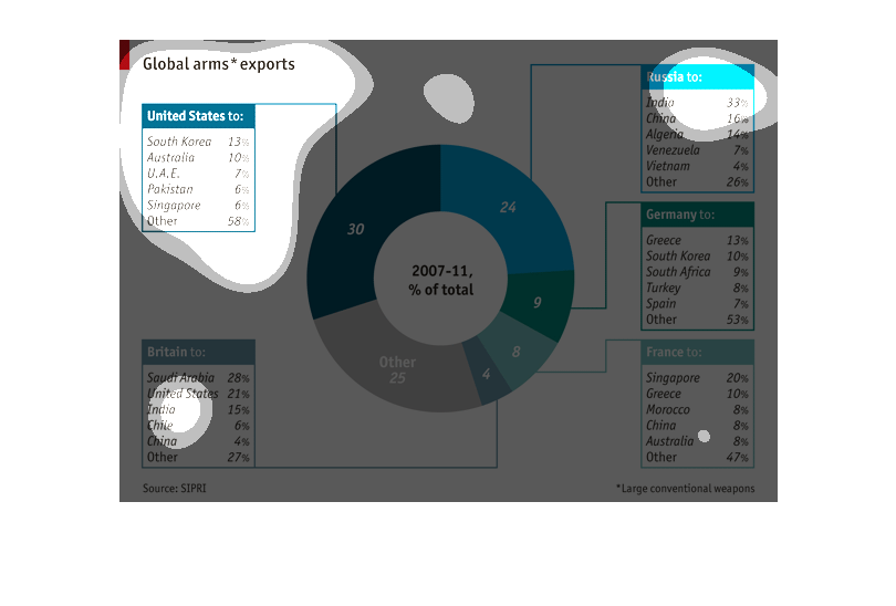
This image shows the percentage of global arms exports from Western countries . The US leads
with 30%, followed by Other, Russia, Germany, France, and Great Britain in descending order.
This table describes global arms exports during a specific period of time. This table describes
which countries exported the most to which countries. The pie chart in the middle describes
how much of the total each exporter was responsible for.

A global arms export chart. It lists all of the countries that Russia, Germany, United States,
Britain and France exported arms to between 2007-11. The larget to smallest are listed in
pie graph format.
In this image it shows a pie graph by percentages of different countries from 2007-2001 what
the main topic is what I'm still trying to figure out it shows the United States has more
percentage than any other country
This pie chart represents global arms exports from the major powers (US, Great Britain, Russia,
etc) to other countries from 2007 to 2011. The chart is divided into the percentage of exports
from each power, and each country has a list of the countries receiving arms, listed by percentage.
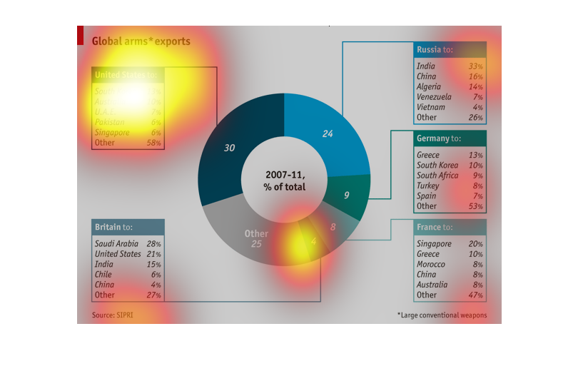
The image discribes exports from global arms dealers with large conventional weapons from
2007-2011.  With the top exporting country being the US, 30% of exports, and it exports 13%
of its arms to south korea.  The next country with the highest exports is russia,24% of exports,
with 33% of its exports going to India.  Farther down the list is Germany, 9% exports, and
13% of those are going to greece.  Next is France, 8% exports, with 20% going to singapore.
 And all other country make up 25%.
This chart explores global arms exports from 2007 through 2011 in terms of percentages of
total arms exports between the largest arms exporters (U.S., Russia, Germany, France, and
Britain) and other nations exporting arms. Also depicted are the largest/most notable export
destinations by the major exporters. The chart is clear that the U.S. and Russia account for
over 50% of total arms exports for the time period stated with 30% and 24% respectively. Adding
Germany (9%), France (8%), and Britain (4%) brings total global arms exports to 75% for just
five nations.
The following is a pie chart so to speak. It shows the global arms exports by major countries
and to whom that have exported arm to. The 5 groups that are highlighted her are the US Great
Britain Germany France and Russia.
The image is a chart showing the shares of each major country's arms industry in the world.
The countries are shown by what proportion of the industry they make up, and their destination
countries are listed in side charts.
A global arms race chart. It maps out the exports of arms by each country and which country
they are sending the arms too. It also has a circle chart that describes the total amount
of arms exported in a four year period.
This series of charts shows the arms exports of The USA, Britain, Germany, France, and Russia
between 2007-2011. Each country's box shows who they export to and in what percentage. The
central chart shows how much of the global percentage each country contributes.
A large circle graph titled "Global Arms Exports." Each color in the circle graph is a different
country, and the large their color is, the more exports they have.
The image details the mobilization of weaponry between the largest supplying countries in
the world, by percentage, and breaks down their buyers in percentage. (2007-2011)
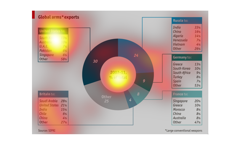
This chart describes Global Arms exports around the world. The United States contributed 30%
of Arms exports from 2007 to 2011. Russia contributed 24%, Germany contributed 9%, France
contributed 8%, Britain contributed 4%, and the remaining 25% came from other places.