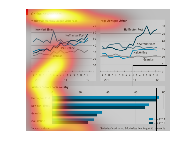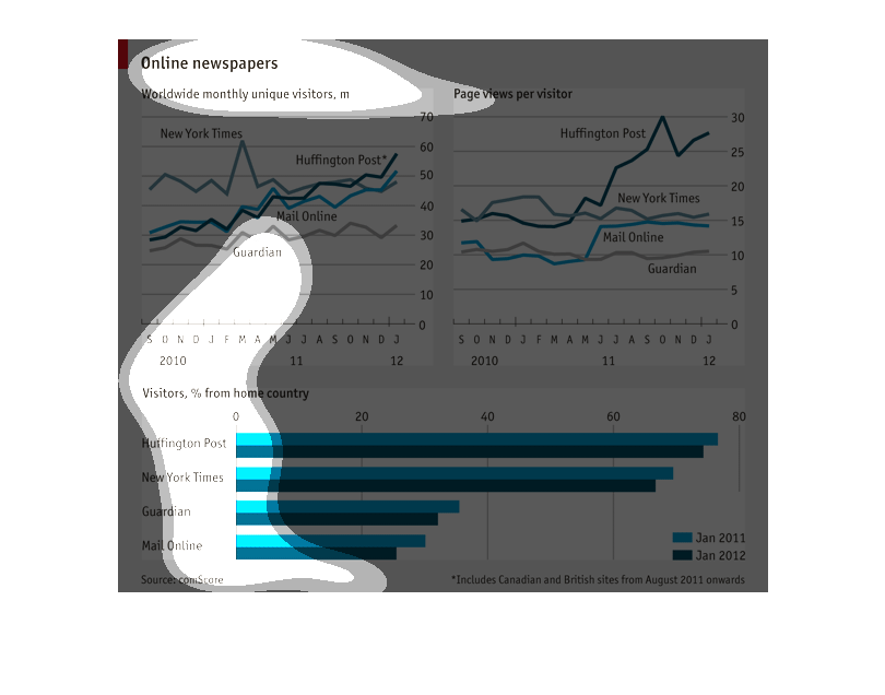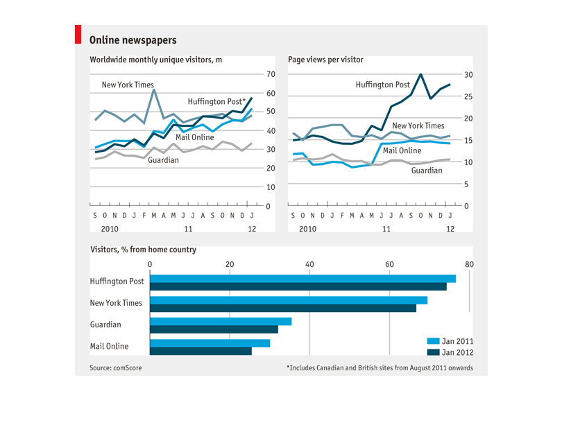
This shows a comparison of visits to online newspapers from various news sources.  According
to the bottom graph, comScore has the lowest page views and Huffington Post has the most.
 According  to the top left graph, the New York Times gets the most unique page views per
month while the Guardian gets the fewest.  The top right shows that the Huffington Post gets
the most views per visitor in pages.
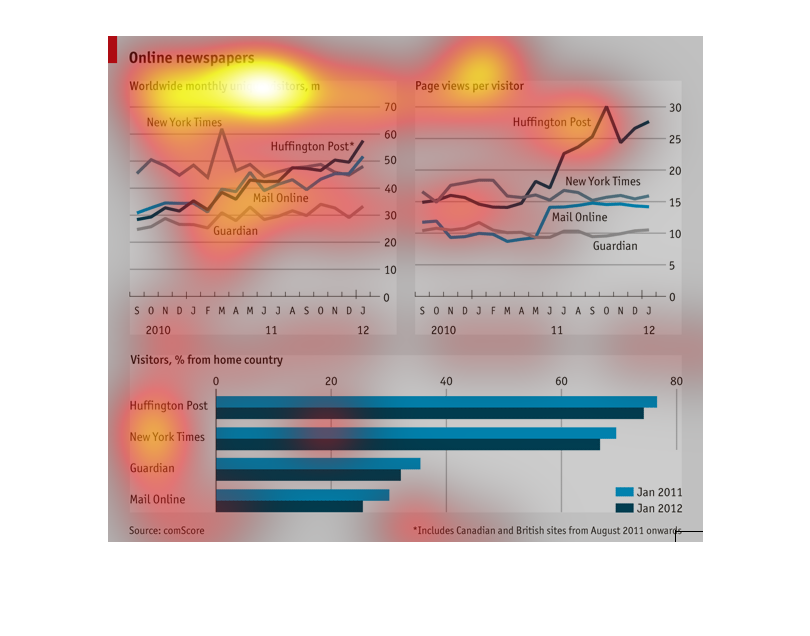
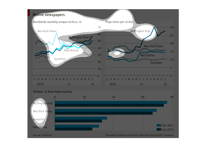
This chart the wordwide monthly unique visitors for different online newspapers and the pageviews
per visitor.  The newspapers listed are the New York Times, the Huffington Post, the Guardian,
and the Mail Online.  The chart also shows the percent of visitors from the newspaper's home
country.
This bar chart shows: Online newspapers, showing worldwide monthly unique visitors. Some of
the newspaper listed are: Huffington Post, New York times, and Guardian.
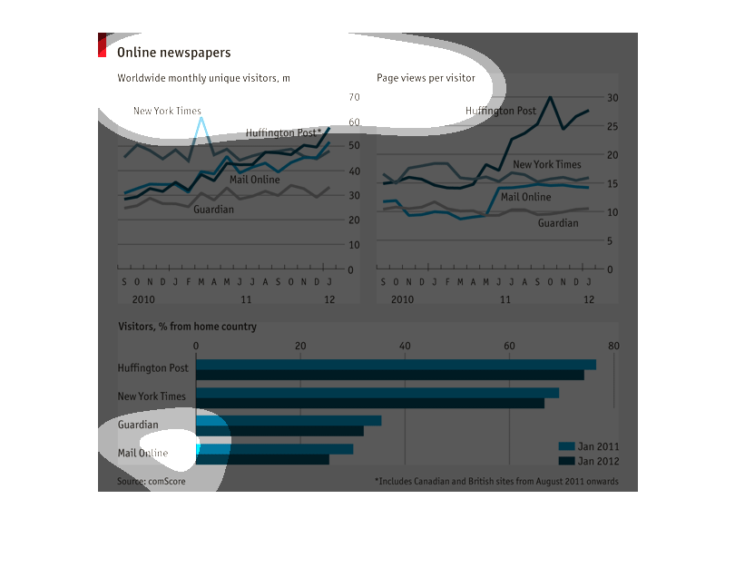
Graph entitled "Online newspapers-Worldwide Monthly Unique Visitors.  The graph lists the
names of 5 or 6 newspapers and it appears each paper has a different colored line.  I see
dates around the middle of the graph indicating months and years 2010 through 2012
This image talks about online newspapers. The graph right below the title talks about worldwide
monthly unique visitors. The graph next to that shows the page views per visitor. The graph
in the bottom shows the percentage of visitors from home country.
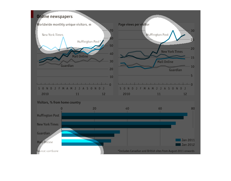
There are three graphs total in this image relating to online newspapers. The first graph
in the top left is one that shows the amount of monthly unique visitors for various online
newspapers from 2010 to 2012. The top right graph is similar, but compares page views per
visitor rather than unique visitors. The final bottom graph shows what percent of visitors
viewed from home country in January 2011 and January 2012.
looks like a graph about online american newspapers and the number of visitors. It also has
data of how many of these visitors are from the home country vs foreign.
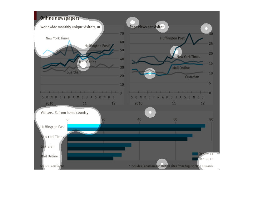
The image and chart describes online newspapers that have worldwide monthly visitors in Jan
2011 compared to Jan 2012. The chart shows that Huffington post has the most readers where
mail online has the least.
This image is three graphs relating to online newspapers. The first one is the number of worldwide
unique viewers for various online newspapers. The second is the number of page views per visitor.
The third is the number of visitors from the home country of the online newspaper as a percentage.
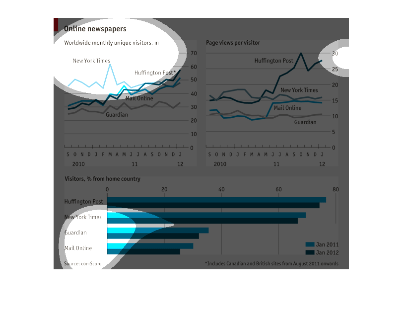
Graphs that showcase the different online newspapers that exist around the world and who reads
which ones more than others. Two separate graphs are present.
Online news papers...  Line graphs of unique visitors and 2nd line graph of links clicked/stories
read per vistor  Bar graph of readers.... Huffington Post, New York Times, The Guardian, Mail
Online
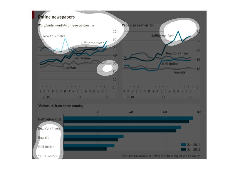
This set of graphs illustrates three things (1) the number of monthly worldwide unique views
to different newspapers, (2) the number of page views per visitor, and (3) the percentage
of the site's views that came from their home country.  While sites like huffington post and
NY times are viewed primarily by people in the US,   the Guardian and mail online have larger
percentage of their views coming from international locations.  This graph seems September
2010 to January 2012.
The graph shows online newspaper and how many worldwide monthly unique visits they get. It
compares four websites to each other. The four papers are hufington post, new york times,
guardian and mail online.