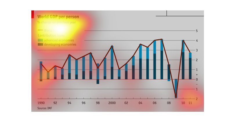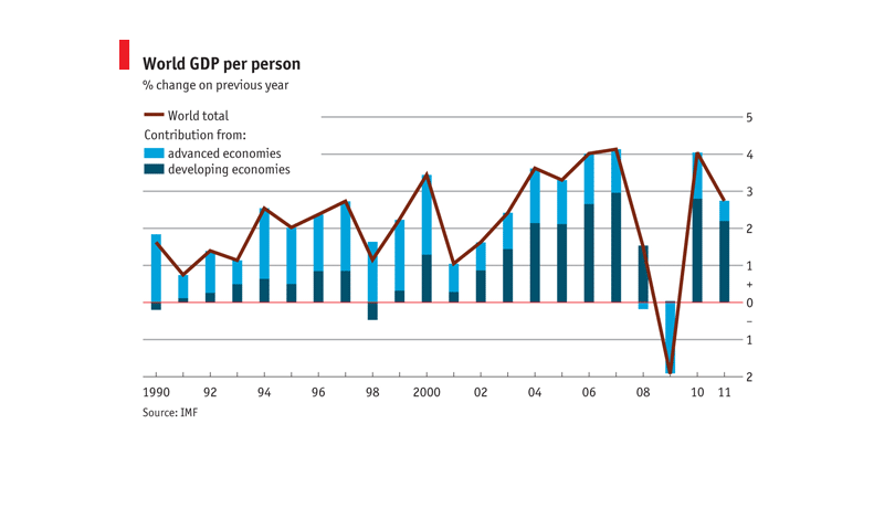
This is a chart that shows the world GDP. or Gross Domestic Product, per person from 1990
through 2011 and the percentage of change from the previous year. It compares advanced countries
vs developing countries. It shows that there was a gradual rise until about 2009, when there
was a precipitous drop. It also shows the world total for those years.
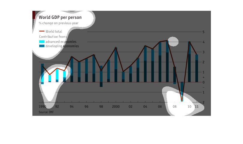
Graph representing world GDP per population. It focuses on world total, advance economies
and developing economies. The source of the data information is IMF
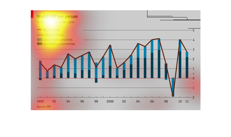
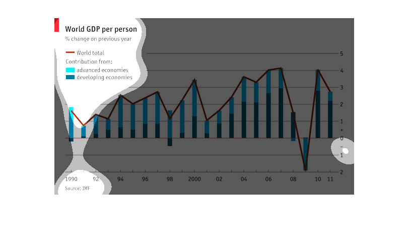
This graph shows the World GDP per person as a percentage change from last year. It divides
the graph between advanced economies and developing economies.
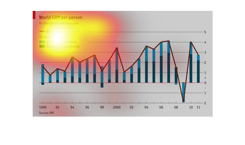
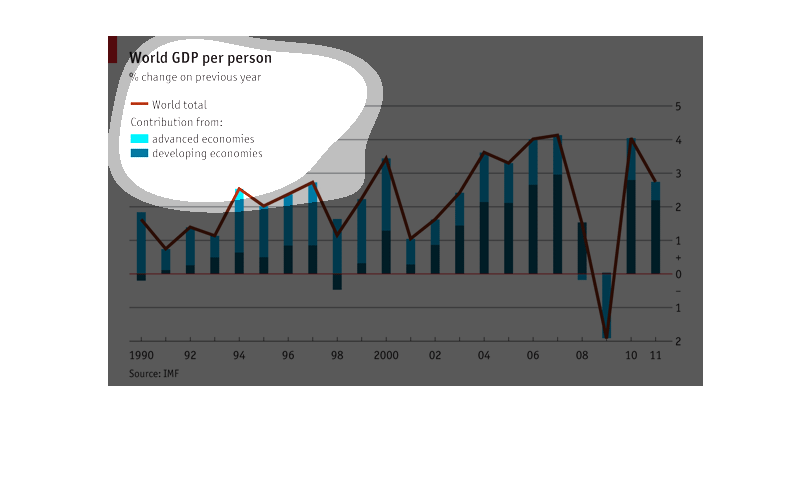
This bar graph shows world GDP % changes per person in developing economies, advanced economies
and world total economies from 1990 to the year 2011.
This graph shows the change in the worlds GDP and how much economically developed countries
and underdeveloped countries counted toward that figure. The brown line is the GDP and the
light blue portion of the bar is the percentage that the developed countries gave and the
dark blue is the percentage that the underdeveloped countries gave.
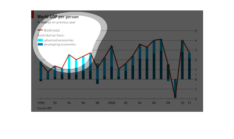
This hart shows the World GDP per person. It shows the % change on previous year. In light
blue it shows contributions from advanced countries, and developed countries.
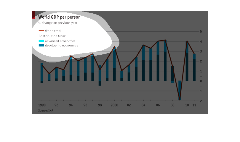
The Chart displays percent change vs last year in World GDP per Person comparing World Totals
and advanced economies and developing economies.  Source is the IMF.
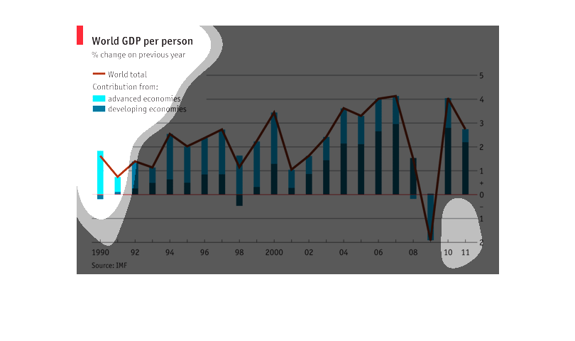
This chart represents the Gross Domestic Product split between developed economies and advanced
economies.  The chart goes from the year 1990 to 2011.
This is an info graph describing the World GDP per person. It compare the economies of advanced
nation as well as the economies of the developing world from  1990-2011
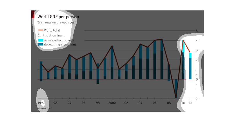
This chart shows world GDP per person over a period of 21 years, with a distinction between
advanced and developing economies. After rising in 90s, GDP fell sharply in the global recession
but began to rebound in 2009 and 2010.
This chart describes and depicts the GDP per person as a percentage of change on the previous
year for the entire world from the year 1990 to the year 2011.
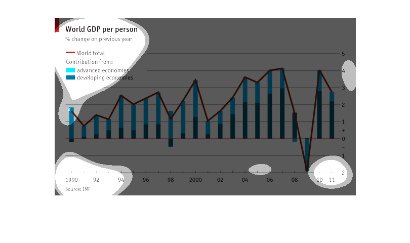
This chart measures world gross domestic product per person.  More precisely it also measures
% change on previous year.  On this chart the color brown measures world total.  The color
light blue represents economies which are considered "advanced".  The color dark blue represents
 economies which are considered "developing".  The date range for this particular chart is
from 1990 - 2011.    The trend is generally upward, however, there seems to drops in gross
domestic product in the years 1991-1992, 1998-1999, 2001-2002 and 2008-2009.