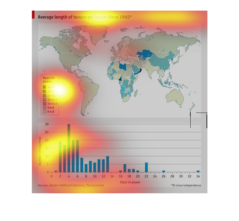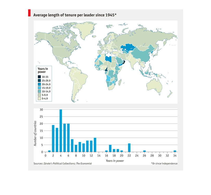
Showing the average length of tenure per leader since 1945. It is showing a world map with
different colors across it. The colors represent years in power, this way you can see the
shortest and longest. Also at the bottom showing a bar graph depicting the length of time
with the number of countries having the same outcome.
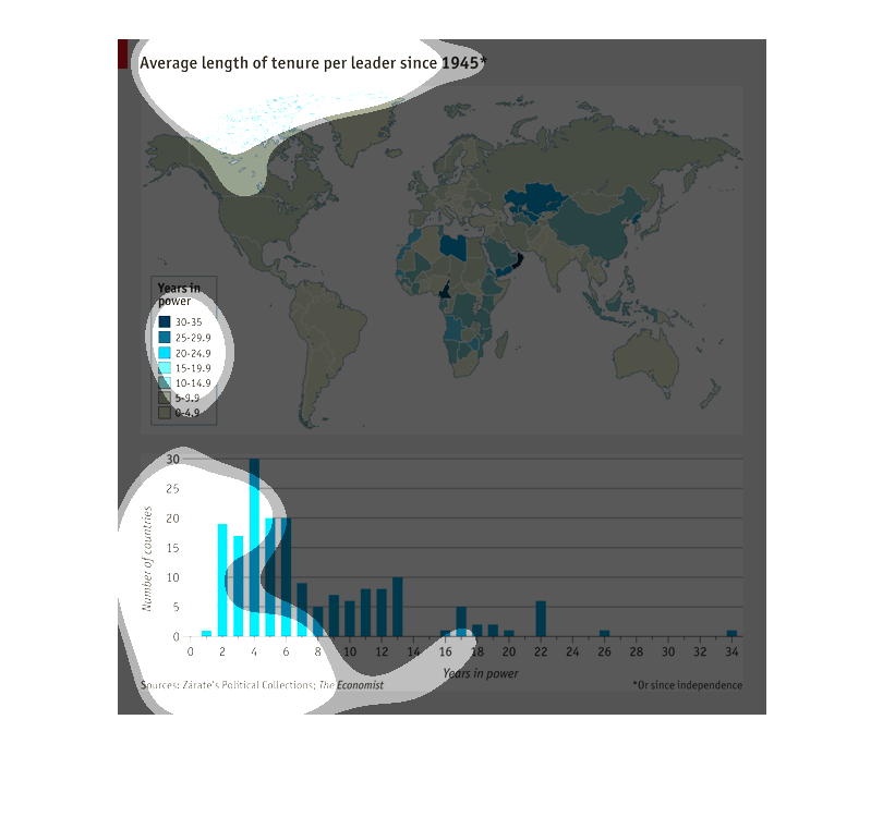
Two graphs that state "Average length of tenure per leader since 1945". The one on top is
a world mass, where the colors change depending on how long that country's average tenure
is. The bottom one shows the number of countries, and the years in power they were.
The chart describes the average length of tenure per leader since 1945 throughout the globe.
Comparing the number of countries and the years in power.
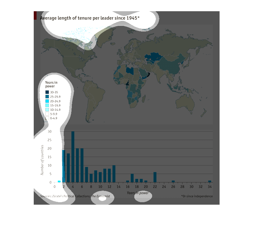
This graph shows a map of the average amount of time leaders around the world stay in office
and hold power over their area since 1945. It shows a map and a bar graph
This graph show the Average length of tenure per leader since 1945. The years in power range
from 0-35. There is a bar graph, and a map graph showing the whole country.
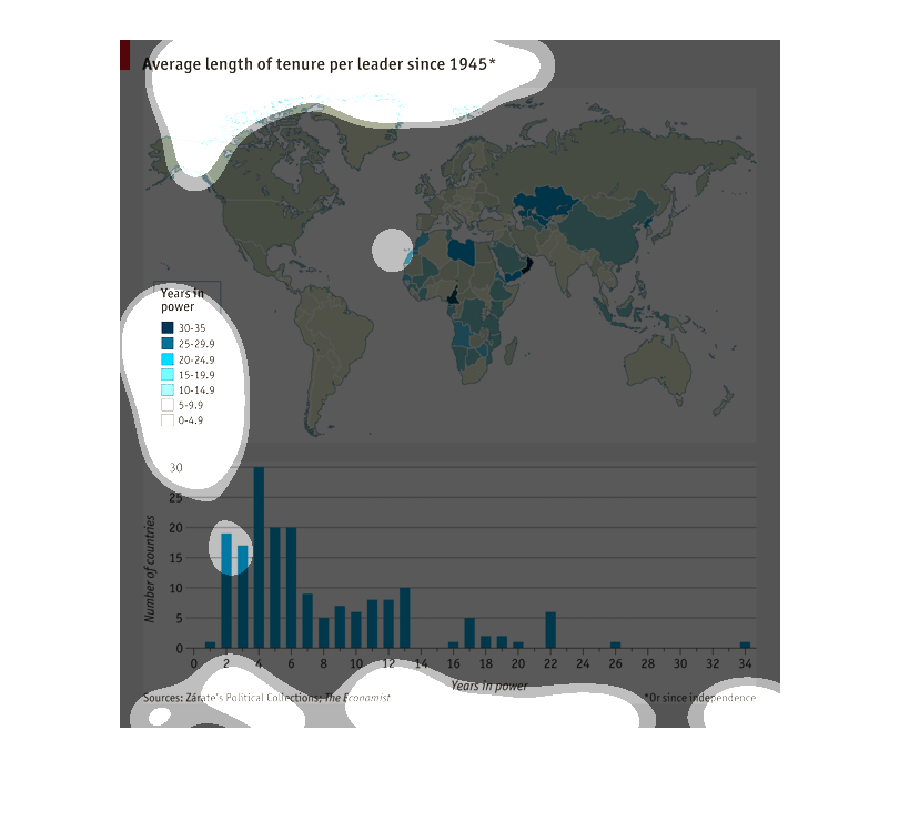
I don't quite understand this graph but it shows the average length of tenure per leader across
all the different countries in all the continents in the world.
This map describes the lengths of the world leaders' regimes. A bar graph appears at the bottom,
noting the number of years that leaders have ruled in different parts of the world.
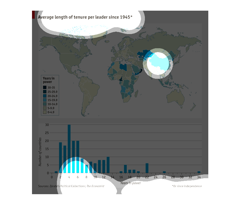
This diagram shows the average tenure for per leaders since 1945 across the world. It is broken
down by years ranging from 0 through 35. It is color coded based upon the length of time/
tenure.  The graph at the bottom of the diagram shows the number of countries along the y
axis (0-30) and the years in power running along the x axis ( 0-34).
It shows the average length of tenure per leader since 1945 globally. The ranges are between
0-35 years, incrementally. The heaviest average is 6 years or less, focused primarily in the
Americas.
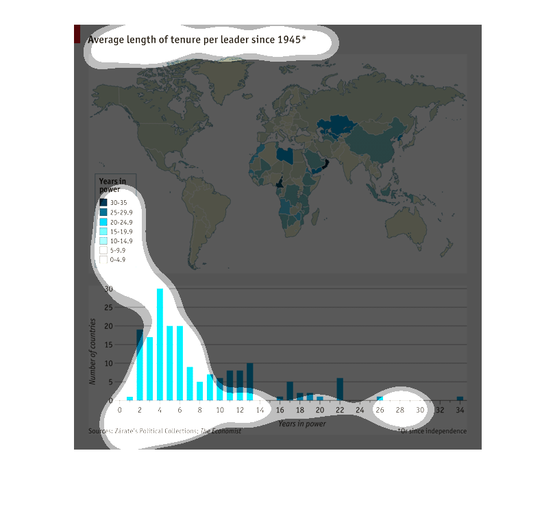
This graph shows the average length of tenure per leader since 1945. We are able to see how
many countries were measured and then the average number of years of power. There's a country
in Africa where a leader had 30-35 years in power.
This chart of the world shows the average length of leadership of rulers from around the world
since 1945, from almost nothing to 35 years. The shortest lengths (10 years or less) are found
in the Americas, India, Russia, and most of Europe. Higher length reigns are in Africa, parts
of Asia, and the middle east.  The bottom shows how many countries have a certain average
length.
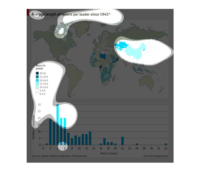
This is a map on the world showing average length of tenure per leader since 1945. It shows
that more developed countries have leaders who spend less time in power