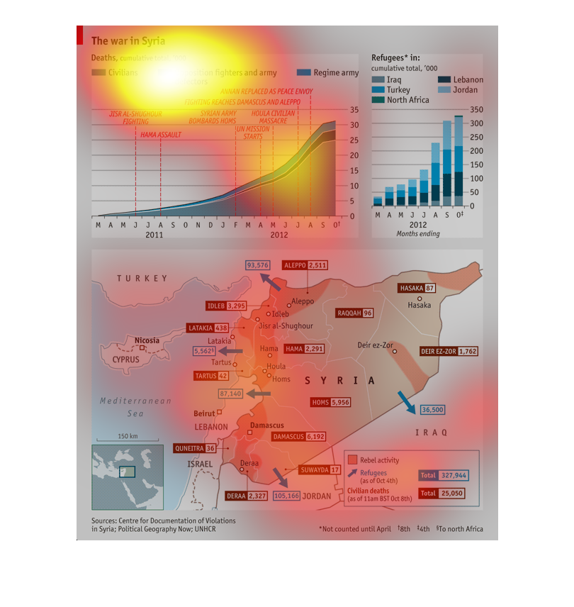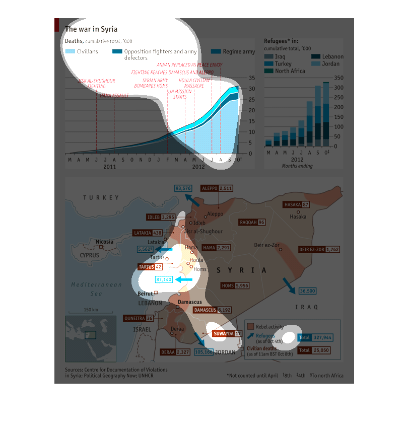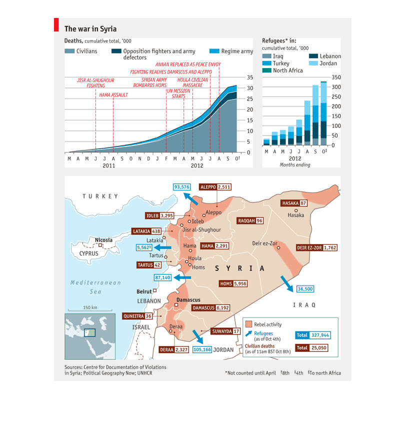
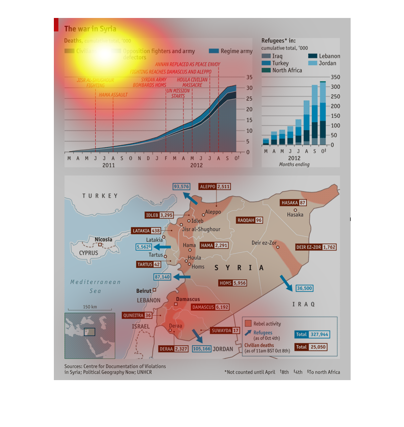
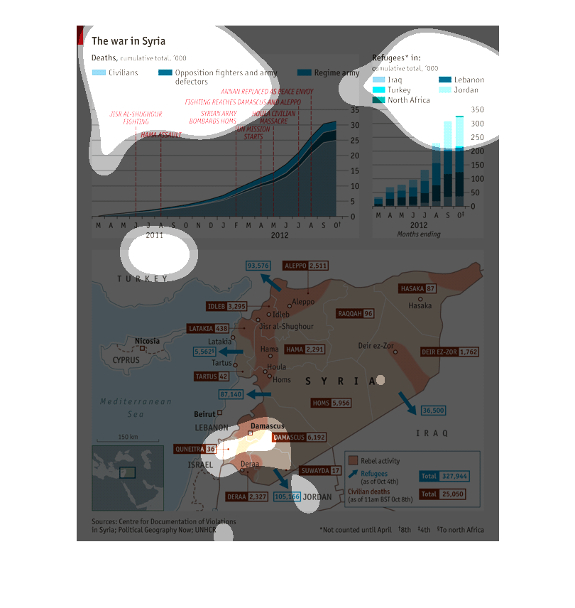
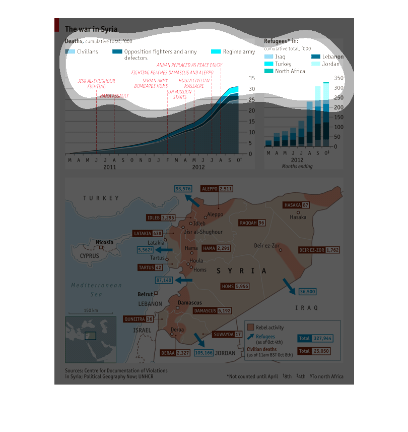
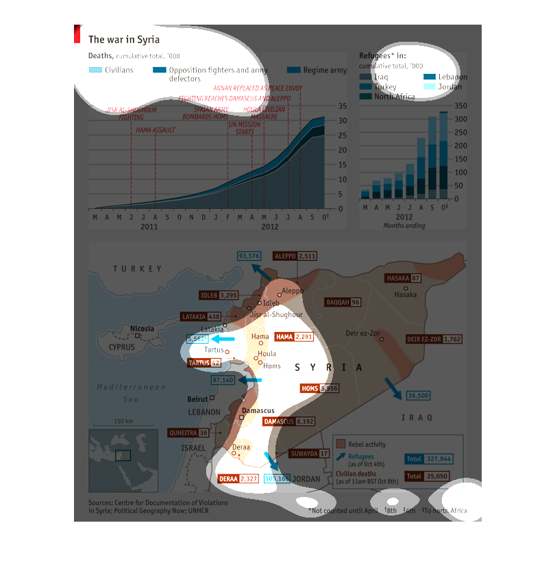
This is a graph that displays the accumulated death toll for the war in syria. The death toll
for citizens and military can also be viewed and compared . This information is displayed
using a graph and a country map.
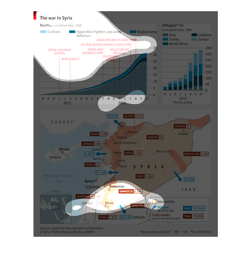
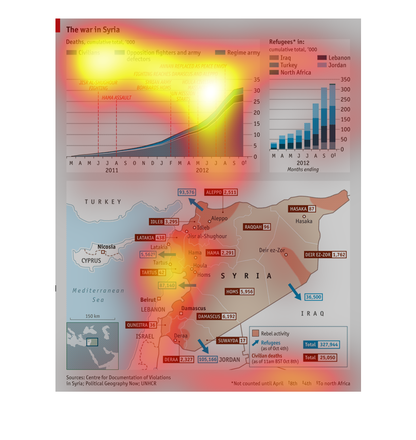
This graph illustrates deaths in middle eastern countries (e.g., Iraq, Syria) during the months
of 2012. Specifically, it shows that cumulative total deaths have accelerated sharply during
the latter part of the year. The image provides a map of the region for context.
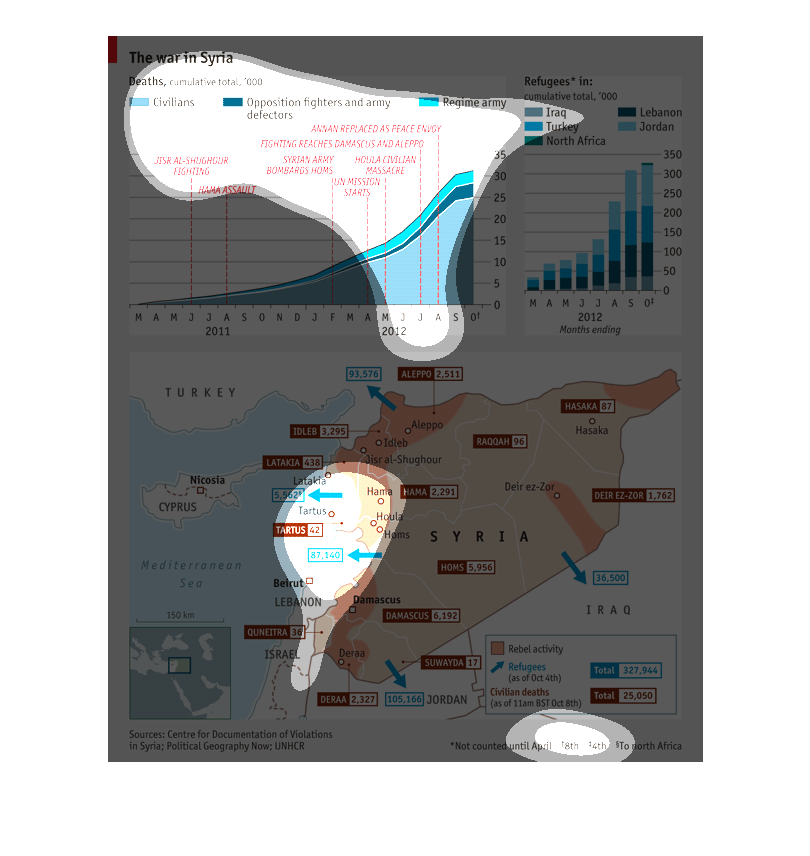
This is a very detailed map of the war in Syria that total the amount of deaths of civilians,
opposition fighters, and the Syrian regime army. Furthermore, we see where refugees have gone
to. We also see major battles and massacres as well as a map as to where these conflicts took
place.
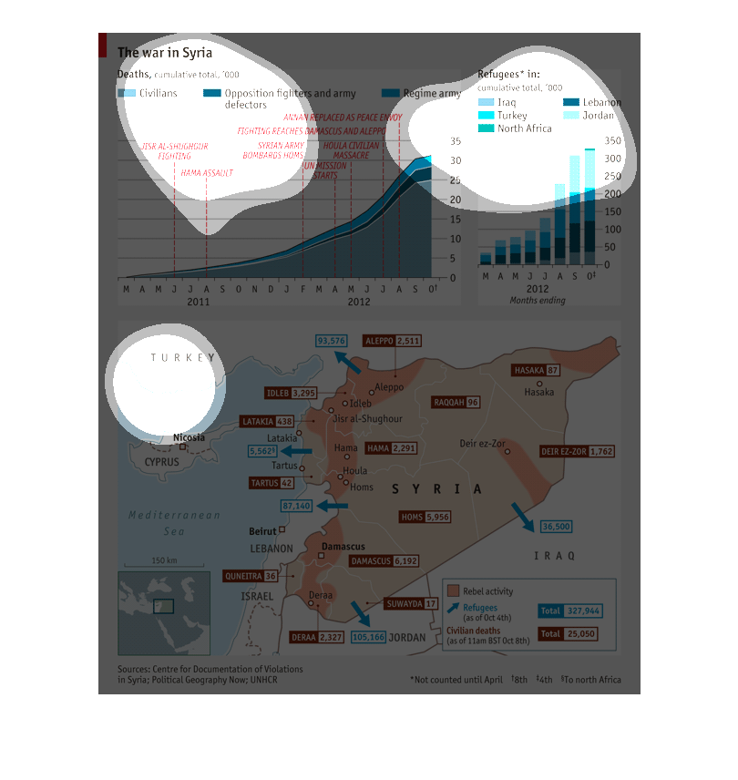
This chart shows The war in Syria. The sections show are for civilians in light blue, opposition
fighters, and army defectors in dark blue, and Regime army in medium blue.
This is a graph depicting the war in Syria and the number of casualties, including military
and civilians.  Also included are data detailing the number of refugees from the war, as well
as a map detailing the region.
This chart illustrates the effects of the war in Syria.  It shows the death toll and also
a map of Syria illustrating where those deaths occurred within the region.
This chart and map describes the war in Syria.  It shows the number of deaths among civilians,
opposition fighters, and the regime army.  The information also reveals the number of refugees
in Iraq, Turkey, North Africa, Lebanon, and Jordan.
This map is about the war in syria. It shows the number of civilian and military deaths, the
number of refugees, as well as the specific large-scale events of the war.
This series of charts refers to the war in Syria.  The top left chart is a cumulative account
of deaths of civilians, opposition fighters and army defectors, and the regime army between
March 2011, and October 2012.  The top right chart shows Syrian refugees in 2012, and the
bottom chart shows the flow of refugees away from areas of conflict in Syria.
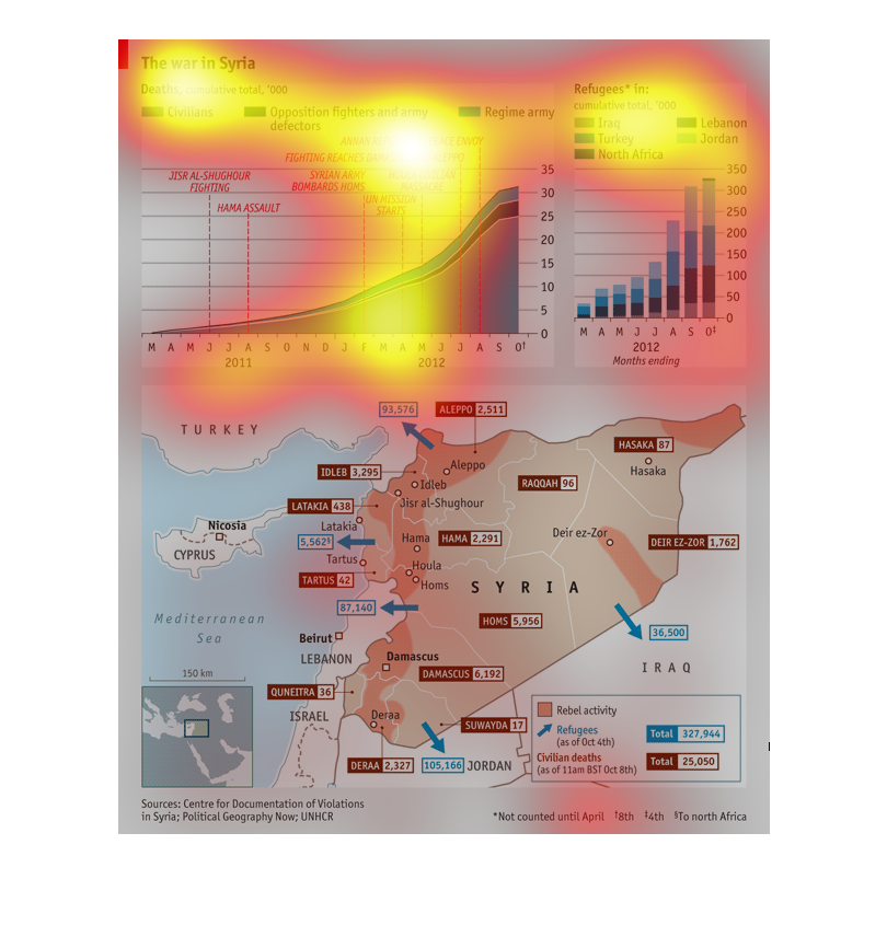
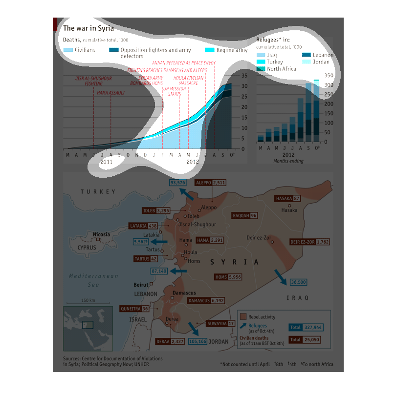
This graph demonstrates the human cost of the war in Syria. One of the graphs shows where
all the refugees have gone on a month-by-month basis, with a steady escalation. Another of
the charts shows the number of deaths as a result of the war, again with a steady escalation
in numbers, and again on a month-by-month basis. This chart attempts to show all deaths related
to the war, including civilians and opposition forces. The bottom of the page is a map that
shows where Syrian refugees have escaped to and which areas have seen the most loss.
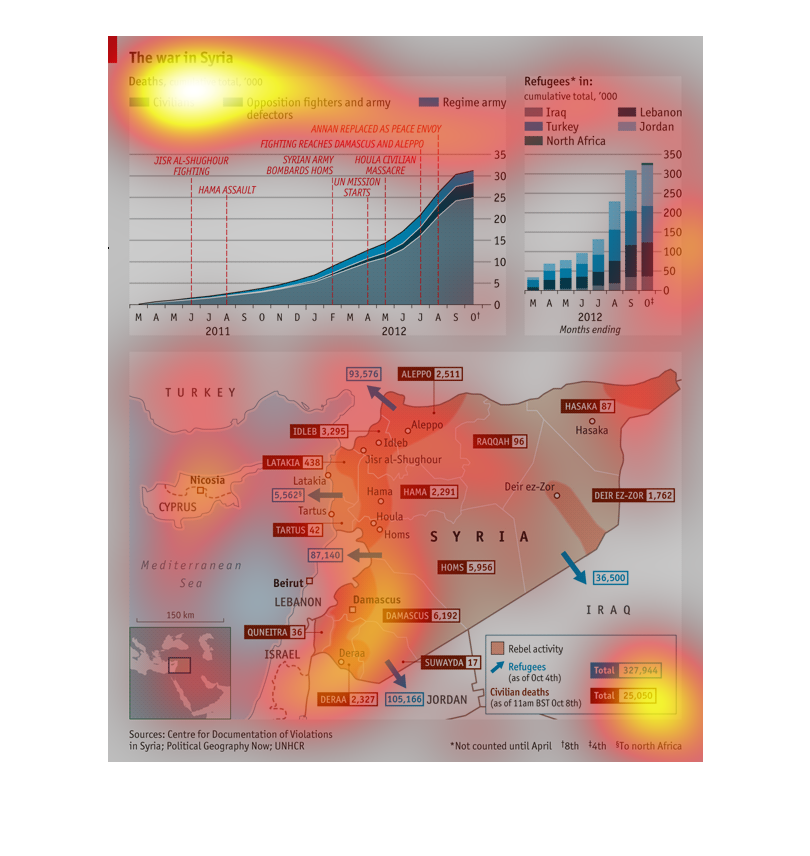
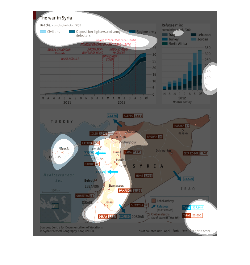
This is a chart describing the war in Syria and it's overall impact thus far. Different parts
of the map describe the death tolls, refugees, and where they are going to or from in the
region.
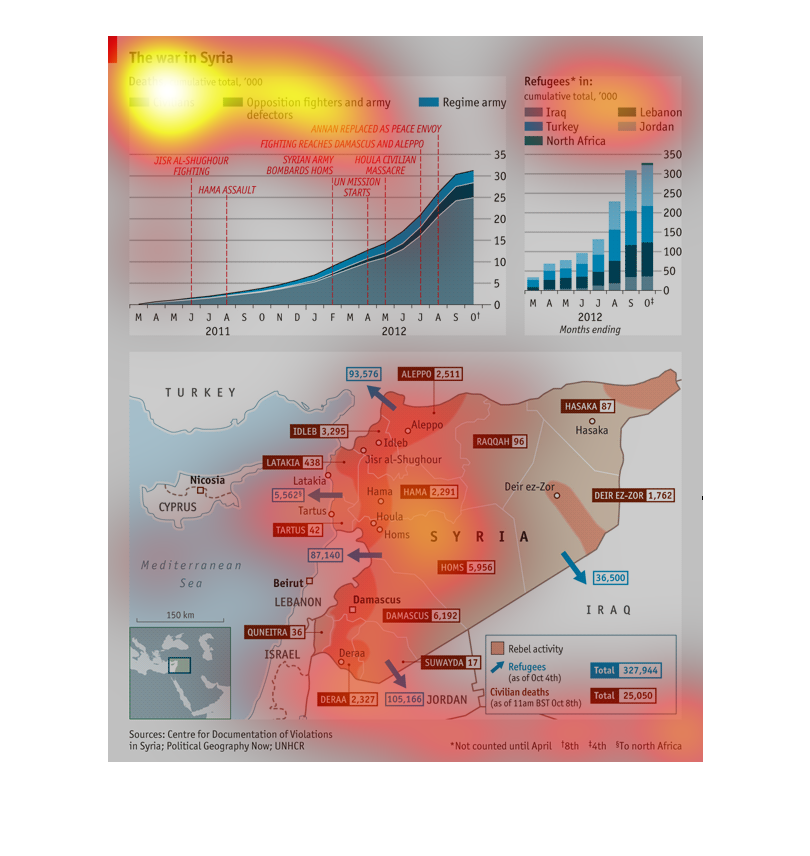
This show the number of people hurt in the war in Syria. It also shows the number of refugees
that are coming from different countries because of that war.