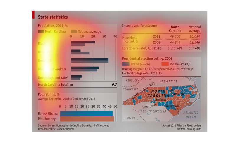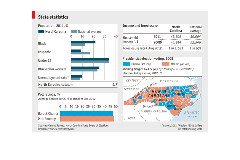
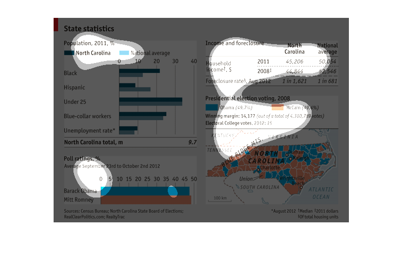
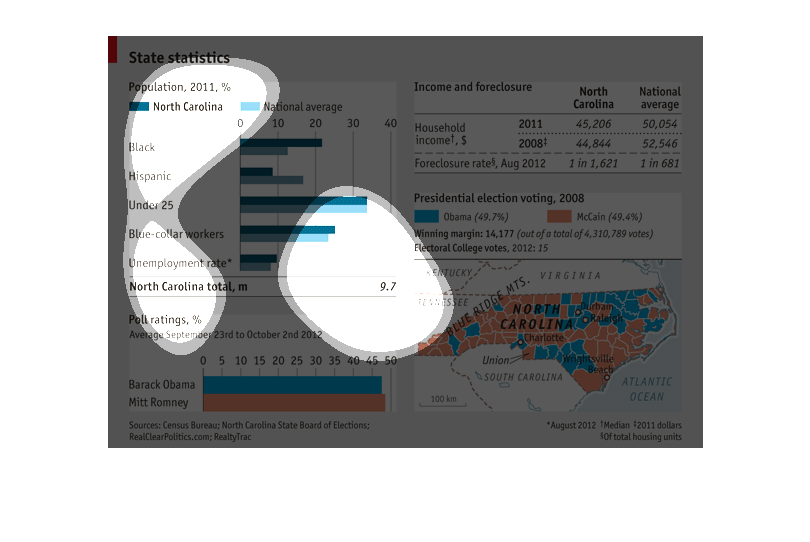
The chart shows statistics for the population of the State of North Carolina for the year
2011.  The chart also breaks down the Presidential election in which Obama was opposed by
Romney.  It gives a county by county break down of how each county in the sate voted. It also
has information on the actual winning percentage of the election.
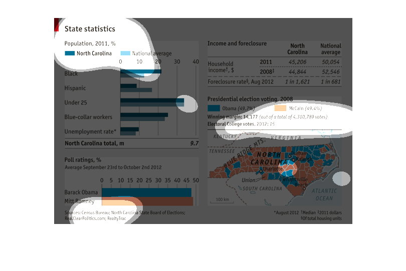
State statistics. National average based on race, employed and unemployed in the state of
North Carolina. Income and foreclosure. Household income. Presidential election voting. Barack
Obama and Mitt Romney.
This graph shows state-wide statistics for Income and foreclosure in North Carolina in 2011
as well as poll ratings for both Barack Obama and Mitt Romney. The statistics compare NC to
the national average.
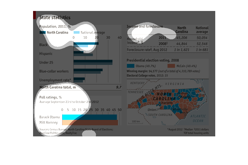
This is a graph of state statistics for north carolina. It compares the different races for
a percentage. It also compares unemployed percentages with emp@oyed percentages.pIt also looked
at poll ratings.This information is from the year 2011.
This graph exhibits the high poverty rates in North Carolina, vs other areas of the world
and how more of certain races live there than on a national level. The difference of those
races in North Carolina vs the world matches the small difference in how many people vote
Republican vs Democratic..suggesting if those races were equally represented it might change
elections?? I think
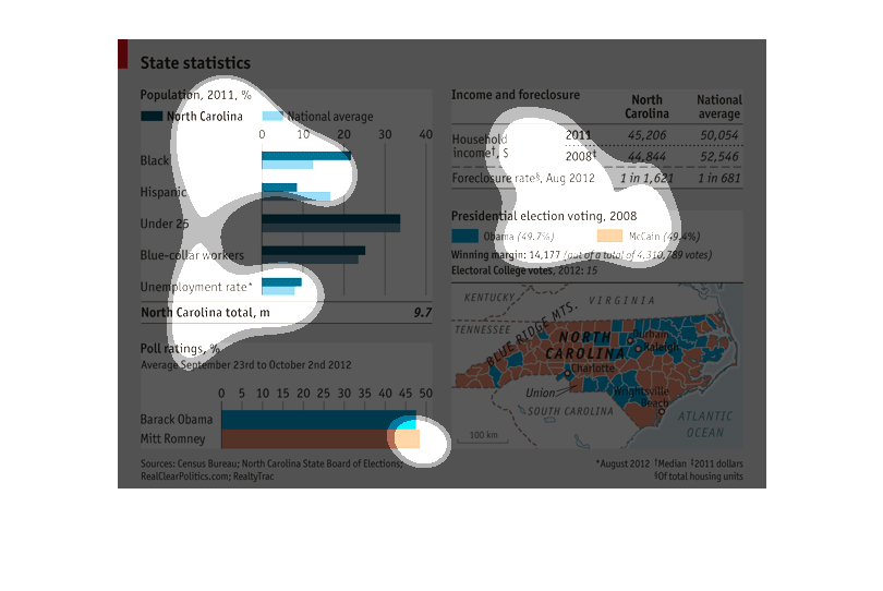
This shows the state statistics in North Carolina in 2011 based on race, age, unemployment,
and so forth. It also looks at income and foreclosures, and who they voted for in the last
two elections.
Statistics for the state of North Carolina including population breakdown by race compared
to the national average, poll ratings between Barack Obama and Mitt Romney, income and foreclosures
in 2008 and 2001 compared to the national average, and a chart of North Carolina broke up
by counties showing where the population voted for Barack Obama and John McCain in 2012.
The following charts include the population of California, income and foreclosure amounts
in North Carolina compared the national average, election voting between Obama and McCain
as well as one between Obama and Romney.
This graphic has information on State Statistics on North Carolina in 2011. It had a much
higher rate of Blacks than the National average, but lower rate of Hispanics. The rate of
those under 20 was pretty close to the national average. Blue collar workers and unemployment
rates were slightly higher than the national average. It also contains information regarding
households and the presidential election.
This chart graphs and displays a multitude of information on the state of North Carolina.
Specifically is describes the state's statistics such as income.
This chart describes state statistics for the state of North Carolina.  It describes ethnic
background, age, employment type, employment rate, election outcomes, average household income,
and a map of the political parties associated by county.  Much of this information is involved
in census information.
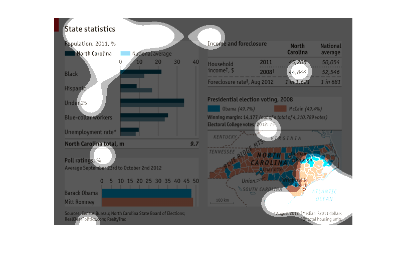
These charts show several different characteristics for North Carolina. The first part compares
the population's demographic information to the US average. The next chart shows the popularity
of the 2012 Presidential candidates. The next chart compares income and foreclosure information
between North Carolina and the national average (North Carolina is worse on both counts.)
The final chart shows county by county results for the 2008 presidential election.
This chart depicts statistics of North Carolina as it relates to the 2012 presidential election.
It shows income levels and percentage of districts who voted for Obama or Romney.
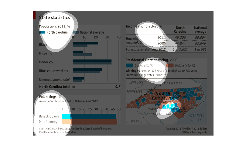
State statistics for North Carolina 2011 comparing ethnic groups and their incomes and rate
of forclosure.  2012 poll ratings between republicans and democrats
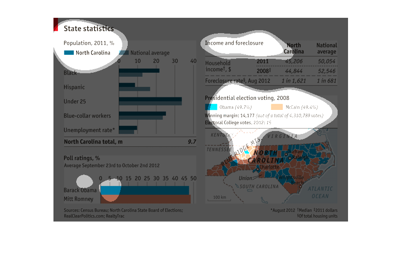
This image describes statistics for the election of 2012 in the the state of North Carolina.
Population  statistics including race ,unemployment, job type ,youth percentage, and home
foreclosures are compared to national averages. Poll ratings and county by county election
results for Obama and Romney are then listed.