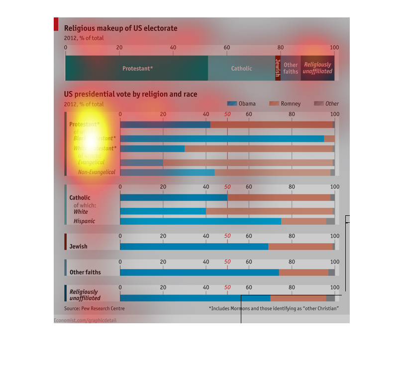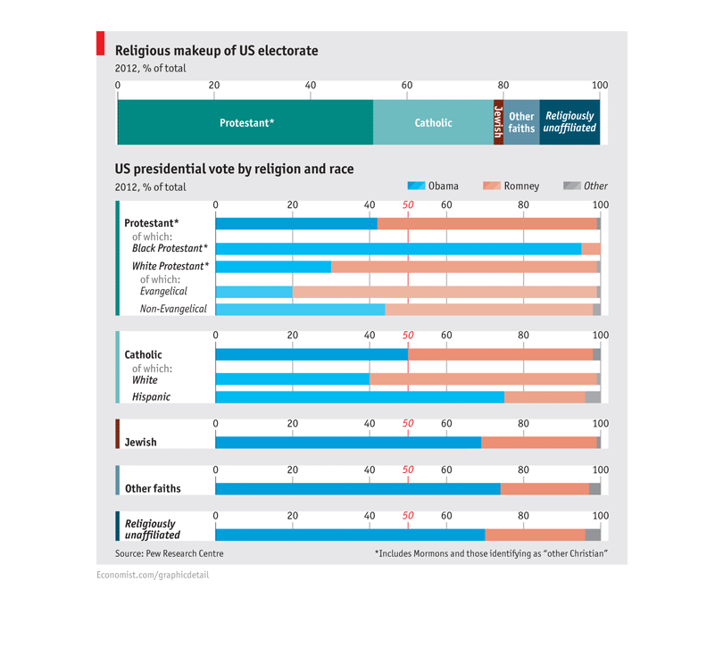
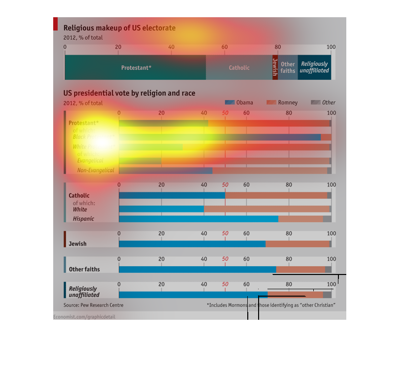
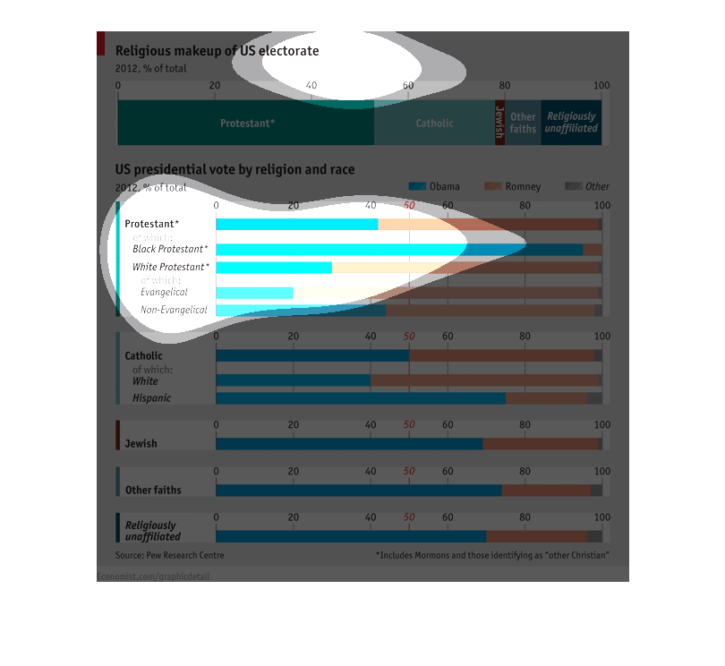
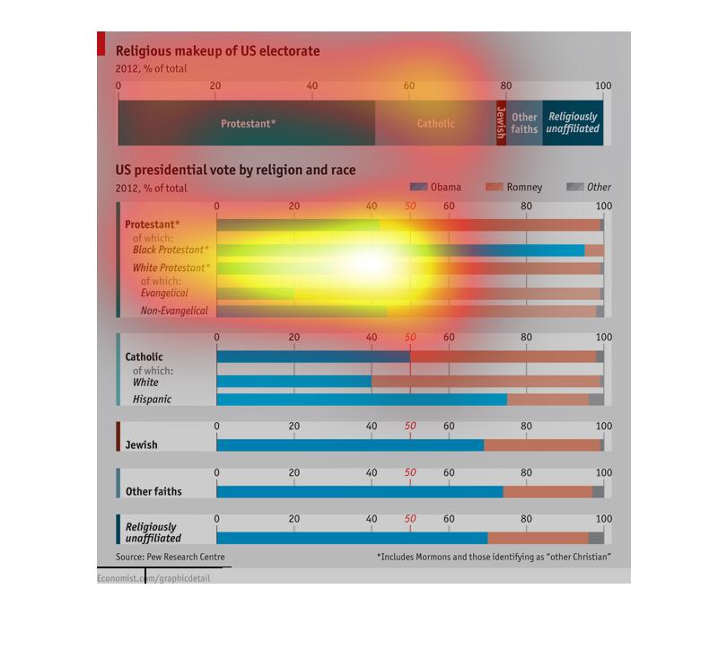
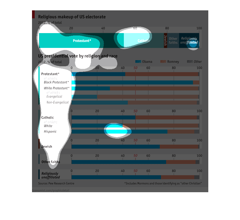
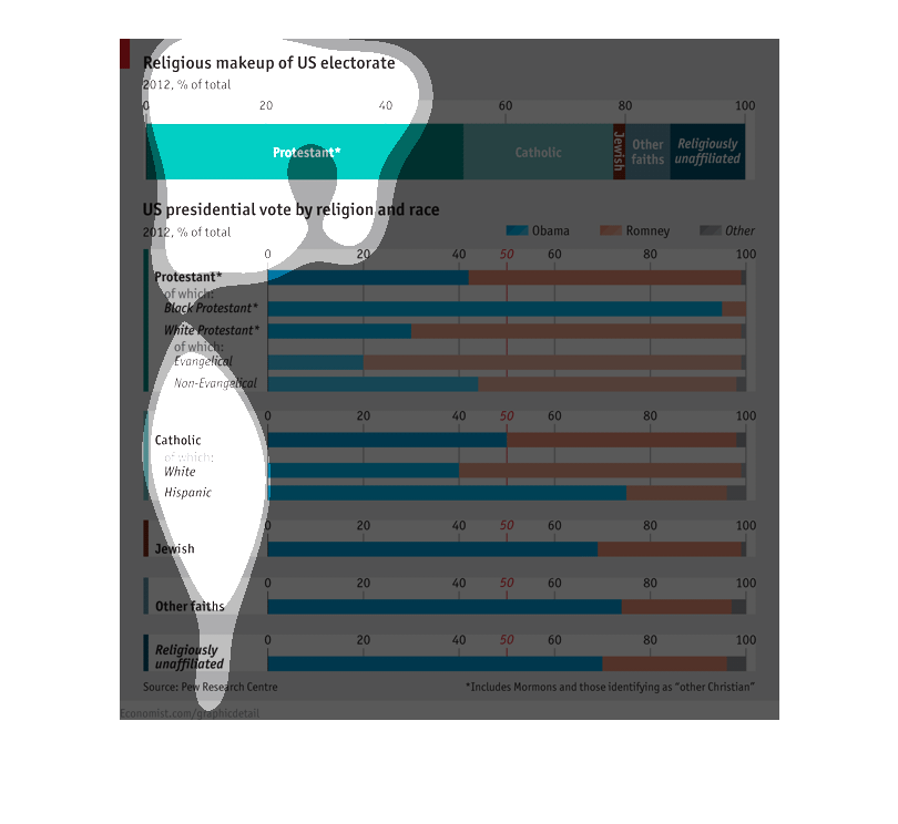
This chart describes the religious make-up of the United States electorate.  It depicts the
2012 United States presidential vote by religion and race.
it was a article about religion and government and different topics about the situations it
apply's to america.it was a article about religion and government and different topics about
the situations it apply's to america.
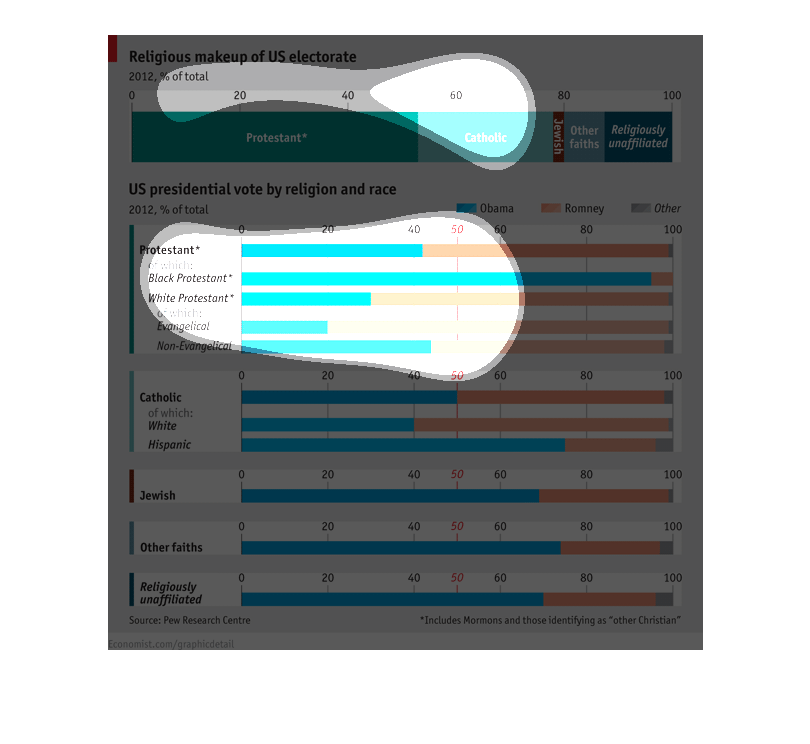
This chart shows the reiligious make up of the United States in 2012.  50% were protestant
and 25 % were Catholic.  The rest was comprised of Jewish and other religions.  It goes on
to show the presidential vote by religion and race.   Obama's largest vote came from black
Protestants and Romney's came from white evangelicals.
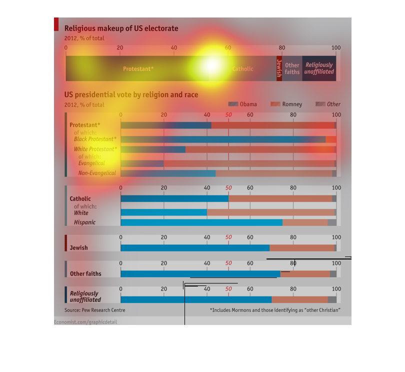
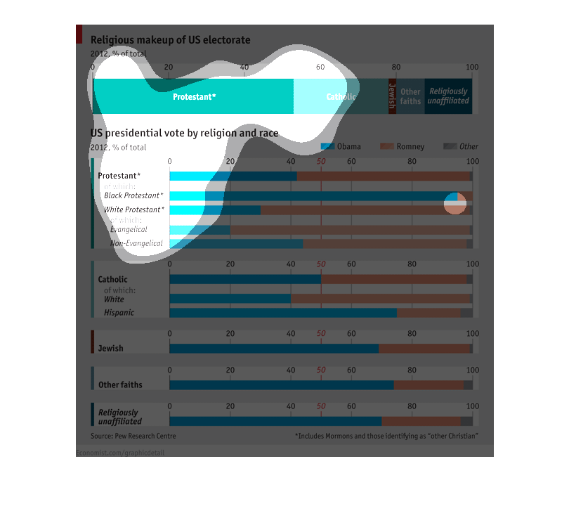
This graph shows the US presidential vote by religion and race.The three possible candidates
were Obama, Romney, and 'other'. The categories looked at were: protestant, which included
both black and white (of which white was further broken down into evangelical and non-evangelical);
catholic, which included both white and Hispanic; Jewish; other faiths; and religiously unaffiliated.
Protestants were overall more likely to vote for Romney, but the black and white protestant
groups were more likely to vote for Obama. Overall, Catholics were equally likely to vote
for Romney and Obama, but white Catholics were more likely to vote for Romney, and Hispanics
were more likely to vote for Obama. The three other categories were more likely to vote for
Obama.
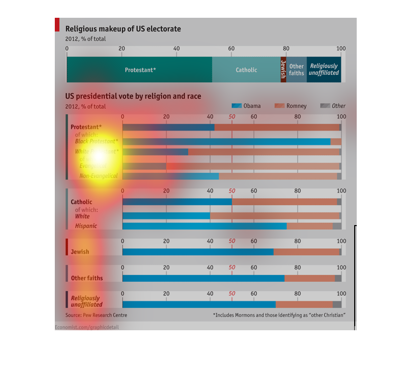
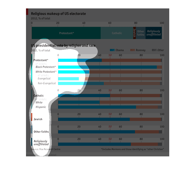
The Chart shows religious and racial makeup of the US electorate and how they voted in 2012.
The electorate is roughly 50% Protestant. With a large majority of black protestants voting
for Obama and a small portion of white protestants voting for him. Obama holds the majority
of all other types of voters except white Catholics.
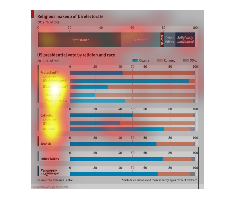
The image portrays the religious makeup of US electorate. The bar shows a large amount is
Protestant while the smallest amount are Jewish. The rest of the image seems to break down
those following the religion by skin color.
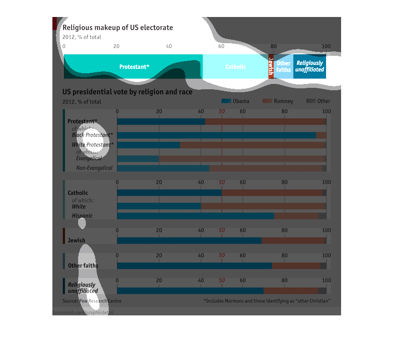
Religion of the US electorate. It looks like the vast majority is protestant. Behind that
looks to be Catholic. The smallest percentage looks to be jewish and the other faiths are
a small margin but larger than jewish. Religious unaffiliated is just slightly more than the
other faith category. The second graph categorizes the presidential vote by religion and race.
It is broken down by black protestant and white protestant. Which is the majority. Then Catholic
close behind, then Jewish. Other is a little higher than jewish. Religious unaffiliated is
right at the same mark jewish is.
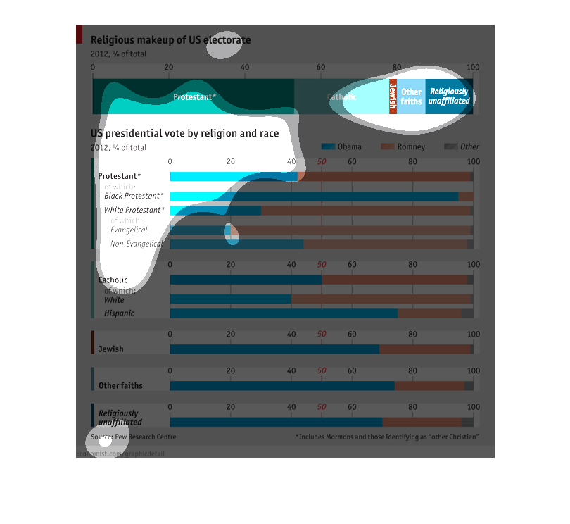
This chart describes the religious makeup of the US electorate.  Protestant makes up the majority
of the religion. Whereas Evangelical religion makes up the least of the electorate.
This image is a graph of  the religious makeup of the electorate in 2012. It divides the graph
into a specific type of religion or sect of religion, then divides it further into black and
white.
This graph describes the religious makeup of the US electorate since 2012.  Protestants top
the list, with Catholics, Jewish, and other faiths coming in behind it.
Religious make up of US electorate.  US presidential voters by region and race.  Top Cluster
of Bar Graphs arranged by religion: Protestant, and then race... at the bottom it's divided
into Evangelical and Non-Evangelical.   Second Cluster: Catholic,and then race.  Third: Jewish
 Forth: Other faith  Fifth: Unaffiliated
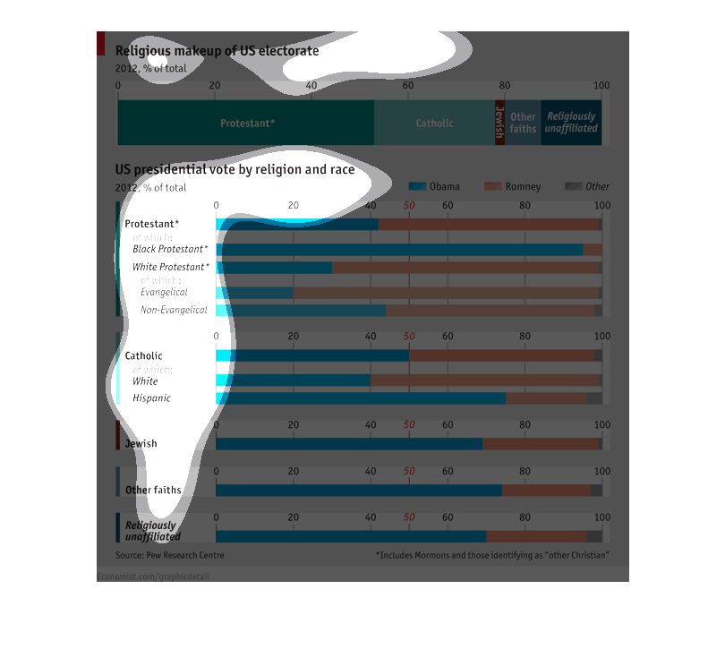
The chart is a summary of the religious make up of the US electorate college.  It also includes
a summary of the large religious groups in the US with the US presidential vote based on religion
and race.
The graph shows two different sets of data showing how religion influences the decisions of
voters.  At the top a form of a pie chart shows what percentage of the electorate is comprised
of each religion or denomination.  The second part of the graph shows more detailed demographic
information (race and religion) of the body of voters for the two 2012 presidential candidates.