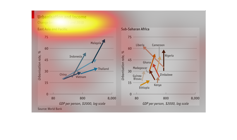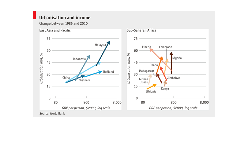
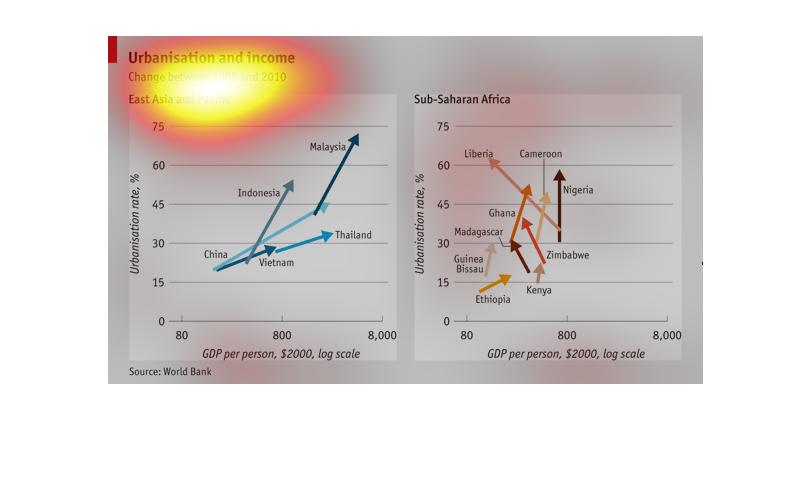
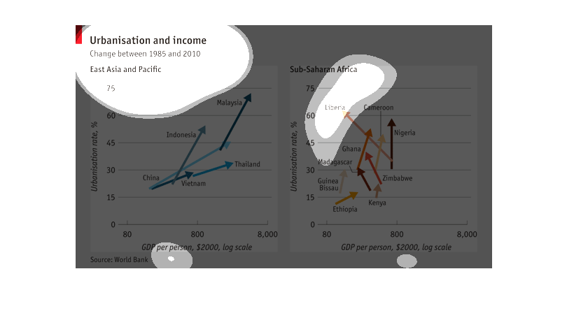
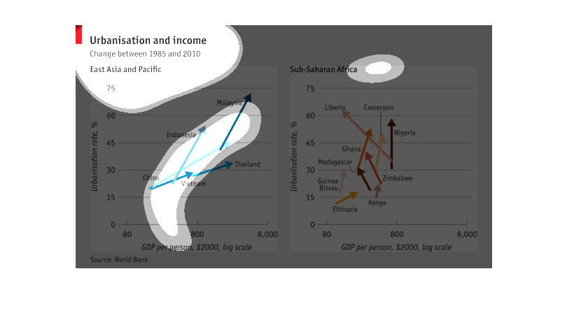
The first graph on the left shows urbanization and income changes between 1985 and 2010 in
the Asia Pacific area.  The graph includes GDP per person.  The second graph on the right
shows urbanization rates in African countries in the Sub Saharan area, also including GDP
per person.
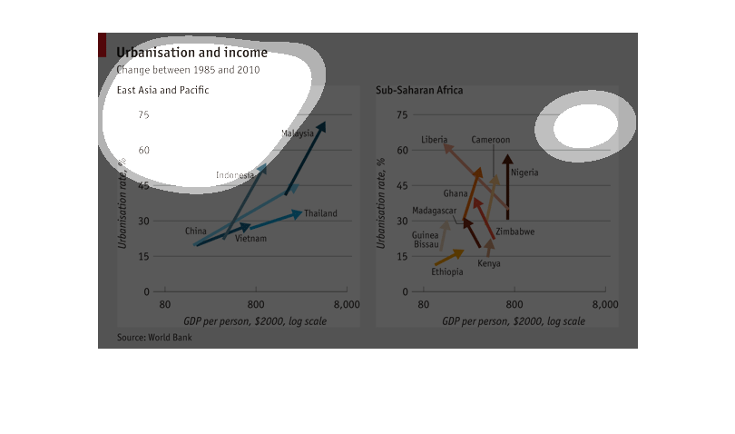
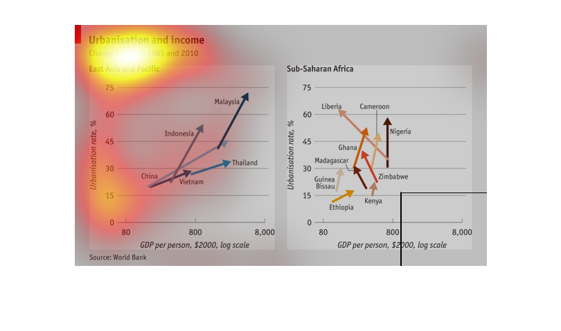
This chart shows Urbanization and income, and the changes between 1985, and 2010. The regions
on the chart are East Asia, and Pacific, and Sub saharan Africa.
This image depicts urbanization and income changes between 1985 and 2010 in east Asia and
Pacific plus sub Saharan Africa. East Asia and Pacific includes China, Thailand, Indonesia,
and  Malaysia.
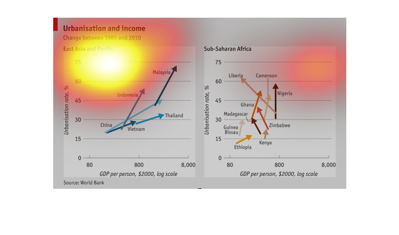
This graph shows the relationship between urbanization and income in both east asia/pacific
and sub-saharan Africa. In both graphs, urbanization is increasing, while the GDP per person
in Asia is increasing but, for the most part, decreasing in Africa
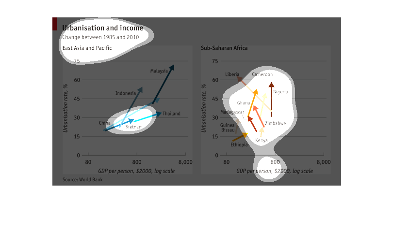
This chart shows the correlation between urbanization and income from 1985 to 2010 in East
Asia and the Pacific compared to Sub-Saharan Africa. It shows that the East Asian group is
growing much faster.
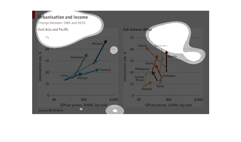
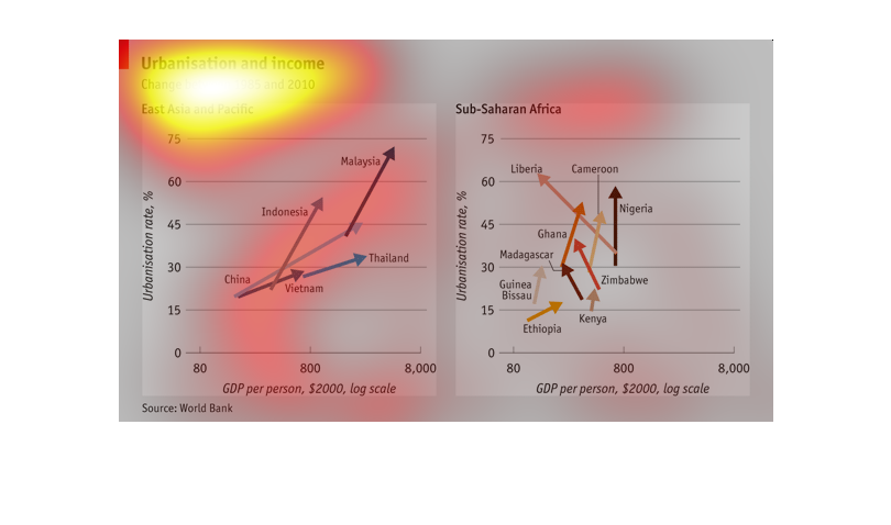
This chart describes the relationship between Urbanization and income from  1985 to 2010.
It takes East Asia: China, Vietnam, Indonesia, Thailand, and Malaysia and Sub-Saharan Africa:
Liberia, Ghana, Cameroon, Nigeria, Zimbabwe, Ethiopia, Kenya, and Madagascar.
This chart is about urbanization and income. There are two regions explored: East Asia and
the Pacific and Sub Saharan Africa. Each chart shows that with urbanization for each region
there is a direct correlation with a rise in income.
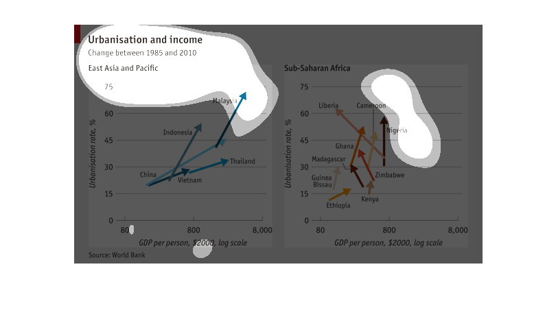
A chart showing changes in urban growth and income over twenty five years. In Asia Malaysia
had the quickest level of growth over other nations in the region while in Africa Liberia
had a decline.
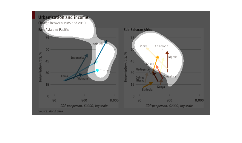
This image shows the urbanization rates between 1985 and 2010 in Asia The chart basically
gives you an idea of how fast a country is growing in the Asian continent.
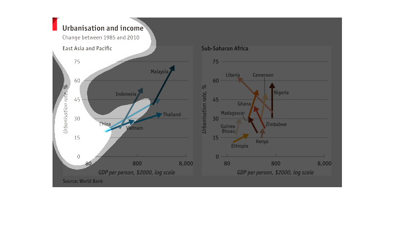
I would assume this is a chart to show the difference in the urban and rural and city residences
income. basely the income level for poor, middle or up class citizens. showing different counties
to see the over all difference with in each area and comparing to other counties.
This chart shows the comparison of urbanisation and income statistics between East Asia &
Pacific and Sub-Saharan Africa. Nigeria and Malaysia showed the most improvement.
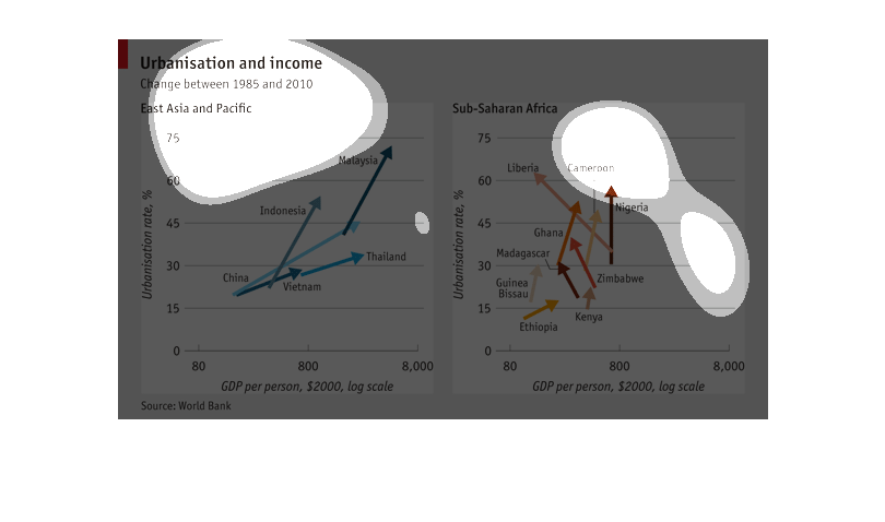
Urbanization and income graphs. Sub-Saharan Africa. graph. GDP per person, 2,000 log scale.
urbanization  rare%. East asia and pacific graph. Urbanization rate%. GDP per person 2,000
log scale.
Two line graphs that illustrate the increase of urbanization as income increase in Asian and
Sub-Saharan countries, with the highest urbanization being in Malaysia and Cameroon.
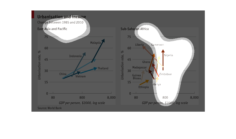
The image shows the correlation between urbanisation and income between 1985 and 2010 in the
areas of East Asia and the Pacific, and Sub Saharan Africa. Urbanization rate is represented
on the y-axis, and gross domestic product per person is represented on the x-axis.
This graph shows the Urbanisation and Income change between 1985 and 2010 of the East Asian
and Pacific. It shows that on average as the income rises, the urbanisation also rises.