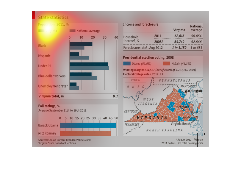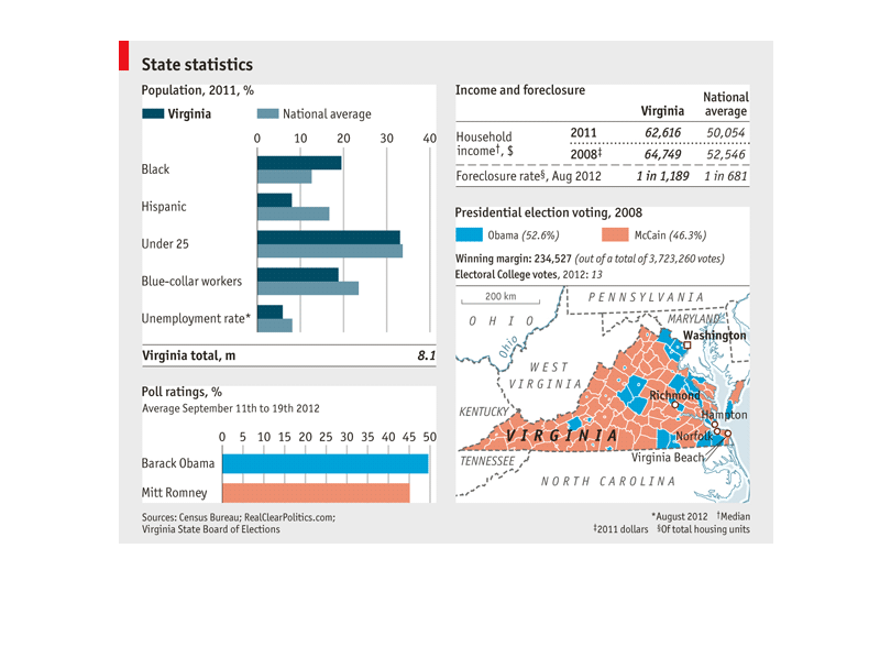
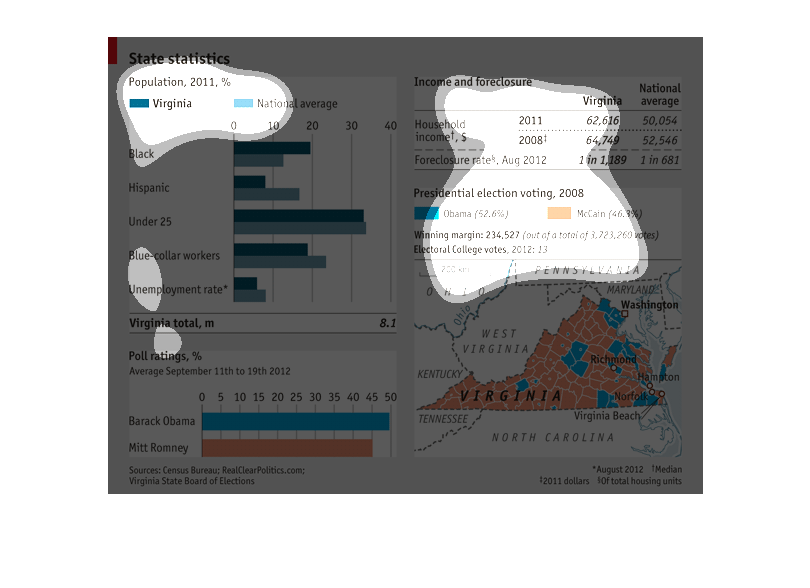
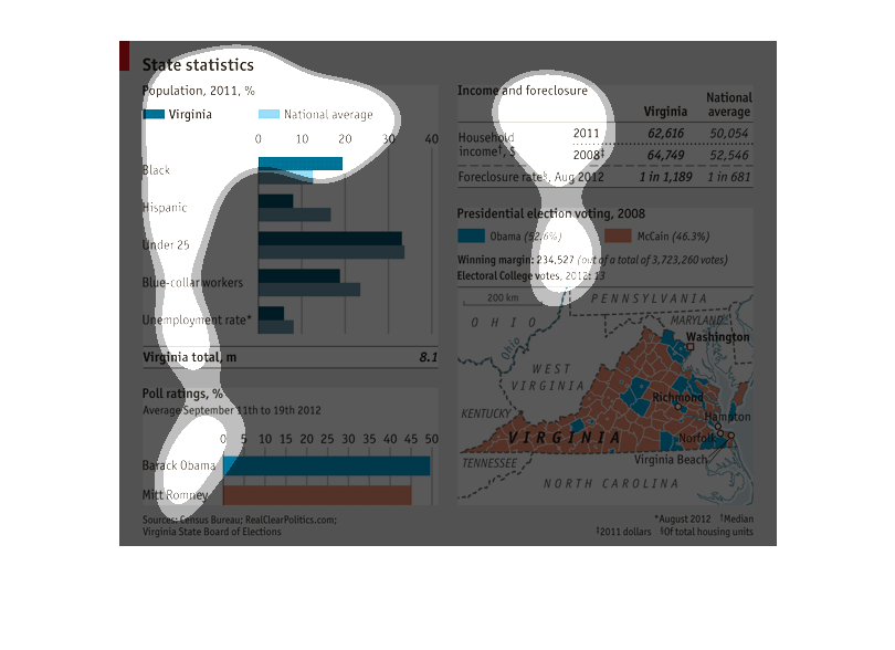
This image shows data related to the demographic statistics of Virginia state. It breaks down
the population into Hispanics, blacks, blue collared jobs, and also under 25 population
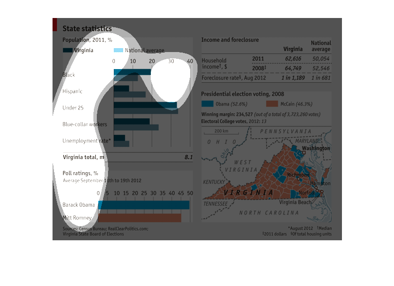
The image contains statistics about the population of Virginia compared to the National average,
including; unemployment rates by race; avg. income and foreclosure rates in 2001 and 2008;
presidential voting (McCain vs. Obama); presidential candidate preference (Romney vs. Obama);
and a map of Virginia separated into counties and colored by majority political preference.
State Population statistics based in year 2011 and the state of Virginia compared to the national
average. The first one is by races Black, HIspanic, Age Under 25, Blue-collar worker, and
unemployment rate.  Another date included is Poll rating for Barack Obama and Mitt Romney.
 Also the data on the Presidential Election voting  of 2008  for Obama or McCain.  It shows
the winning margins and the Electoral College votes, including a color coded map.  There is
also a comparison by Income and Foreclosure.  It compares the household  income and foreclosure
of 2011 and 2008 to the National Average.
This is state statics of the state of Virginia talking about race, age , middle or blue collar
workers, along with employed or unemployed statics.. the national average and the categories
of income and foreclosure. this also has the categories of the presidential election voting
of 2008 of Obama and McCain. The percentage of that election from all the states. the poll
ratings. I like to believed that this chart is showing the presidential election and the rating
and votes from different walks of life. the diversity of the public.
This is a demographic chart that compares Virginia's racial diversity and household income,
and to the national average. Then it also describes previous voting polls and outcomes between
Obama, McCain, and Romney in Virginia. Obama won in both cases, Virginia has more blacks than
the national average but less of every other race, and it has had a higher household income.
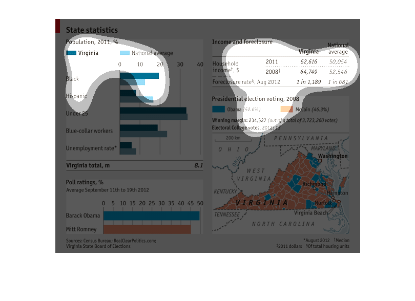
This graph shows the state of Virginia's statistics according to race (blacks & Hispanics),
under age 25, blue collar workers and the unemployed.  In addition, it also shows the ratings
of Barack Obama and Mitt Romney in the last presidential election from Sept 12th to the 19th,
2012.  It also compares the Virginia income and foreclosures to the National average.
The first chart contains Virginia percentages, as compared to the national average, for different
economic, racial, and social statistics. Below, the second chart compares the most recent
election results in Virginia. The map to the right breaks down those statistics by district.
 Above that, the chart contains information on income disparities.
The following is statewide statistics and how it releates to demographics and politics. firstly
it compares demographics of Virginia to the nation. Then it shows how they voted last presidentail
election. It also shows the areas of which candidate one.
This graph is about the statistics between Virginia and the rest of the nation in terms of
race, age and employment. It also includes polling ratings and income and foreclosure ratings.
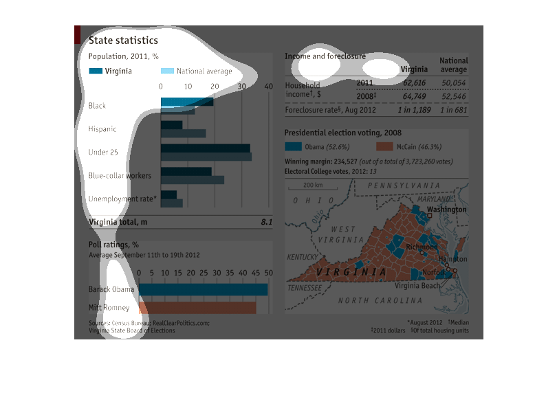
This chart depicts different statistics related to the 2012 elections from the state of Virginia
including ethnicity, age, working class and income as well as a breakdown of how the state
voted by district.
The image is a graphic describing the demographics and political behavior of Virginians. Demographics
are compared to national averages. Poll ratings of Barack Obama and Mitt Romney are provided.
Income and foreclosure ratings are provided. Voting proportions for Obama and Romney are also
reported. Last, electoral college votes are reported.