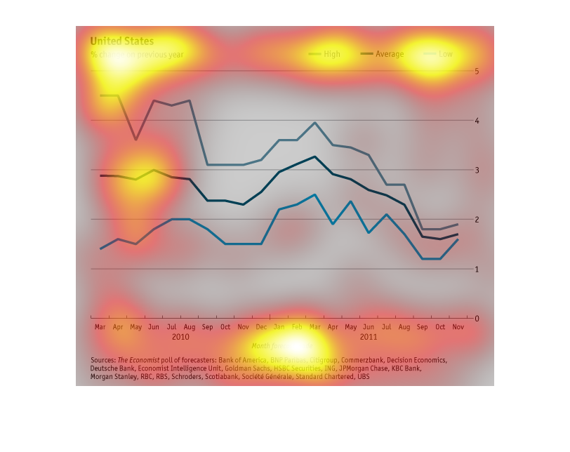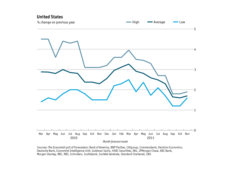
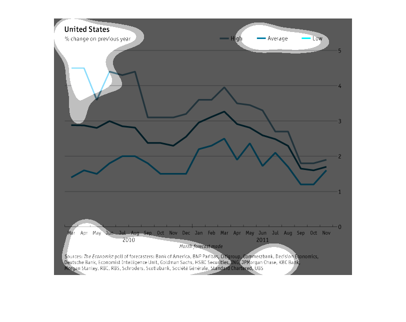
The chart shows the change in something, presumably financial or stock market data, on a month
by month basis. There are seperate lines for the high, low, and average. There seem to be
some seasonal trends, and overall the trend is downward.
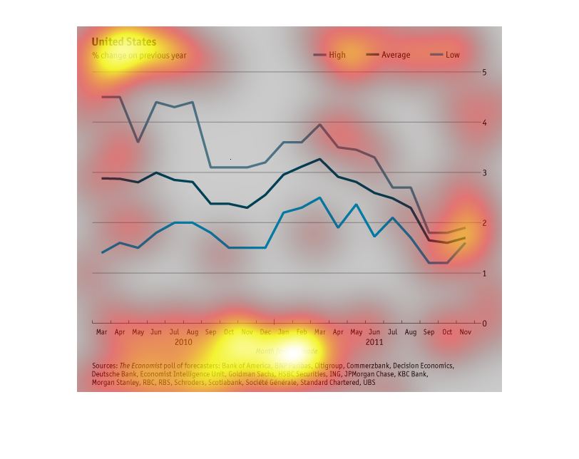
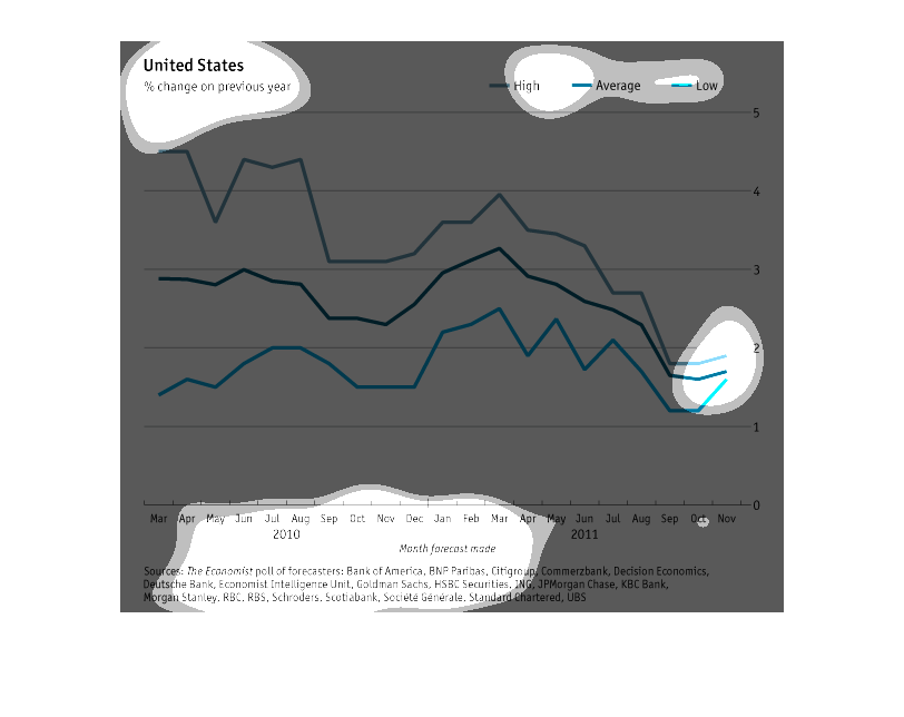
This chart describes the United States in 2010 and 2011 and compares the forecast from the
two years for the months of March, April, June, July, August, September, October, November,
and December.
This chart show the United States, and the % change on previous years. The chart goes from
March to November. It shows the difference in months. The chart dips up and down.
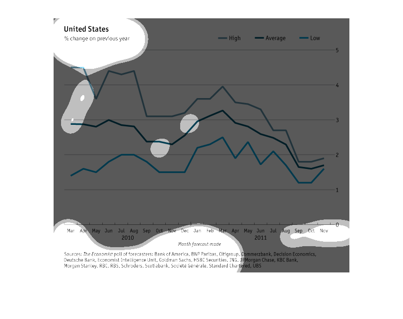
This chart shows the United States % change over the previous year (monthly 2010-2011).  At
the beginning of 2010, the change was well above average and has begun to drop significantly
towards the end of 2011. There was a documented spike in change around March of 2011 before
the % change dropped extremely low.

This shows a change in percentage in the US from the previous year, but I cannot figure out
what it is that is changing. Something has decreased over time, but I cannot figure out the
Y axis.

This chart is lacking some information. It does not specify to what the percentages are referring.
However, this chart does track three different economic percentages in the United States (low,
average, and high) over the course of almost two years.   According to the chart, all three
percentages increase and decrease at the same times; however, in March 2010 (at the beginning
of the chart) the three percentages were each at least a full percentage point apart (2% and
3%, for example). Near the end of the graph, in November 2011, the gaps between high, average,
and low percentages were much smaller.
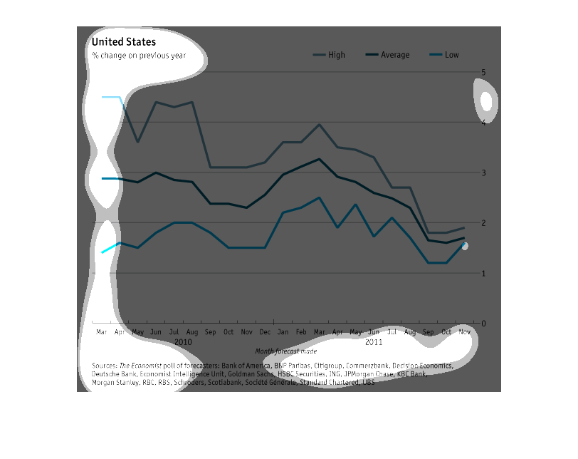
This chart simply has United States listed and a line graph measuring three things that are
not listed. It is not possible to gather any meaningful information from this chart. Numerous
corporations are credited for no clear reason.
it is really really a blurry image, but looks like a river based map of some sort. i am not
100 % certain of this but what i make out looks like a river map.
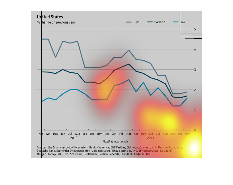
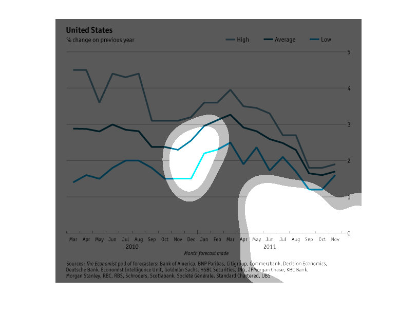
This is a beautifully illustrated line graph that helps visually signify the United states'
percent change over the previous year. As of the end of 2011, change has declined to sub-2%
for High Average and Low segments, but all are projecting rising trends in the months to come.
I can't find exactly what this graph is suppose to be showing, but it includes lines of 'high'
'average' and 'low' from 2010 to 2011.  All three lines show an overall negative trend, with
quite a bit of variability.  Best I can gather it has something to do with banks in the U.S.
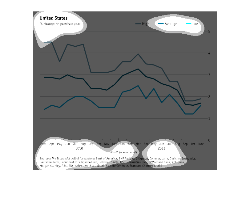
This chart shows the percentage change of financial forecast trends compared to the previous
year's forecast in the United States by month from March 2010 to November 2011. We see that
October and November's trends seem to be the most similar year to year.
It is a line graph of the United states of America and the changes that accrued in a full
calender year it does not how ever start off in January like the year or calender them selfs
but instead it starts off In may like it's going along with the zodiacal year but never the
less it's still a year
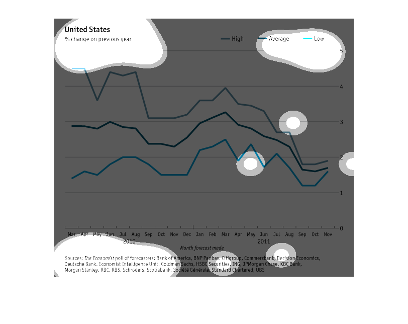
The title of this graph is United States, this can be found in the upper left hand corner.
 There are there data streams being charted, high, average, and low.  Data seems to be from
years 2010 and 2011 listed by month.
This image describes changes in high, average, and low financial forecasts in the United States
from 2010 to 2011. The changes are in comparison to the previous year.