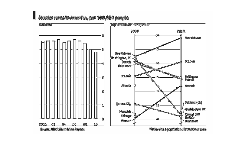
This chart depicts the murder rates in America per 100,000 people between the years 2000 and
2010. It then correlates them as they have risen or fallen between the years that the data
was taken.
Error using .*
Matrix dimensions must agree.

Error in plotSpotlight (line 30)
    output = repmat(a,[1 1 3]).*single(im)/255;

Error in plot_individual_user_maps (line 49)
        [heat] = plotSpotlight(im,heatmap,3);