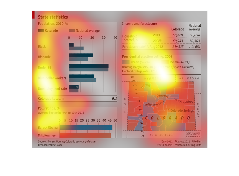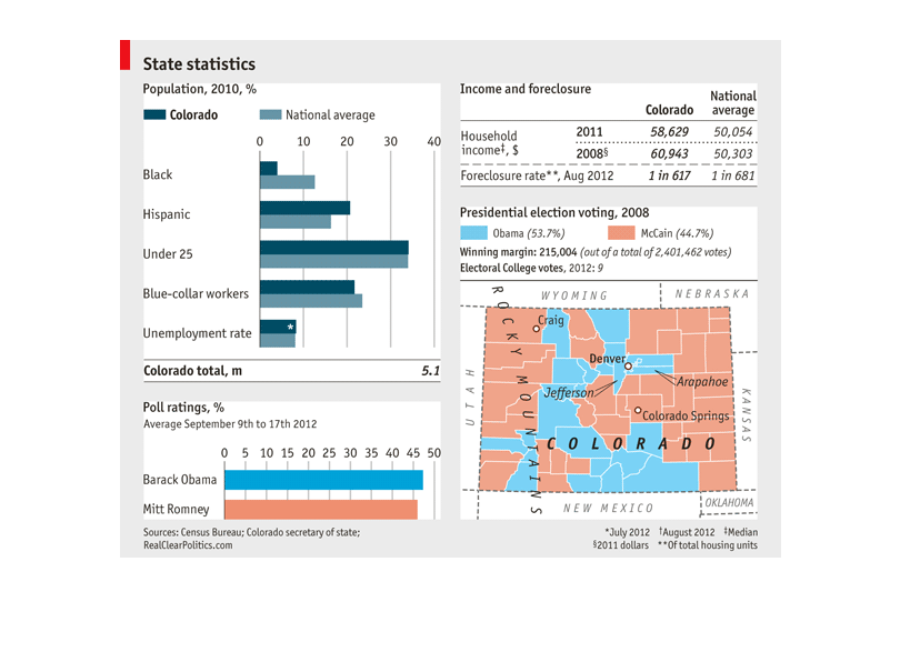
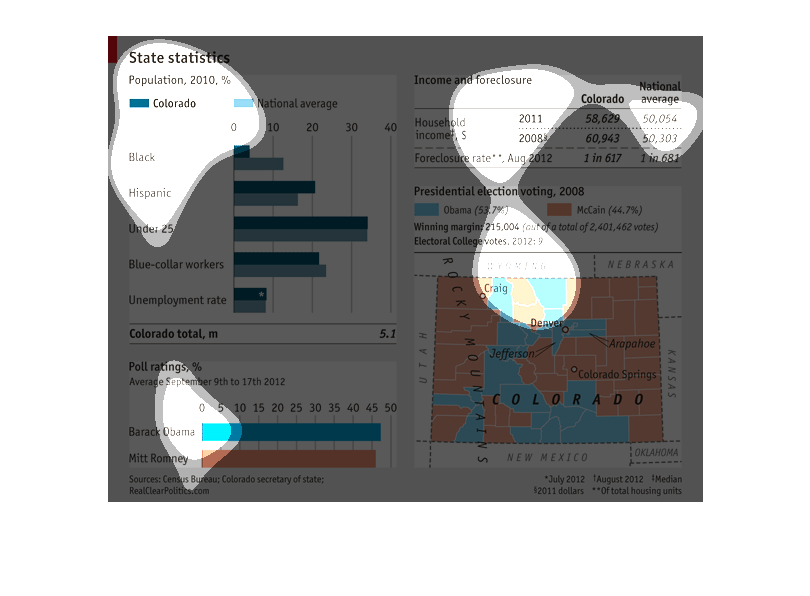
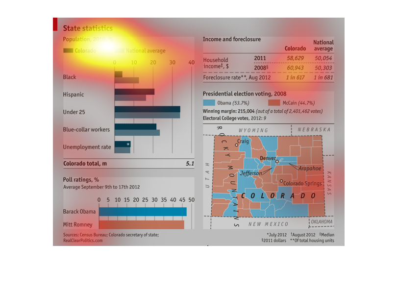
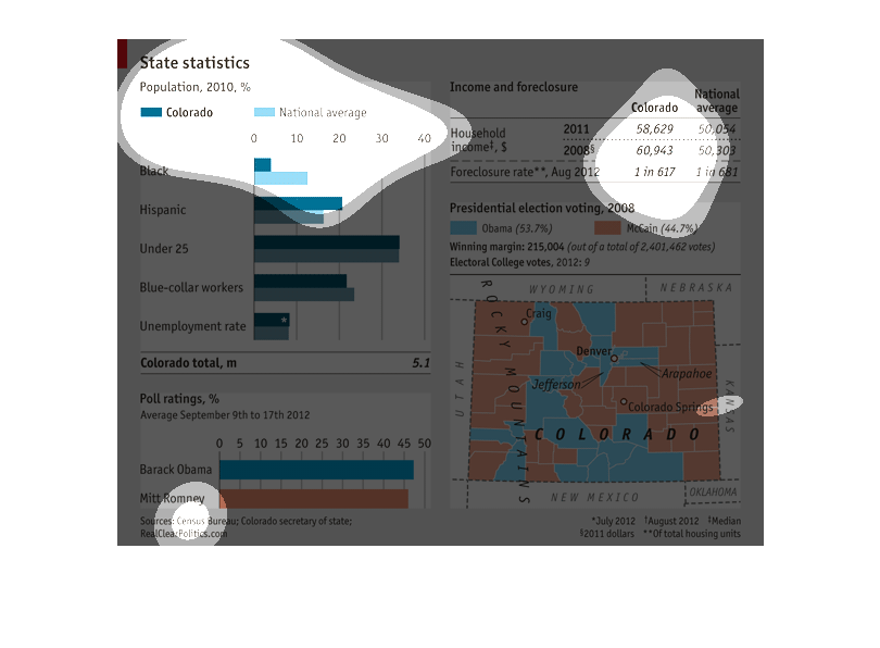
The left graph shows the general demographics of Colorado in comparison to the national average.
The bottom-left graph shows poll ratings for the 2012 presidential election for Colorado from
September 9th to 17th. The bottom right graph shows how each county in Colorado is voting
in the 2008 election. The top right table depicts income and foreclosure rates in Colorado.
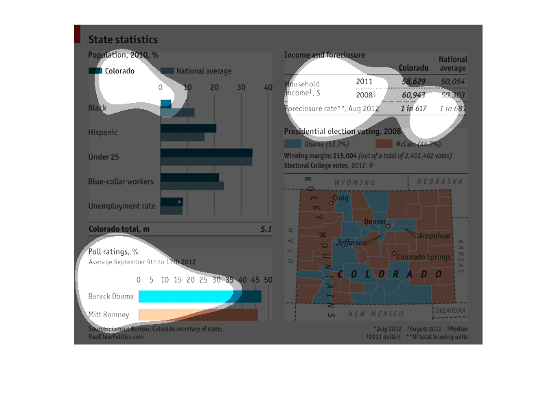
This chart describes demographics in the state of Colorado. there is political information,
foreclosure rate, political preference. Ethnic makeup of the population, employment statistic
This series of graphs shows state statistics in 2010 for Colorado.  It has population by race.
 It shows the popular and electoral college votes for Presidential election.  It also shows
the amount of income and foreclosures in the area.
This image includes graphs and a map of the US. It is depicting results from the 2012 election
between Barack Obama and Mit Romney. Data is sorted by socio economic class, race, as well
as by state.
This graph compares Colorado demographics and economic health with National averages. Although
foreclosure rates were slightly higher than average, household income was higher. Demographics
were similar to National averages, in terms of race, age and social class. In 2012 Colorado
slightly favored Obama in the Presidential election; Democratic votes coming primarily from
the more urban areas.
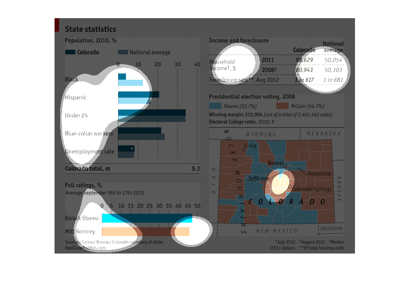
graph is State Statistics for Colorado on population in 2010, income and foreclosure. Presidental
election voting in 2008 for obama and mccain and poll rating for average in september of 2012
This is a series of graphs and charts of the state of Colorado as it relates to demographics
and the presidential election of 2012 between Obama and Romney.
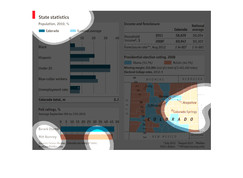
This chart describes a state in many different aspects. The state it describes is colorado,
and includes the population. Also a chart on income, and a chart on which president was supported
in 2012.
This graph describes State Statistics for population 2010. The different states, and races
of blue collar workers, unemployed within the state of Colorado.
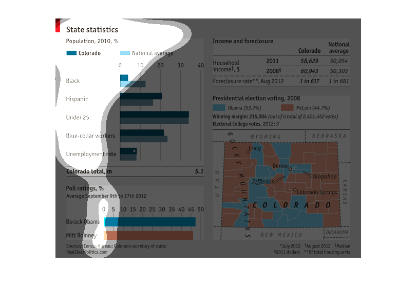
This is a chart of state statistics for the state of Colorado. It includes the population
of 2010 in percentages, household income and voting trends among other stats.
This graph is talking about "state" statistics" and it's differentials from race when it comes
to "unemployment" all the way to "employed."  The graph also describes foreclosed homes from
2011 to 2008, along with a "voting" chart.
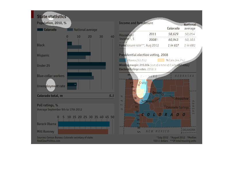
This image shows the state statistics for Colorado. It shows the statistics on race, employment,
foreclosure and how the people voted in the previous election.
There are several different graphs on this image. 3 of them refer to different statistics
for various states while the third one focuses on presidential approval ratings.
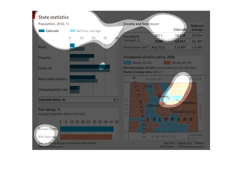
The graph shows basic and advanced statistics belonging to the population of the state of
Colorado. The statistics shows the population relative to the national average, some sociodemographic
statistics, the geographic location of varying population densities, and financial statistics.
This chart shows information on a city, including employment rates, poll ratings, income disclosure.
All of these are also rated based on Colorado numbers and then compared to national numbers.