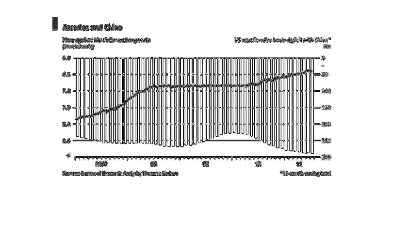
The graph highlights differences between China and the US. On one end you have the yuan against
the dollar exchange rate and you have a line graph that lines up with the other end which
features the US merchandise trade deficit with China. Over the course of time as the exchange
rate lowered, the trade deficit rised.
Error using .*
Matrix dimensions must agree.

Error in plotSpotlight (line 30)
    output = repmat(a,[1 1 3]).*single(im)/255;

Error in plot_individual_user_maps (line 49)
        [heat] = plotSpotlight(im,heatmap,3);