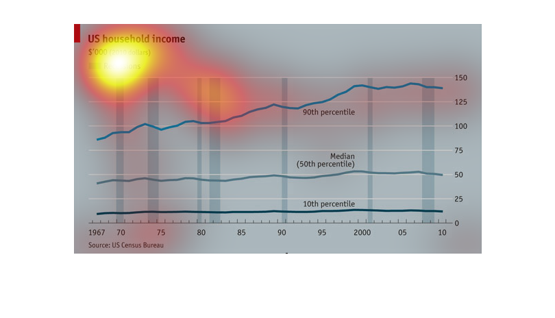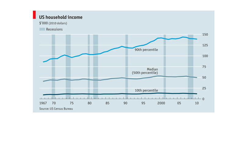
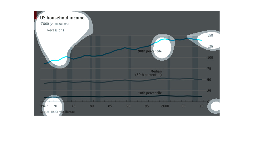
This chart describes the relationship of recession and income from 1967-2011 in dollar amounts.
Explains what percentile falls into these categories and the year.
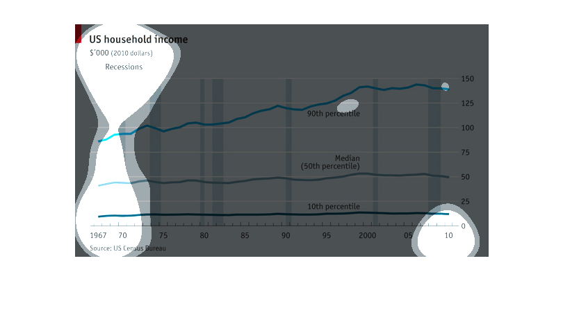
The chart shows the average of US household income. The period covered in the chart ranges
from 1967 to 2010. It also includes an indicator as to when the economic depressions were
during that period of time. It shows that people in the 10th to 50th percentile's income remained
virtually unchanged, while the population that falls in the 90th percentile income gradually
increased.
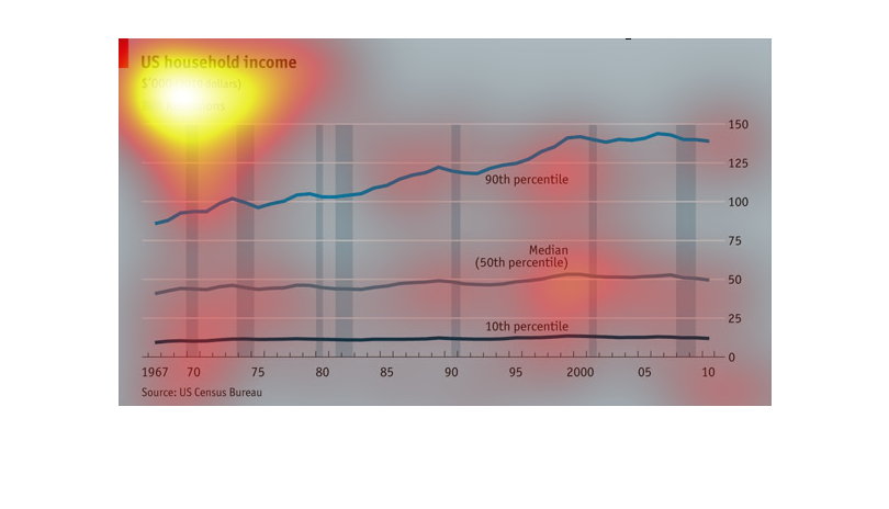
This shows over time the average US household income, with recessions shown as vertical columns.
We see the top 10% are constantly gaining while the rest maintain over time, if not fall slightly.
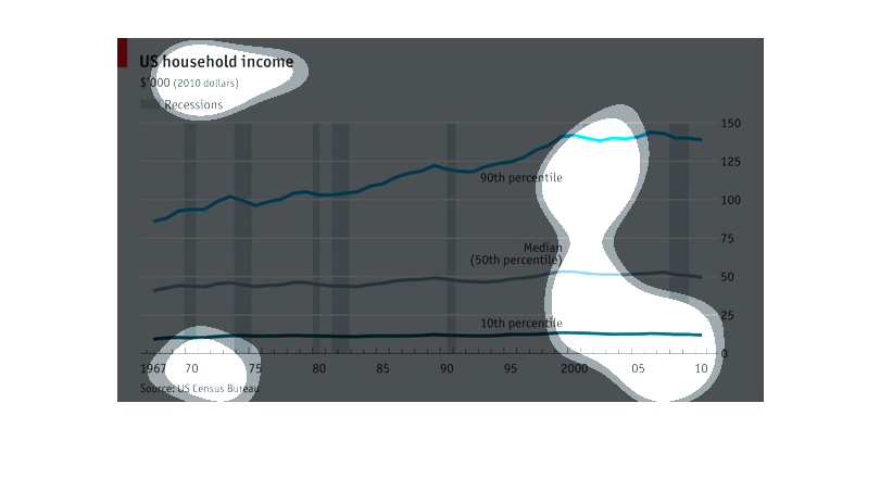
A graph about US household income. The graph has 3 lines: 90th percentile, 50th percentile,
and 10th percentile. It starts at 1967 and goes all the way to 2010. The 90th percentile had
the biggest change as the years past it would get higher. The 50th and 10th percentiles had
steady lines throughout the years.
This graph shows US household income from 1967 to 2010, broken down into percentiles, and
with periods of recession shown. While the bottom 50th percentiles of wage earners showed
no change in income over that time period, the 90th percentile showed steady increases over
that time period.
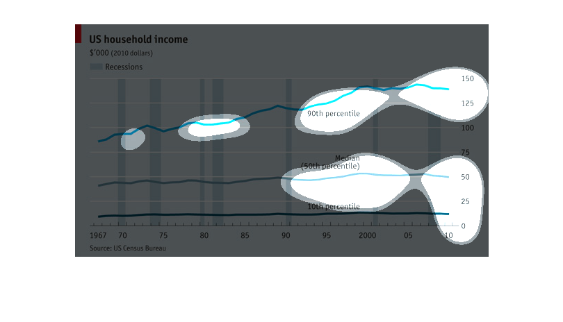
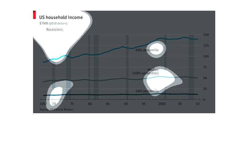
This image represents data that needs to be shown in the form of a line graph. This line graph
that represents certain data must be reflecting growth of the data and loss.
US Household income from 1967 till 2010 in years and range from 0-150K in dollars. The line
graph represents the amount of money and how it changed and the bar graph part represents
depressions over the years.
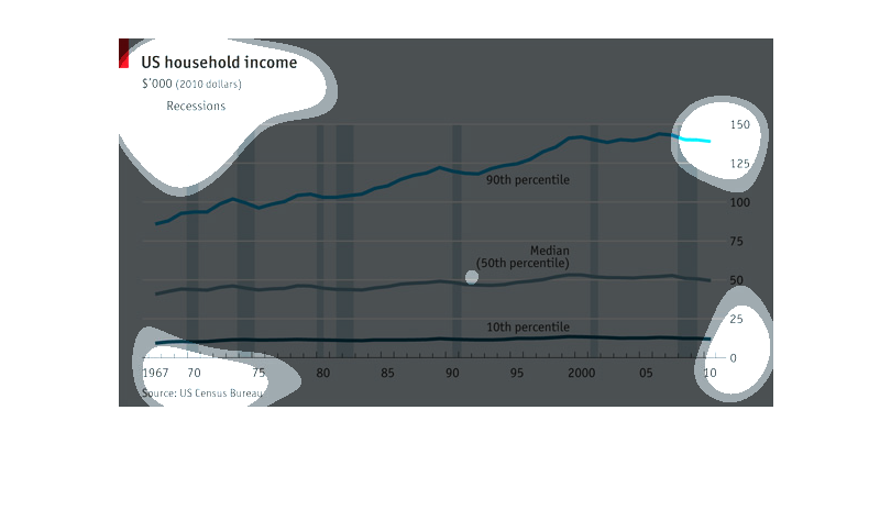
This graph depicted U.S. household income  ranging from 1967 to 2010, using 2010 constant
dollars. The bar graph uses trend lines to show the gradual increase in household income over
the 40+ year span, with periods of recession noted by a blue vertical line. The trend lines
show that the 10th percentile of earners stayed relatively steady over 40 years and despite
recessions, while median earners saw a slight increase in their annual income during the same
period. The 90th percentile of earners saw the most significant increase over time, increasing
from to approximately 100k to 135K annually. All data is from the U.S. Census Bureau.
This chart describes US household income for the years 1967 through 2010. The lowest income
rates are recorded in the 1960s. The chart is sourced by the US Census Bureau.
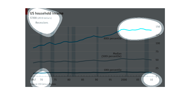
A chart that describes the trend of household incomes over the years, the average household
income has been steadily increasing since the 60's with the rich getting richer and the lower
and middle classes staying roughly the same
This is a chart depicting US household income from 1967 to 2010, all in 2010 dollars. While
the overall trend line is up, in recent years there has been a slight trend downwards.
This graph depicts US household incomes from 1967-2010 and how it correlates to economic recessions.
The bottom 10th percentile of household income appears to be affected the least during recessions,
the line graph appearing overall quite steady. The median household income has more fluctuation
in income during recession years and seen minimal growth. The highest income earners were
more affected by recessions from 1967-1980's yet it appears in the last 20 years the largest
earners saw significant gains in income, independently of recessions.  In summary the data
in this graph reveals the lowest and highest earners are not as financially impacted by recessions
as the middle class.
The chart shows the rise in household incomes since 1967. The lines represent the incomes
of households in the 10th, 50th, and 90th percentiles. Adjusted for inflation, the richest
got richer while the others did not.
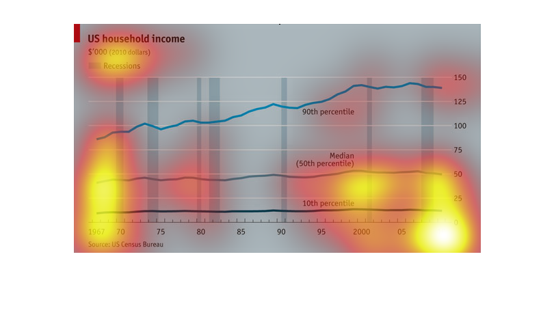
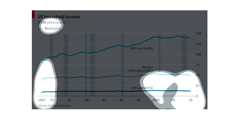
A chart of US household incomes from 1967 to 2010 which chart showing periods of time when
recessions occurred. Shows steady incline for most of the periods