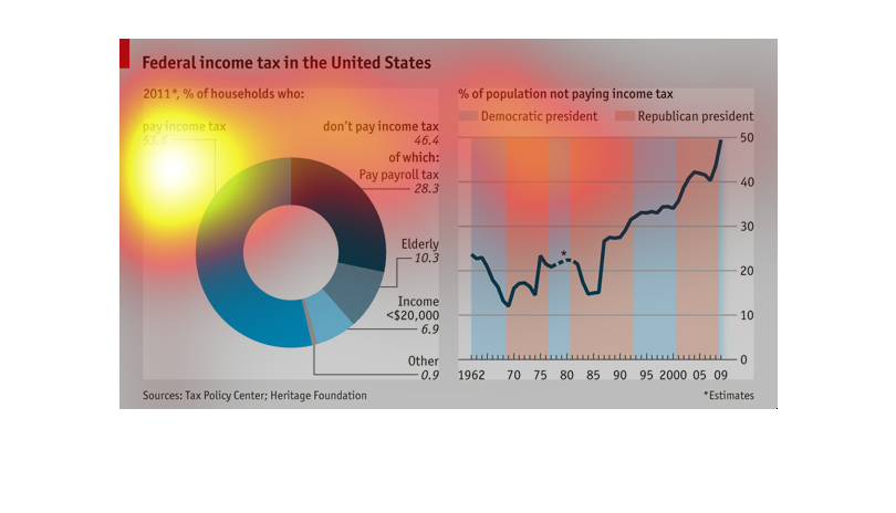
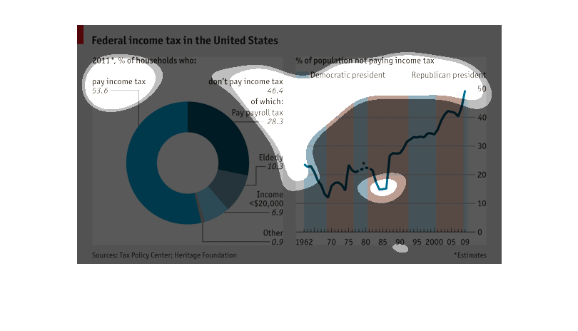
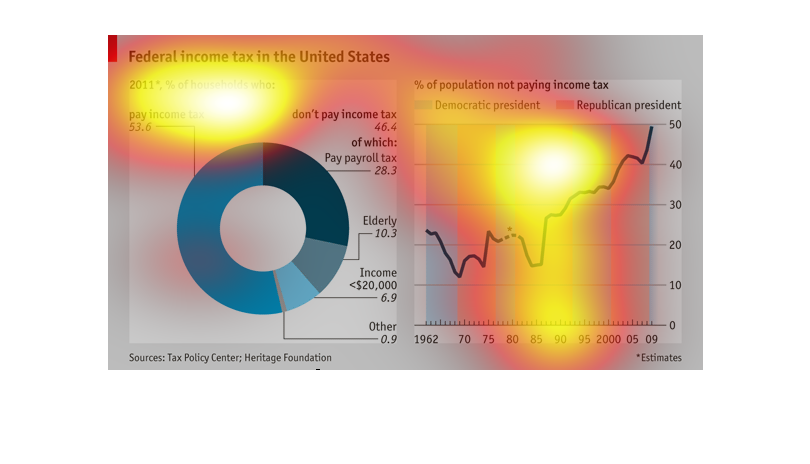
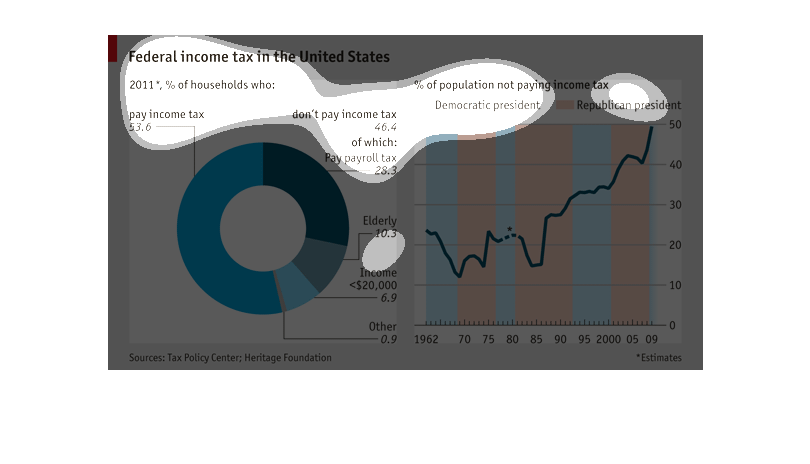
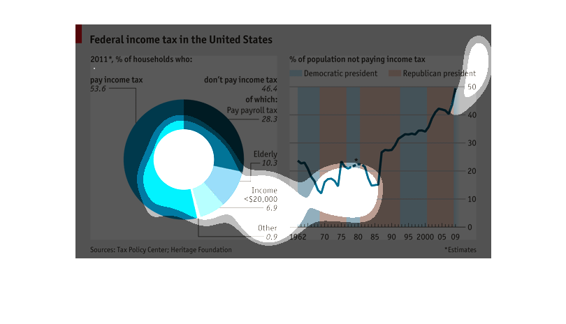
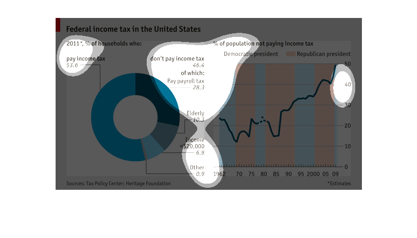
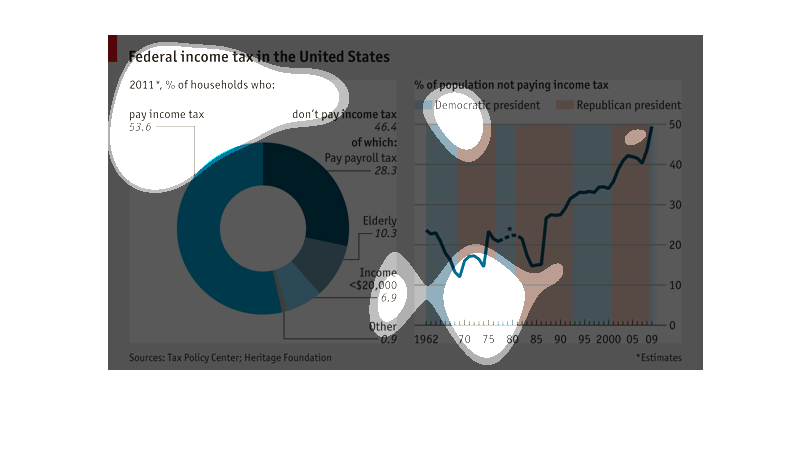
This is a chart depicting the federal income tax in the United States as of 2011 in terms
of those who do pay income taxes, those that don't and the overall percentage of the population
who pays no income tax.
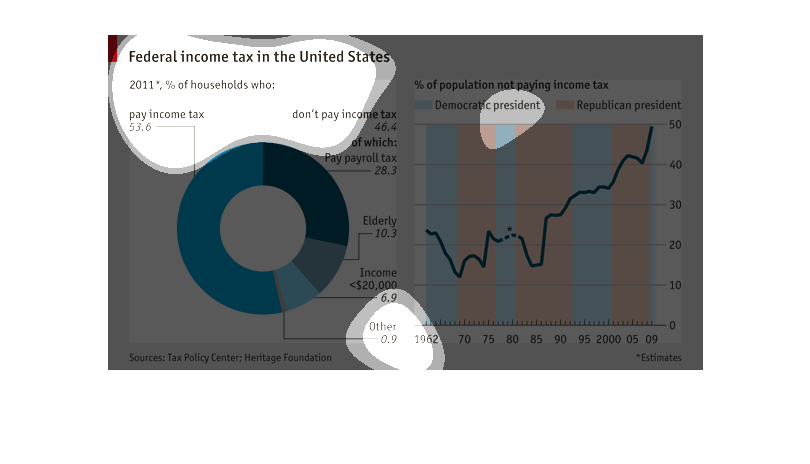
The left side of the chart shows the percentage of households that pay income tax and the
percent of households that don't pay income tax, 46.4 % of households don't pay income tax
but of those households 28.3% pay employment tax. The right side of the chart shows the percent
of households that don't pay tax from 1962 through 2009 and shows if a democratic or republican
president was in office in the time. It appears that the amount of households not paying income
tax has continued to rise from 1962 regardless of the political party of the president at
the time
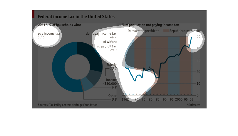
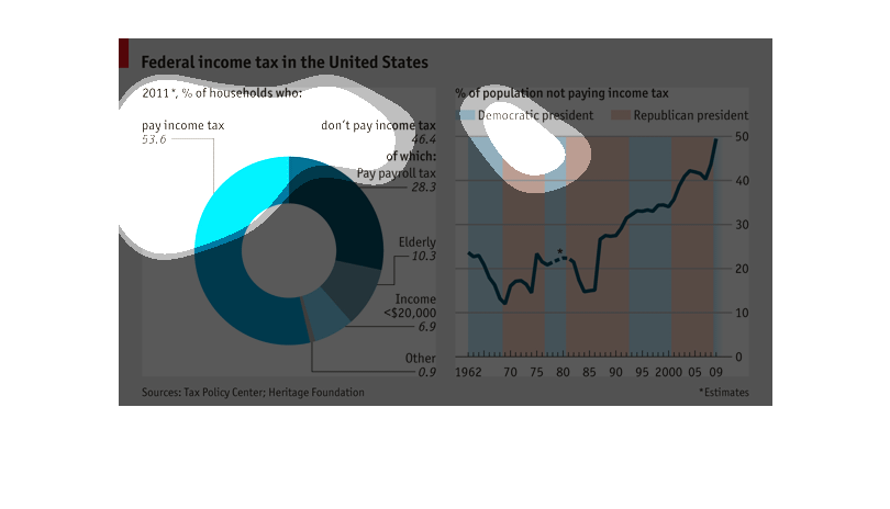
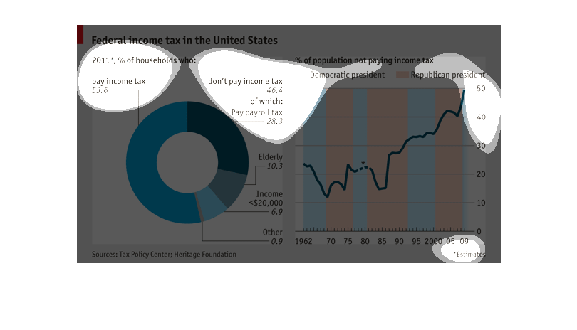
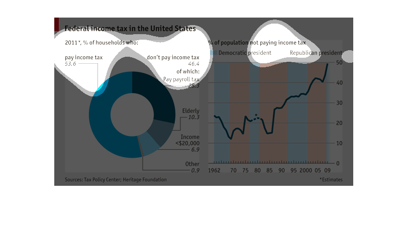
This graph is about the federal income tax. On the left is a circular graph showing the percentage
of those who pay an income tax, and those who don't. The graph on the right side shows the
percentage of the population not paying an income tax from the years 1962 through 2009 and
also shows whether it was a Democratic president in blue or a Republican president in orange.
Starting in the mid-80s, there has been a significant rise ever since.
defined in a comprehensive manner in the Internal Revenue Code and tax regulations issued
by the Department of Treasury and the Internal Revenue Service. Taxable income is gross income
as adjusted minus deductions. Most states and localities follow these definitions at least
in part, though some make adjustments to determine income taxed in that jurisdiction. Taxable
income for a company or business may not be the same as its book income.

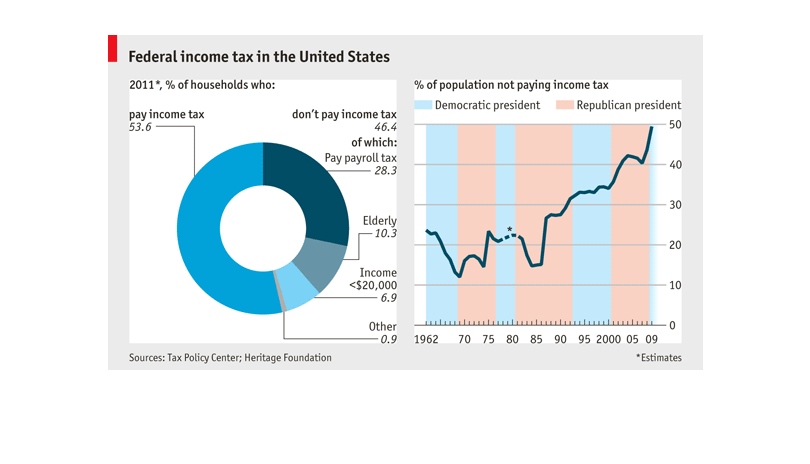
This chart describes federal income tax in the United States in the year 2011, as a percentage
of households who pay income tax and don't pay income tax.
Federal income tax in the United States. Looking at percentages of households that pay income
tax, don't pay income tax, are elderly, pay payroll tax, and those who make more than $200,000
The "federal income tax in the United States" image includes two charts based on date from
the tax policy center and the Heritage Foundation . There is a donut chart showing the people
who pay income tax, people who do not pay income tax, the elderly, those with incomes under
$20,000 and "other."  The other chart is a combination chart potting the percentage of people
not paying income tax since 1963 against whether there has been a Republican or Democratic
president. It shows that the percentage not paying income tax has gone up over time.

These charts show data of Federal income in the United States and identifies the percentage
of who pay income tax and who don't pay. On the left side there's a pie chart of the households
of 2011 and 53.6% paid their taxes with 46.4% not paying. The chart of the right shows data
of those who didn't pay their taxes of the year in conjunction with the president and their
party.
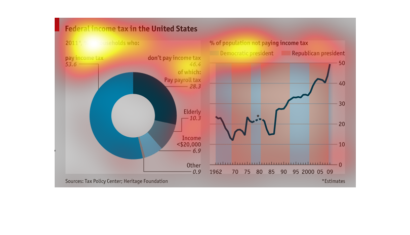
Two charts showing the percentage of the population which pays income tax in the United States,
and the correlation between the president's political affiliation and the percentage of Americans
which don't pay income tax.
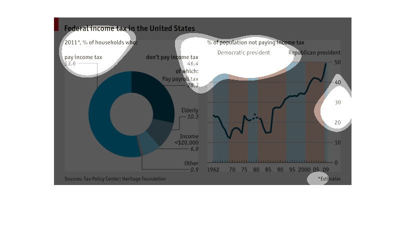
Image is very very blurry and the clicking is not working at all. However, I see what looks
like a big blue circle to the left with writing on the side and what looks like a chart/graph
with blue and orange vertical line with writing on it also.
Two graphs; one pie chart describing the taxes/demographics of people who do not pay income
taxes.  The second is a line graph showing how the percentage of people who do not pay income
tax has increased significantly over time; this graph also has the background color coded
to indicate the party affiliation of the president during the time period.
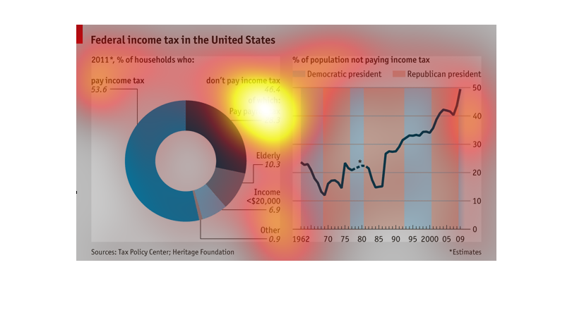
The 2011 US federal income tax is examined by households in the chart on the left.  53.6 of
households paid income taxes at one level or another, 46.4 (payroll-tax exemptions, elderly,
'other) did not.   The chart on the right looks at percentages of households that didn't pay
income taxes under Democratic presidents vs. Republican presidents from 1961 to 2009.  And
2009 was the high spot, with 50% not paying.
The graph on the left shows federal income tax in the US in 2011 with a radar chart of those
who paid tax compared to those who didn't.  The graph on the right shows the percentage of
people not paying income tax who were Democrats and Republicans.
This shows multiple statistics as to percentages of households in the US who commit various
acts, like paying income tax (53.6%), payroll tax (28.3). It also shows the trends over time
with a republican and democrat present. Overall, the percentages are increasing.
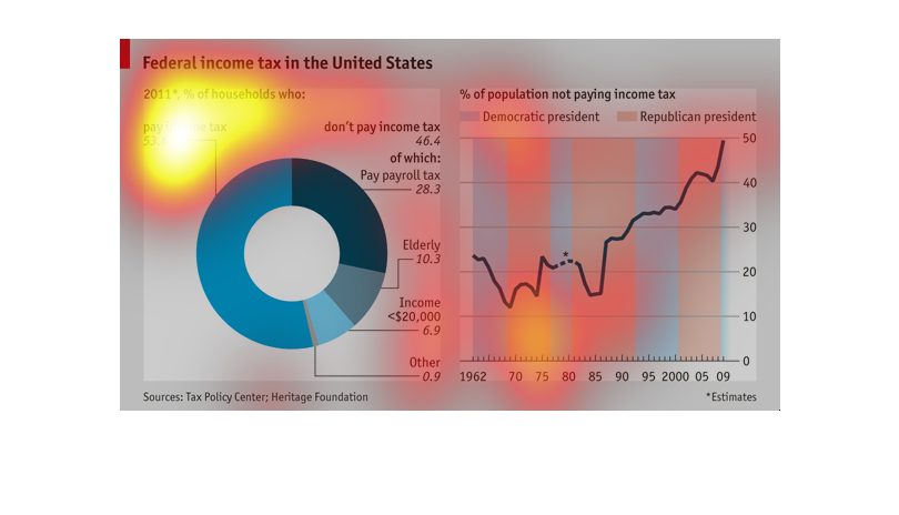
This chart describes the federal tax income of households who paid taxes in 2011 compared
to the percent who did not pay with relations to political party preference.