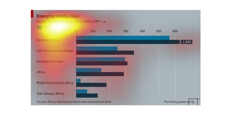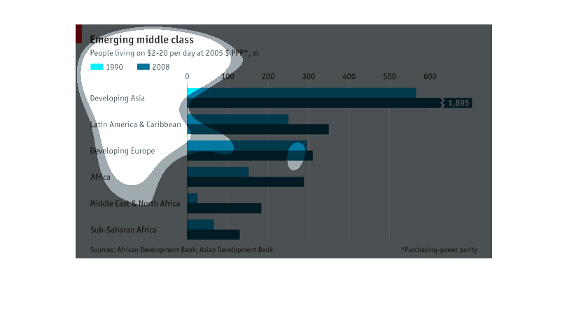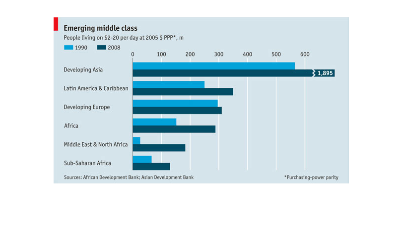
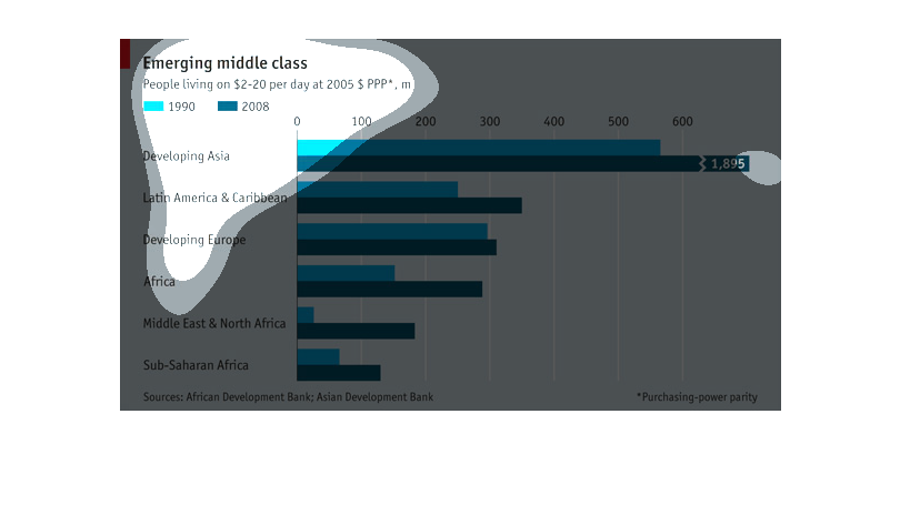
This chart shows the comparison of the amount of people living on $2-20 per day in various
developing regions of the world. It compares the data in 2008 to 1990.
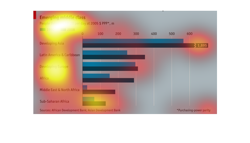
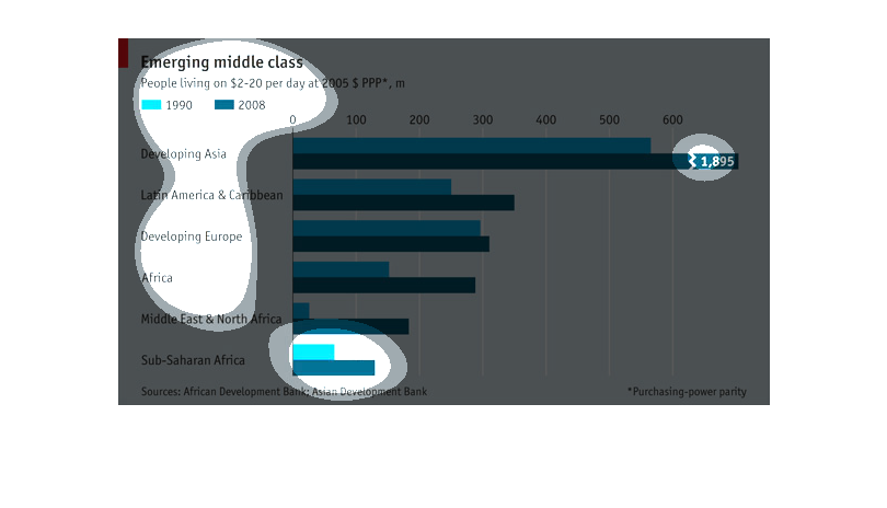
This chart describes the emerging middle class. Specifically people living on $2-20 dollars
per day. Years represented on the chart include 1990 and 2008.
This graph shows the emerging middle class, comparing the growth of these nations in the 90s
to the development in the later half of the 2000s. The graph shows that Asia went far and
ahead in that regard over Africa, the middle east, and Latin America during the 2000s in this
regard.
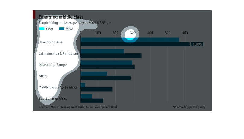
This is a chart showing the growth of the emerging middle class living on between 2 and 20
dollars per day in several areas around the world. Developing Asia is shown to lead this growth.
The chart looks at the emerging middle class in developing countries (grouped by continent),
comparing incomes in 1990 versus 2008.  Developing Asia was doing significantly better than
other developing countries in 1990, and increased their lead even more in 2008, with earnings
almost 6 times higher than the next group of countries  (Latin America).
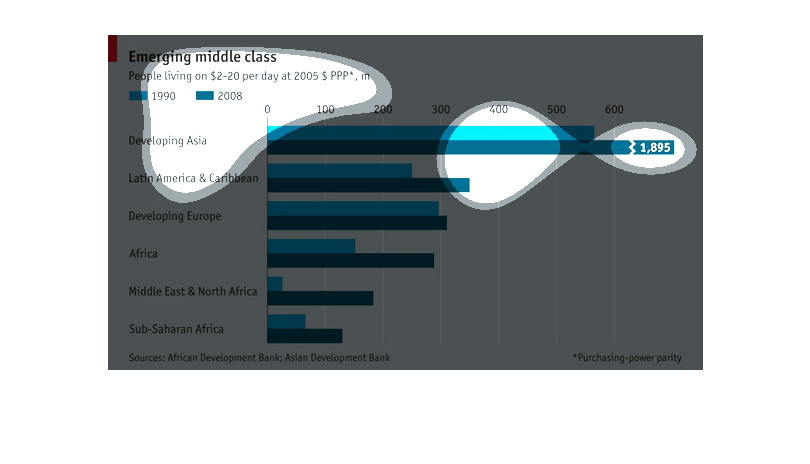
The image is talking about emerging middle class individuals living on 20 dollars a day or
less.   Its focus is on developing countries and the middle east.
This graph shows the population of middle class individuals in multiple geographic locations.
The middle class is defined as someone living on $2-$20 per day.
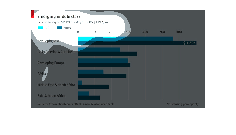
This shows the middle class (those who live on $2-$20 per day) in 1990 and 2008 in Developing
Asia, Latin America, Developing Europe, Africa, the Middle East, and Sub-Saharan Africa, in
millions. The amounts have increased all over these areas, but especially so in developing
Asia with over 1 billion more. Proportionally, Middle East/NE Africa gained quite a bit as
well, going from about 15 million to 190 million.
This graph show the emerging middle class in developing areas. Like developing western Europe
and Sub-saharan Africa. Developing Asia is expected to have the largest growth in the middle
class based on 2005 money usage. There is a clear increase from 1998 and 2008, however it
shows that some areas are still struggling to grow. Developing Europe is not expected to grow
much within the ten years, which could beg the question of what is holding back some form
of greater progress into industrialization.
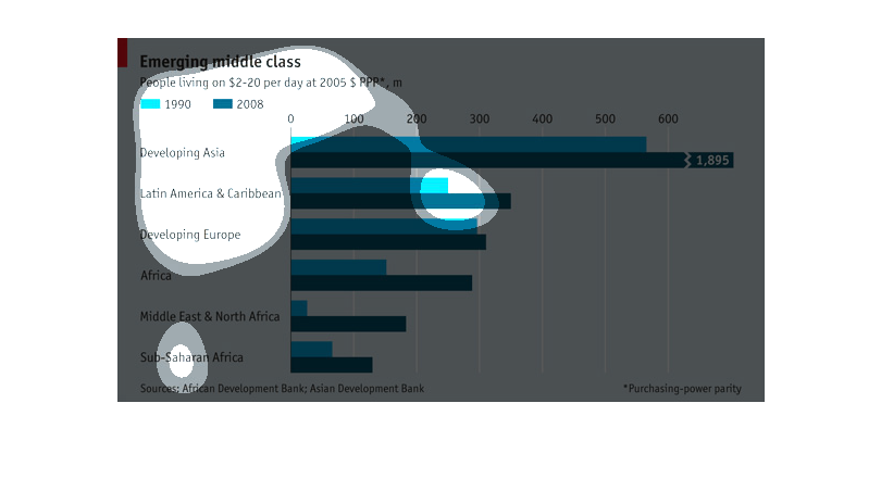
This graph represents the emerging middle class.  The statistical data has been collected
from many different types of countries around the world.  It ranges from 1990 to 2008.
The graph is showing the difference in middle class purchasing power and how it has grown
over time for developing Asia, Latin America and the Caribbean, Developing Europe, Africa,
Middle East and North Africa, and Sub-Saharan Africa. The years for comparison are 1990 and
2008 and displays the number of people living on $2-20 per day. In all countries there is
a larger middle class from 1990 in 2008.
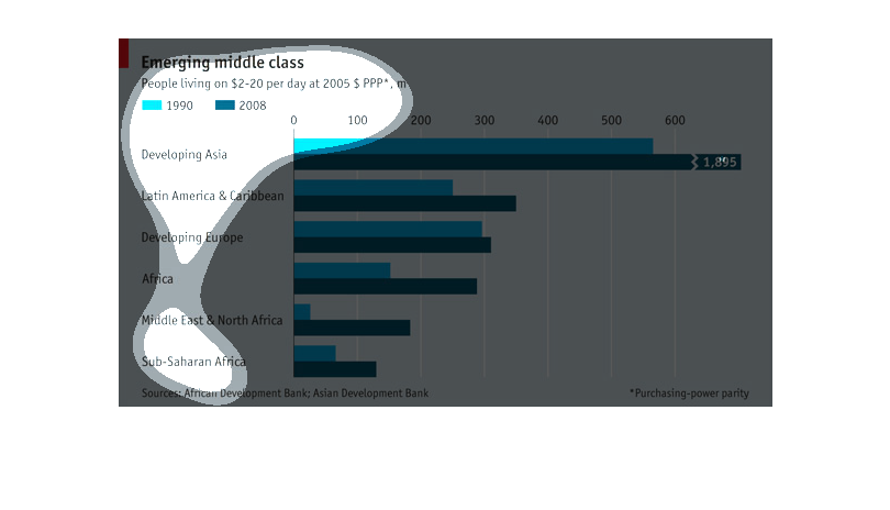
This image compares the number of people living on $2-20 per day between 1990 and 2008, categorized
by regional area.  It went up for every area, although in some areas the number went up more
than others.
this is a bar graph the represents a comparison of two quanities   The quanity  repressented
by gray bar is greater that the blue bar The infor mation seems to be related to developing
countries
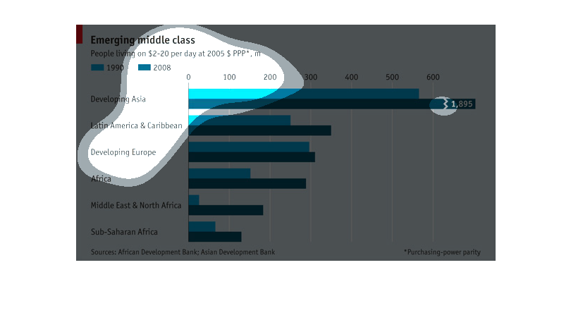
This graph shows the emergence of the middle class population which is people living on between
$2-20 per day.  Sub Saharan Africa has the lowest rate of emerging middle class.
The graph shows how many people in the respective areas are living on $2-$20 dollars per day.
 The light blue bar showing the amount of people living on this amount of money in 1990 and
the dark blue showing the amounts for 2008.