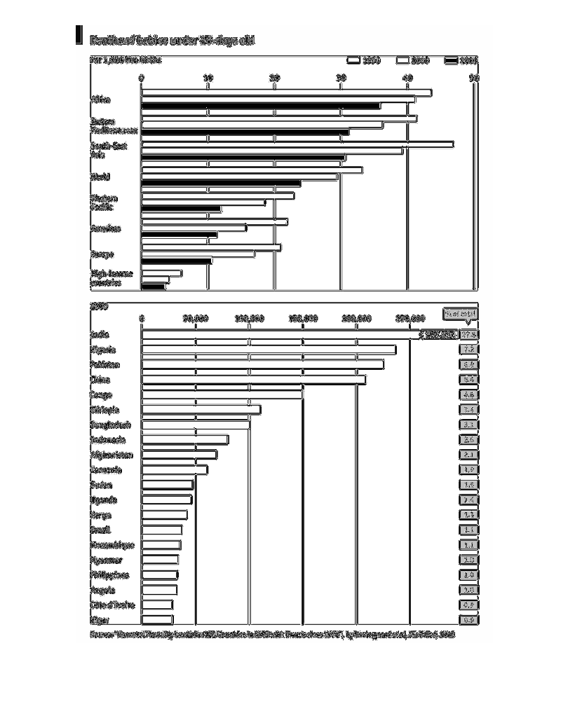
This is a chart of the deaths of babies under 28 days. This chart is ranks by country. In
the top graph, baby death is per capita and shown in three different years and in the bottom
chart it is total deaths. In the lower chart the shape is very left leaning. In the top it
is closet to a smooth decrease as the list progresses downward.
Error using .*
Matrix dimensions must agree.

Error in plotSpotlight (line 30)
    output = repmat(a,[1 1 3]).*single(im)/255;

Error in plot_individual_user_maps (line 49)
        [heat] = plotSpotlight(im,heatmap,3);