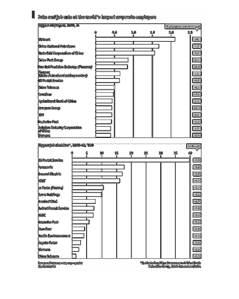
A set of two bar graphs. The top one depicts the corporations with the largest number of employees,
in increments of 1 million, with a separate set of data points on the right explaining what
the change over (or under) the previous year is in percentages.  The bottom graph depicts
the corporations that have terminated the employment of the largest number of people, from
2009 to 2010, along with the percentage change.  The graphs are sourced from Fortune and The
Economist.
Error using .*
Matrix dimensions must agree.

Error in plotSpotlight (line 30)
    output = repmat(a,[1 1 3]).*single(im)/255;

Error in plot_individual_user_maps (line 49)
        [heat] = plotSpotlight(im,heatmap,3);