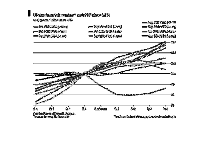
Line graph of US stock market crashes and GDP since 1951. Separated by quarter. Looks like
crashes are higher during the fourth quarter. Might have an outlier arching on the bottom
of the chart.
Error using .*
Matrix dimensions must agree.

Error in plotSpotlight (line 30)
    output = repmat(a,[1 1 3]).*single(im)/255;

Error in plot_individual_user_maps (line 49)
        [heat] = plotSpotlight(im,heatmap,3);