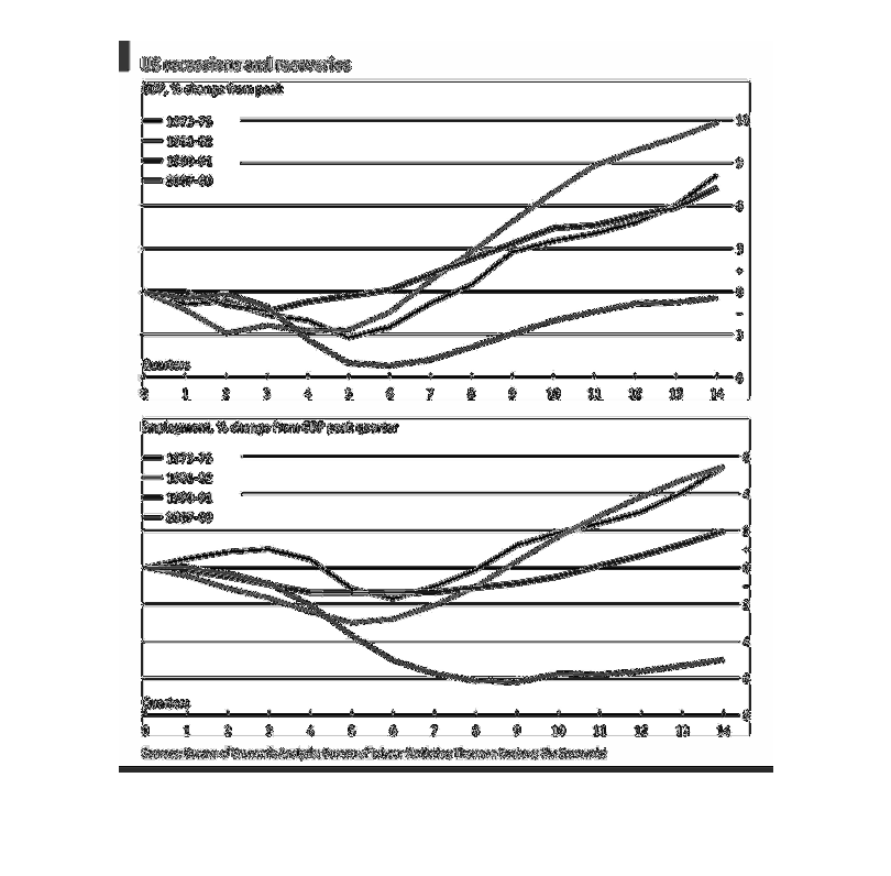
There are two different graphs in this image. The first graph is the US recessions and recoveries
and the GDP % change from peak. It lists years 1973-75, 1981-82, 1990-91, and 2007-09. The
graph is broken up by quarters on the bottom of the graph. The second graph is the Employment
% change from GDP peak quarter. It lists years 1973-75, 1981-82, 1990-91, and 2007-09. This
graph is also broken up by quarters on the bottom of the graph.
Error using .*
Matrix dimensions must agree.

Error in plotSpotlight (line 30)
    output = repmat(a,[1 1 3]).*single(im)/255;

Error in plot_individual_user_maps (line 49)
        [heat] = plotSpotlight(im,heatmap,3);