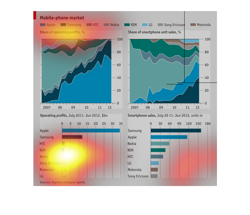
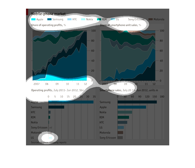
This shows the mobile phone market for Apple, Samsung, HTC, Nokia, RIM, LG, Sony, and Motorolla
in share of profits and share of unit sales.  Nokia is going WAY down while Apple and Samsung
are leading the way. Motorola barely exists anymore.
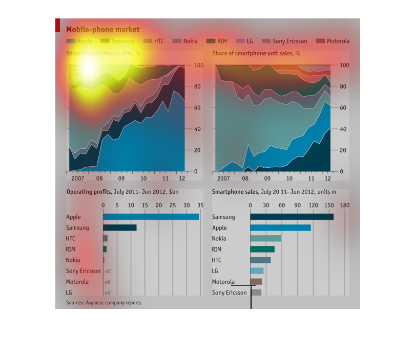

This graph depicts manufacturers in the mobile phone market in relation to each other in terms
of percentage of the market share. It shows the share of market profits, along with the share
of smartphone sales.
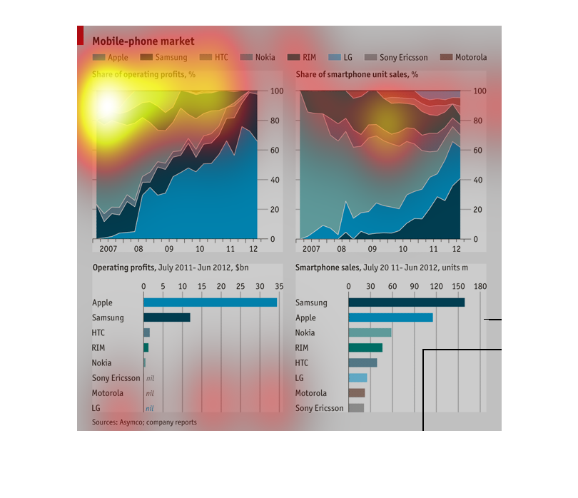
The chart, shows the differences in the mobile phone market over the different platforms of
cellphones. It specifically shows the amount of phones sold and the operating profits of the
phones (profit from selling phones).
The graph portrays the share of operating profits, share of smartphone unit sales  in the
Mobile phone market by showing the shares of operating profits and smartphone sales of Apple,
Samsung, HTC, Nokia, RIM, LG, Sony Ericsson and Motorola in two separate charts. It also
graphs the total operating profits and smartphone unit sales of these companies. The years
covered include from 2007 through 2012.

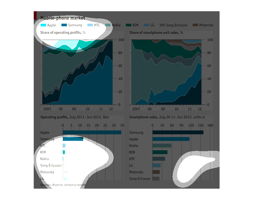
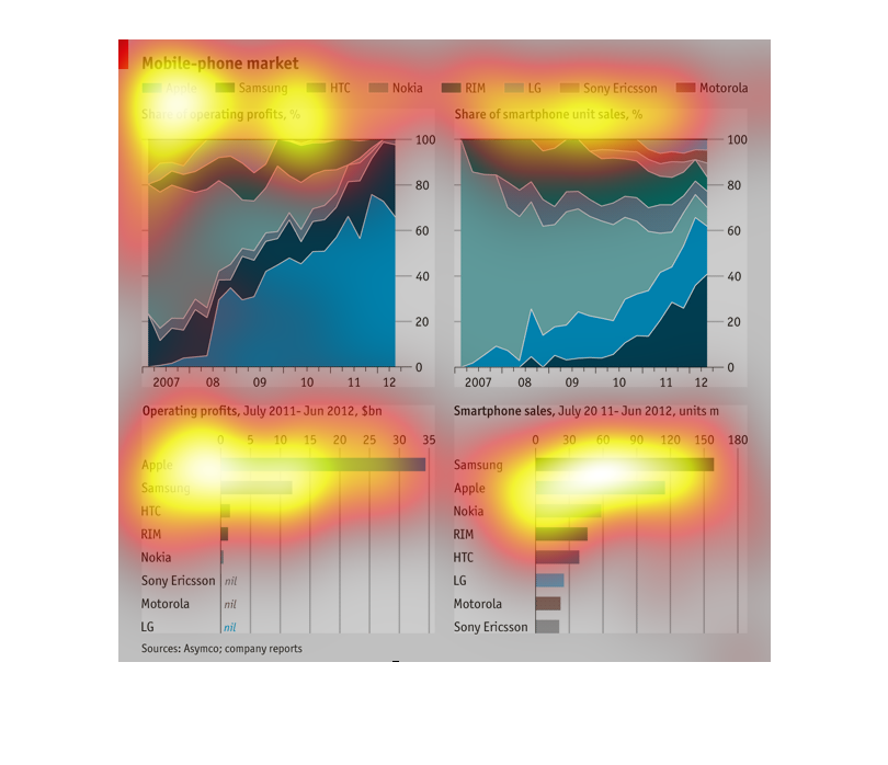
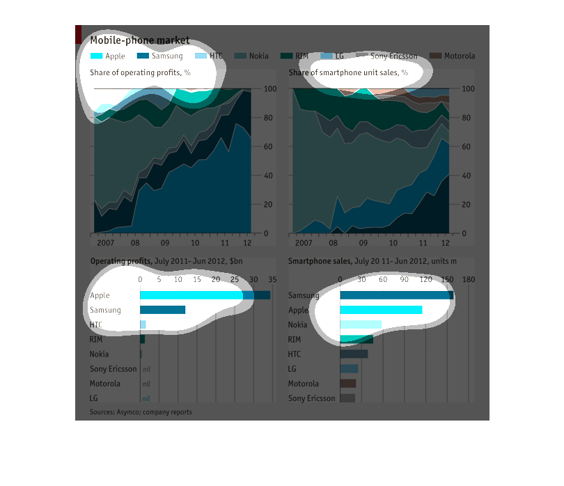
This chart describes the Mobile phone market. The participants are Apple, Samsung, HTC, Nokia,
RIM, LG, Sony Ericssona, and Motorola. Apple and Samsung are the highest on the chart.
This chart describes mobile phone market. Categories on the chart include Apple, Samsung,
HTC, Nokia, RIM, LG, Sony Ericsson, and Motorola. The chart is sourced by Asymco.
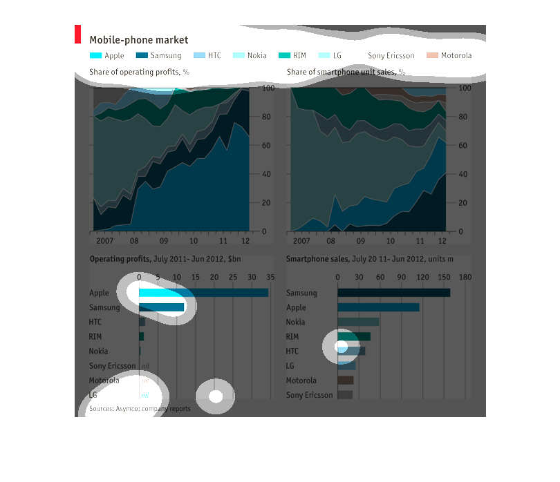
This image shows four graphs each one provides information on mobile device growth over the
years. It also shows the percentage of users that prefer one phone brand over the other as
well as the operating systems.
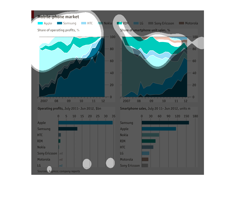
These graphs show a variety of information related to the Mobile phone market by brand. One
graph shows % Share of operating profits in which Apple is the leader. Another shows share
of smart phone unit sales in which HTC is the leader. Apple has the largest operating profits
and Samsung is the sales volume leader.
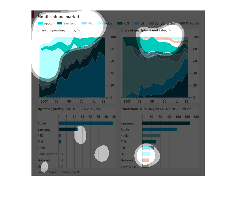
This is to show the difference between different types of smart phones as well as their service
and dependability. Shows their operating systems and which is most likely to be used.
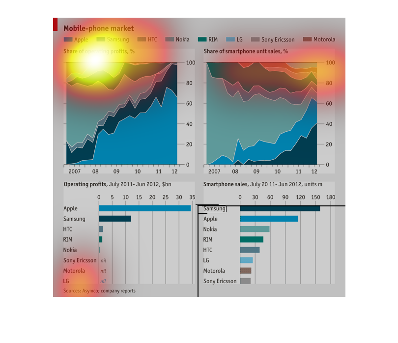
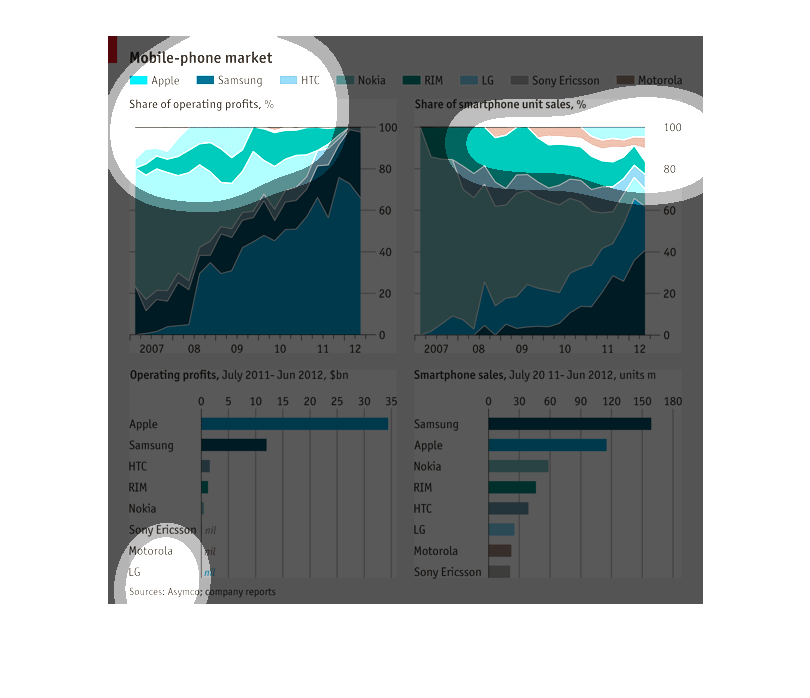
THIS GRAPH IS CALLED THE MOBILE PHONE MARKET AND IT SHOWS THE PROFITS FROM 2011 TO 2012 FROM
JULY TO JUNE. THE TWO BOTTOM GRAPHS ARE CALLED BAR GRAPHS
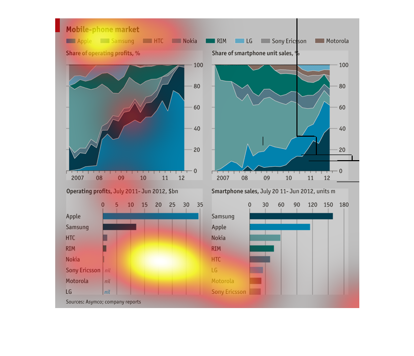
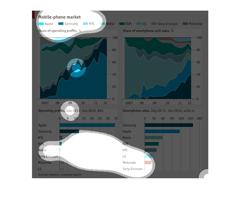
Mobile Phone share of operating profits and smart phone unit shares for the following companies:
Apple Samsung HTC Nokia RIM Sony Ericson Motorola. It is over the course of 2007-2012
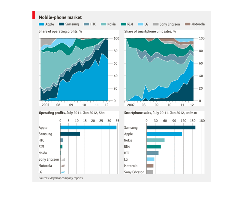
in these images you can observe the Apple and Samsung mobile phones taking over a majority
of the market. Apple is grossing the most profit from operating while Samsung is leading in
sales.
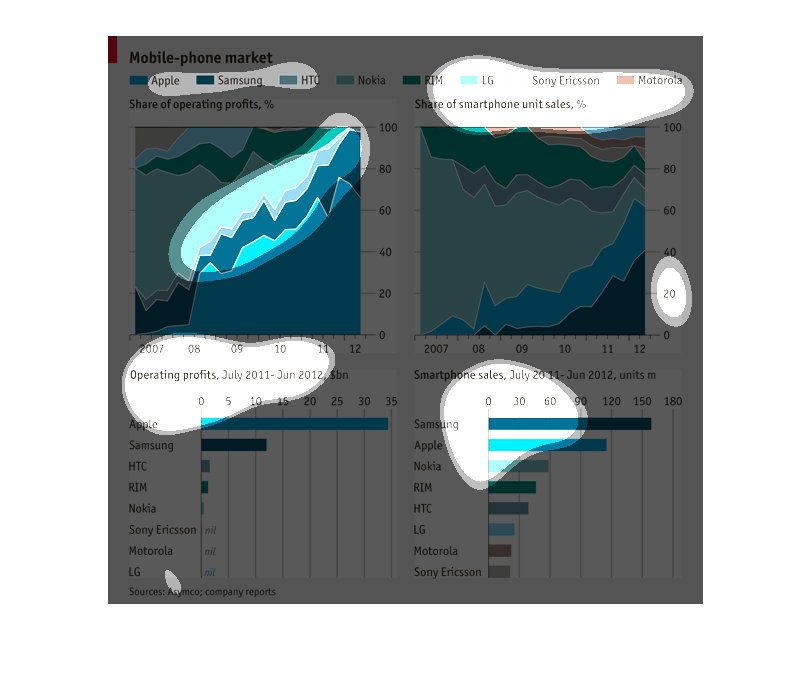
This is a chart showing mobile phones market percentage by company. It shows Apple, Samsung,
HTC, Nokia, RIM, Sony, And Motorola. This charts their profits from 2007 to 2012.
This series of graphs depicts the mobile phone markets by provider such as Apple and Samsung.
 The bottom graphs show the operating profits and smartphone sales by provider with Apple
and Samsung displaying the highest.